Hello! In our last lesson, you mastered the CSS box model, learning how to control the size and spacing of individual elements with properties like padding, margin, and the crucial box-sizing: border-box reset. This gave us control over the boxes themselves.
Now, it's time to arrange those boxes on the page. In this lesson, we'll dive into one of the most powerful tools in modern CSS for layout: Flexbox. The learning outcome is to use Flexbox to create common layout patterns like centered elements, navigation bars, and card grids. We will apply these patterns directly to your personal profile project, starting with styling the navigation bar you've already built.
1. The Core Idea: One-Dimensional Layout
Before we write any code, it's essential to understand what problem Flexbox is designed to solve. At its heart, Flexbox is for laying out a group of items in a single direction—either as a row or as a column. This "one-dimensional" focus is its superpower.
To get a solid grasp of the fundamentals, I'd like you to read through the first few sections of a fantastic interactive guide. It will introduce you to the core concepts of the primary axis and cross axis, which are key to understanding every other Flexbox property.
An Interactive Guide to Flexbox in CSS
The article 'An Interactive Guide to Flexbox in CSS' by Josh W. Comeau provides an intuitive and hands-on explanation of the foundational concepts.
Please read from the beginning down to the heading 'Hypothetical size'. As you read, pay close attention to: How to create a 'flex formatting context' with display: flex. The difference between the primary axis and the cross axis, and how flex-direction changes them. How justify-content distributes items along the primary axis, and align-items aligns them on the cross axis. The 'kebab vs. cocktail wieners' metaphor is particularly helpful here.
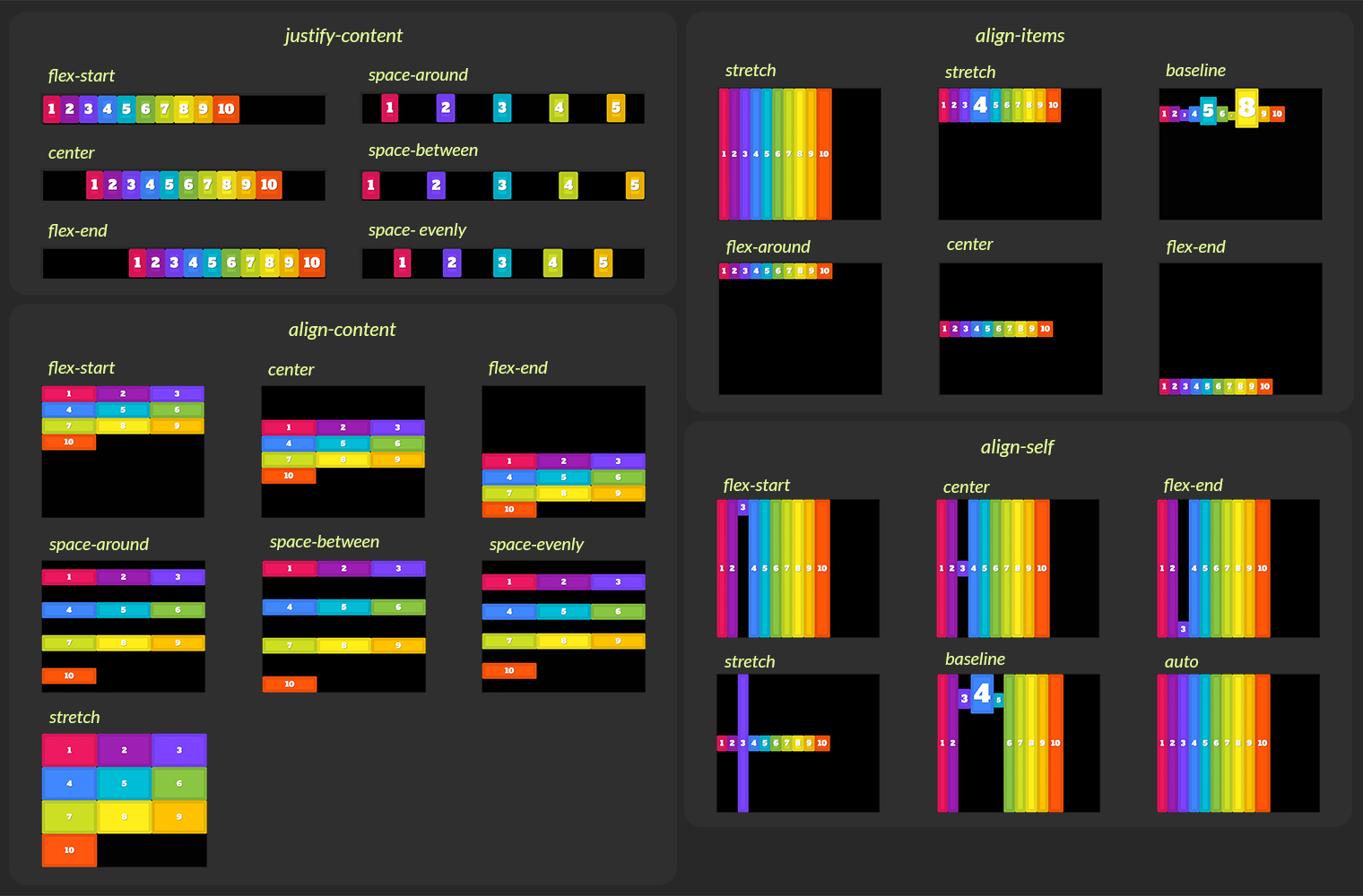
To help you remember these alignment properties, here is a handy visual guide. You can refer back to this throughout the lesson.
2. Pattern 1: Perfect Centering
The most basic Flexbox pattern is centering an item within its parent. With the properties you just learned about, this becomes incredibly simple.
If you have a container with a single child element, you can perfectly center it both horizontally and vertically with just three lines of CSS on the container:
.container {
  display: flex;
  justify-content: center; /* Centers horizontally along the primary axis */
  align-items: center;    /* Centers vertically along the cross axis */
}
This is a powerful and common technique for hero sections, modals, or loading spinners.
3. Pattern 2: Building a Responsive Navigation Bar
Now let's apply Flexbox to your project. Your site has a navigation bar that is currently just a vertical list of links. We'll use Flexbox to create a standard, professional-looking header layout.
The goal is to place the site title or logo on the far left and the navigation links on the far right, with everything vertically centered.
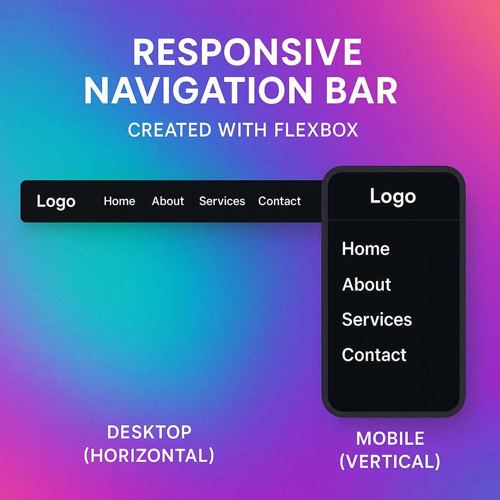
Let's start by styling the navigation container. In your styles.css file, add the following CSS. Your navbar might be inside a <header> tag, and the links inside a <ul>. We'll target that <ul>.
/* In styles.css */
header nav ul {
  list-style: none; /* Removes the default bullet points from the list */
  margin: 0;
  padding: 0;
  display: flex;
  align-items: center; /* Vertically centers the list items */
  gap: 2rem; /* Adds space between the nav links. 1rem = 16px by default */
}
After adding this, you'll see your list items are now in a row and vertically centered. But the site title and the links are all bunched up on the left. How do we push the links to the right?
One common method is using justify-content: space-between. A more powerful and flexible technique, however, involves using auto margins on a flex item.
An Interactive Guide to Flexbox in CSS
Let's go back to Josh Comeau's guide to see how auto margins work in a Flexbox context. This is a great example of learning the 'why' behind a powerful CSS trick.
Read the section 'Auto margins'. Notice how margin-right: auto on the first item consumes all available space, pushing subsequent items to the end of the container.
Your Turn: Implement the Navbar Layout
-
In your HTML files (
index.html,about.html,contact.html), make sure your site title has a unique class. If it's the first<li>in your navigation<ul>, you can addclass="site-title"to it.<!-- Example from index.html --> <nav> <ul> <li class="site-title"><a href="index.html">My Profile</a></li> <li><a href="about.html">About</a></li> <li><a href="contact.html">Contact</a></li> </ul> </nav> -
Now, in your
styles.cssfile, add the rule to push the other items away from the site title..site-title { margin-right: auto; }
Save your files and check the result. You should now have a clean, modern navigation bar layout!
4. Pattern 3: Creating a Card Grid
Flexbox also excels at creating evenly spaced grids of items, like for a portfolio or a list of services. A common challenge here is that cards with different amounts of content end up with different heights, looking messy. Flexbox solves this elegantly.
Let's explore the properties that control how flex items grow and shrink to fit their container: flex-grow, flex-shrink, and flex-basis.
An Interactive Guide to Flexbox in CSS
This final reading from Josh Comeau's guide covers the sizing properties that make Flexbox so flexible.
Read the sections 'Growing and shrinking' and 'Wrapping'. Focus on: flex-grow: How it distributes extra space. flex-basis: How it sets the initial 'ideal' size of an item. flex-wrap: How it allows items to move to a new line when the container is too small.
With these properties, we can create a responsive card layout that automatically adjusts the number of columns to fit the screen size, often without needing media queries.
Watch this video to see a practical demonstration of this powerful pattern.
Flexbox design patterns you can use in your projects
Kevin Powell's video 'Flexbox design patterns you can use in your projects' demonstrates how to build a responsive, grid-like layout with flex-wrap.
Watch the section on the 'Grid-ish' layout (04:31 to 08:11). Pay attention to how the flex shorthand property (flex: 1 1 10em;) and flex-wrap: wrap; work together. The flex-basis (the 10em part) tells the browser the 'ideal' width for each card, and it wraps them accordingly.
Your Turn: Build a Card Section
-
On one of your pages (e.g.,
about.html), add a new<section>for some cards. You can use this HTML as a starting point.<!-- In about.html, inside the <main> tag --> <section class="card-container"> <div class="card"> <h3>Project One</h3> <p>A short description of the first project, showing off my skills.</p> </div> <div class="card"> <h3>Project Two</h3> <p>This project was more complex. It involved building a responsive layout and fetching data from an API. It really highlights my abilities in modern web development.</p> </div> <div class="card"> <h3>Project Three</h3> <p>A simple but elegant design.</p> </div> </section> -
Now, add the following CSS to your
styles.cssfile to turn this into a responsive grid..card-container { display: flex; flex-wrap: wrap; gap: 1rem; /* Creates space between the cards */ } .card { /* This is the magic! */ /* flex-grow: 1; flex-shrink: 1; flex-basis: 300px; */ flex: 1 1 300px; padding: 1.5rem; border: 1px solid #ccc; border-radius: 8px; /* Adds rounded corners */ background-color: #fff; }
Now, resize your browser window. You'll see the cards automatically reflow from a single column to multiple columns as you give them more space. Notice also that even though the content is different, the cards in the same row stretch to be the same height. This is a default behavior of align-items: stretch in Flexbox, and it's incredibly useful for card layouts.
Conclusion
You've done an excellent job today. You've moved from styling single boxes to creating sophisticated, one-dimensional layouts.
Key Takeaways:
- Flexbox is a layout mode for arranging items in a single row or column.
- Layout is controlled by the primary axis and cross axis.
display: flexon a container turns it into a flex container.justify-contentdistributes items along the primary axis (e.g.,center,space-between).align-itemsaligns items along the cross axis (e.g.,center,stretch).flex-grow,flex-shrink, andflex-basisgive you fine-grained control over item sizing.flex-wrap: wrapallows items to flow onto multiple lines, creating responsive layouts.- The
gapproperty is the modern way to add space between flex items.
In our next lesson, we'll tackle two-dimensional layouts. While Flexbox is perfect for rows or columns, what happens when you need to align things in a strict grid, controlling both the rows and the columns simultaneously? For that, we'll turn to the other modern layout powerhouse: CSS Grid.