Hello! Welcome back.
In our last lesson, you did a great job mastering Flexbox to create one-dimensional layouts, like your site's navigation bar and a responsive card section. You learned that Flexbox is perfect for arranging items in either a single row or a single column.
Today, we'll expand our layout capabilities by diving into CSS Grid. While Flexbox handles one dimension, Grid is designed for two dimensions, giving you simultaneous control over both rows and columns. This makes it the ideal tool for building complex page structures.
Our learning outcome for this lesson is to use CSS Grid to build a two-dimensional portfolio layout. We'll explore two powerful techniques to achieve this, giving you the flexibility to choose the best approach for different design challenges.
1. From One Dimension to Two: Introducing CSS Grid
Flexbox arranges items along a single axis. CSS Grid, by contrast, creates a rigid structure of rows and columns, much like a spreadsheet. You can then place items precisely within this structure.

To begin, you create a grid container by setting display: grid. Then, you define the structure of your grid's tracks (the rows and columns).
The most fundamental properties for this are:
grid-template-columns: Defines the number and size of your columns.grid-template-rows: Defines the number and size of your rows.gap: A shorthand to set the space between your rows and columns.
A key concept you'll use is the fractional unit (fr). It represents a fraction of the available space in the grid container. For example, grid-template-columns: 2fr 1fr; creates two columns, where the first is twice as wide as the second. This makes creating flexible and responsive grids intuitive.
Mastering CSS Grid: Building Responsive Two-Dimensional Layouts
For a handy reference, the article 'Mastering CSS Grid' on dev.to provides excellent summary tables of the key properties for both grid containers and grid items. You don't need to read the whole article, but keep these tables in mind.
Take a quick look at the two tables under the headings 'Common Properties Applied to the Grid Container' and 'Common Properties Applied to the Grid Items'. They serve as a great 'cheat sheet' that you can refer back to.
2. Method 1: Building a Mosaic Layout
One powerful way to use Grid is to define a precise grid structure and then tell specific items how many rows or columns they should span. This is perfect for creating dynamic, asymmetrical, or "mosaic" style portfolio layouts.
Let's watch a video that walks through this exact process. The instructor uses SCSS syntax, a preprocessor for CSS. When you see &.medium, this is just shorthand for the parent selector. In standard CSS, you would write .portfolio-item.medium. I'll guide you through the standard CSS implementation.
Build a Mosaic Portfolio Layout with CSS Grid
The video 'Build a Mosaic Portfolio Layout with CSS Grid' by Kevin Powell is a fantastic practical guide to creating an advanced portfolio layout.
Watch from 05:33 to 14:34. Focus on these key steps: Setting up the grid container (05:33 - 09:24): Notice how he uses display: grid and defines the grid structure with grid-template-rows and grid-template-columns, using the repeat() function and the fr unit. Spanning items across tracks (09:24 - 14:34): Pay close attention to how he uses grid-row: span 2 and grid-column: span 2 on individual portfolio items to make them occupy multiple cells, creating the mosaic effect.
Your Turn: Create a Simple Mosaic
Now, let's apply this technique to a new portfolio page.
-
Create the HTML: Create a new file named
portfolio.html. Copy the structure from one of your other pages to get the header and footer. Inside the<main>section, add the following HTML:<!-- In portfolio.html --> <section class="portfolio-grid"> <div class="portfolio-item item-large">Project A</div> <div class="portfolio-item">Project B</div> <div class="portfolio-item">Project C</div> <div class="portfolio-item item-wide">Project D</div> <div class="portfolio-item">Project E</div> </section>Don't forget to add a link to this new page in the navigation bar of all your HTML files.
-
Add the CSS: In your
styles.cssfile, add the following rules./* Style for the grid container */ .portfolio-grid { display: grid; /* Creates a 3-column grid with each column taking up an equal fraction of space */ grid-template-columns: repeat(3, 1fr); /* Automatically creates rows that are at least 150px tall */ grid-auto-rows: minmax(150px, auto); gap: 1rem; padding: 1rem; /* Add some padding around the grid */ } /* Basic styling for each portfolio item */ .portfolio-item { background-color: #f4f4f4; border: 1px solid #ccc; display: flex; justify-content: center; align-items: center; font-size: 1.5rem; } /* --- This is the magic --- */ /* Make the 'large' item span 2 columns and 2 rows */ .item-large { grid-column: span 2; grid-row: span 2; } /* Make the 'wide' item span 2 columns */ .item-wide { grid-column: span 2; }
After saving your files, open portfolio.html. You should see a simple but effective mosaic layout where "Project A" takes up a 2x2 space and "Project D" takes up a 1x2 space. Try resizing your browser to see how the fr unit keeps everything responsive.
3. Method 2: Drawing Your Layout with grid-template-areas
An alternative and often more readable method is to name your grid areas and then "draw" your layout in the CSS. This is incredibly powerful for page-level layouts and modern "Bento Grids," which aligns well with your interest in graphic design.
The process is:
- Assign a name to each child element using the
grid-areaproperty. - On the grid container, use
grid-template-areasto define the layout by arranging those names.
This image perfectly illustrates the concept.
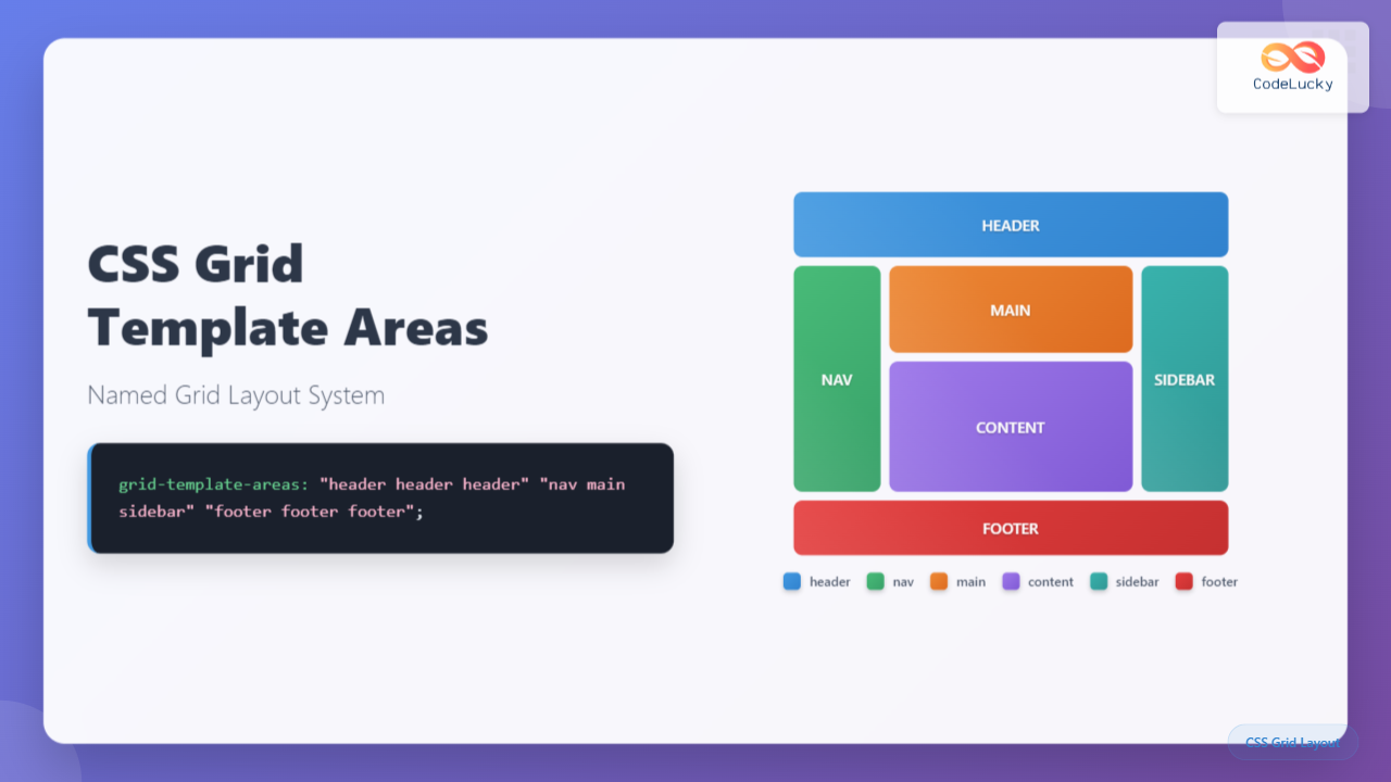
Now, let's watch a video that demonstrates how to build a responsive Bento Grid using this technique.
Learn GRID-AREA to Build Amazing BENTO GRIDS | CSS Tutorial
The video 'Learn GRID-AREA to Build Amazing BENTO GRIDS' by Coding2GO provides a concise and clear explanation of this powerful technique.
Watch from 00:48 to 03:30. Note that the video uses inline styles for the grid-area property for a quicker demonstration. In a real project, it's better to use CSS classes, as we will do. Naming Grid Areas (00:48 - 01:15): See how each item is given a unique name with grid-area. Defining the Layout (01:15 - 02:32): This is the key part. Observe how strings are used in grid-template-areas to visually map out the grid. Repeating a name makes that item span multiple cells. Making it Responsive (02:32 - 03:30): Notice how easily the entire layout can be redefined inside a media query just by changing the grid-template-areas string.
Your Turn: Refactor a Page Layout
Let's use this technique to create a classic main content and sidebar layout on your about.html page.
-
Update the HTML: On your
about.htmlpage, wrap your existing main content in a<article>and add a new<aside>element for a sidebar, all inside the<main>tag.<!-- In about.html --> <main> <article class="main-content"> <h2>About Me</h2> <p>Your existing 'about me' paragraph goes here...</p> <!-- The card-container you built last lesson can go here too --> </article> <aside class="sidebar"> <h3>My Skills</h3> <ul> <li>HTML & CSS</li> <li>JavaScript</li> <li>Git & GitHub</li> </ul> </aside> </main> -
Add the CSS: Add the following rules to your
styles.css. This will apply the layout only on larger screens./* Add this inside the media query you created in the last module */ @media (min-width: 768px) { /* Target the <main> tag specifically on the about page if needed, */ /* for example, by adding a class to the <body> of about.html */ main { display: grid; /* Define a 3-column grid and name the areas */ grid-template-columns: 3fr 1fr; grid-template-areas: "content sidebar"; gap: 2rem; } /* Assign each element to its named area */ .main-content { grid-area: content; } .sidebar { grid-area: sidebar; } }Note: If you want this layout to apply to all pages, you can apply it to the
mainelement directly. If you only want it on the "About" page, you can add a class like<body class="about-page">to yourabout.htmland then targetbody.about-page mainin your CSS.
Now, when you view your about.html page on a wide screen, you'll see a two-column layout. On smaller screens, the grid layout won't apply, and the items will stack vertically, which is a great default for mobile!
Conclusion
Great work today! You've added CSS Grid to your toolkit, enabling you to build robust, two-dimensional layouts. You now have both Flexbox and Grid at your disposal, the two pillars of modern CSS layout.
Key Takeaways:
- CSS Grid is for two-dimensional layouts, controlling both rows and columns.
- The
frunit is essential for creating flexible, responsive grid tracks. - Method 1 (Spanning): Define a grid with
grid-template-columns/rowsand usegrid-column: span Xorgrid-row: span Yon items to create complex layouts like mosaics. - Method 2 (Areas): Name items with
grid-areaand "draw" your layout withgrid-template-areasfor highly readable and maintainable page structures.
In our next lesson, we will take a brief detour from CSS to address a crucial version control skill. As you build more complex features on different branches, you will inevitably run into situations where your changes conflict with changes on the main branch. Our next goal will be to resolve a basic merge conflict, a vital skill for any developer.