Hello! Welcome back to our course.
In the last lesson, you did an excellent job learning to build two-dimensional layouts with CSS Grid. You used both the span keyword to create a dynamic portfolio mosaic and the grid-template-areas property to structure your "About" page with a main content area and a sidebar. We even dipped our toes into responsive design by using a simple min-width media query to apply that grid layout only on larger screens.
Today, we're going to dive deep into that concept. Our goal is to write media queries to make layouts responsive across mobile, tablet, and desktop breakpoints. This is a cornerstone of modern web development, ensuring your site looks great and functions perfectly on any device. Mastering this will be a huge step toward building professional, production-ready websites.
1. What Are Media Queries?
At its core, a CSS Media Query allows you to apply a block of CSS styles only when certain conditions are met. While it can test for things like print vs. screen or device orientation, its most common use by far is to test the viewport (the visible area of the browser window) size.
The basic syntax looks like this:
@media (media-feature-rule) {
  /* CSS rules to apply when the rule is true */
}
For responsive design, the most important media features are min-width and max-width.
@media (max-width: 600px): Applies styles on screens up to 600px wide.@media (min-width: 601px): Applies styles on screens 601px wide and wider.
This ability to apply different styles at different screen widths is what allows us to create responsive layouts.
To get a solid grasp of the fundamental syntax and the difference between min-width and max-width, let's start with a short video.
Master Media Queries And Responsive CSS Web Design Like a Chameleon!
The video 'Master Media Queries And Responsive CSS Web Design' by Slaying The Dragon provides a clear and concise introduction to the syntax and concepts.
Watch from the beginning to 04:17. Focus on: The basic @media syntax. The crucial difference between max-width (for screens smaller than a value) and min-width (for screens larger than a value). How styles inside a media query override the default styles when the condition is met.
2. The Mobile-First Approach
The video you just watched mentioned two strategies: desktop-first (using max-width) and mobile-first (using min-width). In modern web development, mobile-first is the prevailing best practice.
Here's why:
- Growing Mobile Usage: A significant portion of web traffic comes from mobile devices. Designing for them first ensures a good experience for a huge user base.
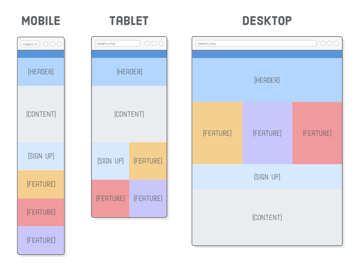
- Progressive Enhancement: You start with a simple, clean layout that works on all devices. Then, you add complexity (like multi-column layouts) as more screen space becomes available. This is often easier than starting with a complex layout and trying to "remove" or "fix" it for smaller screens.
- Performance: Mobile devices may have slower connections. A mobile-first approach encourages loading only essential CSS and assets by default, improving initial page load times.
For a more comprehensive look at the syntax and a great hands-on tutorial for building a mobile-first layout, the Mozilla Developer Network (MDN) is an invaluable resource.
The MDN article 'Media query fundamentals' is an excellent reference that covers the syntax in detail and walks through building a mobile-first responsive design.
Please read the following sections: 'Media query basics': Quickly review the syntax for media types and features. 'Width and height': This is the most important part. Understand how min-width and max-width are used to create ranges. 'Mobile-first responsive design': Read this short section to reinforce the concept. 'Creating your own mobile-first design': Follow this tutorial. It's a great practical exercise that shows how to start with a single-column layout and add media queries to create two- and three-column layouts for wider screens. You don't need to copy the code exactly, but understand the process. 'viewport meta': This explains a critical piece of HTML you need for media queries to work correctly on mobile devices.
3. Hands-On: Making Your Site Responsive
Now, let's apply the mobile-first approach to the personal profile site you've been building.
First, ensure this meta tag is in the <head> of all your HTML files. Without it, mobile browsers will "lie" about their width, and your media queries won't work as expected.
<meta name="viewport" content="width=device-width, initial-scale=1">
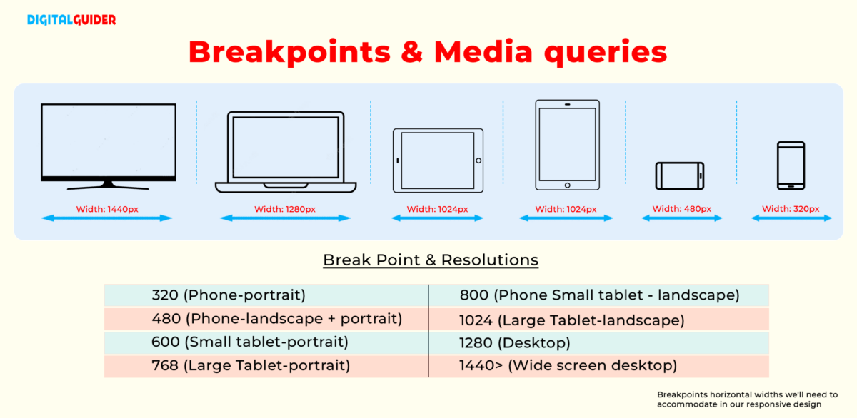
Next, we need to decide on our breakpoints. A breakpoint is a specific width where we introduce a media query to change the layout. While you can choose breakpoints based on where your content "breaks," a common practice is to start with a standard set. Since you'll be learning Tailwind CSS later, let's use breakpoints inspired by its system. This will help you get familiar with the mindset.
| Breakpoint | Minimum Width | Target Devices (Approx.) |
|---|---|---|
sm |
640px |
Large phones, small tablets |
md |
768px |
Tablets (e.g., iPad) |
lg |
1024px |
Laptops, small desktops |
Here's our mobile-first workflow:
- Write base styles for mobile: Style your components (nav, cards, etc.) to look good in a single column on a narrow screen. Do this outside of any media queries.
- Add complexity for larger screens: Use
min-widthmedia queries to apply layout changes at your chosen breakpoints.
Your Turn: Update Your CSS
Let's refactor the layouts you've built.
-
Navigation Bar:
- Base Styles (Mobile): Style your
nav ulto be a vertical list. The links should stack on top of each other. - Media Query (Tablet & up): The horizontal nav bar you built with Flexbox should only apply on wider screens. Move the
display: flex;rule into a media query.
/* styles.css */ /* --- NAVIGATION --- */ /* Base styles (mobile-first) */ nav ul { list-style-type: none; margin: 0; padding: 0; } nav li { text-align: center; margin: 0.5rem 0; } /* Media Query for tablet and up */ @media (min-width: 768px) { nav ul { display: flex; /* This was your old style */ justify-content: center; /* Or whatever you used */ gap: 1rem; } } - Base Styles (Mobile): Style your
-
About Page (Main/Sidebar Layout):
- In the last lesson, you already put your
gridlayout for theabout.htmlpage inside a@media (min-width: 768px)block. That was perfect mobile-first thinking! The default is a stacked layout, and the grid only applies when there's enough space.
- In the last lesson, you already put your
-
Portfolio Page (Mosaic Grid):
- Your mosaic grid might look cramped on a small mobile screen. A good mobile-first approach would be to make it a single column by default.
- Base Styles (Mobile): Set the grid to have only one column.
- Media Query: Move your multi-column
grid-template-columnsand thespanrules into a media query.
/* --- PORTFOLIO GRID --- */
/* Base styles (mobile-first) */
.portfolio-grid {
  display: grid;
  grid-template-columns: 1fr; /* Single column for mobile */
  gap: 1rem;
}

/* Media query for small tablets and up */
@media (min-width: 640px) {
  .portfolio-grid {
    /* Your original 3-column grid definition */
    grid-template-columns: repeat(3, 1fr);
    grid-auto-rows: minmax(150px, auto);
  }

  /* Your original spanning rules */
  .item-large {
    grid-column: span 2;
    grid-row: span 2;
  }

  .item-wide {
    grid-column: span 2;
  }
}
Open your portfolio.html and about.html pages and resize the browser window. You should see the layouts transform smoothly from a single column on mobile to your more complex grid and flex layouts on wider screens.
4. Do You Always Need a Media Query?
Now that you know how to write media queries, the next level of understanding is knowing when to use them. Modern CSS layout methods like Flexbox and Grid have powerful "intrinsic" responsive capabilities.
A practical guide to responsive web design
This video by Kevin Powell, 'A practical guide to responsive web design', offers a brilliant perspective on this. It encourages you to 'work with the browser' and let modern CSS do the heavy lifting before reaching for a media query.
Watch from 13:28 to 22:28. Pay attention to: How flex-wrap: wrap creates a responsive list of tags without any media queries. The incredible power of repeat(autofit, minmax(250px, 1fr)) for creating a responsive grid that automatically adjusts the number of columns. His philosophy: use media queries to add complexity when a layout needs a fundamental change (e.g., from one column to two), not for every small adjustment.
This idea of using media queries only for major layout shifts is key. For things like a gallery of cards, the autofit grid technique is often superior to writing multiple media queries. For your main page structure (like a header, main content, and footer), media queries are the perfect tool.
Conclusion
Fantastic work today! You've tackled one of the most essential skills in modern web design. You now have the power to create fluid, adaptable layouts that provide a great user experience on any device.
Key Takeaways:
- Media queries apply CSS rules based on conditions, most commonly viewport
min-widthormax-width. - The mobile-first approach is the industry standard: design for small screens first, then use
min-widthmedia queries to add complexity for larger screens. - Always include the
<meta name="viewport" ...>tag in your HTML. - Before writing a media query, ask if a modern CSS feature like
flex-wrapor anautofitgrid can achieve the same result more simply. - It's practical to start with a standard set of breakpoints (e.g.,
640px,768px,1024px), which will also prepare you for using CSS frameworks like Tailwind.
In our next lesson, we'll switch gears back to Git to learn how to resolve a basic merge conflict. This is a critical skill that you will inevitably face when working on a project, especially as you continue using branches for different features. Don't worry, it's a normal part of the process, and knowing how to handle it confidently is a sign of a professional developer.