Hello! In our last session, you did a fantastic job building the complete HTML structure for a 3-page personal profile website and managing the process with Git. Your site is structurally sound, but it's currently unstyled.
This lesson marks our first step into CSS, where we'll begin to bring your project to life visually. To build any layout, whether simple or complex, we must first understand how elements take up space on the page. This is governed by a fundamental concept in CSS called the box model.
Today, you will learn to apply the CSS box model and explain how margin, padding, border, and content interact. Mastering this concept is the absolute key to creating predictable and professional-looking web layouts.
Let's begin styling your project!
1. Everything is a Box
The first principle of CSS layout is that every single element on your webpage—a paragraph, a heading, an image, a <div>—is treated as a rectangular box. The CSS box model is the set of rules that defines how this box is sized and how it interacts with other boxes around it.
This box is composed of four distinct layers, working from the inside out:
- Content: The actual text, image, or other media. Its size is defined by
widthandheight. - Padding: The transparent space between the content and the border. It's the "breathing room" inside the box.
- Border: A line that is drawn around the padding. It can have a size, style, and color.
- Margin: The transparent space outside the border. It's used to push other elements away.
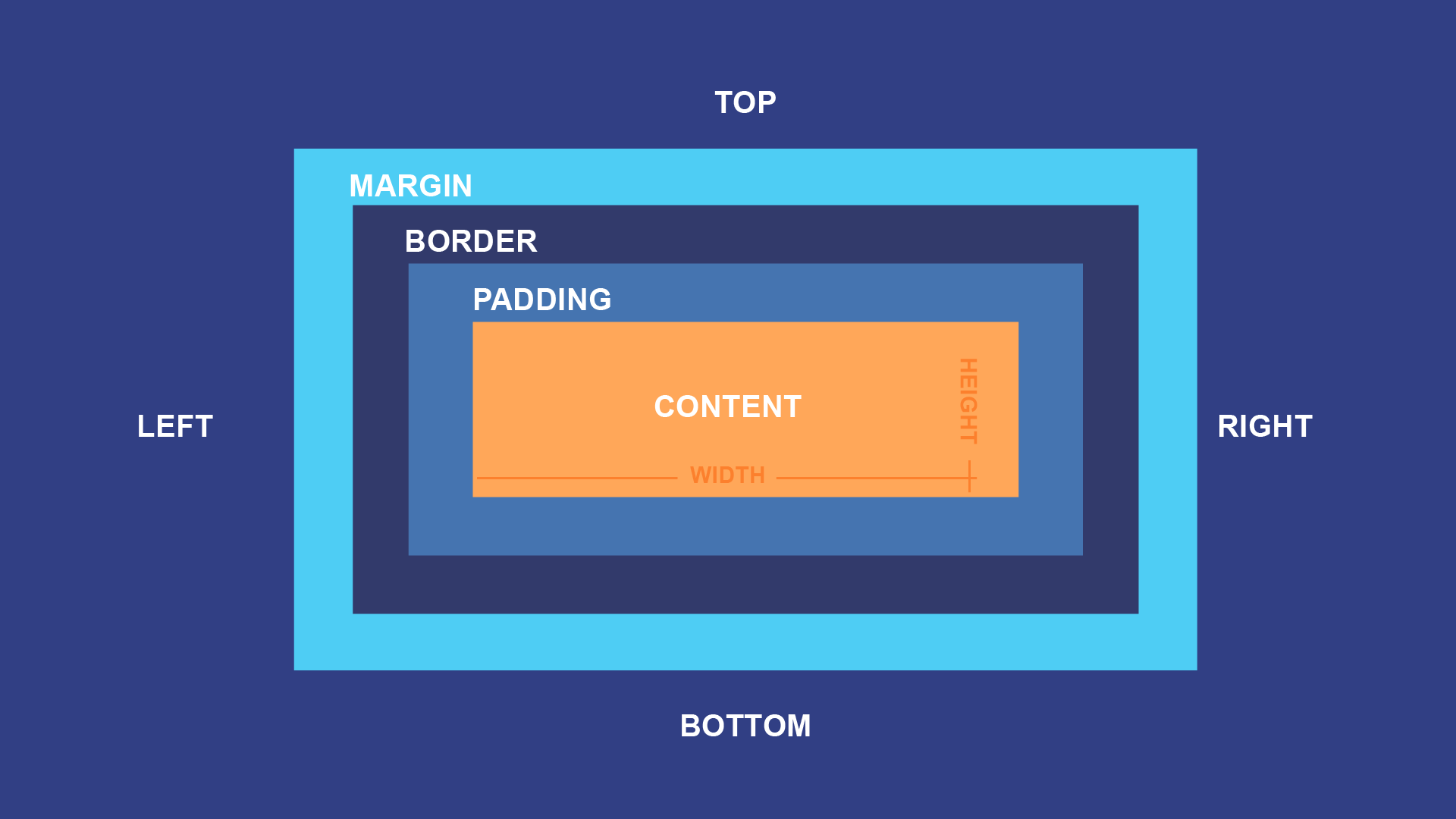
To see these concepts in action, let's watch a short, clear explanation.
Learn CSS BOX MODEL - With Real World Examples
The video 'Learn CSS BOX MODEL - With Real World Examples' by Slaying The Dragon provides an excellent visual introduction to these four components.
Watch from 00:21 to 02:14. Pay close attention to the distinction between padding (space inside) and margin (space outside).
2. Hands-On: Setting up Your Styles
Let's apply this to your project.
-
In your
personal-profile-sitefolder, create a new file namedstyles.css. -
Open your
index.htmlfile. Inside the<head>section, add the following line to link your new stylesheet:<link rel="stylesheet" href="styles.css">You will need to add this same line to
about.htmlandcontact.htmlfor them to be styled as well. -
Now, open
styles.cssand add the following code to style the main hero section on your home page./* You can target the first section inside main */ main section { width: 500px; height: 200px; padding: 20px; border: 5px solid #333; margin: 30px; background-color: #f0f0f0; /* Added so we can see the box area */ } -
Save your files and view
index.htmlusing Live Server. You should see a gray box with a border, and some space around it.
3. Inspecting the Box Model with DevTools
How can we be sure about the final size of our element? Browser developer tools give us a visual debugger for the box model of any element. This is one of the most important tools for a web developer.
Learn CSS BOX MODEL - With Real World Examples
Let's return to the Slaying The Dragon video to see how to use browser DevTools to inspect the box model.
Watch from 03:03 to 04:30. The video will show you how to open DevTools, select an element, and find the box model diagram in the 'Computed' tab.
Your Turn:
- With your page open, right-click on the gray box you just styled and choose Inspect.
- In the DevTools panel that appears, make sure the
<section>element is highlighted in the Elements tab. - Switch to the Computed tab (you may need to click
>>to find it). - You will see a diagram just like the one at the start of this lesson. Hover your mouse over the margin, border, and padding values in the diagram. Notice how the corresponding area is highlighted on the webpage itself.
4. The Sizing Problem: content-box vs. border-box
Take a look at the "content" area in the DevTools diagram. It shows 500px x 200px, which is what we set for width and height. But what is the total width of the visible box on the screen?
- Width =
500px(content) +20px(left padding) +20px(right padding) +5px(left border) +5px(right border) = 550px
This is the default behavior, known as box-sizing: content-box. Your width and height properties only apply to the content box, and the padding and border are added on top of that. This is unintuitive and makes creating predictable layouts difficult. Imagine trying to fit two boxes, each 50% wide, side-by-side. If you add any padding, they won't fit!
Fortunately, there is a better way.
Learn CSS BOX MODEL - With Real World Examples
The 'Slaying The Dragon' video explains this problem perfectly and introduces the modern solution.
Watch from 10:35 to 14:54. This is the most crucial part of the lesson. Understand: Why content-box is problematic for calculating element size. How box-sizing: border-box solves this by including padding and border within the element's width and height.
With box-sizing: border-box, if you set an element's width to 500px, the entire visible box, from the left edge of the border to the right edge, will be exactly 500px. The browser automatically shrinks the content area to make room for any padding and border you add.
5. Best Practice: The Universal Box-Sizing Reset
This behavior is so much more predictable that it has become a standard best practice to apply it to every element on the page. We do this with a special "universal" selector at the very top of our CSS file.
For a more detailed explanation and an interactive demo, take a look at this article from web.dev.
The article 'Box Model' from web.dev reinforces this concept and provides the exact CSS rule that is considered a modern standard.
Read the sections 'Control the box model' and the following code block with its explanation. Focus on the box-sizing: border-box; rule and the universal * selector.
Your Turn:
Add this CSS reset to the very top of your styles.css file. From now on, you'll start every project with this.
*,
*::before,
*::after {
  box-sizing: border-box;
}
Now, with this rule added, inspect your gray box again. You'll see that its total width is now 500px, and the content area inside has been automatically reduced to make room for the padding and border. This is the predictable behavior we want.
6. Applying Padding and Margin with Shorthand
Finally, let's look at a more efficient way to write these properties. You can set the margin or padding for all four sides at once using shorthand.
Learn CSS BOX MODEL - With Real World Examples
Let's watch one last clip that demonstrates the shorthand properties for padding and margin.
Watch from 04:15 to 06:13 (for padding) and 07:09 to 08:57 (for margin). Focus on how one, two, three, and four values work. The 'clockwise' rule (Top, Right, Bottom, Left) is very helpful to remember.
Quick Reference (applies to both padding and margin):
- 1 value:
padding: 20px;(applies to all 4 sides) - 2 values:
padding: 20px 40px;(Top/Bottom, Left/Right) - 3 values:
padding: 20px 40px 50px;(Top, Left/Right, Bottom) - 4 values:
padding: 20px 40px 50px 30px;(Top, Right, Bottom, Left - like a clock)
Final Activity:
Go back to your styles.css file. Modify the main section rule to use shorthand properties for padding and margin. Experiment with different values to get comfortable. For example, try to give the section more top margin to push it down from the navigation, and equal padding on all sides.
Conclusion
Great work today! You've taken a significant step in your CSS journey by mastering its most fundamental concept.
Key Takeaways:
- Every HTML element is a box with four layers: content, padding, border, and margin.
- Padding creates space inside an element, while margin creates space outside it.
- By default, browsers use
content-boxsizing, wherewidthandheightonly apply to the content area, making layout calculations difficult. - The modern best practice is to use
box-sizing: border-box, which makes an element's total width and height inclusive of its padding and border. - Starting your CSS with a universal
border-boxreset is essential for creating predictable and maintainable layouts.
Now that you understand how to control the size and space of individual boxes, our next lesson will focus on arranging them. We will dive into Flexbox, a powerful layout tool for creating common patterns like navigation bars and card grids.