Hello! Welcome to your sixth lesson in the "Foundational UI/UX Design Principles" module.
In our last lesson, we explored the Gestalt principles and saw how proximity—placing related items close together—is fundamental to creating intuitive layouts. We established that the lack of space (whitespace) is the primary tool for creating these groupings.
This lesson builds directly on that idea. Your learning outcome is to explain the importance of whitespace and apply appropriate spacing systems in interface layouts. We'll move from the why (Gestalt theory) to the how: a systematic, engineering-friendly approach to managing space. For you as a developer, this is where design intent translates into concrete, maintainable code.
1. The Role of Whitespace in UI Design
Whitespace, or negative space, is the unmarked space between and within elements in a design. It's an active and powerful element, not just an empty background. Correctly used, it enhances readability, creates focus, and gives a design a sophisticated, uncluttered feel.

To formalize this, let's break down the two main types of whitespace.
How to Use White Space in UI Design (UI Principles Series)
The video 'How to Use White Space in UI Design' by Brendan Colarusso provides a great introduction to the two main categories of whitespace: micro and macro.
Please watch from 00:45 to 01:47 and from 04:12 to 05:35. Focus on understanding the definitions of micro and macro whitespace and the benefits that effective spacing brings to an interface.
As the video explained, we can categorize whitespace as follows:
- Micro Whitespace: This is the small space between elements, such as the space between lines of text (line-height), between list items, or between an icon and its label. Its primary role is to improve legibility and readability, making content easier to scan and process.
- Macro Whitespace: This is the large space between major layout sections and around the entire composition. For example, the wide margins on either side of a blog article. Its role is to guide the user's eye, create focus on key elements, and establish an overall aesthetic (e.g., minimalist, premium).
While "just adding space until it looks right" can work sometimes, it's inefficient and leads to inconsistency. This is a common point of friction between designers and developers. A systematic approach is far more effective.
2. The 8pt Grid System: A Systematic Approach to Spacing
To ensure consistency and scalability, designers and developers rely on spacing systems. The most widely adopted standard is the 8-point (8pt) grid system.
The principle is simple: every dimension, margin, and padding value should be a multiple of 8 (e.g., 8px, 16px, 24px, 32px).
Why 8?
- Scalability: Most modern screen resolutions are divisible by 8, which makes scaling designs from a 1x display to higher-density screens (like on many Android and iOS devices) straightforward and pixel-perfect.
- Granularity: Multiples of 8 provide a good range of options without being overwhelming. For finer control when needed, a 4px increment is often used.
- Consistency: It establishes a clear, predictable rhythm in the design, which improves the user experience.
- Developer Handoff: It creates a simple rule for developers to follow, eliminating guesswork and "magic numbers" in the CSS or layout code.
Let's watch a video that explains the rationale and shows how it works in practice.
Why Product Designers (UX/UI) should be using a 8pt grid system | Tutorial and Template
The video 'Why Product Designers (UX/UI) should be using a 8pt grid system' by Gemma Helyer offers a clear, practical guide to this concept.
Please watch from the beginning to 05:54. Pay attention to how this system creates a consistent language between designers and developers and simplifies decisions about layout.
3. Implementing a Spacing System
Knowing the 8pt rule is one thing; applying it is another. Let's look at how professional design systems formalize this.
Space Tokens
A key concept in implementing a spacing system is the use of design tokens. Instead of using raw pixel values like 16px in the code, we use named variables (tokens) that correspond to the steps in our spacing scale.
This is analogous to using constants or environment variables in your backend code instead of hardcoding values. It makes the system maintainable and scalable.
The Atlassian Design System provides an excellent real-world example of this.
The 'Spacing' page from the Atlassian Design System documentation is a fantastic reference for how a large company builds and documents its spacing system.
Read the sections '8 pixel base unit', 'Scale', 'Space tokens', and the table of tokens. Notice how they create a token system (e.g., space.100) based on an 8px unit. This is the bridge between design and code.
As you saw, a system like Atlassian's might look like this:
space.100= 8pxspace.200= 16pxspace.300= 24px- ...and so on.
In CSS, you would implement this with custom properties:
:root {
  --space-100: 8px;
  --space-200: 16px;
  --space-300: 24px;
}

.card {
  padding: var(--space-200); /* 16px */
  margin-bottom: var(--space-300); /* 24px */
}
In Flutter, you'd define these as constants in your theme file:
class AppSpacings {
  static const double space100 = 8.0;
  static const double space200 = 16.0;
  static const double space300 = 24.0;
}

Container(
  padding: const EdgeInsets.all(AppSpacings.space200), // 16.0
  margin: const EdgeInsets.only(bottom: AppSpacings.space300), // 24.0
);
Practical Rules for Application
Having a system is great, but which value do you choose? Here are two fundamental rules to guide you.
1. The Internal ≤ External Rule
This rule is a direct application of the Gestalt principle of Proximity. It states that the space around an element (its margin, or external space) should be equal to or greater than the space within it (its padding, or internal space).
What are spacing best practices (8pt grid system, internal ...
The article 'What are spacing best practices' from Cieden explains this rule clearly.
Read the section 'The rule of internal and external spacing'. This will connect the Gestalt theory from our last lesson to a very practical spacing rule.
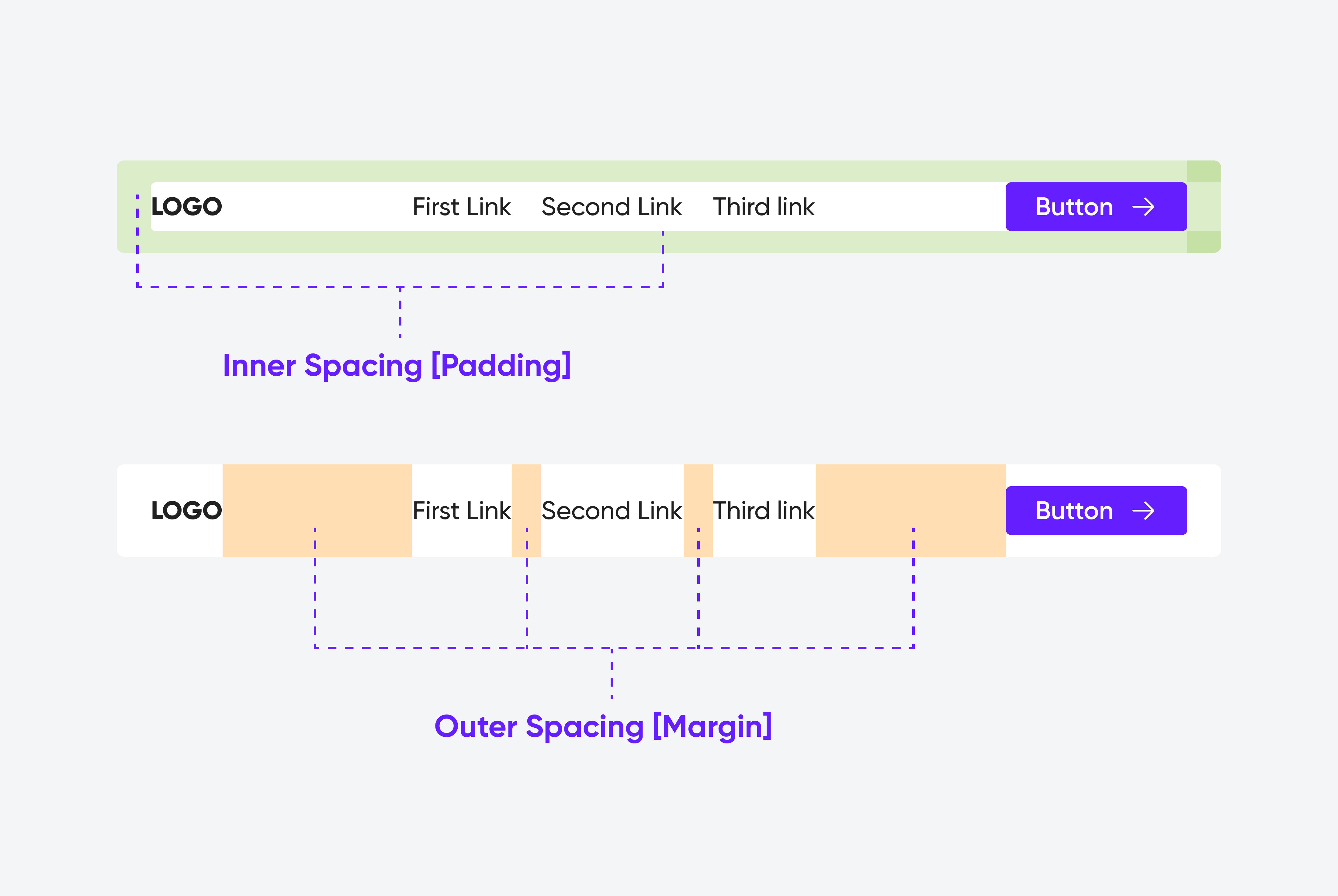
2. Use Different Scales for Different Contexts
Not all spacing is equal. You can create hierarchy and clarity by using different ranges from your spacing scale for different purposes.
Let's return to the Atlassian documentation to see how they categorize their spacing tokens for specific use cases.
Read the sections 'Spacing usage' and 'Layout guidelines'. This provides excellent heuristics for when to use small, medium, and large spacing values.
To summarize the guidelines from Atlassian:
- Small values (e.g., 2px-8px): Use for high-density components, like the space between an icon and text, or within input fields. This is micro whitespace.
- Medium values (e.g., 12px-24px): Use for spacing inside larger components like buttons or cards, and for vertical spacing between elements within a card.
- Large values (e.g., 32px-80px): Use for page layout, like the space between main content sections. This is macro whitespace.
Test your understanding!
Imagine you are designing a user profile card component using an 8pt spacing system. The card contains:
- An avatar (image)
- A user's name (heading)
- A short bio (paragraph)
- A "Follow" button
The card itself needs to be separated from other cards in a list.
Based on the principles you've learned (8pt system, internal ≤ external rule, and contextual spacing), propose spacing token values (e.g., 16px, 24px) for the following:
- A: Padding inside the card.
- B: Space between the user's name and their bio.
- C: Space between the bio and the "Follow" button.
- D: Margin between this card and the next card in the list.
Explain your reasoning for each choice. There isn't one single "correct" answer, but your reasoning should be sound.
Show answer
Here is one possible, well-reasoned solution:
-
A: Padding inside the card = 24px. This is the main internal space for the component. A medium-large value like 24px gives the content inside ample breathing room from the card's edge.
-
B: Space between user's name and bio = 8px. These two elements are very closely related. A small micro-spacing value reinforces that the bio belongs to the name above it.
-
C: Space between bio and "Follow" button = 16px. The button is related to the profile but represents a primary action. Giving it slightly more space than the name/bio gap separates the informational content from the interactive content, creating a subtle hierarchy.
-
D: Margin between cards = 32px. This is the external space. According to the
internal ≤ externalrule, this value must be greater than or equal to the internal padding (24px). Using a larger value like 32px clearly separates each profile card, making the list easy to scan.
This solution demonstrates:
- Use of the 8pt scale (8, 16, 24, 32 are all multiples of 8).
- The internal (24px padding) is less than the external (32px margin).
- Contextual spacing: smaller values for tightly-related text, larger values for separating components.
Conclusion
Today, we've transformed the abstract concept of space into a concrete, systematic tool. By adopting a spacing system, you can create layouts that are not only visually harmonious but also consistent, scalable, and easier to implement and maintain.
Key Takeaways:
- Whitespace is an active design element that guides users, improves readability, and creates focus.
- Micro whitespace is for readability within components, while macro whitespace is for overall page layout and structure.
- The 8pt grid system is the industry standard for creating a consistent and scalable spacing scale based on multiples of 8.
- Design tokens (e.g.,
--space-200) are used to implement the spacing system in code, creating a shared language between design and development. - Apply the
internal ≤ externalrule to ensure that groups of elements are clearly defined, reinforcing the Gestalt principle of proximity.
Preview of the next lesson:
Proper spacing is one of the most effective ways to make an interface feel simpler and easier to use. In the next lesson, we will broaden this idea and explore cognitive load, learning how to apply its principles to simplify interface designs and reduce the mental effort required from your users.