Hello! Welcome to your seventh lesson in the "Foundational UI/UX Design Principles" module.
In our last lesson, we established how a systematic approach to spacing, like the 8pt grid, can create order and clarity. This is one of the most direct ways to make an interface feel simpler. Today, we'll expand on that "why" by focusing on a core concept in psychology and UX: cognitive load.
Your learning outcome for this lesson is to apply cognitive load principles to simplify interface designs. We'll explore what cognitive load is and, more importantly, discuss actionable strategies you can use as a developer to reduce the mental effort your users need to expend, leading to more efficient and pleasant experiences.
1. What is Cognitive Load?
Think of a user's brain as having a finite amount of processing power and short-term memory (RAM). Every element on a screen—every piece of text, every icon, every choice—consumes some of this mental resource. Cognitive load is the total amount of mental effort being used in a person's working memory to accomplish a task.
When the amount of information and required actions exceeds a user's ability to process it, they experience high cognitive load. The consequences are tangible:
- Tasks take longer to complete.
- Users make more mistakes.
- They feel frustrated, confused, or overwhelmed.
- They may abandon the task or the product entirely.
As a developer, you can think of this as optimizing for the user's "mental CPU". Your goal is to eliminate any unnecessary processing (extraneous cognitive load) so the user can focus their mental energy on their actual goal.
The article 'The Psychology of Design' provides a concise and clear definition of cognitive load and connects it directly to UI design principles.
Please read the section titled 'Cognitive load'. It's a short section found under the 'Hick’s Law' heading. Note the analogy between the brain and a computer processor.
2. Principles for Reducing Cognitive Load
So, how do we actively reduce this load? It's not about "dumbing down" interfaces, but about making them more efficient and intuitive. We can achieve this by applying a few key psychological principles.

Let's dive into these strategies, grounding them in established psychological laws.
Principle 1: Reduce the Number and Complexity of Choices (Hick's Law)
Hick's Law predicts that the time it takes to make a decision increases as the number and complexity of choices grow. More options mean more mental processing.
Let's return to 'The Psychology of Design' to see how Hick's Law is explained and applied.
Read the section on 'Hick’s Law', including the examples of the TV remotes and Slack's onboarding. This perfectly illustrates the benefit of reducing choices to minimize cognitive load.
Here are practical ways to apply this principle:
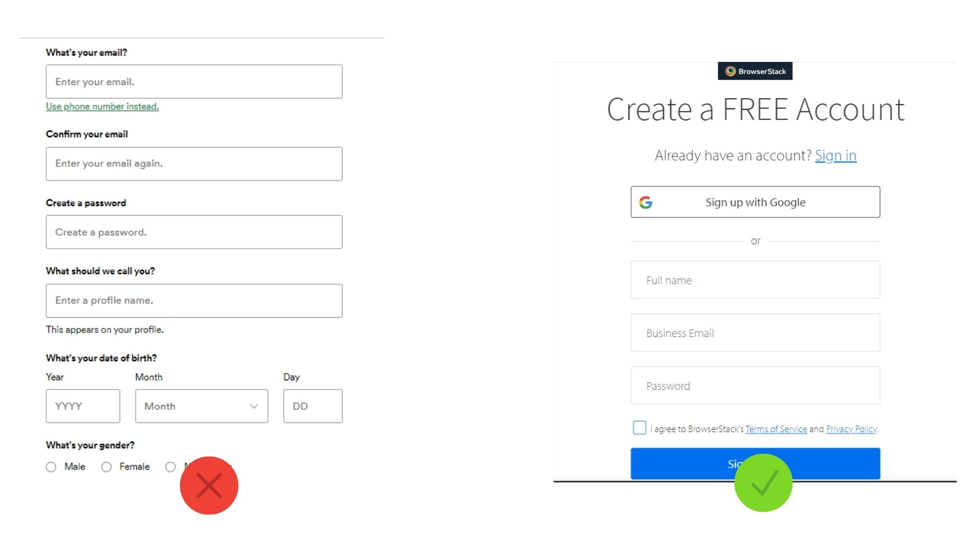
- Simplify Forms: Don't ask for information you don't need. Offer streamlined options like social sign-on.
- Prioritize Actions: Make the most common or important action the most prominent. Don't give equal weight to every button.
- Use Progressive Disclosure: Hide complex or advanced options until the user explicitly asks for them. A common example is an "Advanced Settings" link that reveals more configuration options. This keeps the default view clean and focused.
Principle 2: Structure Information Logically (Miller's Law)
Miller's Law is famously misinterpreted as "users can only handle 7 things." The real, more valuable insight from George Miller's work is the concept of chunking. Our brains are excellent at processing information when it's grouped into smaller, related "chunks."
Your experience with organizing code into modules, classes, and functions is a direct parallel. You do this to manage complexity. The same applies to UI.
The 'The Psychology of Design' article also has a great section on Miller's Law and the power of chunking.
Please read the section on 'Miller’s Law' and 'Chunking'. Pay close attention to the phone number and layout examples, as they show how visual grouping makes information easier to process.
How to apply chunking:
- Group Related Fields: In a long form, use whitespace and headings to group related information (e.g., "Personal Details," "Shipping Address").
- Break Down Tasks: Instead of one massive page, use a multi-step wizard to guide users through a complex process. Each step is a manageable chunk. The Task List pattern, mentioned in the resource below, is an excellent example of this.
- Use Cards and Lists: These UI patterns are effective because they naturally chunk content into digestible units.
Principle 3: Offload Tasks from the User's Memory
Don't force users to remember information from one part of your interface to use it in another. Human working memory is notoriously unreliable.
How To Reduce Cognitive Load In UX
The article 'How To Reduce Cognitive Load In UX' by Vitaly Friedman offers excellent, practical advice. We'll focus on a few key pillars he identifies.
Read the sections '3. Create Order Around A Task' and '4. Support Working Memory'. Notice the debunking of the '3-clicks rule' and the emphasis on not forcing users to remember things, for example, by avoiding modals that obscure needed information.
Techniques for offloading memory tasks:
- Ensure Visibility: Keep relevant context visible. For example, in a checkout process, a summary of the cart should remain on screen as the user enters shipping and payment details.
- Use Clear Labels and Icons: Rely on recognition over recall. A user should be able to recognize what an icon means, not have to recall it from memory.
- Provide Sensible Defaults: Pre-fill forms with smart defaults or previous user entries to reduce the amount of work and memory required.
Principle 4: Leverage Existing Mental Models (Jakob's Law)
Jakob's Law of Internet User Experience states that users spend most of their time on other sites. This means they form expectations—or mental models—about how things should work based on their cumulative experience. When your site defies these conventions, you increase cognitive load because the user must learn a new way of doing things.
This is analogous to using established design patterns in software engineering (e.g., Singleton, Factory, MVC). You use them because they are proven solutions to common problems and are understood by other developers. The same is true for UI patterns.
Let's look at the final principle from 'The Psychology of Design'.
Read the section on 'Jakob’s Law' and 'Mental models'. This is crucial for understanding why consistency with established patterns is a benefit, not a limitation.
Adhering to conventions for common UI elements like navigation menus, form controls, and shopping carts doesn't stifle creativity; it offloads the cognitive work of "how do I use this?" so the user can focus on "what do I want to do?".
Test your understanding!
You are tasked with redesigning a settings page for a web application. The current page is a single, long-scrolling form with over 40 distinct settings, each with a toggle switch or input field.
Based on the principles of reducing cognitive load, describe three specific changes you would make to the design. For each change, name the primary principle you are applying (e.g., Hick's Law, Miller's Law/Chunking, etc.).
Show answer
Here are three possible changes based on the principles we've discussed:
-
Change: Organize the settings into logical groups like "Profile," "Notifications," and "Security," and present them as a set of tabs or a side navigation menu. The user would only see the settings for the selected category at one time.
- Principle Applied: Miller's Law (Chunking) and Hick's Law. By breaking the 40+ items into smaller, semantically related groups, we make the information much easier to process. It also reduces the number of choices visible at once.
-
Change: Within the "Notifications" section, instead of listing every single notification type with a toggle, create a primary toggle for "Enable/Disable All Notifications." If enabled, the granular options for email, push, and SMS notifications become visible.
- Principle Applied: Progressive Disclosure (a strategy related to Hick's Law). This hides complexity from users who don't need it. The most common action (turning all notifications on or off) is prioritized.
-
Change: Implement a "Reset to Defaults" button for each section. This allows users to easily undo their changes without having to remember the original state of each of the 40+ settings.
- Principle Applied: Supporting Working Memory. This offloads the mental task of remembering the default configuration and reduces the fear of making an irreversible mistake.
A Note on Nuance: Complexity vs. Complication
Finally, it's important to recognize that the goal is not always to eliminate cognitive load entirely. Some tasks are inherently complex, and for expert users, having powerful tools at their fingertips is essential.
How To Reduce Cognitive Load In UX
To round out our understanding, let's look at two final points from Vitaly Friedman's article that add important nuance.
Read the short sections '1. Beware of Oversimplification' and '5. Just Enough Friction'. This will help you understand that the goal isn't to make everything simplistic, but to make it manageable and avoid unnecessary complexity.
The key distinction is between complex and complicated. A fighter jet cockpit is complex, but for a trained pilot, it's not complicated because the layout maps to their mental model. Your goal is to manage inherent complexity, not to oversimplify to the point where the tool becomes useless.
Conclusion
Today we explored cognitive load as a critical factor in user experience. By understanding the limitations of human working memory, we can design and build interfaces that are not just visually appealing, but are fundamentally more efficient and user-friendly.
Key Takeaways:
- Cognitive Load is the mental effort required to use an interface. Exceeding a user's capacity leads to errors and frustration.
- Hick's Law: Simplify and reduce choices. Use progressive disclosure to hide complexity.
- Miller's Law: Chunk information into logical groups to make it easier to process. Break down long tasks into steps.
- Support Working Memory: Don't force users to remember things. Make information visible and rely on recognition over recall.
- Jakob's Law: Leverage existing mental models by following established UI conventions for common patterns.
Preview of the next lesson:
We'll conclude our first module by looking at one of the most significant sources of cognitive load in any application: navigation. In the next lesson, we will discuss common navigation patterns like tabs, breadcrumbs, and hamburger menus, and identify the appropriate use cases for each.