Hello! Welcome to the final lesson in our first module, "Foundational UI/UX Design Principles."
In our previous lesson, we explored the concept of cognitive load and how principles like Hick's Law and Miller's Law can help us design simpler, more intuitive interfaces. We established that a primary source of cognitive load for users is figuring out where they are and how to get where they want to go.
Today, we directly address that challenge. Your learning outcome is to describe the purpose and appropriate use cases for common navigation patterns (e.g., tabs, breadcrumbs, hamburger menus). Effective navigation isn't just about providing links; it's about designing a clear, predictable system that guides users through your application with minimal mental effort.
By the end of this lesson, you'll be able to analyze an application's structure and choose the right navigation patterns for both desktop and mobile contexts.
A Framework for Understanding Navigation
Before we dive into specific patterns, it's helpful to have a high-level framework for thinking about how users move. Navigation isn't random; it generally follows predictable directions based on the application's information architecture.
Let's begin by reading a short piece from Google's Material Design guidelines, which provides a clean and powerful mental model for categorizing navigation.
This guide, 'Understanding navigation,' introduces three fundamental directions of movement within an app. This framework will help us structure our discussion of specific UI patterns.
Please read the section 'Types of navigation' up to (but not including) 'Lateral navigation'. Focus on understanding the distinction between Lateral, Forward, and Reverse navigation.
To summarize, all navigation can be categorized as:
- Lateral Navigation: Moving between screens at the same level of importance (e.g., from your "Inbox" to your "Calendar").
- Forward Navigation: Moving deeper into the application hierarchy or through a sequence (e.g., clicking on an email to read it, or proceeding through a checkout flow).
- Reverse Navigation: Moving backward or upward (e.g., using the browser's back button or returning to a parent category page).
With this framework in mind, let's explore the common patterns used to facilitate these movements.
1. Lateral Navigation Patterns: Moving Between Peers
Lateral navigation patterns are used for the main "destinations" in your app. The choice of pattern depends heavily on the number of destinations and the device (desktop vs. mobile).
Horizontal Navigation Bar and Tabs
The most common pattern on desktop websites is the horizontal navigation bar. It's familiar, highly visible, and places the main destinations at the top of the page, leveraging users' established mental models (Jakob's Law).
Tabs function similarly but are often used to switch between different views or data sets within the same context, not just for top-level site navigation.
- Purpose: To provide persistent, visible access to the primary sections of a site or app.
- Use Cases:
- Horizontal Bar: Ideal for desktop sites with 5-7 main navigation items. It becomes cluttered with more.
- Tabs: Excellent for organizing content at any level of the hierarchy, such as switching between "All Messages," "Unread," and "Spam" in an email client.
- Key Consideration: The number of items is the main constraint. This relates back to Hick's Law—too many visible options increase decision time.
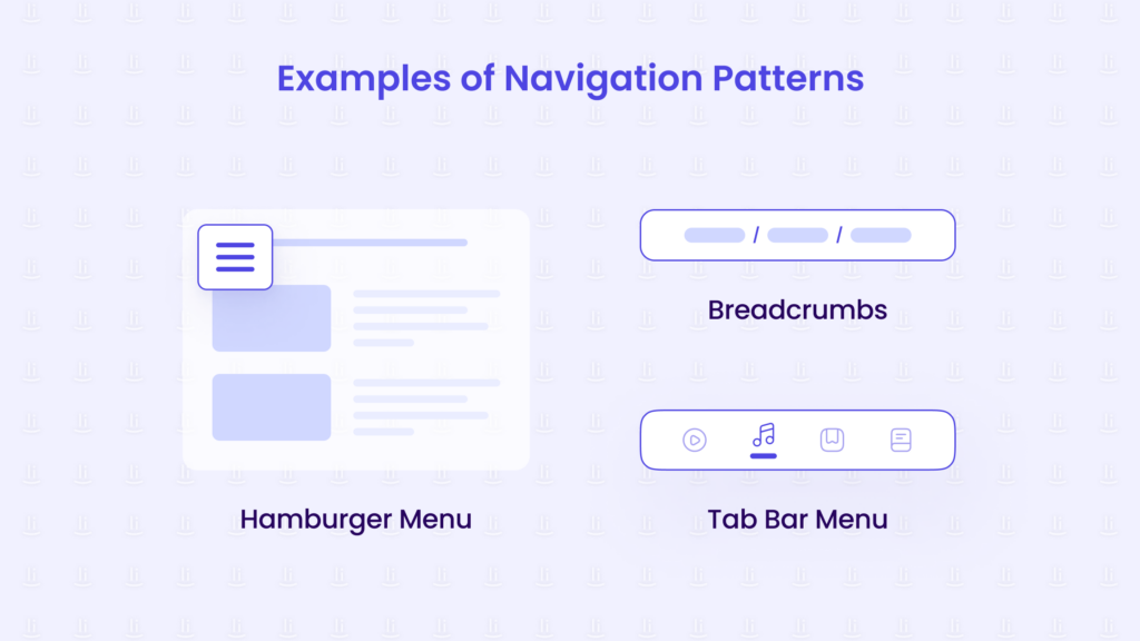
Hamburger Menu / Navigation Drawer
The hamburger menu is an icon that, when tapped or clicked, reveals a list of navigation options (often in a side panel or "drawer").
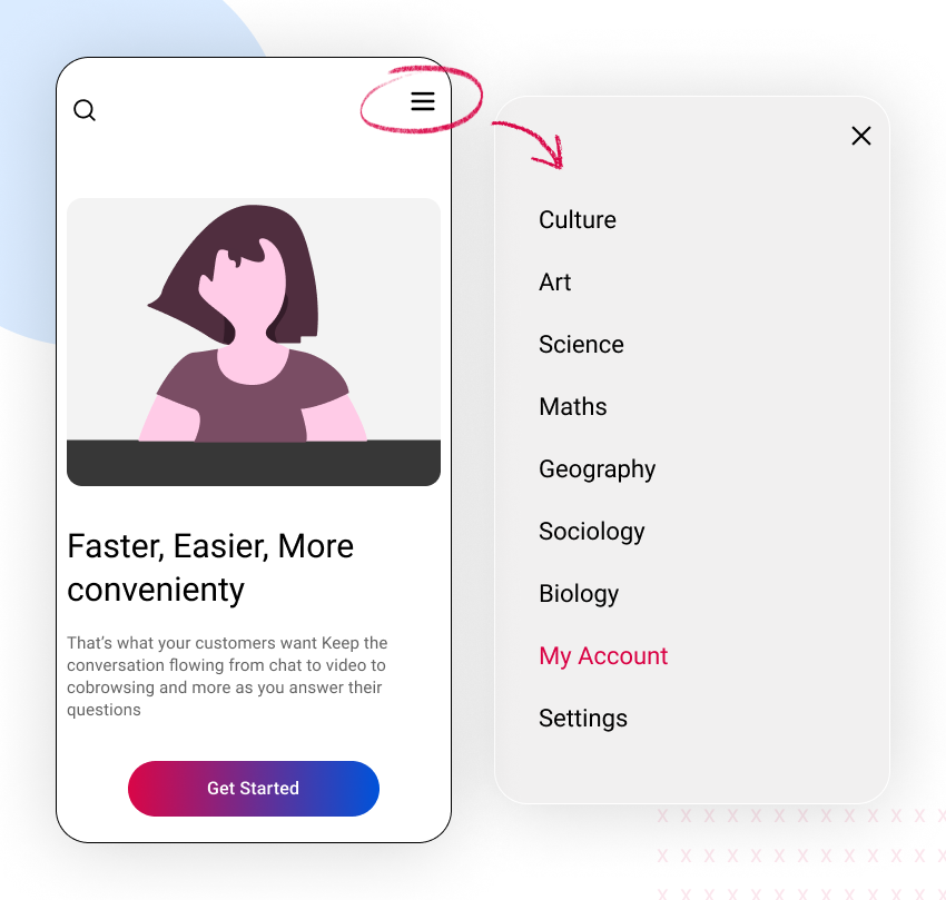
- Purpose: To consolidate a large number of navigation links into a single, space-saving icon.
- Use Cases:
- Almost ubiquitous on mobile websites to hide the main navigation.
- On desktop, it's often used for secondary or less-frequently-used items (e.g., "Settings," "Help," "Log Out") to keep the main navigation clean.
- In complex web applications (like a project management tool), it's often used in a vertical sidebar (a navigation drawer) that can be collapsed.
- The Big Trade-off: Its primary strength (hiding options) is also its main weakness. It suffers from low discoverability—"out of sight, out of mind." Users are less likely to engage with navigation items they cannot see.
Bottom Navigation Bar (Tab Bar)
On mobile, the discoverability problem of the hamburger menu is significant. To solve this, many native apps use a bottom navigation bar.
- Purpose: To provide persistent, one-tap access to the 3-5 most important destinations in a mobile app.
- Use Cases: Exclusively for mobile apps. Think of Instagram, Spotify, or your banking app. The core functions ("Home," "Search," "Profile") are always visible at the bottom.
- Key Consideration: This pattern leverages the "thumb zone." As mobile devices get larger, the bottom of the screen is the most ergonomically accessible area for one-handed use.
To solidify your understanding of when to use which lateral navigation pattern, please read these sections.
Menu-Driven Interface: Navigation Best Practices
The article 'Menu-Driven Interface' provides practical advice on desktop and mobile patterns. The Material Design guide offers a helpful decision-making table.
From 'Menu-Driven Interface', please read 'Desktop Menu Patterns' (focus on Horizontal Headers) and 'Mobile Navigation Patterns' (focus on Hamburger Menus and Bottom Navigation Bars).
Now, let's look at the Material Design guidelines for a concise summary.
Read the 'Lateral navigation' section. Pay close attention to the table that recommends a component based on the number of destinations. This is a very practical decision-making tool.
2. Hierarchical Navigation: Finding Your Way Back
While lateral patterns help you move between top-level screens, other patterns are needed to handle movement within the hierarchy (Forward and Reverse navigation).
Breadcrumbs
Breadcrumbs are a secondary navigation aid that shows the user their current location within the site's hierarchy. Given your background in systems and data structures, you can think of breadcrumbs as a visual representation of the traversal path down a tree structure.
- Purpose: To orient the user and allow for easy "upward" navigation to parent categories.
- Use Cases: Essential for sites with a deep, hierarchical structure, such as:
- E-commerce sites:
Home > Men's Clothing > Shirts > Casual Shirts - Large documentation portals:
Docs > API Reference > Users > Get User - This is analogous to the path in an API route or a file system directory.
- E-commerce sites:
- Benefit: They significantly reduce the number of clicks required to move back up the hierarchy, lowering frustration and improving the "scent of information"—the user's sense that they are on the right path.
Menu-Driven Interface: Navigation Best Practices
Let's read the short section on breadcrumbs to understand their role in 'wayfinding.'
Read the section titled 'Wayfinding: Breadcrumb Navigation'. It's a concise explanation of their purpose.
Test your understanding!
You are tasked with designing the navigation for two different applications:
- A mobile-first social media app that has four primary features: a news feed, messages, user profiles, and notifications.
- A large corporate website for a multinational electronics company, which has dozens of product categories and sub-categories, plus sections for "Support," "About Us," and "Investors."
For each application, answer the following:
- What primary navigation pattern would you choose for the mobile view? Why?
- For the corporate website, what secondary navigation pattern would be essential for its product pages? Why?
Show answer
-
Social Media App (Mobile):
- Pattern: A Bottom Navigation Bar (Tab Bar).
- Reasoning: With only four primary, high-frequency-use features, a bottom navigation bar is the ideal choice. It keeps these core functions constantly visible and easily accessible within the user's thumb zone, which is crucial for a mobile app. A hamburger menu would hide these primary features, harming engagement.
-
Corporate Website:
- Primary (Mobile): A Hamburger Menu. The site has too many top-level sections ("Products," "Support," etc.) to fit in a bottom navigation bar. The hamburger menu is the standard convention for housing this many links on a mobile website.
- Secondary (Essential for Product Pages): Breadcrumbs.
- Reasoning: Given the deep hierarchy of product categories (e.g.,
Electronics > TVs & Home Theater > Televisions > OLED TVs), breadcrumbs are essential for user orientation. They allow a user who lands on a specific product page to easily understand where they are and navigate back to the broader "Televisions" category or even the main "Electronics" hub to continue browsing.
Conclusion
In this lesson, we've systematically broken down the 'why' and 'when' of common navigation patterns. By categorizing them based on their directional purpose—lateral vs. hierarchical—you can make more informed decisions that reduce cognitive load and create a more intuitive user journey.
Key Takeaways:
- Navigation can be framed as Lateral (peers), Forward (deeper), and Reverse (backward/upward) movement.
- Horizontal Bars/Tabs are the desktop standard for visible, primary navigation with a limited number of items.
- Hamburger Menus / Navigation Drawers save space but reduce discoverability, making them suitable for secondary items or consolidating many links on mobile.
- Bottom Navigation Bars are the mobile-first solution for 3-5 core destinations, prioritizing visibility and ergonomics.
- Breadcrumbs are a crucial secondary navigation tool for deep hierarchies, providing orientation and easy upward traversal.
This lesson concludes our module on foundational UI/UX principles. You've built a strong conceptual base, moving from user-centered design and visual principles to the psychology of cognitive load and now the practical application in navigation.
Preview of the next module:
You now have a solid foundation in the 'what' and 'why' of UI design. In our next module, "Web Layout and Responsive Design," we will shift our focus to the 'how'. We'll start getting our hands dirty with the core technologies that allow you to build these navigation patterns and layouts. Our first lesson will be: "Implement complex layouts using CSS Flexbox with various alignment and distribution patterns."