Hello! Welcome to your fifth lesson in our UI/UX foundations module.
In our previous lessons, we've focused on styling individual elements using visual hierarchy, color, and typography. You now have the tools to make text and components clear, meaningful, and legible. However, a great interface is more than just a collection of well-styled elements; it's about how those elements are arranged to create a cohesive and understandable whole.
This lesson bridges that gap by introducing Gestalt Principles. These are fundamental laws of human perception that describe how our brains instinctively find order and create patterns from visual information. Your goal is to identify and apply the core Gestalt principles of proximity, similarity, closure, and continuation to organize UI elements logically.
For someone with your background in engineering and backend development, you can think of these principles as the "psychological API" of the human brain—a set of predictable rules that, when followed, result in layouts that feel intuitive and "just right" to users.
1. What Are Gestalt Principles?
The term "Gestalt" is German for "unified whole." In the 1920s, German psychologists discovered that our brains are wired to perceive entire patterns or configurations, not just individual components. The central idea is that the whole is other than the sum of the parts. When we look at a design, we don't see a collection of lines, shapes, and colors; we see a login form, a product card, or a navigation menu.
To get a formal introduction and some historical context, let's turn to a foundational article.
What are the Gestalt Principles?
The article 'What are the Gestalt Principles?' from the Interaction Design Foundation (IxDF) provides an excellent overview of the topic. We'll use it as a reference throughout this lesson.
Please read the introduction and the section 'Gestalt Principles – a Background'. This will give you the core philosophy behind why these principles are so critical in design.
Now, let's dive into the four key principles outlined in our learning goal and see how they apply directly to UI design.
2. Proximity: Grouping Through Space
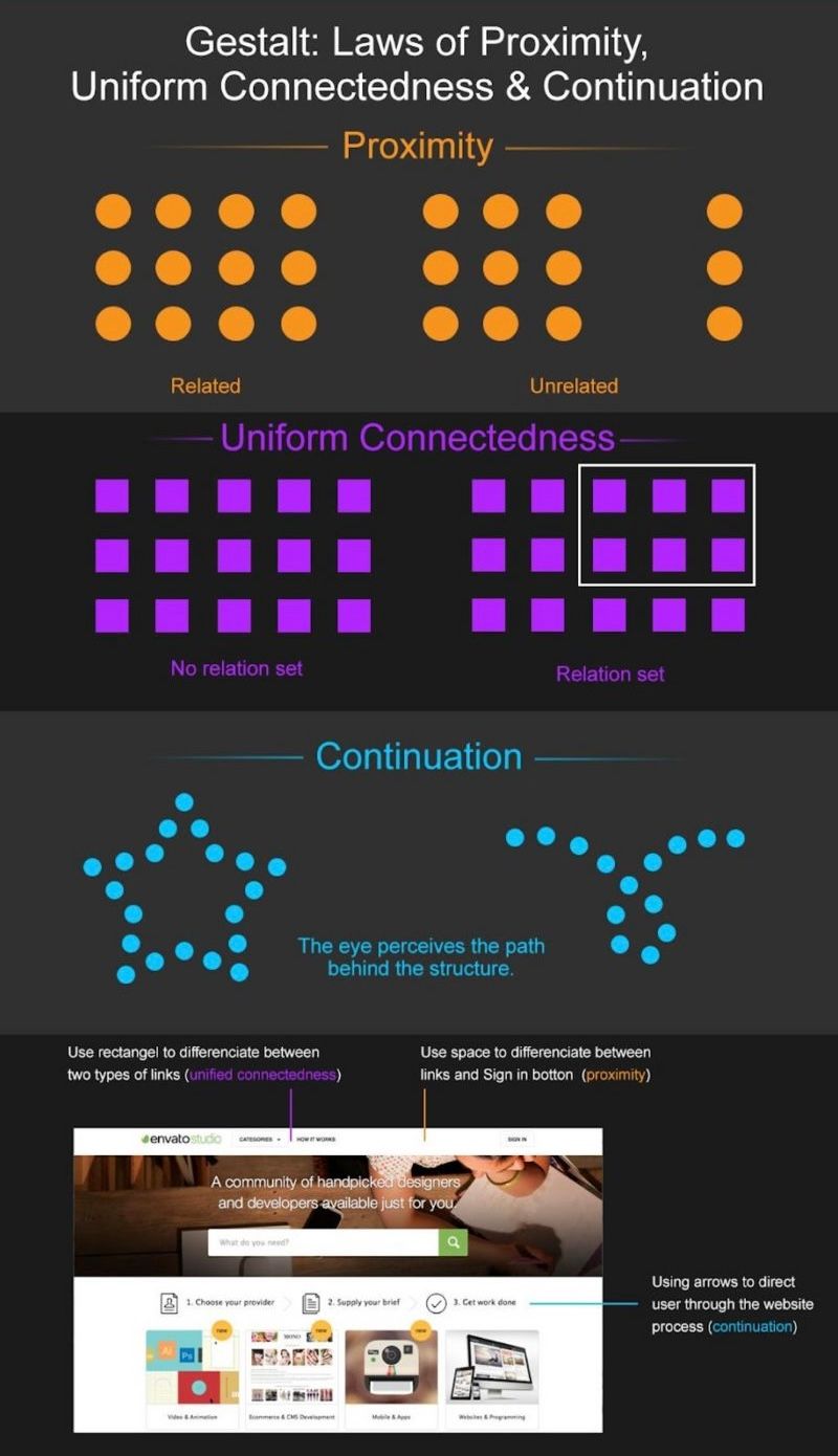
The principle of proximity states that objects that are close to each other are perceived as being more related than objects that are farther apart. This is perhaps the most powerful and frequently used Gestalt principle in UI design. It's the primary way we create logical groupings without needing to draw lines or boxes around everything.
To see it in action, let's watch a short, focused video.
Proximity: Gestalt Principle for User Interface Design
The Nielsen Norman Group (NN/g), a leading voice in UX research, has a great video explaining this principle with clear UI examples.
Watch the entire video. Notice how whitespace (or the lack thereof) is the tool used to enforce proximity. Pay attention to how this single principle can overpower other cues like color and shape.
Application in Code:
As a developer, you apply the principle of proximity every time you adjust margin and padding in CSS or use widgets like Padding and SizedBox in Flutter.
- Good Proximity: A form where a
<label>has a small bottom margin (e.g.,4px) to associate it with its<input>, but the entire label-input group has a larger bottom margin (e.g.,16px) to separate it from the next group. - Bad Proximity: Equal spacing between all elements, which makes it hard to tell which label belongs to which input field. This forces the user to think, increasing cognitive load.
3. Similarity: Grouping Through Consistency
The principle of similarity says that we perceive elements that share visual characteristics as being part of the same group. These characteristics can include:
- Color
- Shape
- Size
- Font style (weight, family)
- Orientation
Similarity signals to the user that elements sharing a style also share a function or belong to the same category of information.
Similarity: Gestalt Principle for User Interface Design
Let's watch another excellent video from NN/g that demonstrates the power of similarity.
Watch the full video. Pay close attention to how color is a particularly strong signifier of similarity and how making something dissimilar (e.g., larger) makes it stand out.
Application in Code:
This principle is the foundation of creating a consistent design system.
- Similarity in Web/React: All primary action buttons on your site have the same
className(e.g.,btn-primary) that applies a consistent background color, font size, and padding. All hyperlinks are the same color. - Similarity in Mobile/Flutter: You define a
ThemeDataobject with styles for buttons, text, and colors, and apply it consistently throughout the app. AnElevatedButtonfor a primary action always looks the same, no matter where it appears.
4. Closure: Filling in the Gaps
The principle of closure explains our tendency to perceive incomplete shapes as complete. Our brain automatically fills in the missing information to see a whole, familiar object. This allows designers to suggest shapes and boundaries using minimal visual information, leading to cleaner, less cluttered interfaces.
What are the Gestalt Principles?
Let's return to the IxDF article to see how closure is used.
Read the section '2. Closure (Reification)'. Note the classic examples of the IBM and WWF logos, which rely entirely on our brain's ability to complete the shape.
Application in UI Design:
- Icons are a prime example. The "play" icon is just a triangle, and the "menu" (hamburger) icon is just three stacked lines, but we perceive them as complete symbols with clear functions.
- A group of elements placed on a card with a slightly different background color or a subtle drop shadow is perceived as a contained unit, even without an explicit border. Your brain "closes" the shape of the card.
5. Continuation: Following the Path
The principle of continuation states that the human eye will follow the smoothest path when viewing lines, regardless of how the lines were actually drawn. This means we tend to group elements that seem to follow a continuous direction.
How to apply Gestalt principles to web and mobile UI design
The UserQ article provides a practical take on how continuation helps in UI layouts.
Read the short section 'Principle of continuity'. It highlights its use in forms and onboarding screens, which are perfect examples of guiding a user along a path.
Application in UI Design:
- Alignment is key. Aligning form fields, text, and buttons along a strong vertical or horizontal axis creates a clean line for the eye to follow, making the content easier to scan.
- Revealing content. In a horizontal slider or carousel, showing a small piece of the next item on the edge of the screen uses continuation to suggest that there is more content available, encouraging the user to swipe.
- Tabbed navigation menus are perceived as a single continuous unit, even though they are separate clickable elements.
Test your understanding!
Look at the screenshot of a simple blog post interface below. Identify at least one example for each of the four Gestalt principles we've discussed (Proximity, Similarity, Closure, Continuation).
A sample blog post user interface.
Show answer
Here are some examples you might have found:
-
Proximity:
- The author's avatar, name ("Sarah Chen"), and the post date are all close together, forming a single "author info" group.
- Each comment's avatar, name, and text are grouped tightly, while more space is used to separate one comment from the next.
- The "Your Name" label is closer to its input field than it is to the "Comment" label above it.
-
Similarity:
- The post title ("The Future of AI") and the main headings ("Leave a Comment," "Comments") likely share the same font weight and size, indicating they are all top-level headings.
- The "Post Comment" button and the "Like" button might share a similar color or style to indicate they are both interactive actions.
- The author names in the comments ("David Lee," "Maria Garcia") are styled identically (e.g., bolded), grouping them as "comment authors."
-
Closure:
- The comment input area and the individual comments are placed on a light gray background. Even without a solid border, our minds perceive these as distinct "cards" or contained areas.
-
Continuation:
- The left edge of the author avatar, the main paragraph text, the comment form, and the comments themselves are all vertically aligned. This creates a strong, clean line that the eye can follow down the page, making the layout feel orderly.
Conclusion
You have now learned the foundational Gestalt principles that govern visual perception. By consciously applying them, you can move from just styling elements to architecting layouts that are inherently intuitive for users.
Key Takeaways:
- Proximity: Use whitespace to group related items and separate unrelated ones. Items close together are seen as a unit.
- Similarity: Use consistent styling (color, font, shape) for elements that have a similar function or hierarchy level.
- Closure: Leverage the brain's ability to fill in gaps to create minimalist designs that suggest boundaries and shapes without explicit lines.
- Continuation: Use alignment and visual cues to guide the user's eye along a path, making layouts easy to scan and navigate.
These principles are not isolated rules but a system of tools that work together to bring order and clarity to your interfaces.
Preview of the next lesson:
We saw today that Proximity is arguably the most important principle for creating structure, and it is achieved by the deliberate use of space. In our next lesson, we will dive deep into this concept by exploring whitespace and spacing systems. You'll learn how to move beyond arbitrary margin values and create a consistent, scalable system for spacing that will make applying the principle of proximity methodical and efficient across your entire application.