Hello! Welcome to your second lesson.
In our first session, we established the "why" of our work by exploring the User-Centered Design (UCD) process. We learned that every design decision should be rooted in understanding user needs through a cycle of research, specification, design, and evaluation.
Today, we move from the process framework into the practical craft of design. This lesson begins our journey into the "Produce Design Solutions" phase of UCD. We'll focus on visual hierarchy, a fundamental concept that answers the question: "How do we arrange elements on a screen to make it instantly understandable and easy to use?" By the end of this lesson, you will be able to explain the core principles of visual hierarchy and how they guide user attention in interfaces.
1. What is Visual Hierarchy?
Visual hierarchy is the deliberate organization of design elements to signal importance, create focal points, and guide the user's eye through the content. When done well, a user doesn't have to think; their brain subconsciously processes the visual cues and understands where to look first, second, and so on.
To see the immediate impact of hierarchy, let's watch a short video that deconstructs a user interface by removing its typographical hierarchy.
The 80% of UI Design - Typography
In this clip from the video 'The 80% of UI Design - Typography' by Sajid, you'll see a dramatic before-and-after that shows how a familiar UI becomes confusing and unusable without clear visual hierarchy.
For the first 46 seconds of the video, watch the demonstration on removing font styles. Notice how the removal of font styles, sizes, and colors flattens the interface and eliminates any sense of order.
As you can see, without hierarchy, the interface is just a wall of text. It's impossible to quickly scan or understand the relative importance of any piece of information. This increases cognitive load—the mental effort required to use a product. As engineers, we optimize code for performance; as designers, we optimize interfaces to reduce the user's cognitive load.
2. The Core Principles of Visual Hierarchy
Designers have a toolkit of principles to create hierarchy. Think of these as the variables you can manipulate to control user attention. An excellent way to get a quick overview is to see them in their simplest form.

Now, let's explore the most important of these principles in detail. We'll use a well-structured article from the Design Bootcamp publication on Medium as our guide.
Visual Hierarchy 101: The Designer's Guide to ...
This article, 'Visual Hierarchy 101,' breaks down the concept into six fundamental 'pillars.' We'll use it to structure our exploration of the core principles.
Please read the introduction and the sections for the first four pillars: '1. Size and Scale,' '2. Color and Contrast,' '3. Typography Hierarchy,' and '4. White Space.' We'll cover the other pillars in future lessons on layout.
Let's break down these four pillars with some additional insights and examples.
A. Size and Scale
As the article states, this is the most direct way to establish importance. Larger elements are perceived as more important. This applies to everything from text and buttons to images. A common mistake is to make too many things large, which results in nothing standing out.
B. Color and Contrast
Our eyes are naturally drawn to areas of high contrast. A brightly colored "Sign Up" button on a neutral background is a classic example. You can also use color to create hierarchy without high contrast. For instance, you can de-emphasize secondary text by reducing its color's lightness, making it a lighter shade of gray on a white background.
Let's watch a practical demonstration of this technique.
The 80% of UI Design - Typography
This clip, also from Sajid's video on typography, provides a brilliant explanation of how to use the HSL (Hue, Saturation, Lightness) color model to de-emphasize secondary information, thereby making the primary information stand out more.
Starting around two and a half minutes in, watch the first part showing the technique in action, and then skip forward to the second part explaining the HSL color model that makes it possible. Focus on how changing the 'lightness' value creates hierarchy.
This is a powerful and subtle technique. Rather than making the title bigger or bolder, the designer makes the secondary text less prominent, which has the same effect of directing attention to the title.
C. Typography
Hierarchy isn't just about font size. Font weight (e.g., Light, Regular, Bold, Black) is an equally powerful tool. A bold headline at the same font size as a regular-weight subtitle will still appear more important. Using a combination of size, weight, and color for your text is critical.
A common approach is to establish a typographic scale—a set of predefined sizes and weights for different text elements (H1, H2, body, caption). This ensures consistency, which we'll see later is also a principle of hierarchy.
D. Whitespace (or Negative Space)
Whitespace is not wasted space; it's an active design element. More space around an element isolates it and gives it more importance. It also helps in grouping related items. Think of how a form groups a label and its input field closely together, but puts more space between that group and the next. This use of space is an application of the Gestalt principle of Proximity, which states that objects near each other are perceived as a group.
Test your understanding!
You are designing a product card for an e-commerce site. The card must contain the product name (string), its price (number), a short description (string), and an "Add to Cart" button.
How would you apply at least three principles of visual hierarchy to guide a user's attention effectively?
Show answer
There are many correct answers, but here is one possible approach:
- Size/Scale: Make the product name the largest text element to serve as the primary title. The price could be the second largest, or at least have a heavier weight, to draw attention. The description would be the smallest text size.
- Color/Contrast: The "Add to Cart" button should have the highest contrast. For example, a solid, bright brand color with white text. This makes the primary action on the card immediately obvious.
- Font Weight (Typography): Use a bold or semi-bold weight for the product name and price to make them stand out. Use a regular weight for the description so it doesn't compete for attention.
- Whitespace: Keep the space between the product name, price, and description relatively small to group them as related information. Then, use a larger amount of whitespace between this information block and the "Add to Cart" button to separate the information from the action.
3. Guiding the Eye: Common Scanning Patterns
Now that we have the tools, we need to know where to apply them. Eye-tracking studies have shown that users tend to scan web pages in predictable patterns. By understanding these patterns, we can place important elements where users are naturally inclined to look.
The two most common patterns are the F-Pattern and the Z-Pattern.
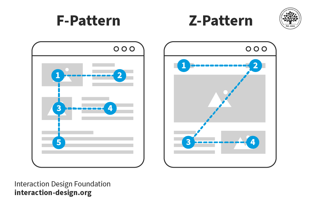
To see how these patterns work in practice, let's watch a video that explains them in the context of visual hierarchy.
The ONLY Video On Visual Hierarchy ANY Graphic Designer Needs
This clip from Satori Graphics explains the 'three flow rule' and demonstrates how most designs align with the F- and Z-patterns of scanning. It provides a clear mental model for how to structure a layout.
Starting just before the eight-minute mark, watch the viewing patterns. Pay attention to how the presenter breaks down the viewer's journey and maps it onto these common patterns.
By placing your most important elements (like your main headline and call-to-action) along the natural paths of these scanning patterns, you make your interface feel more intuitive and effortless to use.
4. Combining Principles for Effective Design
Effective hierarchy rarely relies on a single principle. It's the combination of size, color, weight, spacing, and position that creates a clear, multi-layered experience. Great designs typically have three levels of hierarchy:
- Primary Level: The most important elements. These are the "hooks" that grab attention first (e.g., a hero image or a large headline).
- Secondary Level: Elements that provide key supporting information (e.g., subheadings, short descriptions). They give context to the primary elements.
- Tertiary Level: The rest of the content (e.g., body text, metadata, fine print). This is information that users can explore once they are oriented.
As a developer, you might be used to thinking of hierarchy in terms of HTML tags (<h1>, <h2>, <p>). This is document hierarchy. Visual hierarchy builds upon this but is not strictly bound by it. For example, your most important visual element might be a "Buy Now" button, not the <h1>.
This distinction is crucial: you style for visual hierarchy based on what you want the user to focus on, while using semantic HTML for document hierarchy to ensure accessibility and structure.
Conclusion
In this lesson, we've broken down the core principles of visual hierarchy and how they are used to guide user attention and reduce cognitive load.
Key Takeaways:
- Visual hierarchy is the strategic arrangement of UI elements to communicate importance and guide the user.
- The core principles for creating hierarchy are Size & Scale, Color & Contrast, Typography (weight, style), and Whitespace.
- Understanding common scanning patterns like the F-Pattern and Z-Pattern helps you place important elements where users are most likely to see them.
- Effective designs combine these principles to create multiple levels of hierarchy (primary, secondary, tertiary), guiding the user from the main "hook" to the finer details.
These principles are not just about making things look good; they are functional tools that make interfaces more efficient and user-friendly.
Preview of the next lesson:
We touched on color and contrast as a tool for hierarchy today. In our next lesson, we will dive much deeper into color theory. We'll explore how to choose colors, create accessible and harmonious color schemes, and use color to convey meaning and emotion in your designs.