Hello! Welcome to your third lesson in our UI/UX design journey.
In our last session, we focused on visual hierarchy, establishing how to guide a user's attention using principles like size, contrast, and spacing. We briefly touched on color as a powerful tool for creating contrast and drawing focus. Today, we're going to expand on that single idea and explore the rich world of color in its entirety.
This lesson is dedicated to applying color theory principles to create effective, meaningful, and harmonious color schemes for your interfaces. By the end, you'll understand not just which colors to use, but why you're using them and how to combine them into a cohesive system that you can implement in a React or Flutter application.
1. Color and Emotion: The "Why"
Before we dive into the technical aspects of color, it's crucial to understand its primary role in design: communication. Colors evoke emotions, carry cultural meanings, and set the tone for a user's experience. A color palette for a banking app will feel very different from one for a children's game, and this is by design.
To get a feel for how designers use color to convey a specific message, let's watch a few segments from a video by Satori Graphics.
🔸 The ONLY Colour Theory Video You Ever Need To Watch!
This video, 'The ONLY Colour Theory Video You Ever Need To Watch!', provides excellent examples of how color choices are tied to emotion, brand perception, and audience.
Please watch the following three clips: Starting about half a minute in, focus on how the design emotion (e.g., 'energetic' for a gym, 'calm' for skincare) dictates the color choice. Around the six-minute mark, pay attention to the psychological effects and physiological effects of color, particularly the case study on red vs. green call-to-action buttons. Past seven and a half minutes, the audience section highlights the importance of considering your target audience (culture, age, gender) in your color decisions.
As the video illustrates, your first step in choosing a color isn't to open a color picker; it's to define the personality of your product and the feeling you want to evoke in your user. Is it trustworthy, playful, luxurious, or minimalist? Answering this question will narrow down your options significantly.
2. The Language of Color: A Technical Foundation
To manipulate color effectively, we need a precise vocabulary and a mental model for how it works. Your experience with digital systems has likely exposed you to the RGB model, where a color is a mix of Red, Green, and Blue light. While essential for displays, it's not very intuitive for design work. A more practical model is HSB (or HSV).
- Hue: This is what we typically think of as the "color" (e.g., red, green, blue). It's represented as an angle on the color wheel (0-360 degrees).
- Saturation: This is the intensity or purity of the color. 100% saturation is the pure hue, while 0% is a shade of gray.
- Brightness (or Value): This is the relative lightness or darkness of the color. 100% brightness gives the purest color, while 0% is black.
The HSB model is powerful because it separates the pure color (Hue) from its intensity and brightness, allowing you to modify one without affecting the others. This is exactly what we saw in the last lesson when de-emphasizing text by reducing its lightness.
Let's watch a clear explanation of these terms and color models.
Super Practical Guide to Color Theory, Color Models and Perfect Color Palettes | UI Design
The video 'Super Practical Guide to Color Theory' from DesignerUp gives a fantastic breakdown of these core concepts and explains why the HSB model is so useful for UI designers.
Starting about two and a half minutes in, watch the color definitions, which covers hue, tint, tone, shade, and temperature. After that, continue to the color models, which explains the RGB and HSB color models and shows you how to switch to HSB in common design tools. This is a crucial skill for translating design to code.
Understanding HSB is key. When a designer gives you a color palette, thinking in HSB helps you understand the relationships between the colors. For example, a monochromatic scheme involves keeping the Hue constant while varying Saturation and Brightness.
3. Building Palettes: Color Harmony Rules
Once you have a primary color in mind, how do you find other colors that work well with it? This is where color harmony comes in. These are time-tested "rules" or algorithms based on the color wheel that produce aesthetically pleasing combinations.
Let's look at the most common schemes.
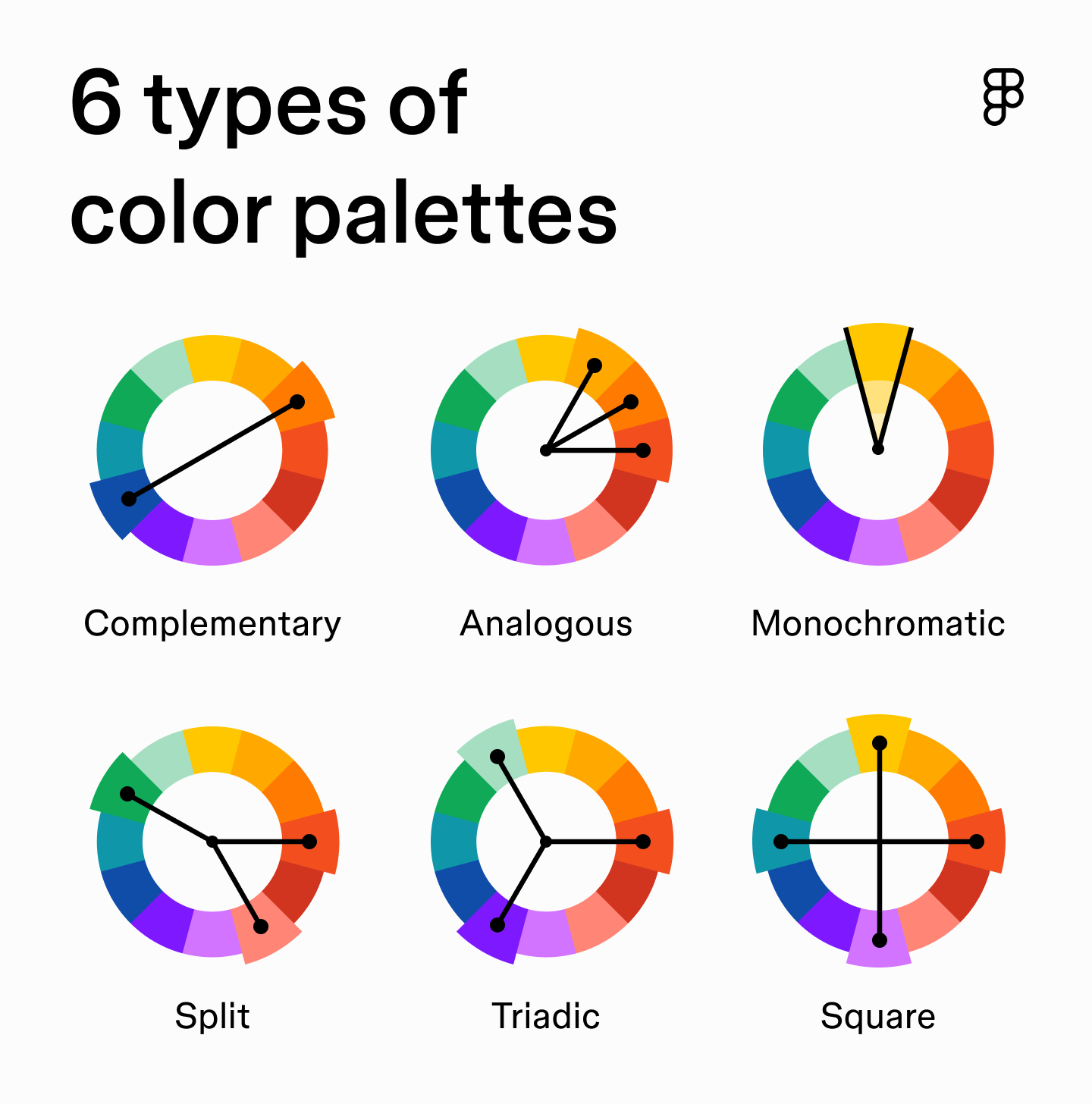
Here's a breakdown of what these mean for your UI:
- Monochromatic: Uses variations (tints, tones, shades) of a single hue. Creates a very clean, elegant, and subtle look. It's low-contrast by nature, so you have to be careful.
- Analogous: Uses colors that are next to each other on the color wheel. These schemes feel harmonious and are often found in nature. They are also low-contrast.
- Complementary: Uses colors directly opposite each other on the color wheel (e.g., blue and orange). This creates the highest possible contrast and is great for drawing attention, like for a call-to-action button. Use it sparingly to avoid a visually jarring design.
- Triadic: Uses three colors that are evenly spaced around the color wheel. This provides a balanced, high-contrast palette. It's a good practice to let one color dominate and use the other two for accents.
To reinforce these concepts, we'll return to the Satori Graphics video, which walks through how these schemes are constructed.
🔸 The ONLY Colour Theory Video You Ever Need To Watch!
This final clip from the Satori Graphics video demonstrates how to create palettes using the fundamental harmony schemes.
At about 27 minutes in, watch the color schemes. The video clearly explains and shows examples for monochrome, complementary, analogous, and triadic schemes.
4. A Systematic Approach: The Material Design Color System
Harmony rules give us combinations, but how do we apply them to a real application with dozens of components? We need a system. Design systems like Google's Material Design provide an excellent, structured framework for this. This approach will feel familiar, as it mirrors how you might structure code with clear variable names and purposes.
Let's explore the Material Design color system. It provides a logical structure for theming an application that is directly applicable to both web (React) and mobile (Flutter) development.
Read the sections 'Color usage and palettes' and 'Color theme creation.' Focus on understanding the role of each color type: Primary color: The main brand color. Secondary color: The accent color. Surface, Background, Error colors: The neutral and functional colors. 'On' colors (e.g., onPrimary, onSurface): The colors for text and icons that appear on top of other colored surfaces, chosen for legibility. After reviewing the color types, read the section 'Accessible colors.'
This system of primary, onPrimary, surface, onSurface, etc., is exactly how you define a ThemeData object in Flutter or a theme in a React component library like Material-UI. It's the bridge from abstract color theory to concrete implementation. The concept of "on" colors is particularly critical, as it directly addresses accessibility—ensuring your text is readable against its background.
Test your understanding!
You are designing a mobile banking app. The brand's primary color is a deep, trustworthy blue (#0D47A1). Your goal is to create a color scheme that feels secure, modern, and clear.
- Using the color harmony rules, what would be a good choice for a secondary/accent color to use for call-to-action buttons like "Transfer Money"? Justify your choice.
- Based on the Material Design system, what would be the likely colors for
onPrimaryandonSurface(assuming a standard light theme with a white surface)?
Show answer
-
A good choice for an accent color would be a complementary or near-complementary color. The complement to blue is orange/yellow. A vibrant orange or amber (like
#FFAB00) would create high contrast, making the CTA button stand out clearly against the blue and white interface. This uses a complementary scheme to draw attention to key actions, reinforcing visual hierarchy. -
onPrimary: The primary color (#0D47A1) is a very dark blue. To ensure legibility, text and icons placed on top of it must be very light. Therefore,onPrimarywould be white (#FFFFFF).onSurface: The surface is white (#FFFFFF). Text placed on it needs to be dark for readability. Therefore,onSurfacewould be a very dark gray or black (#000000).
5. A Practical Method for Generating Palettes
While harmony rules are a great starting point, sometimes you want a more controlled, almost scientific way to ensure your colors feel cohesive. The DesignerUp video we watched earlier proposes a fascinating method: defining palettes by keeping their saturation and brightness values within a specific range.
This technique transforms color selection from a purely artistic exercise into a process with defined parameters, which might appeal to your engineering mindset.
Super Practical Guide to Color Theory, Color Models and Perfect Color Palettes | UI Design
Let's revisit the 'Super Practical Guide to Color Theory' video to learn a formulaic approach for creating beautiful, balanced palettes.
Starting at 11 minutes and 20 seconds, watch the palette demonstration. This section demonstrates how to create a 'Jewel Tone' palette by constraining the saturation and brightness values and only changing the hue. Absorb the method itself.
The key takeaway from this method is that colors with similar saturation and brightness levels tend to feel like they belong to the same "family," regardless of their hue. The video goes on to define ranges for other families like Pastels, Earth Tones, and Neutrals. This is a powerful technique for generating a rich, harmonious palette from a single starting color.
Conclusion
Today, we've journeyed from the psychology of color to a systematic framework for its application in digital products.
Key Takeaways:
- Color is a primary tool for communicating emotion, brand identity, and function.
- The HSB (Hue, Saturation, Brightness) color model is more intuitive for UI design than RGB because it separates the core color from its intensity and lightness.
- Color harmony rules (monochromatic, complementary, etc.) provide a foundation for building aesthetically pleasing palettes.
- A design system approach (like Material Design's
primary,secondary,surface,onSurfaceproperties) provides a logical structure for applying colors consistently across an entire application. - Accessibility is non-negotiable. Always ensure sufficient contrast between text and its background (e.g., using "on" colors).
You now have a robust mental model for thinking about and working with color—from high-level strategy to low-level properties.
Preview of the next lesson:
We've covered two major pillars of UI design: visual hierarchy and color. In the next lesson, we'll tackle the third: typography. You'll learn how to choose and pair fonts, set readable line heights, and create a typographic scale that works in harmony with your color palette to build clear, legible, and stylish interfaces.