Welcome back! In our previous lesson, we established a crucial mental model for thinking about UI animation by distinguishing between functional and decorative motion. This helps us decide why and when to use animation. Now, we'll move from the "why" to the "how," focusing on the principles that make animations feel natural, responsive, and believable.
Today's lesson addresses a key learning outcome: explaining the core animation principles of anticipation, follow-through, and squash-and-stretch as applied to UI motion. These concepts originated in classic character animation but are fundamental to creating high-quality digital interfaces. Mastering them will give you the vocabulary and conceptual framework to design motion that feels intentional and lifelike, long before you write your first line of CSS.
The Illusion of Life in User Interfaces
In the 1930s, animators at Disney developed a set of guidelines to make their animations more realistic and appealing. These became known as the 12 Principles of Animation. While originally for cartoons, they are rooted in physics and human psychology, making them incredibly relevant for UI design. They help us give digital objects properties we understand from the physical world: weight, momentum, and responsiveness.
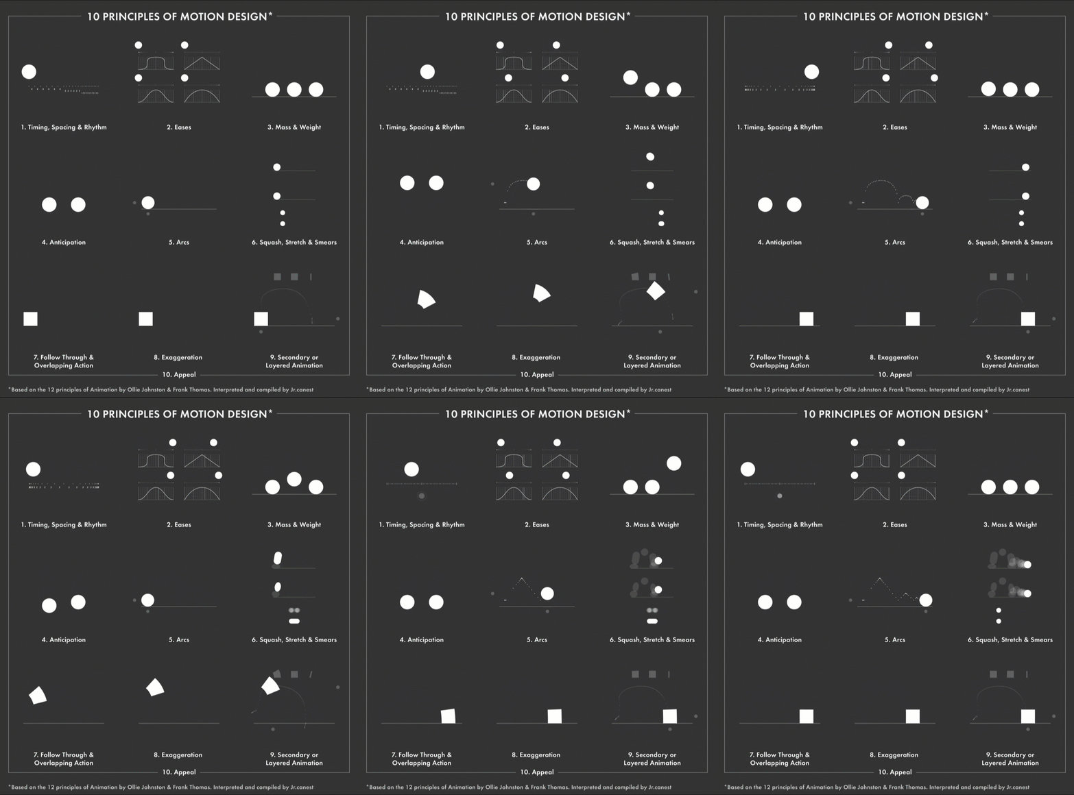
We will focus on three of the most impactful principles for UI work: Squash and Stretch, Anticipation, and Follow-through. To begin, let's get a brief overview of the origin of these principles.
The 12 Principles of Animation with Emanuele Colombo
This video from Skillshare provides a concise introduction to the 12 principles and their relevance beyond character animation, specifically mentioning user interfaces.
Please watch the introduction from the beginning to understand the context and origin of these principles.
As the video states, these principles form the "bible of animation." Let's translate its key scriptures for our work in UI.
1. Squash and Stretch: Conveying Tactility and Mass
The principle of Squash and Stretch dictates that an object's shape should distort to reflect its speed, mass, and the forces acting upon it. A soft rubber ball squashes when it hits the ground and stretches as it accelerates up or down. A hard bowling ball would do the same, but so subtly it would be almost invisible.
To see this foundational principle in action, let's look at its classic application.
12 Principles of Animation (Official Full Series)
The "12 Principles of Animation" series by Alan Becker is a masterclass in explaining these concepts. This first part focuses entirely on Squash and Stretch.
Watch the segment from the beginning to see the classic bouncing ball example and how the principle conveys softness versus stiffness. Pay close attention to the point about keeping the object's volume consistent.
So, how does this apply to UI, where we're animating pixels, not rubber balls? Squash and Stretch is used to make interface elements feel tangible and responsive. A button isn't made of rubber, but by making it "squash" slightly when pressed, we give the user satisfying, physical feedback that their action was registered. It makes the element feel like it's reacting to the user's touch.
For a more formal definition and its connection to UI design, let's turn to an excellent article by the Interaction Design Foundation (IxDF).
UI Animation—How to Apply Disney's 12 Principles of ... - IxDF
This article provides clear, UI-focused explanations for several of the Disney principles.
Please read the section titled Squash and Stretch. Focus on how it can make elements feel tactile and provide visual cues.
A perfect, real-world example of this principle is the animation of a hamburger menu icon transforming into a close (X) icon.

In this animation, the lines of the icon briefly compress (squash) before they animate into the "X" shape. This subtle effect adds a moment of tactility and polish, making the interaction feel more organic and less mechanical.
2. Anticipation: Preparing the User for Action
Anticipation is a preparatory motion that signals a larger action is about to occur. A character bends their knees before jumping. A baseball pitcher winds up before throwing the ball. This "wind-up" prepares the audience for what's next and makes the subsequent action more powerful and believable.
12 Principles of Animation (Official Full Series)
Let's return to Alan Becker's series to see a clear breakdown of Anticipation.
Watch the explanation from the start of the segment, focusing on the "jump" and "punch" examples. Notice how the action feels weak and unconvincing without the preparatory movement.
In UI design, anticipation is a crucial tool for communication. It reduces surprise and helps users understand what will happen next. Abruptly changing the screen or revealing a new element can be disorienting. By providing a small, anticipatory animation, we give the user a moment to process the impending change.
The IxDF article provides a great summary of its use in interfaces.
UI Animation—How to Apply Disney's 12 Principles of ... - IxDF
We'll continue with the same article.
Read the section on Anticipation. The most common application you already know is the hover effect.
When you hover over a button and it slightly increases in size or gains a more prominent shadow, that's anticipation. The animation is signaling, "This is an interactive element, and if you click me, something will happen." Similarly, if you drag a file on your desktop, it might "lift" off the screen slightly before you start moving it, anticipating the drag action. This small hint makes the interface feel more intelligent and responsive to your intent.
3. Follow-through and Overlapping Action: Creating Natural Flow
Follow-through is the idea that when a moving object stops, different parts of it stop at different times. Think of a car that stops abruptly—the passengers lurch forward due to inertia. Overlapping Action is the related concept that different parts of an object move at different rates. When a character with long hair turns their head, their hair lags behind the movement of the head.
These principles ensure that motion doesn't stop rigidly and unnaturally. They give objects a sense of weight and physical hierarchy.
12 Principles of Animation (Official Full Series)
Once again, Alan Becker's series provides the clearest visual explanation.
Watch the section on Follow-through and Overlapping Action from the beginning. Focus on how different parts of an object (like an antenna or an appendage) drag behind and continue to move after the main body has stopped.
In UI design, these principles are the key to choreographing animations involving multiple elements. When a group of elements appears on screen, they look far more graceful and are easier to process if they don't all appear at the exact same instant.
By introducing a slight delay between the animation of each element, we are using overlapping action. This creates a pleasing cascade or "stagger" effect that guides the user's eye naturally through the new content.
Let's see how the IxDF article connects this to UI hierarchy.
UI Animation—How to Apply Disney's 12 Principles of ... - IxDF
One last reading from this article.
Read the section Follow Through and Overlapping Action. Pay attention to the example of an image, title, and description animating at different rates.
When you open a new screen and the main container slides in first, followed milliseconds later by the header, and then by the list items animating in one-by-one—that is a perfect application of overlapping action. It establishes a visual hierarchy and creates a smooth, controlled flow instead of an abrupt, jarring transition.
Conclusion
In this lesson, we've translated three core principles from classic animation into a practical framework for UI motion design. By understanding and applying these concepts, you can create animations that are not just functional, but also feel polished, intuitive, and alive.
Key Takeaways:
- Squash and Stretch: Use this to give UI elements a sense of mass and tactility. Subtle squashing on button presses or other interactions provides satisfying physical feedback.
- Anticipation: Prepare the user for an action before it happens. Use subtle hover effects or small "wind-up" animations to signal interactivity and reduce disorientation during transitions.
- Follow-through and Overlapping Action: Make animations feel natural and less rigid by ensuring not everything moves and stops at once. Use staggered or delayed animations to create a sense of flow and visual hierarchy when multiple elements are involved.
These principles provide the qualitative foundation for good motion. Now that you have a sense of how things should move, our next lesson will address the question of how fast. We'll explore appropriate animation durations for different UI interactions to ensure your animations enhance the user experience without slowing it down.