Hello again! In our last lesson, we explored the fundamental "why" of UI animation, establishing its role in guiding users and providing feedback. We saw that motion is a powerful communication tool, not just visual flair.
Today, we'll sharpen that understanding by learning to classify animations based on their core purpose. Your goal for this lesson is to distinguish between functional animation and decorative animation using clear examples. This is a crucial skill. Before you ever write a line of CSS, you must first be able to judge whether an animation serves a real user need or simply adds noise. This critical filter will guide every design and development decision you make in this course.
The Great Divide: Function vs. Decoration
Nearly every UI animation can be placed on a spectrum with "purely functional" at one end and "purely decorative" at the other. Most animations have elements of both, but they will always lean more heavily toward one. Understanding this distinction is the key to using motion responsibly.
To start, let's get a clear definition of these two categories. The following article from Bentley University provides a concise and practical breakdown.
Are Your Animations Functional or Delightful? | Bentley University
This article offers a great starting point by introducing the two primary types of animation and summarizing their characteristics.
In the article, please read the section The 2 Types of Animation. Pay close attention to the definitions provided by Nick Babich and the comparison table, which neatly summarizes the core differences.
As the article explains, the line is drawn by intent. Functional animation is task-oriented; it's there to help the user understand the interface and complete their goals. Decorative animation, which the article calls "delightful," focuses on emotion, branding, and creating a memorable experience.
Let's explore each of these in more detail.
The Workhorse: Functional Animation
Functional animation is the invisible hand that guides users. When done well, it's so natural that users don't even notice it's there—they just feel that the interface is intuitive and responsive. Its purpose is to answer subconscious user questions like "Did my click register?", "Where did this new window come from?", and "What should I look at now?".
The most important question you can ask yourself as a designer and developer is: "What does this animation communicate?" A great article from CorsoUX provides a stern but effective rule of thumb.
UI Animations: Principles, Examples & Tools in 2026 | CorsoUX | CorsoUX
This article takes a very practical, no-nonsense approach to UI animation, focusing on purpose above all else.
First, read the section Why animations matter. This gives you a checklist of five valid reasons for an animation to exist. Then, find the principle titled "Purpose over style" and read that short paragraph, which begins with "Every animation must answer".
As you just read, if you can't justify an animation with a reason like "it confirms the click" or "it guides to the next step," you should reconsider it.
A perfect example of functional animation is the loading of list items. Compare the two approaches below.
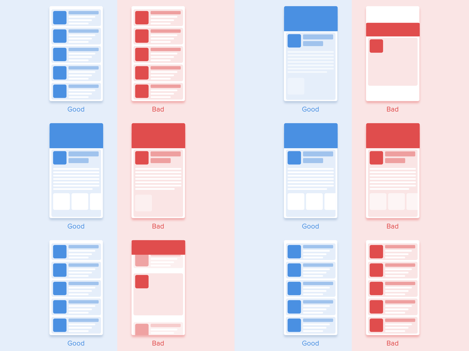
The "Good" example on the left is functional because the staggered effect creates a clear visual path, helping the user process the information sequentially. The "Bad" example isn't terrible, but it doesn't serve this guiding function; it's more of a generic "pop" effect. Both are animations, but only one is working hard to improve usability.
Other common examples of functional animation include:
- State Changes: A button that subtly changes shape or color when you press it.
- Error Feedback: A form field that gently shakes when input is invalid.
- Spatial Transitions: A menu sliding in from the side, which shows the user where it came from and where it will go when dismissed.
The Storyteller: Decorative Animation
If functional animation is the workhorse, decorative animation is the storyteller. Its purpose isn't to improve usability in a direct, measurable way, but to add personality, create moments of delight, and strengthen a brand's identity.
This type of animation is often more elaborate and noticeable. It's not trying to be invisible; it's trying to make an impression.

In the example above, the skateboarding character doesn't make the interface easier to use. It doesn't provide feedback or guide attention to a critical element. Its function is purely expressive. It communicates a brand that is playful, modern, and creative.
Let's return to the Bentley University article to see a few more examples of decorative (or "delightful") animation used effectively.
Are Your Animations Functional or Delightful? | Bentley University
Now let's look at the other side of the coin and see how decorative animations can be used to create positive emotional experiences.
Read the section Purposes of Delightful Animation. Notice how each example—entertaining during a wait, rewarding a user's success, or adding personality—serves an emotional purpose.
Mailchimp's famous "high-five" after sending a campaign is a classic example. It does nothing to improve the function of the app, but it creates a memorable, positive moment for the user, reinforcing their sense of accomplishment.
A Word of Caution
Because you are comfortable with CSS, it can be tempting to animate everything. However, the most common mistake in UI animation is overuse, especially of decorative motion. The internet, particularly portfolio sites like Dribbble, is filled with beautiful but impractical animations that would harm usability in a real product.
The following video provides a pragmatic warning about this.
Complete Guide to UI Animation and Tools!
In her "Complete Guide to UI Animation," designer Elizabeth Alli draws an important distinction between animations for show and animations for production.
First, watch the brief segment on animated mockups, where she discusses their purpose. Then, jump to her concluding advice from "don't go overboard". This is a critical mindset to adopt as you begin your animation journey.
The key is intentionality. Use functional animation to solve usability problems. Use decorative animation sparingly to create high-impact, emotionally resonant moments. Never add animation just for the sake of it.
Conclusion
In this lesson, we've established a critical framework for evaluating motion in UI design. By learning to distinguish between what is functional and what is decorative, you've gained the most important tool for making purposeful animation decisions.
Key Takeaways:
- Functional Animation: Serves a usability purpose. It provides feedback, shows system status, maintains context during transitions, and guides user attention. It should be subtle and feel like a natural part of the interface.
- Decorative Animation: Serves an emotional or branding purpose. It adds personality, entertains the user, or celebrates a milestone. It is often more noticeable and should be used intentionally and sparingly.
- The fundamental question is always "Why?". Every animation must have a clear purpose. If its only purpose is to "look nice," it likely needs to be rethought or removed.
Now that you can identify why you might use a particular animation, our next lesson will delve into the principles of how things should move. We will explore concepts like anticipation, follow-through, and easing to make our animations feel natural and believable. This will lay the final piece of our design foundation before we dive into writing CSS code.