Welcome back. In our last lesson, we explored the qualitative "how" of animation, borrowing principles like anticipation and follow-through from classic animation to make our UIs feel more natural and alive. Now, we'll shift our focus from the quality of motion to its quantity: its speed, or more precisely, its duration.
Today, we will focus on how to select appropriate animation duration ranges for different types of UI interactions to enhance the user experience. Getting the timing right is a delicate balancing act. An animation that is too fast can feel jarring or be missed entirely, while one that is too slow can feel sluggish and make your entire application seem unresponsive. By the end of this lesson, you'll have a clear framework for choosing durations that make your animations feel just right.
The "Goldilocks Zone" for UI Animation
The speed of an animation has a profound psychological effect on the user. Fast, snappy animations contribute to a feeling of performance and efficiency. Slower, more deliberate animations can convey elegance, drama, or importance. However, there's a general range where most functional UI animations should live to be effective without being annoying.
The Nielsen Norman Group, a leading voice in user experience research, has studied this extensively. They've identified a "sweet spot" for most animations. Let's start by reading their core recommendation.
Executing UX Animations: Duration and Motion Characteristics - NN/G
This article provides foundational, evidence-based guidelines for animation timing. As you read, focus on the specific millisecond ranges recommended and the rationale behind them.
Please read the section titled Animation Duration. Pay close attention to the general rule of 100–500 ms and how that range is broken down for simple feedback versus more substantial screen changes.
The key insight from this reading is that for most UI animations, you're operating within a very small window of time, typically between 100 and 500 milliseconds (0.1s to 0.5s).
- Anything faster than 100ms risks not being perceived by the human eye at all, defeating the purpose of the animation. It can feel like an abrupt, jarring jump rather than a smooth transition.
- Anything slower than 500ms starts to feel like a delay. The user is forced to wait for the animation to finish, which can quickly lead to frustration.
The goal, as the article states, is to find the shortest possible duration that doesn't feel jarring. This creates a sense of "perceived performance"—the interface feels fast and responsive, even if the underlying processes take a moment.
Matching Duration to the Interaction
Within that 100-500ms range, the ideal duration depends heavily on what is being animated. The scale and complexity of the UI change are the most important factors. A simple state change on a single button should be much faster than a full-screen panel sliding into view.
We can group animation durations into a few general categories, as illustrated in this helpful chart.
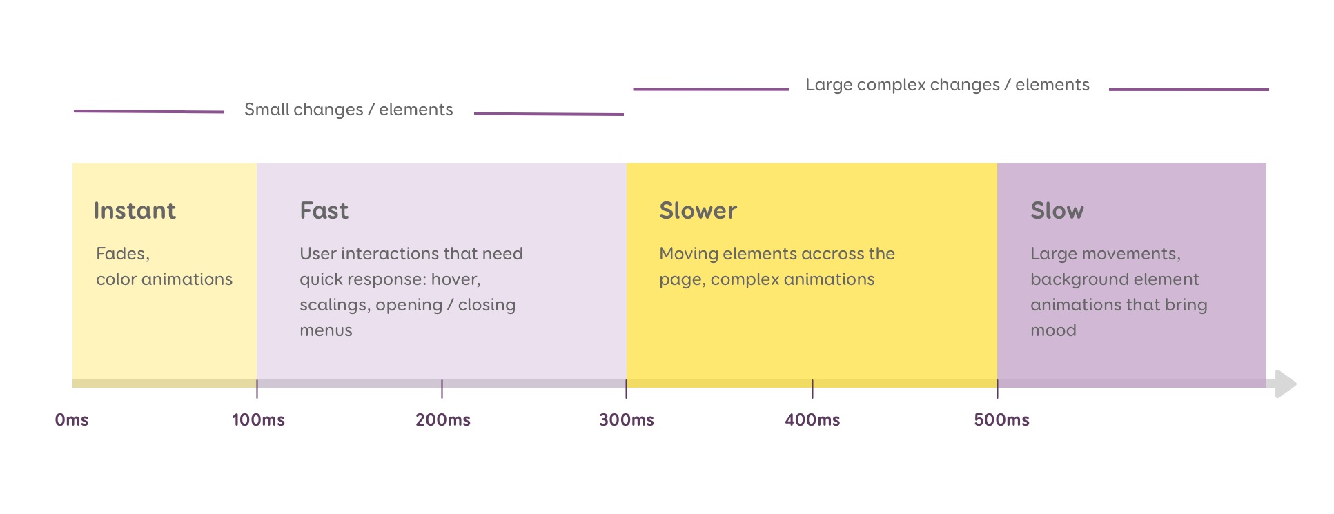
Let's break these categories down with concrete examples.
1. Fast Durations (approx. 100ms - 250ms)
This range is ideal for micro-interactions where the user expects immediate feedback. These animations typically involve small elements changing state without moving a great distance.
- Use Cases: Toggling a switch, checking a box, changing the color of a button on hover, or a subtle scaling effect on a clicked icon.
The goal here is responsiveness. The animation should be just long enough to confirm the action without interrupting the user's flow. A 100ms duration, as mentioned in the NN/G article, feels almost instantaneous while still providing perceivable motion.
Consider the detailed breakdown of a toggle switch animation. The entire sequence is completed in 100ms.
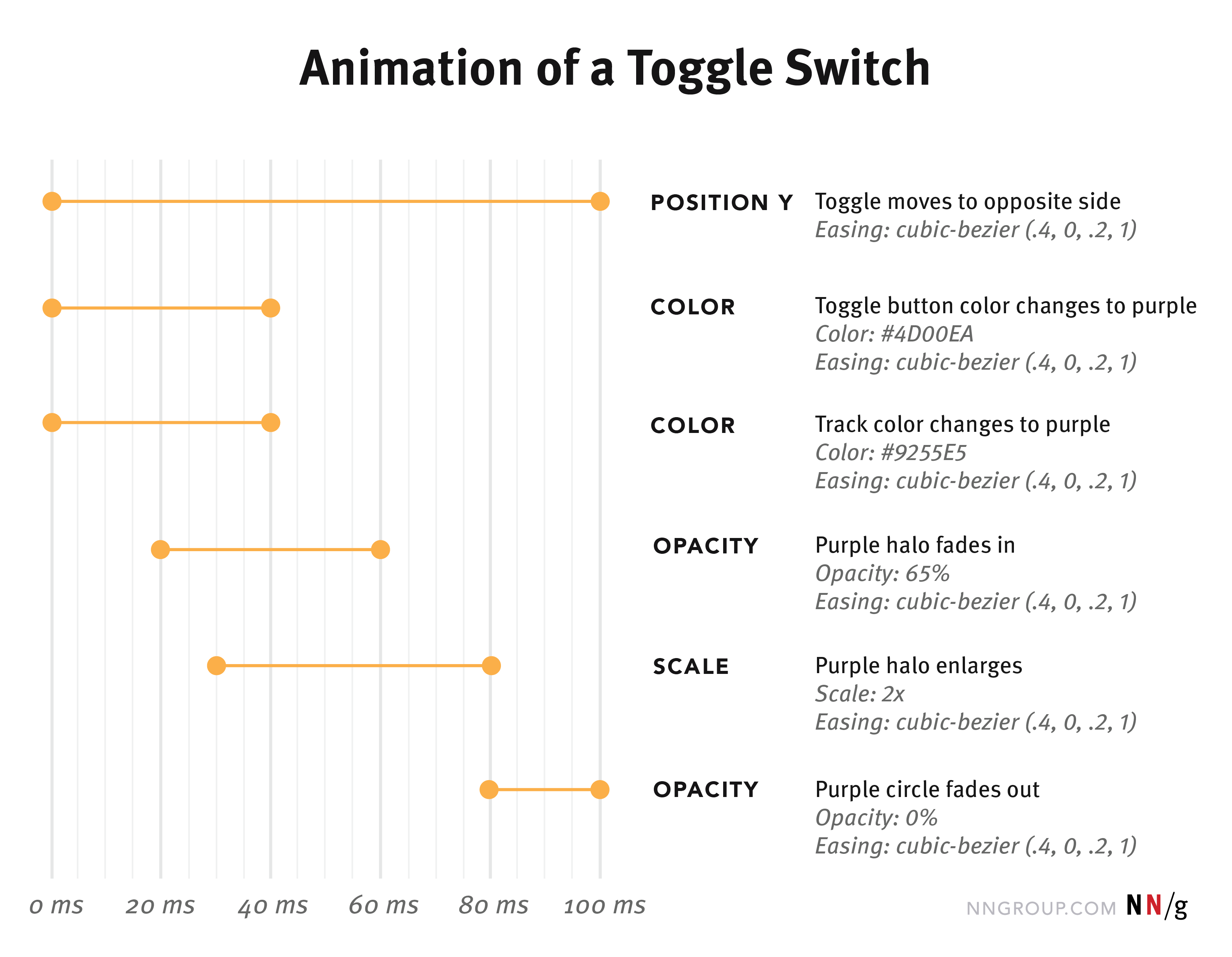
The Google Material Design system, a comprehensive design language, formalizes this with its "short durations" (50ms-200ms), reserving them for "small utility-focused transitions" like selection controls.
2. Medium Durations (approx. 250ms - 400ms)
This range is suited for transitions that involve elements moving across a portion of the screen. The element needs enough time to travel without feeling like it's teleporting.
- Use Cases: A side navigation panel sliding into view, a modal dialog appearing, or an accordion section expanding.
Here, the animation is not just feedback; it's helping the user track an object and understand a spatial change in the interface. Material Design's "medium durations" (250ms-400ms) are for transitions that "traverse a medium area of the screen," like a menu appearing or a card expanding slightly. This aligns with the NN/G's recommendation of 200-300ms for modal windows.
For a clearer understanding of how timing choices can affect the overall feel of a product, watch this short segment.
UI Animation, Motion Design & Micro Interaction Basics
This video by Jake Pomper provides practical advice on animation timing and its impact on brand perception.
Watch the segment from note on timing, where the presenter gives a rule of thumb for micro-interactions versus larger screen transitions. Then, continue watching from some examples to see how slower, more dramatic timing creates an "elegant" feel, while quicker timing feels "snappy and performant."
3. Slow Durations (approx. 400ms and up)
Durations at the slower end of the spectrum should be used sparingly. They are best reserved for large-scale, complex, or expressive transitions that cover a large area of the screen or are meant to be a focal point of the experience.
- Use Cases: Full-screen view transitions, hero image animations on page load, or elaborate, choreographed sequences that set a particular mood.
These animations are often more "decorative" or "narrative" than purely functional. Material Design's "long durations" (450ms-600ms) are for "large expressive transitions," like a small card expanding to fill the entire screen. Durations beyond this are typically only for ambient effects that don't block user input, like a slowly auto-advancing image carousel.
A Few More Heuristics
Beyond these general categories, keep a couple of other useful rules of thumb in mind:
- Entering vs. Exiting: As the NN/G article notes, objects entering the screen can have a slightly longer duration than objects exiting. An element appearing at 300ms gives the user a moment to notice and process it. An element disappearing at 250ms feels quick and responsive, getting out of the user's way.
- Distance Matters: A simple rule is that the farther an object has to travel, the more time it needs. An animation moving an element 50 pixels across the screen might feel right at 200ms, but an element moving 500 pixels will need a longer duration (e.g., 350-400ms) to feel smooth rather than frantic.
Ultimately, these numbers are powerful starting points, not unbreakable laws. The best timing always depends on the context of your design, the easing curve you choose (which we'll cover in the next module), and the overall personality you want to convey.
Conclusion
You now have a solid, evidence-based framework for selecting animation durations. By matching the duration to the scale and purpose of the interaction, you can ensure your animations enhance the user experience by feeling responsive, informative, and intentional.
Key Takeaways:
- Most UI animations should fall within the 100ms to 500ms range.
- Fast durations (~100-250ms) are for small, immediate feedback like toggles and hover effects.
- Medium durations (~250-400ms) are for elements moving across a portion of the screen, like side panels or modals.
- Slow durations (>400ms) should be reserved for large, expressive transitions that define a change in context, such as a full-screen change.
- A good heuristic is to make animations for exiting elements slightly faster than for entering elements.
In our previous lessons, we've focused on what makes animation good. But sometimes, the best animation is no animation at all. In our next lesson, we'll explore the other side of the coin: identifying common scenarios where animation can harm usability or accessibility, and how to design motion responsibly.