In our journey so far, we've explored the principles that make UI animations effective and learned how to choose the right duration to make interactions feel responsive and natural. We've focused on the positive impact of motion. However, a crucial part of mastering any powerful tool is understanding its potential for harm.
This lesson addresses a vital aspect of responsible design: identifying common scenarios where animation can harm usability or accessibility. While well-executed motion can enhance an interface, poorly considered animation can be distracting, frustrating, or—in the most serious cases—physically harmful to users. By the end of this lesson, you'll be able to recognize these pitfalls, completing our foundational understanding of motion theory before we dive into writing code.
When Animation Harms Usability: Distraction and Frustration
The primary power of animation is its ability to attract attention. As we've discussed, this is great for guiding users. But this power is a double-edged sword. Our visual systems are hardwired to notice movement, a trait inherited from ancestors who needed to spot predators in their peripheral vision. In a user interface, this means any motion, whether it's important or not, will pull the user's focus.
To understand why this is so critical, watch this short video from the Nielsen Norman Group.
This video, "Animations are Distracting!", explains the evolutionary reason we are so sensitive to motion and why this makes animation a potentially disruptive force in UI design.
Watch the entire video. Pay close attention to the types of motion identified as most attention-grabbing (which animations) and the examples of UI elements that can be overly distracting (common examples).
As the video explains, when an animation's ability to grab attention is disproportionate to its importance, it harms the user experience. We can categorize these usability harms from mildly annoying to actively manipulative.
Let's explore this spectrum with some concrete examples.
The Role of Animation and Motion in UX - NN/G
This article from the Nielsen Norman Group provides clear examples that illustrate how animation can be used in benign, distracting, or unethical ways.
Focus on two sections of the article. First, read the introductory paragraphs that explain why motion is a double-edged sword. Next, scroll down to the section "Attention Grabbing and Attention Hijacking" and read the entire section. Pay special attention to the three examples provided: benign, distracting, and dark pattern.
From this reading, we can identify three key ways animation can degrade usability:
-
Frustration: As the article mentions, animations that are merely "time-filling visual stimulations" can frustrate users. If an animation's primary purpose is to fill a loading delay without providing meaningful feedback, it can make the application feel slower and quickly become tiresome.
-
Distraction: This is the most common pitfall. Gratuitous animations, like the moving squiggle on the Outline website, add no value and needlessly pull the user's attention away from their primary task, which is usually reading content or completing an action. This constant fight for attention increases cognitive load.
-
Manipulation (Dark Patterns): This is the most unethical use of animation. The flashing countdown clock example shows how motion can be used to "hijack" a user's attention and trigger psychological biases like loss aversion. The animation isn't just distracting; it's actively trying to manipulate the user into making a decision they might not otherwise make.
When Animation Harms Accessibility: Causing Physical Discomfort
Beyond usability issues like distraction, certain types of animation can cause severe physical discomfort and adverse health effects for some users. This is where animation crosses the line from being a poor design choice to an accessibility barrier.
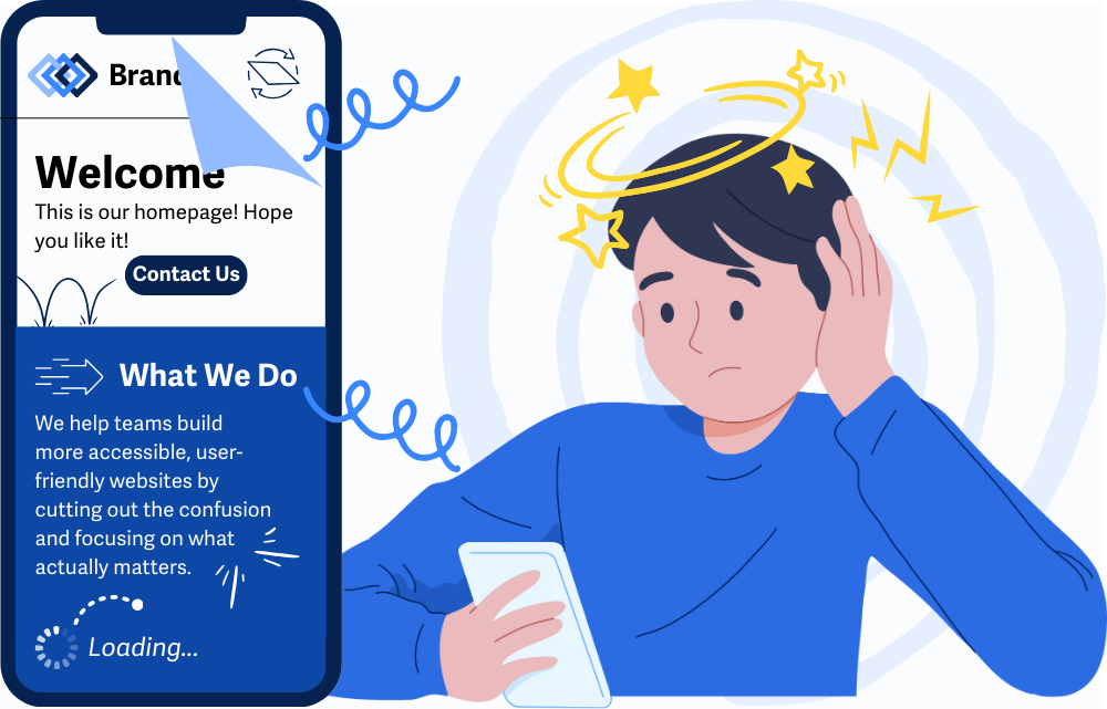
Conditions like vestibular disorders, which affect balance and spatial orientation, can be triggered by specific kinds of on-screen motion. For these users, animations are not just an annoyance; they can be a source of genuine physical distress.
Let's dive into the specific health impacts.
Accessibility Animation: Designing Motion for Inclusion
This article provides a thorough overview of the health risks associated with animation and the corresponding accessibility guidelines.
Please read the section titled "Health Impacts of Animated Content." It begins right after the first image and details the four major health concerns. Then, jump to the "FAQs" section at the end and read the answers to the first two questions: WCAG compliance and GIF accessibility.
The article you just read highlights several critical scenarios where animation can be harmful. Let's summarize them.
- Vestibular Disorders: Large-scale motion, parallax scrolling (where background and foreground move at different rates), and rapid zooming or spinning can create a sensory mismatch between what the eyes see and what the inner ear perceives. This can trigger symptoms like vertigo, nausea, dizziness, and migraines.
- Photosensitive Epilepsy: This is the most severe risk. Content that flashes or strobes more than three times per second can induce seizures in susceptible individuals. The Web Content Accessibility Guidelines (WCAG) have a strict rule against this.
- Motion Sickness and Headaches: Even for users without a diagnosed disorder, jarring animations, scrolljacking (where the site hijacks the normal scroll behavior), and excessive movement can lead to eye strain, headaches, and a general feeling of motion sickness.
To reinforce the importance of the "three flashes" rule, let's hear it directly in the context of a WCAG crash course.
Web Content Accessibility Guidelines (WCAG 2.1) Crash Course
This segment from a WCAG 2.1 crash course directly addresses the rules for moving and flashing content.
Watch the short clip from this timestamp. The speaker is very clear about the danger of flashing content and the need for user controls.
The message is unequivocal: flashing content is dangerous and should be avoided entirely. For other auto-playing, scrolling, or looping animations that last more than five seconds, WCAG requires that you provide a mechanism for the user to pause, stop, or hide it.
This brings us to the core principles of accessible animation. While we will cover the implementation details in Module 9, it's essential to be aware of the high-level guidelines now.

This mind map elegantly summarizes the solutions to the problems we've discussed:
- Limit Flashing: Adhere strictly to the WCAG 2.3.1 standard of no more than three flashes per second.
- Respect Reduced Motion: Use the
prefers-reduced-motionmedia query to detect and respect a user's system-level setting for less motion. Since you're already proficient with media queries, you can see how this would allow you to provide a different, safer animation style for those who need it. - Provide User Control: For any moving content, adhere to WCAG 2.2.2 by adding controls to pause, stop, or hide the animation.
- Keep Animations Brief: As a best practice, animations should be purposeful and not loop indefinitely without reason.
Conclusion
In this final lesson of our foundational module, we've balanced our perspective on UI animation. While motion is a powerful tool for creating engaging and intuitive interfaces, it must be wielded with responsibility and empathy.
Key Takeaways:
- Usability Harms: Unnecessary animations can harm usability by distracting users from their goals, frustrating them with perceived delays, or manipulating them through dark patterns.
- Accessibility Harms: Certain types of animation can pose serious health risks. Large-scale motion can trigger vestibular disorders, causing dizziness and nausea. Content flashing more than three times per second can induce photosensitive epileptic seizures.
- The Designer's Responsibility: To design motion responsibly, you must avoid dangerous patterns (like flashing), provide controls for users to pause or stop motion, and respect system-level preferences for reduced motion.
We have now established a solid theoretical foundation, covering the purpose, principles, timing, and potential pitfalls of UI animation. You are ready to move from theory to practice. In our next lesson, we will begin Module 2 and write our first lines of animation code, learning how to create simple and effective CSS transitions.