Welcome to your fourth lesson. In our previous session, we established why Resin-Coated (RC) paper is the ideal medium for mastering your darkroom skills, prized for its efficiency, consistency, and cost-effectiveness. With our paper choice settled, we can now turn our attention to the chemistry that brings the image to life.
This lesson explores the role of the print developer. We will investigate how your choice of developer, along with its dilution and temperature, are powerful variables that you can manipulate to control the final look of your print. Understanding these controls is fundamental to moving from basic exposures to creatively refined prints, allowing you to systematically influence both the contrast and the overall tonality of your work.
The Developer's Role and Your Levers of Control
As we touched on in our lesson on emulsions, the developer's job is to reduce the light-exposed silver halide crystals into black, metallic silver, making the latent image visible. While the basic mechanism is the same for film and paper, print developers are formulated to work faster and produce different aesthetic characteristics.
For an engineer, printing can be viewed as a process where you manipulate specific input variables to achieve a desired output. In the case of development, you have three primary levers to pull:
- Developer Choice: The specific chemical formulation.
- Dilution: The concentration of the developer solution.
- Temperature: The temperature at which development occurs.
Let's examine how each of these affects your final print.
1. Developer Choice: The Chemical Recipe
Not all developers are created equal. They are complex recipes, and the choice and proportion of developing agents—chemicals like Metol, Phenidone, Hydroquinone, and Glycin—have a significant impact on the final image. Different formulations are designed to produce specific results, primarily affecting two key properties: contrast and image tone.
- Contrast: Some developers are known for being "hard-working," producing high-contrast images, while others are "softer," yielding lower contrast and more delicate mid-tones.
- Image Tone: This refers to the subtle color of the black in the print. It can range from a cold, slightly bluish-black to a neutral black, or a warm, brownish-black. This is determined by the developer's chemistry and its interaction with the specific paper you're using.
A comprehensive study of different developers can reveal these nuances. The following resource is an excerpt from a massive "shoot-out" where one photographer tested eleven different developers on various papers. This systematic approach provides excellent data on how developer choice influences the final look.
[PDF] THE GREAT PAPER-DEVELOPER SHOOT-OUT
This document provides a fantastic real-world comparison of various print developers, highlighting their distinct characteristics. It's a great example of the kind of A/B testing that can reveal subtle but important differences.
First, read the section that lists the developer candidates. Note the different chemical agents mentioned (e.g., Phenidone, Hydroquinone, Glycin) and the stated tonal characteristics (neutral, cold, warm). Next, jump to the section titled "Developer Tone" and review the author's ranking of developers from warmest to coldest. This clearly demonstrates how different chemical formulations produce measurably different results on the same paper.
As you can see from that study, choosing a Glycin-based developer like Formulary 130 will predispose your prints to a warmer tone, while something like Edwal Ultra Black is formulated specifically for cold tones. This is your first, and perhaps most fundamental, choice in controlling the aesthetic of your print.
2. Dilution: Controlling Developer Activity
The concentration of your developer is one of the most practical and effective ways to control contrast. The principle is rooted in chemical kinetics, which you'll be familiar with from your university studies.
- A more concentrated (less dilute) developer has a higher concentration of active developing agents. The reaction proceeds faster and more energetically, typically resulting in higher contrast. Development time will be shorter.
- A more dilute developer has a lower concentration of agents. The reaction is slower and gentler, leading to lower contrast and more separation in the mid-tones. Development time will be longer.
This concept is clearly explained in the following text.
Darkroom Printing- A Harmony of Art and Science - The Codex
This article from the Blue Moon Camera Codex offers a concise explanation of the core variables in print development.
Please read the paragraph beginning "You can vary the look...". Focus on the clear relationship it draws between dilution and contrast.
To see this principle in action, let's watch a video where the presenter compares two developers. Kodak D-155 has the exact same ingredients as the famous Ansco 130 developer, but in a much lower concentration. Pay close attention to how this difference in dilution directly impacts the contrast of the final prints.
This video by The Naked Photographer provides an excellent case study on the effects of developer concentration.
Watch the comparison of prints made with D-155 and the standard developer, Dektol, from Ilford Classic paper. The presenter immediately notes the lower contrast of the D-155 print. Then, skip to the summary starting at the summary, where he explicitly explains that the lower concentration of ingredients in D-155 is the reason for the lower contrast, effectively making it a pre-diluted version of a more active developer.
This demonstrates that dilution isn't just for economy; it's a powerful creative tool for fine-tuning contrast. If your print is too harsh, a more dilute developer can soften it. If it's too flat, a more concentrated mix can add punch.
3. Temperature: Controlling Reaction Rate
The third variable is temperature. Again, from chemical kinetics, we know that increasing the temperature of a reaction typically increases its rate.
- A warmer developer (e.g., 24°C / 75°F) will be more active, developing the print faster and generally increasing contrast.
- A cooler developer (e.g., 18°C / 64°F) will be less active, slowing development and tending to decrease contrast.
While this is a valid control, in practice, most darkroom work emphasizes consistency. Just as in an industrial process, controlling variables is key to reproducibility. Therefore, the standard practice is to maintain a consistent developer temperature for all your printing sessions, typically around 20°C (68°F). This removes one variable from the equation, allowing you to get predictable results and focus on adjustments in exposure, filtration, and developer dilution.
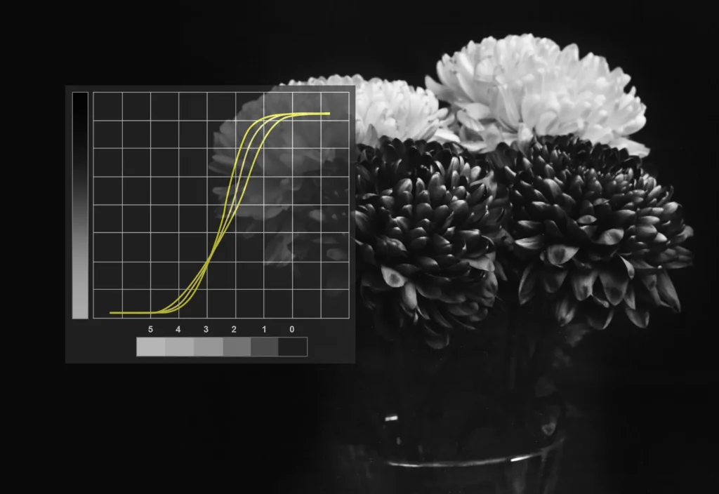
Tying It All Together: Correcting the Negative
Why is all this control necessary? Because not every negative is perfect. The characteristics of your negative, which are set during exposure and film development, dictate the starting point for your print.
- A "thin" or "flat" negative (under-exposed or under-developed) lacks density and contrast. It will naturally produce a gray, lifeless print.
- A "dense" or "hard" negative (over-exposed or over-developed) has too much density and contrast. It will be difficult to print, yielding blocked-up shadows and blown-out highlights.
Your goal in printing is to use the tools at your disposal—including developer controls—to translate the information in the negative into a full-range print. If your negative is flat, you need to add contrast in the printing stage. You could do this with a more concentrated or warmer developer. Conversely, if your negative is too contrasty, a more dilute developer could help tame it.
The following video discusses this concept. While it uses contrast filters (a topic we will cover in detail later), the principle is identical. The adjustments being made with filters could also be achieved through developer manipulation.
What Happens To Your Contrast As Development Changes?
This video, also from The Naked Photographer, masterfully connects the state of the negative to the adjustments required during printing.
First, watch the introduction, which frames the central question. Then, see the result of using a higher contrast filter to correct a flat negative. Next, observe how a lower contrast filter is used to tame a contrasty negative. Finally, listen to the discussion from the discussion of aesthetics. The key insight here is that while you can "rescue" a problematic negative, starting with a well-developed negative gives you the most creative control and the best raw material for a fine print.
Conclusion
Today, we've broken down how the print developer acts as a crucial control system in your darkroom workflow. By understanding and manipulating these variables, you gain the power to shape the final image with intention.
Key takeaways:
- Print developers are chosen for their inherent contrast and image tone (warm, neutral, or cold), which are determined by their chemical makeup.
- Dilution is a primary and practical tool for controlling contrast: a more dilute developer leads to lower contrast and longer development times.
- Temperature also affects contrast by changing the reaction rate, but it is typically kept constant (e.g., 20°C / 68°F) to ensure consistent, reproducible results.
- These developer controls, in conjunction with other techniques, allow you to compensate for the characteristics of your negative and achieve your desired aesthetic.
In our next lesson, we will put some of these ideas into practice for the first time. We'll learn how to create an effective contact sheet, a vital tool for quickly evaluating an entire roll of film and making initial judgments about which negatives hold the most promise for becoming refined prints.