Welcome back to the darkroom. In our last session, you successfully brought together the two fundamental components of split-grade printing—the soft highlight exposure and the hard shadow exposure—to create your first complete split-grade print. You've mastered the how; now it's time to explore the why.
This lesson is dedicated to evaluation. We will critically compare your split-grade print against a traditional single-filter work print. By the end of this session, you will be able to evaluate and articulate the differences in tonal separation, micro-contrast, and overall dimensionality, giving you a deep, practical understanding of the value this advanced technique brings to your printing practice.
The Theory: Why Two Exposures are Better Than One
Before we compare the prints side-by-side, let's delve into the science of why this technique works. Given your background in engineering and physics, you'll appreciate that split-grade printing is not a vague artistic trick but a methodical manipulation of the paper's physical properties.
As we touched on in Module 3, variable-contrast (VC) paper has at least two emulsion layers. One is a low-contrast emulsion sensitive primarily to green light, and the other is a high-contrast emulsion sensitive to blue light.
- A low-grade filter (like Grade 00) is yellow/orange, blocking blue light and allowing mostly green light to pass. This primarily activates the low-contrast emulsion.
- A high-grade filter (like Grade 5) is magenta, blocking green light and passing mostly blue light. This primarily activates the high-contrast emulsion.
The "magic" of split-grade printing comes from how these two exposures combine. You aren't simply averaging them; you're using the most effective part of each filter's characteristic curve.
The following reading from Chris Woodhouse's Way Beyond Monochrome provides an excellent technical breakdown using characteristic curves, which map paper density against light exposure.
[PDF] Basic Split-Grade Printing - Eric Neilsen Photography
This excerpt explains the underlying sensitometry of split-grade printing. It shows graphically why the technique is so effective and controllable.
First, read the section "The Value of Graphs". Pay close attention to fig.2. Notice how the curves for each filter grade have different slopes (contrast) and how they cross over. The slope indicates local contrast; a steeper slope means more separation between adjacent tones. Next, read the section "Split-Grade, Exposure Changes Contrast". Carefully study fig.3 and fig.6. These graphs are key. They show the characteristic curves resulting from a fixed low-contrast exposure combined with varying high-contrast exposures (fig.3), and vice versa (fig.6). Notice two crucial things: The highlight exposure (the "toe" of the curve on the left) remains relatively stable, especially in fig.3. This means you can add shadow density without destroying your delicate highlights. The curves are evenly spaced in the shadow region (the "shoulder" on the right). This demonstrates that you gain fine, predictable control over the overall print contrast by adjusting the ratio of the two exposures.
In essence, the low-grade (soft) exposure gently places the highlight detail on the paper, using the flat, forgiving part of its curve. The high-grade (hard) exposure then comes in and acts primarily on the shadow areas, using its steep curve to drive them to a deep black without adding significant density to the highlights, which are already mostly exposed. This is how you achieve both delicate highlights and rich shadows in the same print, a result that often requires compromise with a single filter.
The Practical Comparison: Seeing is Believing
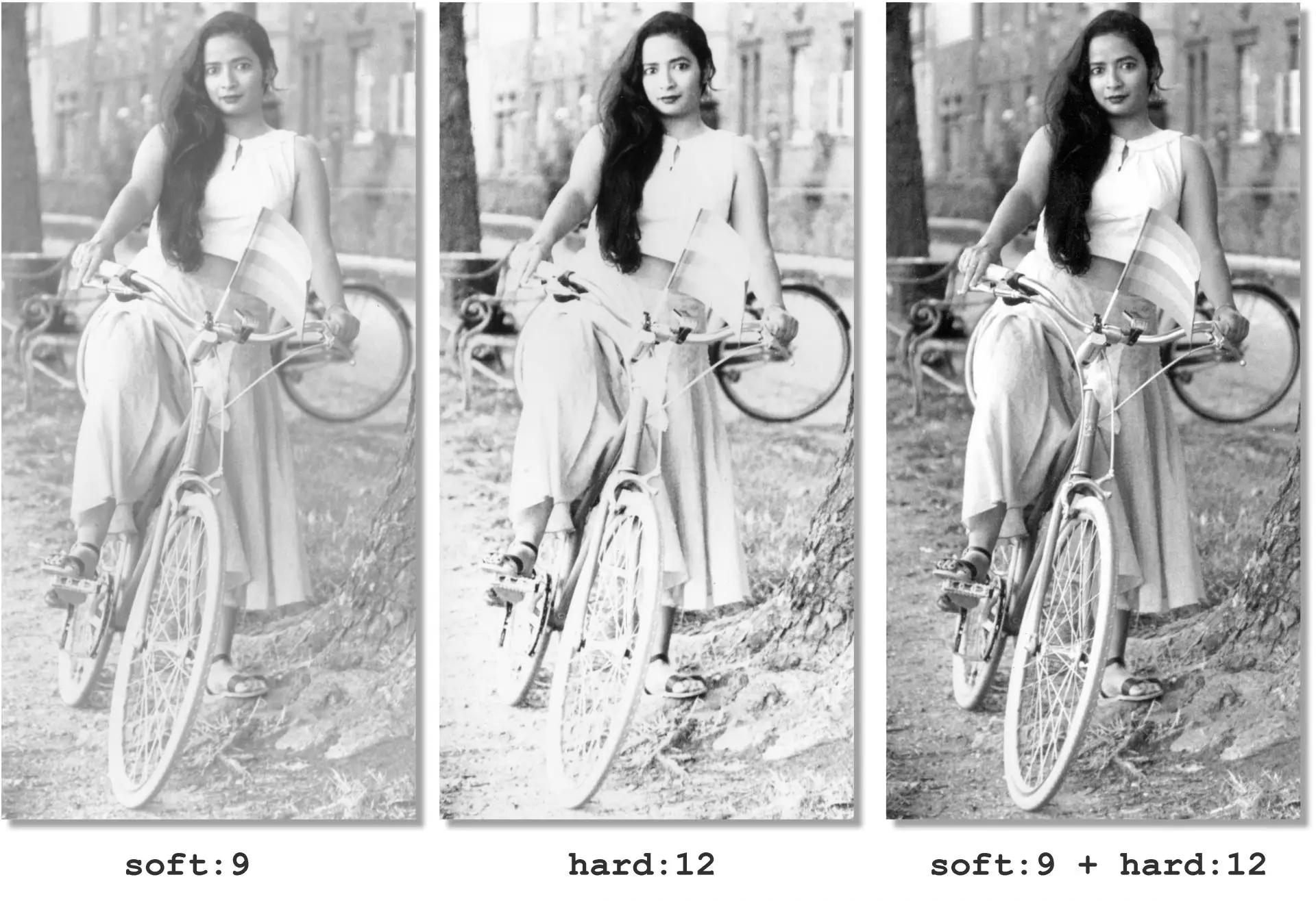
Now, take your best single-filter "work print" of the negative (which you would have made in Module 3) and place it next to the split-grade print you just made. Let's analyze them.
To guide your eye, watch how two experienced printers compare their results.
Darkroom Printing Pt4 - Split Grade Printing 101
First, let's revisit the Pictorial Planet video. The presenter directly compares his Grade 3 work print with the final split-grade print.
Watch the comparison from this point. He notes that while the single-filter print is good, the split-grade version has a "three-dimensional look," appears sharper, and has incredible detail. This sense of depth is a hallmark of a well-executed split-grade print.
Split Filter Printing: How It Works and Why It's Brilliant
Lina Bessonova provides another excellent comparison, introducing a key concept.
Watch her comparison from this segment. She notes that while both prints are "technically correct," the split-grade print has a "fantastic micro-contrast in the gray areas that's rarely possible to get with one filter."
Micro-contrast is the contrast between very fine, adjacent details in your print. High micro-contrast gives a print a sense of texture, sharpness, and "bite." By handling the highlights and shadows independently, split-grade printing excels at enhancing this quality.
Now, evaluate your own two prints. Look for these specific qualities:
- Tonal Separation: Examine areas with subtle gradients, like skin tones, clouds, or the texture of fabric. In which print do these tones appear more distinct and less muddy? The split-grade print should show clearer separation.
- Highlight Detail: Look at the brightest parts of your image that still contain texture. Does the split-grade print render them with more detail and luminosity, whereas the single-filter print might look a bit flat or, if you pushed the exposure, slightly grayed-over?
- Shadow Detail: Inspect the darkest areas. Does the split-grade print have rich, deep blacks that still suggest some underlying detail, while the single-filter print's shadows might be either blocked-up (pure black) or a bit weak (dark gray)?
- Overall Dimensionality: Step back and look at both prints. Does one feel more realistic and three-dimensional? The improved tonal separation and micro-contrast from split-grade printing often create a greater sense of depth.
Limitations and Next Steps
Split-grade printing is a powerful technique, but it is not a magic bullet. As the author of the 35mmc article points out, its primary advantage is giving you a systematic and repeatable workflow to achieve a result that would be very difficult to find through trial-and-error with single filters.
Split Grade Printing – Darkroom Technique Part 4 - 35mmc
This article offers a balanced perspective on the benefits and drawbacks of the technique.
Read the section titled "The lure of split grade". The author rightly dismisses the idea of "secret tones" and points out that split-grade printing's true power lies in its efficiency, fine control, and the unique possibilities it opens for dodging and burning—which we will cover next.
Furthermore, split-grade printing is still a form of straight printing, meaning the entire negative receives the same treatment. Sometimes, different areas of the negative require conflicting exposures to look their best.
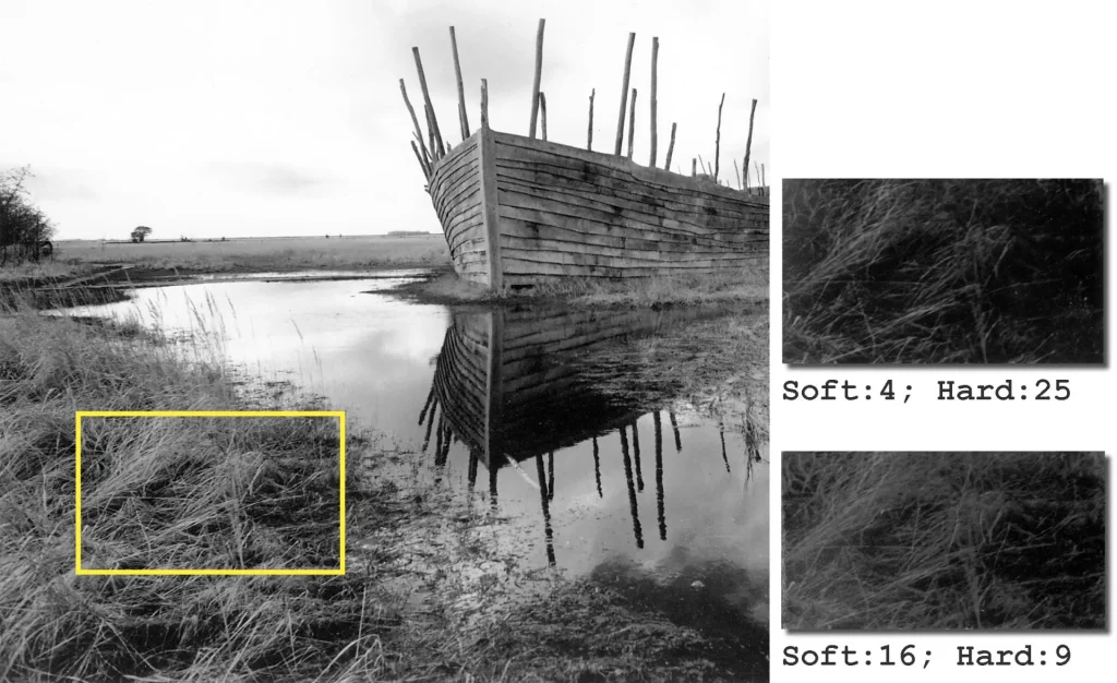
This problem—where you're forced to choose between one area of the print and another—is the perfect entry point to our next topic.
Conclusion
In this lesson, you've moved beyond simply executing a technique to critically evaluating its results. You now understand not only how to make a split-grade print, but why it works and what makes it a superior approach for many negatives.
Key Takeaways:
- Split-grade printing works by using the optimal part of the characteristic curve of two different emulsions in VC paper, allowing for independent control of highlights and shadows.
- Compared to a single-filter print, a split-grade print often exhibits superior tonal separation, greater micro-contrast, and an enhanced sense of three-dimensionality.
- Evaluation involves a side-by-side comparison, looking for specific improvements in highlight/shadow detail and overall print quality.
- While powerful, split-grade printing is still a "straight" technique and cannot resolve exposure conflicts between different regions of the same print.
Next Lesson Preview:
You've now seen the limits of what a straight print can achieve, even with an advanced technique like split-grade printing. To solve the problem of the "Viking Ship" print—optimizing the sky without sacrificing the foreground—we need to apply exposure locally. In the next module, we will dive into the essential artistic skills of dodging and burning, giving you control over every part of your image.