Hello! Welcome back to our exploration of the digital editing workspace.
In our last lesson, we learned how to use transitions to connect clips, focusing on when to use them and when a simple cut is more powerful. We established that every edit, including a transition, should serve the story.
Today, we're adding another essential layer to your videos. Our goal is to learn how to add and format titles and text overlays to enhance clarity. Text in video is a powerful tool. It can be used for opening titles in your short films, introducing speakers in your YouTube videos, providing crucial context, or even as a stylistic element in itself. We'll cover not only the technical steps for adding text in CapCut and Shotcut but, more importantly, the design principles that make text look professional and effective.
The 'Why': Principles of Good Video Typography
Before we jump into any software, let's discuss what makes text on screen work. There's a fine line between text that enhances a video and text that makes it look amateurish. The difference lies in understanding a few core principles of typography and design.
How to Use Text the Right Way in Video
To start, let's read an excellent article from Videomaker, 'How to Use Text the Right Way in Video'. This will give us a strong foundation in the theory of good text design.
Please read the sections titled 'Rules of Typography' and 'Create Separation'. Pay close attention to the advice on choosing a typeface, sizing, spacing, and making your text readable against a background.
This article gives us our foundational rules. Let's summarize the key takeaways:
- Legibility is Priority #1: If the audience can't read it, it has no purpose.
- Choose the Right Typeface: The font you choose has a personality. A serious documentary and a playful travel vlog would use very different fonts. As a general rule, avoid overly decorative or complex fonts (like Comic Sans or Papyrus) and stick to one or two font families per project. Using different weights (e.g., Light, Regular, Bold) of the same font is a professional way to create hierarchy.
- Mind the Spacing: The space between lines and letters is crucial for readability.
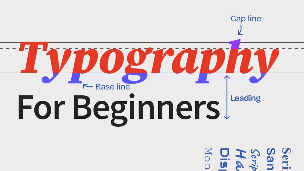
- Create Separation: Text must contrast with the background video. If your video has both light and dark areas, simply choosing a white or black font won't be enough. You need to create separation using:
- Color: Choose a text color that stands out.
- Backgrounds: A solid or semi-transparent shape behind the text (like in a "lower third") is a common and effective solution.
- Subtle Shadows: A soft, subtle drop shadow can help lift text off the background without looking cheesy.
Advanced Separation Techniques
Sometimes, you don't want to add a clunky background box to your shot. There are more elegant ways to make your text readable, which often involve adjusting the video behind the text.
10 Tips for Easier, Better Text Graphics in Your Next Video ...
The article '10 Tips for Easier, Better Text Graphics...' offers some pro-level techniques for integrating text beautifully.
Read the section titled 'Adjust the video instead of the text'. It details several creative methods for making text readable over a busy image.
As you just read, instead of just changing the text, you can:
- Add a subtle, feathered dark area behind the text.
- Apply a vignette to darken the edges of the frame where your text will live.
- Selectively blur the part of the video that is behind the text.
These techniques help the text stand out while maintaining a more integrated and cinematic feel.
The 'How': Adding Text in CapCut and Shotcut
Now that we have the design theory, let's get practical. You're already familiar with CapCut and Shotcut, so let's see how to apply these ideas in both.
Adding and Formatting Text in CapCut
CapCut has a very intuitive and powerful text tool. The following video gives a complete tour of its features.
How to add TEXT to your CapCut PC videos - BASICS #10
This video from the official CapCut PC channel is a comprehensive guide to adding and stylizing text. We'll focus on the core formatting and animation tools.
Watch the following segments to get a full overview: Basics (00:22 - 01:58): See how to add a text clip, change the font, size, and color. Styling (01:58 - 03:36): Learn how to adjust spacing and add styling elements like a background, stroke (outline), or shadow. Refer back to our design principles here! Animation & Templates (04:25 - 05:38 and 06:57 - 08:12): Explore how to add simple entrance/exit animations and use pre-designed templates for titles and social media graphics.
Adding and Formatting Text in Shotcut
In Shotcut, adding text works a bit differently. It's applied as a "filter" directly onto a video clip or a color clip.
Shotcut Lesson 9 - Adding Text and Title Screen
This tutorial by TJ FREE clearly explains Shotcut's text workflow, including how to create title screens.
Watch these key parts: Adding Text as a Filter (00:41 - 03:02): Learn how to add the 'Text: Simple' filter to a clip and format the font, size, color, and outline. Creating a Title Screen (04:02 - 04:56): See how to create a solid color clip and apply the text filter to it, which is perfect for opening titles.
Your Turn: Practical Exercise
Time to apply what you've learned. Open either CapCut or Shotcut and find a short video clip you can use for practice.
1. Create a Lower Third
A "lower third" is the graphic typically seen in the lower part of the screen to identify a speaker.
- Add text to introduce a person (it can be yourself or an imaginary person).
- Use two lines: a name on top and a title/description below.
- Apply the principle of hierarchy: make the name larger and/or bolder than the title.
- Position the text in the lower-left or lower-right corner.
- Challenge: If the text is hard to read against your video, apply one of the separation techniques we discussed. Try adding a subtle drop shadow or a semi-transparent background shape.
2. Create an Opening Title
- Create a simple title card for a hypothetical short film.
- Add a black background to your timeline. (In Shotcut, use
Open Other > Color. In CapCut, you can find stock black videos in theLibrary). - Add the title "The Longest Night" in the center of the screen.
- Experiment with different fonts. Try to find one that fits the mood of the title. Is it a horror film? A romance? A drama? See how changing the font changes the feeling.
- Apply a simple "Fade In" animation to the text.
Test your understanding!
You're editing a YouTube video about your favorite video game. You want to display a quote from one of the game's characters on screen while gameplay footage runs in the background. The gameplay is visually busy with lots of fast movement and changing colors.
According to the principles we've learned, what are two different strategies you could use to make sure the quote is easily readable?
Show answer
Here are a few excellent strategies you could use:
- Add a Background Element: Place a semi-transparent dark rectangle behind the text. This will dim the background video just enough for the text to pop, without completely obscuring the gameplay.
- Adjust the Video: Apply a blur effect only to the area of the video that is directly behind the text. This separates the text from the sharp details of the gameplay, drawing the viewer's eye to the words.
- Use High Contrast with an Outline: Use a thick, clean font in a bright color (like white or yellow) and add a distinct but soft drop shadow or a thin black outline (stroke). This creates a crisp edge that separates the letters from the background.
Any combination of these would work well. The key is creating enough contrast and separation for the text to be legible against a complex background.
Conclusion
Today, you've learned how to add and format text, a skill that moves your edits beyond simple cuts and transitions into a more polished and informative final product. You now have both the design principles and the technical skills to create clear, purposeful, and stylish text overlays.
Key Takeaways:
- Design Before Doing: The best text graphics are born from good design principles. Prioritize legibility, choose fonts that match your theme, and mind your spacing.
- Create Separation: Text must be readable against any background. Use contrast, color, background shapes, drop shadows, or even effects on the video itself to ensure your text stands out.
- KISS (Keep It Simple, Stupid): As the Fstoppers article wisely suggests, often the most effective graphic is simple white text, thoughtfully placed. Don't overcomplicate it.
- Software is a Tool: Whether in CapCut or Shotcut, the tools are there to serve your design choices. Now you know how to find and use the text, color, background, and animation options to bring your ideas to life.
This lesson completes our module on the "Digital Workspace." You now have a solid foundation in organizing your project, performing basic edits, and adding transitions and titles.
In our next lesson, we will begin a new module: "Mastering the Camera." We'll step away from the editing software and begin your journey into cinematography by identifying the key components of a digital camera and understanding what they do.