Hello! Welcome back to our module on "Visual Polish: Color Correction and Grading."
In our last two lessons, we built a strong foundation in color correction. You learned how to adjust exposure, contrast, and saturation to get a balanced image, and then how to correct color casts to achieve a neutral and accurate white balance. You now have the skills to take any raw clip and turn it into a clean, professional "blank canvas."
Today, we transition from the purely technical to the artful. Our goal is to use color grading to create a consistent look across multiple shots. This process, often called "shot matching" or "scene balancing," is one of the most important skills in making a sequence feel cohesive and professional. It ensures that when you cut between different camera angles or shots filmed at slightly different times, the viewer stays immersed in the story without being distracted by jarring shifts in color or brightness.
For your goal of creating compelling short films and YouTube videos, mastering this will dramatically elevate the quality of your work.
1. The "Why" and "What" of a Consistent Look
Before we dive into the "how," it's essential to understand the workflow. Color grading is not a random process; professionals follow a specific order of operations to work efficiently and achieve the best results. The first step after initial correction is always to create consistency.
To understand this principle, let's start with a short article that outlines the professional colorist's workflow.
The Best Order Of Operations For Color Grading & Why ...
The article 'The Best Order Of Operations For Color Grading & Why...' by Noam Kroll provides a clear, high-level overview of the standard color grading workflow. It explains why matching your shots is a crucial step that comes before any creative stylization.
Please read the first section, titled '1. NEUTRALIZING & MATCHING'. Focus on the concept of the 'hero shot' and why creating a matched, neutral baseline will save you a tremendous amount of time later.
As the article explains, the core idea is to:
- Choose a "hero shot": This is typically a key medium or wide shot that contains the most important visual elements of the scene (e.g., the main character's skin tone, key props, the environment).
- Grade the hero shot: You'll create the primary look and feel for your scene on this one shot.
- Match all other shots to the hero shot: You'll then adjust every other shot in the scene to match the color and brightness characteristics of the hero shot.
Once all shots are matched, you can easily apply a creative look across the entire scene, knowing it will affect every shot consistently.
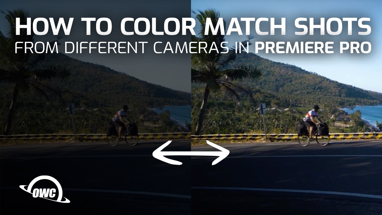
2. The Core Technique: Matching with Stills and Wipes
Now for the practical part. How do you actually match one shot to another? Most editing software provides tools that let you view two shots side-by-side. The most popular and powerful free color grading software is DaVinci Resolve, so we'll use a tutorial based in Resolve. Even though you have experience with CapCut and Shotcut, the principles and tools shown here are universal concepts in color grading that you'll find in most advanced editing software.
This video provides an excellent, beginner-friendly walkthrough of the fundamental shot-matching process.
How to Color Match Shots in DaVinci Resolve for Beginners
The video 'How to Color Match Shots in DaVinci Resolve for Beginners' by Casey Faris is a fantastic practical guide. It demonstrates the entire hero shot workflow from start to finish.
Please watch from 02:06 to 10:29. Pay close attention to these key steps: Establishing the Hero Shot (02:06 - 05:16): Notice how he chooses one shot to define the look for the scene. Using Stills and Wipes (05:16 - 07:45): This is the core of the technique. He 'grabs a still' of the hero shot and uses a 'wipe' (a split-screen view) to compare it directly with another shot. The 'Flip Test' (07:45 onwards): After making adjustments, he flips quickly between the shots. This is a crucial test to see if they feel like they belong in the same world.
The workflow you just saw is your primary method for shot matching:
- Grade your hero shot.
- Save a reference still of the graded hero shot.
- Move to the next shot you need to match.
- Display the reference still over your current shot using a split-screen or "wipe" view.
- Adjust the exposure, contrast, and color balance of your current shot until its key elements (skin tones, whites, blacks, important colors) match the reference still.
- Turn off the wipe and flip back and forth between the hero shot and your newly graded shot. Your eyes are very good at detecting sudden changes, so if the transition feels seamless, you've done a great job.
- Repeat for all other shots in the scene, always matching back to the original hero shot.

3. Precision Matching with Scopes
Sometimes, matching by eye using a wipe isn't enough, especially when the shots are very different. For more precise control, we turn back to our video scopes. By comparing the scopes of your hero shot to the scopes of your current shot, you can match them with mathematical precision. This is especially critical for getting skin tones perfect.
The next video demonstrates a more advanced, professional technique for this. The colorist is working on a music video and needs to ensure the look is consistent across different locations.
Learn to PRO Color MATCH Shots in 15 mins!
In 'Learn to PRO Color MATCH Shots in 15 mins!', colorist Darren Mostyn shows a professional workflow. We'll focus on a brilliant technique he uses to match skin tones precisely.
Please watch the segment from 08:20 to 11:54. Don't worry about his complex node setup; focus on the concept he demonstrates: Using Scopes for Matching: Notice he isn't just looking at the image, he's looking at his scopes. Isolating Skin Tones: He uses a feature called 'qualifier focus' to see exactly where the skin tones fall on the scope. Reference Sizing: He cleverly zooms into the reference image so the subject fills the frame, giving him a more accurate and comparable reading on the scopes. Wiping Between Clips: Finally, he shows how to use a timeline wipe to compare the final results.
This technique of using scopes to verify what your eyes are seeing is what separates good colorists from great ones. The RGB Parade scope, which you've seen before, is excellent for matching the overall balance of reds, greens, and blues, while the Vectorscope is your best tool for nailing skin tones.
Test your understanding!
You have just graded your hero shot, which is a medium shot of a person talking. You move to the next shot in the sequence, a close-up on their face. In the split-screen view, you notice the close-up looks significantly darker and has a slight green tint compared to your hero shot.
- What are the first two adjustments you would make to the close-up shot?
- After making those initial adjustments, you want to perfectly match the skin tone. Which video scope would be most useful for this, and what would you be looking for on that scope?
Show answer
- The first adjustment would be to the exposure (or luminance), likely by increasing the
GainorOffsetto bring the brightness up to match the hero shot. The second adjustment would be to the color balance, pushing the image away from green (towards magenta) to neutralize the green tint. - The Vectorscope would be the most useful tool. You would look for the thin line that represents the skin tones. Your goal would be to adjust the hue and saturation of the close-up shot until its skin tone line sits in the exact same position on the Vectorscope as the skin tone line from your hero shot.
Conclusion
Congratulations! You've just learned one of the most impactful skills in video post-production. The ability to match shots and create a consistent grade is fundamental to crafting a believable and immersive visual world for your audience.
Key Takeaways:
- Always match before you stylize. A consistent scene is the foundation for any creative look.
- Use the hero shot workflow: Grade one key shot, then match everything else in the scene to it.
- Combine visual tools (stills, wipes, and the "flip test") with technical tools (video scopes) for the best results.
- When matching, pay special attention to skin tones and neutral elements (whites, greys, and blacks) as they are key anchors for consistency.
Next Lesson Preview:
Now that you know how to make all the shots in a scene look like they belong together, we can start asking more creative questions. What kind of world do we want to create? In our next lesson, we will explore how to apply color to enhance mood and support genre conventions. We'll move beyond just making things look "right" and start using color to make your audience feel something.