Hello! Welcome to the fourth lesson in our module on "Visual Polish: Color Correction and Grading."
In our last lesson, you learned the crucial skill of creating a consistent look across multiple shots. By establishing a "hero shot" and matching all other clips to it, you built a clean, professional, and cohesive scene. This is the essential foundation for what comes next.
Today, we move from the science of correction to the art of grading. Our goal is to apply color to enhance mood and support genre conventions. We'll explore how deliberate color choices can make your audience feel a certain way—be it tense, nostalgic, joyful, or afraid—and how you can use color to signal the type of story you're telling. This is where you truly start to develop your unique visual voice as a filmmaker, a key step toward your goal of creating impactful short films and YouTube videos.
1. The Language of Color: Hue, Saturation, and Brightness
Before you can tell a story with color, you need to understand its basic components. As we've touched on, any color can be described by three properties:
- Hue: The pure color itself (e.g., red, green, blue).
- Saturation: The intensity or purity of the color. High saturation means a color is rich and vibrant; low saturation makes it appear muted, grayish, or desaturated.
- Brightness (or Value/Luminance): How light or dark the color is.
Manipulating these three elements is how you create a specific mood. Bright, saturated colors might feel energetic and happy, while dark, desaturated colors can feel somber, gritty, or mysterious.
This is very similar to how level designers in video games use color palettes to define the atmosphere of a world, guiding the player's emotional experience from one area to the next.
Let's watch a video that breaks down how these components work together in film.
Color Theory in Film — Color Psychology for Directors: Ep5
The video 'Color Theory in Film — Color Psychology for Directors' by StudioBinder provides a great introduction to how hue, saturation, and brightness are used to create mood.
Please watch from 00:28 to 04:14. As you watch, focus on: The definition of Hue, Saturation, and Brightness (HSB). How a dominant hue can establish a world (e.g., the green in 'The Matrix'). The effect of desaturation ('Saving Private Ryan'). The contrast between bright and dark scenes. The key idea that you get to define what colors mean in your film.
The last point from the video is the most important: while there are common associations (red for love or danger, blue for sadness or calm), these are not unbreakable laws. As the filmmaker, you establish the rules for your story. You can make red feel like warm love, as in Her, or you can make it signify impending doom. Consistency is what teaches the audience your film's unique color language.
2. Building a World with Color Schemes
Working with individual colors is just the start. The real power comes from combining colors into a palette, or a color scheme. A well-chosen scheme creates a sense of harmony or, intentionally, a sense of tension.
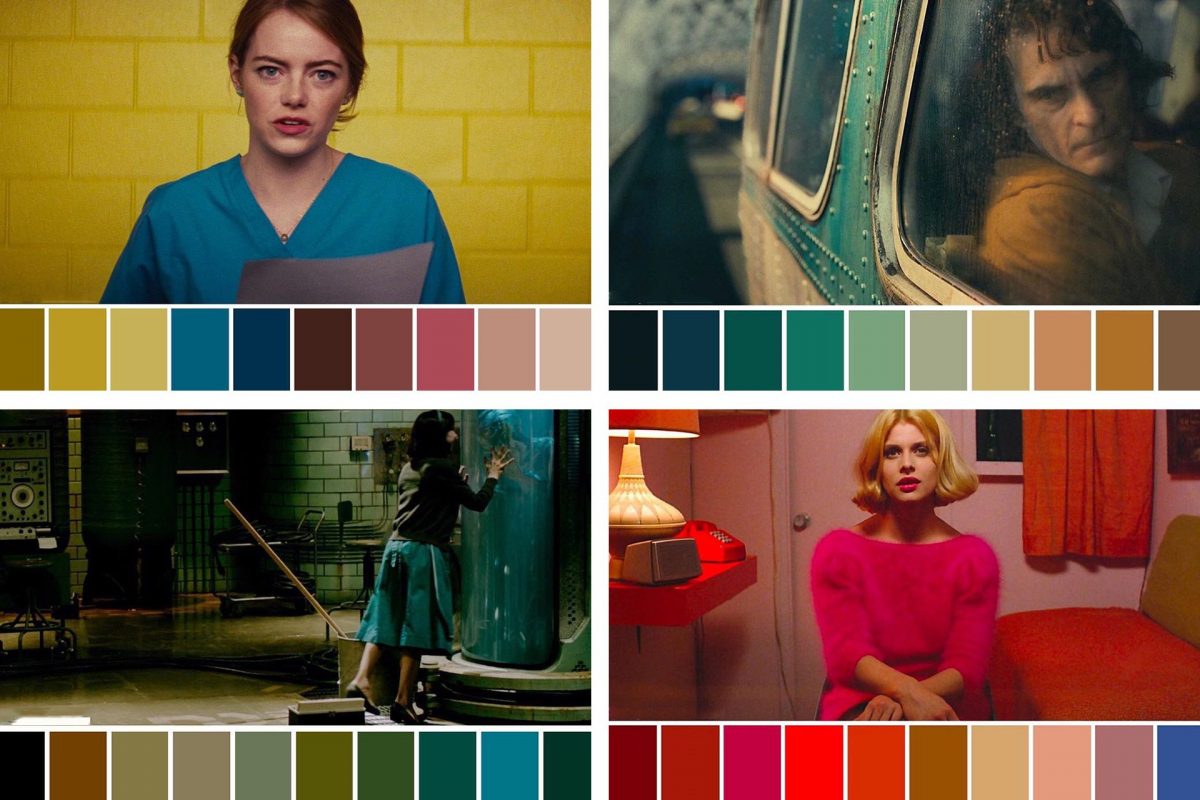
Let's explore the most common color schemes used in filmmaking.
This Will CHANGE How You View Color in Film
The video 'This Will CHANGE How You View Color in Film' by Alex Zarfati offers a clear, practical look at foundational color schemes and their narrative purpose.
Please watch from 01:55 to 03:55. This segment introduces four key concepts: Complementary Colors: Colors on opposite sides of the color wheel (like teal and orange), creating high contrast and visual energy. Monochromatic: A scheme built from different shades and tints of a single color, creating a very harmonious but distinct mood. Analogous Colors: Colors that sit next to each other on the color wheel, also creating a harmonious feel but with more color variation than monochromatic. Discordance: An element that intentionally breaks the color scheme to draw the viewer's attention.
To deepen your understanding and see more examples, the following article explores these schemes and other symbolic uses of color.
50+ Examples of Movie Color Palettes
The article '50+ Examples of Movie Color Palettes' from StudioBinder is a comprehensive resource that provides detailed explanations and fantastic examples of color theory in action.
Please read two sections of this article: Start at the heading 'What are the types of color schemes?' and read through the descriptions of Monochromatic, Complementary, Analogous, and Triadic color schemes. Then, jump to the heading 'How to use color in film symbolically' and read about Discordant, Associative, and Transitional color.
Let's summarize these powerful symbolic techniques:
- Discordant Color: Think of the girl in the red coat in the black-and-white film Schindler's List. This is the ultimate tool for drawing focus.
- Associative Color: Assigning a specific color to a character or idea. In Star Wars, the blue/green lightsabers are associated with the Jedi and the red with the Sith.
- Transitional Color: Using a shift in the color palette to show a character's arc or a change in the story's tone, like Walter White's wardrobe becoming darker as he transformed into Heisenberg in Breaking Bad.
Test your understanding!
You are planning a short film about a detective investigating a case in a rainy, dystopian city. You want the world to feel oppressive and cohesive, but you also want to visually signal that the detective is an outsider who doesn't belong.
- What primary color scheme would you choose for the city to create that oppressive, harmonious feel?
- What color strategy would you use for the detective's clothing or key props to make them stand out?
Show answer
- A monochromatic or analogous color scheme would work well. For example, a monochromatic blue or green scheme would create a unified, sickly, or somber mood. An analogous scheme of blues, teals, and greens would achieve a similar harmonious but oppressive feel.
- You would use discordant color. If the city is predominantly blue and green, you could put the detective in a warm, contrasting color like a brown trench coat or have them carry a yellow umbrella. This would immediately make them pop from the background and visually reinforce their status as an outsider.
3. Color Grading for Genre
Just as certain color schemes evoke specific emotions, they also become associated with film genres. Audiences have been subconsciously trained to expect certain visual cues from a horror film versus a romantic comedy. As a filmmaker, you can either lean into these conventions to meet audience expectations or subvert them for a unique effect.

Let's look at some common genre conventions.
#3 - Color Grading for Different Genres: Challenges and ...
The article 'Color Grading for Different Genres' from The Palette Post clearly outlines the typical color grading approaches for several major film genres.
Please read the sections titled: Drama: Emotional Depth and Subtlety Action: Enhancing Energy and Visual Impact Horror: Crafting Tension and Atmosphere Sci-Fi: Crafting Futuristic and Fantastical Worlds Focus on the keywords used to describe the look of each genre (e.g., 'natural and realistic' for drama, 'bold and contrasting' for action).
As you can see, the color choices directly support the story's intent:
- Horror: Often uses dark, desaturated, and cool-toned palettes (especially blues and greens) to create a sense of unease and dread. High contrast can be used to hide things in shadow.
- Action: Tends to use high-contrast, vibrant, and often complementary color schemes (like the famous teal-and-orange look) to create energy and visual impact.
- Sci-Fi: This genre is all about world-building. Palettes can be imaginative and unnatural (like the green of The Matrix) or stark and sterile to reflect a futuristic setting.
- Drama: Typically aims for a more naturalistic look that supports the emotional reality of the characters. Color is often used subtly to reflect the characters' inner states.
Conclusion
Today you've moved beyond simple correction and into the world of creative color grading. You've learned how color can be a powerful tool for visual storytelling, shaping your audience's emotional journey.
Key Takeaways:
- Color grading is the art of using Hue, Saturation, and Brightness to create a specific mood.
- Color schemes (monochromatic, complementary, analogous) provide a framework for building a cohesive and intentional visual world.
- Color can be used symbolically to draw focus (discordance), represent characters (association), or show change (transition).
- Film genres have established color conventions that you can use or subvert to tell your story effectively.
Next Lesson Preview:
You now understand the "why" and "what" of creating a look. But building a complex grade from scratch every time can be time-consuming. In our next lesson, we will explore how to use Look-Up Tables (LUTs) to achieve a desired visual style efficiently. LUTs are like color presets that can serve as a fantastic starting point for your grade or help you quickly achieve a specific cinematic look.