Hello! Welcome back to our journey into graphic design.
In the last lesson, we focused on controlling the shape and placement of your images by mastering cropping, masking, and using frames. Now that you can confidently fit images into any layout, it's time to learn how to control their look and feel.
Today's lesson addresses the learning outcome: Apply basic image adjustments and effects like overlays and shadows. We'll explore Figma's built-in tools to change an image's mood, color, and depth. You'll learn how to perform non-destructive edits, apply color overlays, and add shadows to make your designs more dynamic and professional.
1. Basic Image Adjustments
Just like photo editing software, Figma provides a set of powerful, non-destructive sliders to adjust the properties of an image fill. This means you can tweak the look of an image without permanently altering the original file.
To find these controls, select an object with an image fill, go to the Fill section in the right-hand Design panel, and click on the image thumbnail. This will open the image properties panel.
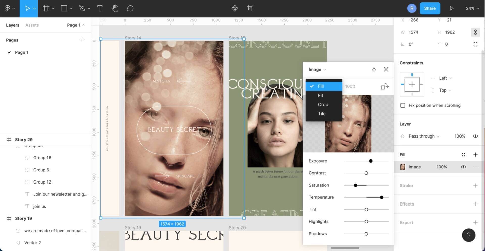
Let's dive into what these adjustments do by reading the official Figma documentation.
Adjust the properties of an image
This guide from Figma explains each of the image adjustment properties available to you. Understanding these is the first step to enhancing your images.
Please read the section titled 'Image adjustments'. Focus on understanding what each slider does: Exposure, Contrast, Saturation, Temperature, Tint, Highlights, and Shadows.
As you've read, these sliders give you precise control:
- Exposure: Makes the entire image brighter or darker.
- Contrast: Increases or decreases the difference between the light and dark areas. Higher contrast makes an image "pop," while lower contrast makes it feel more muted.
- Saturation: Controls the intensity of the colors. Pushing it all the way to -100 will make your image black and white.
- Temperature & Tint: Work together to adjust the color balance. Temperature shifts between cool (blue) and warm (yellow), while Tint shifts between green and magenta.
- Highlights & Shadows: Allow you to specifically target the brightest or darkest parts of an image. For example, you can brighten the shadows to reveal more detail without blowing out the highlights.
Test your understanding!
Let's apply this knowledge.
- Find and import a colorful photo into Figma (you can use the Unsplash plugin).
- Task 1: Make the image black and white.
- Task 2: With the image still black and white, increase the Contrast to make the darks darker and the lights lighter.
- Task 3: Reset the image adjustments. Now, use the Temperature slider to give the image a "cooler," more blueish tone.
Show answer
For Task 1, you should have selected the image, opened the fill properties, and dragged the Saturation slider all the way to -100.
For Task 2, you would then move the Contrast slider to the right (e.g., +25 or more) to see a more dramatic difference between the black and white areas.
For Task 3, after resetting, you would move the Temperature slider to the left, which adds blue tones to the image, making it feel "cooler."
2. Creating Overlays with Blend Modes
An overlay is a common technique where a color is "laid over" an image to tint it, unify its look with other brand colors, or prepare it for text to be placed on top. The key to making this work is using blend modes.
A blend mode determines how the colors of a layer interact with the colors of the layers beneath it.
The process is simple:
- Place your image on the canvas.
- Draw a rectangle (or any shape) that covers the image.
- Give the rectangle a solid color fill (e.g., a dark blue).
- With the rectangle layer selected, find the Layer section in the Design panel. The default blend mode is "Pass-through". Click it to open a dropdown menu of options.
- Change the blend mode to something like Multiply, Overlay, or Soft Light and see what happens! You can also adjust the opacity of the color layer to fine-tune the effect.
This short video demonstrates a similar technique using blend modes to create a stylish effect.
Masking in 4 Minutes (Figma Tutorial)
In this clip from 'Masking in 4 Minutes', the creator shows how to use blend modes to combine image layers. The principle is exactly the same for creating a color overlay.
Watch from 02:45 to 03:57. Notice how he selects a layer and changes its blend mode (Screen, Hard Light, Soft Light) to create different visual effects. This is the same process you'll use to apply a color overlay to an image.
Experiment with different blend modes and colors. For example, a black layer set to Multiply will darken your image, which is great for placing white text on top. A white layer set to Screen will lighten it.
3. Adding Depth with Shadows
Shadows are essential for creating a sense of depth and hierarchy. They can make an element like a button or a photo look like it's lifting off the background. In Figma, you can add shadows and other effects from the Effects panel in the right sidebar.
The two main shadow types are:
- Drop Shadow: Adds a shadow behind a layer, making it appear to float.
- Inner Shadow: Adds a shadow inside the bounds of a layer, making it appear recessed or indented.
Let's read the official guide to understand how to apply and configure these effects.
This Figma article provides a great overview of the Effects panel, with a specific focus on shadows. It explains what they are for and how to use them.
Please read the section titled 'Shadow effects'. Pay close attention to the descriptions of 'Drop shadow' and 'Inner shadow' to understand their different use cases.
When you add a shadow effect, you can click the sun icon to open its settings.

Here’s what the main settings mean:
- X and Y: The horizontal and vertical offset. Positive X moves the shadow right; positive Y moves it down.
- Blur: The softness of the shadow. A high value creates a diffuse, soft glow, while a value of 0 creates a hard-edged shadow.
- Spread: Expands the shadow's size before it's blurred. This is useful for creating larger, more pronounced shadows.
- Color & Opacity: The color of the shadow. Shadows are rarely pure black. Using a dark, desaturated version of your background color often looks more natural. The opacity slider controls its transparency.
Test your understanding!
Let's build with shadows.
- Create a 200x200px white square on a light grey background.
- Task 1 (Drop Shadow): Select the square and add a Drop Shadow from the Effects panel. Adjust the settings to make the square look like it's gently floating above the grey background. Try setting Y to 4 and Blur to 8.
- Task 2 (Inner Shadow): Place an image inside a 300x300px frame. Select the frame and add an Inner Shadow. Adjust the settings to create a subtle "vignette" effect, where the edges of the image are slightly darker than the center.
Show answer
For Task 1, your white square should have a soft, dark blur underneath and to the side of it, making it appear lifted off the grey background. You should see the "Drop shadow" effect listed in the Effects panel.
For Task 2, your image should have a soft, dark shadow around its inner edges. This makes the center of the image appear brighter and draws the viewer's eye inward. In the Effects panel, you should see an "Inner shadow" effect applied to the frame. A common setting for this might be a black color at 20% opacity, a Blur of 20, and a Spread of 10.
Conclusion
Great work! You've just learned how to manipulate the fundamental visual properties of your images and layers. These techniques are crucial for setting the mood, creating focus, and adding a professional polish to your designs.
Here are the key takeaways:
- Image Adjustments: Use the sliders in the Fill panel (Exposure, Contrast, Saturation, etc.) to perform non-destructive edits to an image's tone and color.
- Overlays: Create overlays by placing a colored shape on top of an image and changing its Blend Mode (e.g., Multiply, Soft Light) in the Layer section of the Design panel.
- Shadows & Effects: Use the Effects panel to add depth and dimension. Drop Shadow makes elements float, while Inner Shadow makes them look inset.
In our next lesson, we will move from editing individual elements to composing them. You'll learn how to apply classic layout patterns like the Rule of Thirds, Z-pattern, and F-pattern to arrange your images and text in a visually pleasing and effective way.