Hello! Welcome back.
In our last lesson, we focused on enhancing individual images using adjustments, overlays, and shadows. You now have the skills to control the mood and appearance of your design elements. Today, we'll take the next crucial step: learning how to arrange those elements on the page.
This lesson addresses the learning outcome: Apply layout patterns like the Rule of Thirds, Z-pattern, and F-pattern. We will explore three foundational composition principles that professional designers use to create balanced, effective, and easy-to-understand layouts. Think of these patterns as blueprints for guiding your viewer's eye exactly where you want it to go.
1. Guiding the Viewer's Eye: Reading Patterns
Before we dive into the specific patterns, let's understand the "why." Why do we need layout patterns at all? The goal is to control the flow of information. When someone looks at your design, their eyes follow a predictable path, especially when they are reading. By understanding these paths, you can place your most important content in the spots where it will be seen first.
These predictable paths are often called "reading patterns." The two most common in Western cultures (which read left-to-right) are the F-pattern and the Z-pattern.
Let's get a clear definition of these two patterns, along with the Rule of Thirds, from a concise article on visual hierarchy.
7 visual hierarchy principles for web design
This article from Webflow provides clear, straightforward definitions for the F-pattern, Z-pattern, and the Rule of Thirds. It's a great starting point for understanding these core concepts.
Please read the short sections titled '1. Reading patterns' and '2. Rule of thirds'. Focus on the descriptions of what the F-pattern, Z-pattern, and Rule of Thirds are.
To help you visualize these eye movements, here's a simple diagram.

Now, let's explore these patterns in more detail.
2. The F-Pattern and Z-Pattern
As you've just read, these two patterns serve different purposes and are suited for different types of content.
- F-Pattern: Best for content-heavy pages like blog posts, articles, or search results. Viewers scan horizontally across the top, then move down the left side and do another, shorter horizontal scan. The most critical information (headlines, sub-headers, opening sentences) should align with this 'F' shape.
- Z-Pattern: Ideal for simpler, less text-heavy pages like advertisements or landing pages. The eye moves across the top (from a logo to a menu/button), then diagonally down to the bottom corner (passing over a central image), and finally across the bottom (to a call-to-action or contact info).
This video provides excellent examples and explains how these patterns help form the basis of a design's hierarchy.
The ONLY Video On Visual Hierarchy ANY Graphic Designer Needs
In this clip from 'The ONLY Video On Visual Hierarchy ANY Graphic Designer Needs', the creator explains how designers use the F-pattern and Z-pattern as a framework for their layouts.
Watch the segment from 09:04 to 10:24. Pay attention to how the creator describes the natural path of the eye and how you can place elements along that path to guide the viewer.
How to use them in Figma:
Unlike a grid, F and Z patterns are conceptual. You don't create a literal 'F' or 'Z' on your page. Instead, you use them as a mental map.
- For a Z-pattern, you would place your logo in the top-left, a "Sign Up" button in the top-right, your main visual in the center, and contact details in the bottom-right.
- For an F-pattern, you'd make sure your main headline is large and at the top, and any subheadings or bullet points are aligned to the left, where the eye naturally scans downwards.
3. The Rule of Thirds
The Rule of Thirds is one of the most well-known principles in all visual arts, from painting to photography and graphic design. It's a simple way to create more dynamic and visually interesting compositions.
As the reading and this image show, the idea is to divide your canvas into a 3x3 grid. The four points where the lines intersect are considered the most powerful spots in your composition.
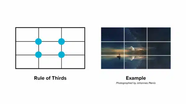
Placing your key elements (like a person's face, a product, or a headline) on or near these intersections creates tension and energy, making the design more engaging.
This next video gives a fantastic deep dive into the Rule of Thirds, including how designers use "sweet spots" within the grid.
Simple Tricks to INSTANTLY Improve Your Graphic Design Skills with the Rule of Thirds
The video 'Simple Tricks to INSTANTLY Improve Your Graphic Design Skills with the Rule of Thirds' is dedicated entirely to this principle. It shows not just the 'what' but the 'how' and 'why'.
Please watch from the beginning to 04:48, and then the practical demo from 05:23 to 09:37. Even though the demonstration is in Adobe Illustrator, the principles of placement, hierarchy, and balance are universal and apply directly to your work in Figma.
How to create a Rule of Thirds grid in Figma:
Figma's Layout Grid tool makes this very easy.
- Select the Frame you are working in.
- In the right-hand Design panel, find the Layout grid section and click the
+icon. - By default, it will create a pixel grid. Click the grid icon (nine small squares) to open the settings.
- Change the type from
GridtoColumns. Set the Count to3. - Click the
+icon on the Layout grid section again to add a second grid. - Click its icon, change the type to
Rows, and set the Count to3.
You now have a perfect Rule of Thirds grid overlaid on your frame to guide your composition! You can toggle its visibility by clicking the eye icon next to the layout grid settings.
Test your understanding!
Let's do a quick practical exercise in Figma. Imagine you are creating a simple web banner to promote a new coffee shop.
You have four elements:
- A beautiful photo of a cup of coffee.
- The coffee shop's name (e.g., "The Daily Grind").
- A short tagline (e.g., "Your perfect morning starts here.").
- A "Visit Us" button.
Task: Create two 1080x1080px frames.
- In the first frame, arrange the four elements using a Z-pattern.
- In the second frame, arrange the four elements using the Rule of Thirds. Set up a 3x3 grid to help you.
Think about the hierarchy. Which element is most important?
Show answer
While there's no single correct design, here is a likely approach for each pattern:
-
Z-Pattern Layout:
- Top-left: The coffee shop's name, "The Daily Grind."
- Top-right: The "Visit Us" button. Viewers see the brand and immediately see the action they can take.
- Center/Diagonal: The photo of the coffee cup would occupy the main central area.
- Bottom-left: The tagline, "Your perfect morning starts here," as the final piece of information.
-
Rule of Thirds Layout:
- You would place the coffee cup (the main subject) on or near one of the four intersection points, likely the top-left or top-right.
- The coffee shop's name could be placed along the top grid line for balance.
- The tagline and button could be aligned with the bottom grid line or placed near one of the lower intersection points. The goal is to avoid centering everything and instead create a more dynamic, asymmetrical balance.
Conclusion
Fantastic work today! You've just added three powerful tools to your designer's toolkit. By moving beyond just placing things on a page and starting to intentionally compose them, you are making a huge leap toward professional-quality design.
Here are the key takeaways:
- Layout Patterns Guide the Eye: The primary purpose of patterns like F, Z, and the Rule of Thirds is to create a clear visual path for your audience, ensuring they see the most important information in the right order.
- F-Pattern: Use for text-heavy content. Place key information along the top and left edges.
- Z-Pattern: Use for simpler, scannable layouts. Place key elements at the four corners of the "Z" path.
- Rule of Thirds: Create a 3x3 grid and place focal points on the intersections to build more dynamic and engaging compositions.
In our next lesson, we'll continue exploring layout by focusing on an element that is often invisible but incredibly important: whitespace. You'll learn how to use it effectively to improve readability, create focus, and give your designs a clean, professional feel.