Hello! Welcome back to our module on "Mastering Color and Typography."
In the last lesson, you learned about the color wheel and how to use color harmonies to create balanced and appealing palettes. We saw how simple geometric rules can help you select colors that work well together. Today, we're going to dive deeper into two crucial aspects of color that every professional designer must understand.
This lesson addresses your goal of building a professional skillset by moving from the "how" of combining colors to the "why" and "where." We will cover today's learning outcome: to describe the psychological impact of color and the difference between RGB and CMYK modes.
First, we'll explore how different colors make people feel and think—a field known as color psychology. Then, we'll get into the technical, but essential, difference between designing for digital screens (RGB) and for physical print (CMYK).
The Psychology of Color: Communicating with Emotion
In the previous lesson, we touched on the idea of warm and cool colors. This is just the beginning of color psychology. As a designer, your color choices are not just aesthetic; they are strategic. Colors carry meaning and can evoke specific emotions, associations, and actions from your audience. Understanding this allows you to build a brand's identity, set the mood for an advertisement, or guide a user's attention.
Let's watch a video that explores the common psychological associations of several key colors.
Color Theory for Beginners | FREE COURSE
This video from Envato Tuts+ provides an excellent overview of color psychology. It covers the emotions and ideas commonly associated with colors like red, blue, and green, and shows examples of how they are used in design.
Watch the section from 00:13:04 to 00:16:28. As you watch, think about famous brands you know and whether their color choices align with the meanings described.
Here’s a quick summary of the key associations mentioned in the video:
- Red: Passion, strength, power, energy. Often used to create urgency or draw attention.
- Blue: Calm, trust, stability, seriousness. A popular choice for corporate, tech, and financial brands.
- Green: Nature, growth, health, serenity. Associated with environmental brands, finance, and wellness.
- Yellow: Happiness, energy, friendliness, optimism. Often used for products related to children or to grab attention in a cheerful way.
- Purple: Luxury, nobility, power, elegance. Frequently used by high-end or creative brands.
- Orange: Optimism, creativity, warmth, energy. A vibrant color used to convey fun and confidence.
It's important to remember that these associations can be influenced by culture, personal experience, and context. However, these general meanings provide a strong starting point for making intentional color decisions.
The following infographic offers a great visual summary of these color meanings and other concepts we've discussed.

Test your understanding!
Think of a popular mobile app or website you use.
- What is its primary brand color?
- Based on what you've just learned, what message or feeling do you think the designers were trying to communicate with that color choice? Does it work?
Show answer
There's no single right answer here, but let's take an example.
App: Spotify
- Primary Color: A vibrant green.
- Message: Green is associated with growth, serenity, and nature. In Spotify's context, the vibrant shade of green feels fresh, energetic, and modern. It suggests a sense of discovery ("growth" of your music library) and ease of use ("serenity"). It stands out from the blues used by many tech companies (like Facebook and LinkedIn), giving it a unique, creative personality.
Color for Screen vs. Print: RGB and CMYK
Now that we've covered the emotional side of color, let's switch to the technical side. Where your design will be seen—on a glowing screen or on a physical piece of paper—fundamentally changes how color needs to be handled. This is where the concepts of RGB and CMYK become critical.
Choosing the wrong color mode can lead to disappointing results, like a logo that looks vibrant on your monitor but dull and muddy when printed on a business card. Let's watch a short, focused video that explains the difference.
What is the difference between RGB and CMYK?
This video from Express Cards clearly and concisely breaks down the difference between the RGB and CMYK color models. It visually demonstrates how each model creates color.
Watch the entire video. Pay close attention to the terms 'additive' for RGB and 'subtractive' for CMYK, and note the key use case for each.
To solidify this concept, let's review a more detailed explanation.
Color Theory: Brief Guide For Designers - Tubik Blog
The article 'Color Theory: Brief Guide For Designers' from Tubik Blog offers a well-written section on this topic. It reinforces the concepts you just saw and stresses the importance of choosing the right model from the start.
Read the section titled 'RGB, CMYK, and the Nature of Color: Understanding the Models Behind the Screen,' including the subsection 'Choosing the Right Model: Screen vs Print.'
Here’s a breakdown of the two color models:
RGB: The Additive Model for Digital Screens
- Stands For: Red, Green, Blue.
- How it Works: It's an additive model that starts with a black screen (the absence of light). It adds light from red, green, and blue pixels in various combinations and intensities to create a spectrum of colors.
- White and Black: When all three colors are combined at full intensity, they create pure white light. When all are off, you get black.
- Use Case: Anything that will be viewed on a screen. This includes websites, mobile apps, social media graphics, digital presentations, and videos. Figma, being a tool for digital design, works primarily in the RGB color space.
CMYK: The Subtractive Model for Print
- Stands For: Cyan, Magenta, Yellow, Key (Black).
- How it Works: It's a subtractive model that starts with a white surface (like paper), which reflects all colors of light. It subtracts colors by layering inks. Each ink absorbs (subtracts) certain wavelengths of light.
- White and Black: White is the absence of ink (the paper itself). While combining C, M, and Y theoretically produces black, it results in a muddy brown in practice. Therefore, "Key" (black) ink is added for deep, true blacks and sharp text.
- Use Case: Anything that will be physically printed. This includes business cards, posters, flyers, brochures, and packaging.
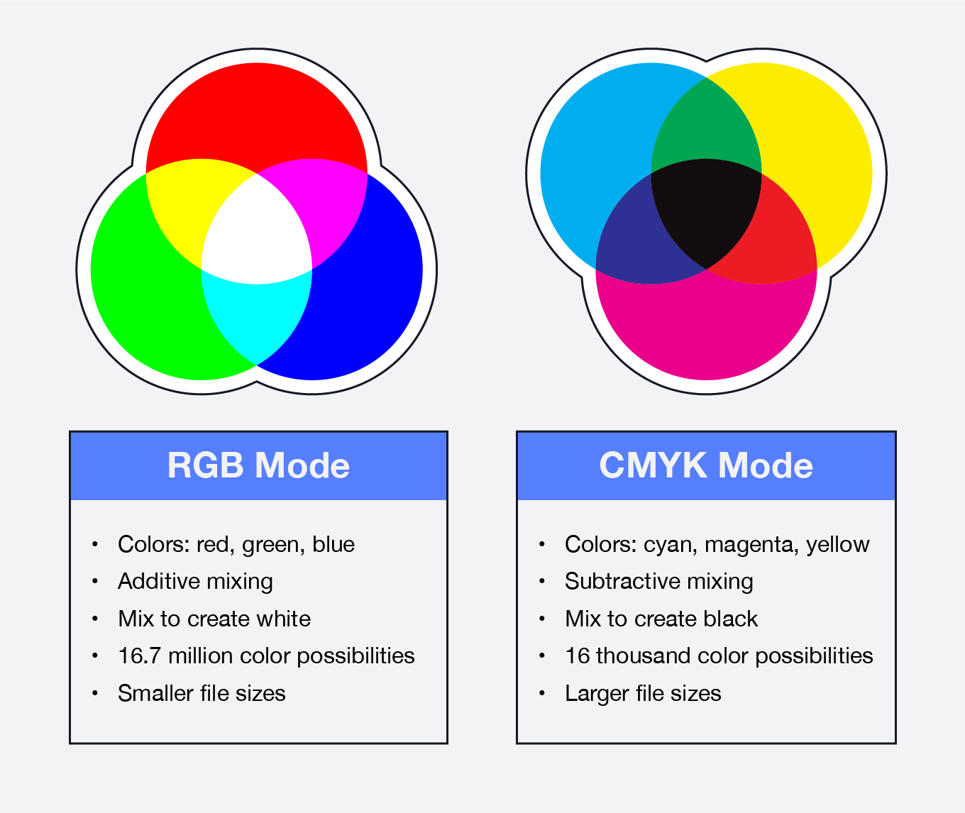
The most important takeaway is that the range of colors that can be produced with RGB (the "gamut") is much larger than what can be reproduced with CMYK. This is why super-bright, neon colors you see on a screen often look muted or different when printed.
Test your understanding!
For each of the following design projects, which color mode should you set up your file in? RGB or CMYK?
- A set of Instagram post templates.
- A new logo for a client that will be used on their website and printed on business cards.
- A two-sided event invitation that will be mailed to guests.
- The user interface for a new mobile banking app.
Show answer
- RGB. Instagram is a digital platform viewed on screens.
- Both, but start with CMYK. This is a trick question! For brand identity projects, it's best practice to design the logo in CMYK first to ensure the printed colors are correct. You can then create an RGB version for digital use. A professional designer delivers logo files in both formats.
- CMYK. The invitation is a printed item.
- RGB. A mobile app interface is exclusively digital.
Conclusion
Excellent work today! You've tackled two fundamental concepts that separate beginners from professionals. Understanding why you're choosing a color (psychology) and how that color will be reproduced (RGB/CMYK) gives you a powerful new level of control over your designs.
Here are the key takeaways from this lesson:
- Color Psychology: Colors evoke emotions and have cultural associations. You can use these to communicate a brand's personality and guide user perception.
- RGB Color Mode: This is an additive model (Red, Green, Blue) used for digital screens. It adds light to a black background to create color.
- CMYK Color Mode: This is a subtractive model (Cyan, Magenta, Yellow, Black) used for print. It uses ink to absorb light from a white background.
- Practical Rule: Use RGB for web, mobile, and digital media. Use CMYK for anything that will be printed.
In our next lesson, we will continue our exploration of color by focusing on accessibility, ensuring that your designs are usable by people with visual impairments. We will also finally jump back into Figma and learn how to create and manage a color palette using color styles, putting your new theoretical knowledge into practice.