Hello! Welcome back to our course.
In our last lesson, we explored the emotional impact of color through psychology and the crucial technical difference between the RGB and CMYK color models. You learned why to choose certain colors and how they're reproduced for screens versus print. Today, we'll add another essential layer to your professional skillset: ensuring your designs are usable by everyone.
This lesson directly supports your goal of becoming a professional designer by tackling a non-negotiable aspect of modern design. We will focus on today's learning outcome: to apply color accessibility principles, including checking contrast ratios. We'll cover what accessibility means, why it's critical, and how to measure and implement it directly within Figma.
Why Color Accessibility is a Pillar of Professional Design
Imagine designing a beautiful poster, but a significant portion of your audience can't read the information on it. That's the reality when color accessibility is ignored. Accessibility in design means creating products and experiences that can be used by everyone, regardless of their abilities.
This isn't just a "nice-to-have"; it's a fundamental part of good design for several reasons:
- Ethical: It’s about inclusivity and ensuring equal access to information.
- Business: A more accessible product reaches a wider audience. In many places, it's also a legal requirement, and companies have faced lawsuits for having inaccessible websites.
- Practical: Good contrast benefits everyone, not just those with visual impairments. Think about trying to read a screen in bright sunlight or when your eyes are tired after a long day.
To understand the real-world importance of this, let's start with a short video that explains the legal and ethical motivations behind accessible design.
Basics of Accessibility in UI Design - Color Contrast Ratios! [Figma Tutorial]
The video 'Basics of Accessibility in UI Design' by Design Pilot begins with a powerful story about a lawsuit against Domino's Pizza. This highlights the serious consequences of ignoring accessibility.
Watch the first two minutes of the video (00:00 - 02:00). Notice how a design choice can become a legal and financial issue for a major company.
As you can see, this is a topic with serious professional implications. Let's dig into the principles that will allow you to get it right.
Understanding Contrast Ratios: The WCAG Standard
To ensure readability, we can't just guess what "looks good." We need an objective measure. This is provided by the Web Content Accessibility Guidelines (WCAG), which are the global standard for web accessibility.
The key concept is the contrast ratio, a number that measures the difference in perceived brightness (or "luminance") between two colors. This ratio ranges from 1:1 (no contrast, e.g., white text on a white background) to 21:1 (maximum contrast, black text on a white background).
For our purposes as designers, we primarily focus on the WCAG Level AA standard, which is the accepted benchmark for most websites and applications.
To learn more about the specifics, please read the following article.
A Guide to Accessible Color Contrast in Design
The article 'A Guide to Accessible Color Contrast in Design' from WebAbility.io provides a clear and comprehensive breakdown of the WCAG standards.
Read the section titled 'Breaking Down the WCAG Contrast Ratios.' Focus on memorizing the core numbers for Level AA and the definition of 'large text.'
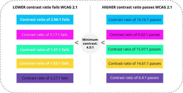
Here are the essential numbers you need to know from the WCAG Level AA standard:
| Text Type | Minimum Contrast Ratio |
|---|---|
| Normal Text | 4.5:1 |
| Large Text | 3:1 |
What is "Large Text"?
WCAG defines large text as:
- At least 18pt (which is roughly 24 pixels) at a regular font weight.
- Or at least 14pt (roughly 18.7 pixels) if it is bold.
Anything smaller than that is considered "normal text" and must meet the higher 4.5:1 ratio.
How to Check Contrast Ratios in Figma
Memorizing the ratios is the first step, but you need a practical way to check them as you design. Fortunately, Figma has a fantastic built-in tool that does the math for you.
Let's watch a video that walks you through how to use it.
A Simple Guide to Color Contrast in Web Design
The video 'A Simple Guide to Color Contrast in Web Design' by Flux Academy provides a perfect, hands-on demonstration of Figma's native contrast checker.
Watch from 00:36 to 03:11. Pay close attention to how to access the contrast tool, how to interpret the AA and AAA lines on the graph, and how Figma can automatically adjust the color for you.
As shown in the video, here is the process:
- Select a text layer in Figma.
- In the Fill section of the right-hand properties panel, click the color swatch.
- In the color picker window, you will see a Contrast section. Figma automatically detects the background color behind the text.
- The tool displays the contrast ratio and shows two lines on the color map representing the WCAG AA and AAA minimums. Your color combination must be on or above the line to pass.
Test your understanding! (Figma Practice)
Let's apply this in Figma.
- Open a new Figma file. Create a rectangular frame and give it a background color with the hex code
#8E94F2. - Inside the frame, create a text box with the words "Hello World!". Set the font size to
16pxand the weight toRegular. Set the text color to#FFFFFF(white). - Select the text layer and open the contrast checker as described above.
- What is the contrast ratio?
- Does this combination pass the WCAG AA standard for normal text?
- If it fails, use Figma's color picker to drag the color selector until the ratio just passes the AA line. What is a new background color that works?
Show answer
- The initial setup is white text (
#FFFFFF) on a light purple background (#8E94F2). - Using Figma's contrast checker:
- The contrast ratio is 2.88:1.
- No, it fails. The minimum for normal text is 4.5:1. You will see a "Fail" icon next to the AA standard.
- To fix this, you need to darken the background color. If you drag the color selector downwards in the color picker, you will find a passing color. For example, a darker purple like
#757DEFgives a ratio of 4.53:1, which passes the AA standard.
Common Pitfalls and How to Solve Them
Knowing how to use the tool is key, but it's also important to recognize common design patterns that cause accessibility issues.
1. The "Light Gray Text" Problem
A very common trend in minimalist design is to use light gray text on a white background. This almost always fails accessibility standards.
- DON'T: Use a color like
#999999for body text on a white (#FFFFFF) background. The ratio is only 2.32:1. - DO: Use a darker gray like
#595959. This preserves a clean look while achieving a ratio of 7.27:1, which easily passes both AA and AAA standards.
2. Text on Images and Gradients
Placing text over a complex background like a photograph or a gradient is a major challenge because the contrast ratio changes from one part of the image to another.

Here are three reliable techniques to ensure readability:
- Add a Color Overlay: Place a semi-transparent dark layer over the image but behind the text. This mutes the background and creates a consistent level of contrast.
- Use a Text Shadow: A subtle but crisp shadow can help "lift" the text from the background, making its edges clearer.
- Place Text in a Scrim/Box: Put your text inside a solid or semi-transparent colored box. This creates a fully controlled, high-contrast area for your text.
For more on these practical solutions, this article is a great reference.
A Guide to Accessible Color Contrast in Design
The WebAbility.io article we looked at earlier also has an excellent section on practical application and common issues.
Now read the sections 'Putting Accessible Color into Practice' and 'Common Questions About Color Contrast.' This will give you solutions to common problems, like what to do if a brand's main color fails a contrast test.
Conclusion
Congratulations on completing this crucial lesson! You now have the knowledge and practical skills to ensure your color choices are not only beautiful but also inclusive and effective for all users. This is a skill that immediately distinguishes a thoughtful, professional designer.
Here are your key takeaways:
- Accessibility is Essential: It's an ethical, legal, and business imperative for modern design.
- Remember the Ratios: For WCAG Level AA, the standard is 4.5:1 for normal text and 3:1 for large text.
- Use the Tools: Figma's built-in contrast checker is your best friend for getting objective, real-time feedback.
- Solve Common Problems: Use techniques like color overlays or darker shades to fix contrast issues without sacrificing your design aesthetic.
In our next lesson, we will put this all together. Now that you know how to choose, harmonize, and test your colors, we'll learn how to create and manage a color palette using Figma's Color Styles. This will empower you to build systematic, scalable, and accessible design systems.