Hello! Welcome back.
In our last lesson, you learned how to apply color accessibility principles, a crucial skill for ensuring your designs are usable by everyone. We focused on checking contrast ratios to guarantee readability, moving your understanding of color from purely aesthetic to functional and inclusive.
Today, we'll build on that by learning how to manage your colors systematically. Instead of picking colors one by one, you'll learn how to build a cohesive and efficient color system. This lesson is designed to teach you how to create and manage a color palette using Figma's color styles. Mastering this will dramatically speed up your workflow and is a fundamental practice for any professional graphic designer.
What are Color Styles and Why Are They Essential?
Imagine you've used a specific shade of blue for 50 different elements in a large design. If you decide to change that blue, you'd have to find and update all 50 instances manually—a tedious and error-prone process.
Color Styles solve this problem. A style is a reusable property (like a color, text setting, or effect) that you can apply to any object. When you edit the style, every object using it updates automatically. This brings three huge benefits to your workflow:
- Consistency: Ensures you use the exact same color every time, maintaining brand integrity.
- Efficiency: Lets you make global changes instantly, saving you enormous amounts of time.
- Organization: Keeps your colors neatly arranged and easy to find.
To see this in action, let's start with a quick introduction from Figma's official channel.
Figma Tutorial: Creating Styles
This video, 'Figma Tutorial: Creating Styles,' provides a concise overview of what styles are and why they are so powerful for managing your designs.
Watch the first 36 seconds of the video (00:00 - 00:36) to get a clear definition of styles and the different types you can create.
The Building Blocks of a Professional Palette
A robust color palette isn't just a random collection of colors; it's a structured set designed for specific purposes. Before we start building in Figma, it's helpful to understand the different roles colors play in a design system.
The Ultimate Guide to Creating Color Palettes in Figma ...
The article 'The Ultimate Guide to Creating Color Palettes in Figma' by Untitled UI gives an excellent breakdown of the components of a UI color palette.
Read the first part of the article, from the start down to the section 'Define your color palette at the start'. Focus on understanding the roles of Neutral, Brand, Accent, and Feedback colors.
To summarize, a good palette typically includes:
- Brand/Primary Colors: The main colors that define the brand's identity.
- Accent/Secondary Colors: Used to highlight secondary information or grab attention.
- Neutral Colors: A range of grays used for text, backgrounds, and dividers.
- Feedback Colors: Used for states like success (green), warnings (yellow/orange), and errors (red).
Creating and Organizing Your First Color Styles in Figma
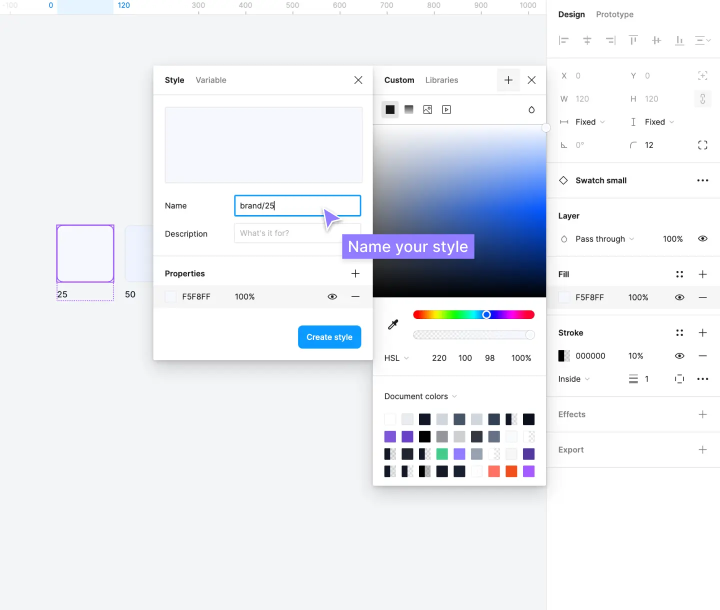
Now for the practical part. Let's create our first style. The process is simple, but the key to a professional workflow is organization. We'll use a forward slash (/) in our style names to group them into folders. For example, naming a style Brand/Primary will create a folder called "Brand" and place the style "Primary" inside it.
Let's watch how to do this.
Figma Tutorial: Creating Styles
The same Figma tutorial we started with also provides a clear, step-by-step guide to creating your first color style.
Watch from 00:36 to 01:38. Pay close attention to the clicks: selecting the shape, opening the style menu (the four-dot icon), clicking the plus (+) icon, and naming the style.
Here is a visual of the naming process using the forward-slash convention:
Test your understanding! (Figma Practice)
Time to apply this in Figma.
- Open a new Figma file.
- Create three square shapes.
- Set their fill colors to the following:
- Square 1 (Primary):
#4F46E5(a shade of indigo) - Square 2 (Success):
#22C55E(a shade of green) - Square 3 (Neutral):
#6B7280(a shade of gray)
- Square 1 (Primary):
- Now, create a color style for each one. Use the
/naming convention to organize them:- Name the first style
Brand/Primary. - Name the second style
Feedback/Success. - Name the third style
Neutral/500.
- Name the first style
- After creating them, click on the blank canvas to deselect everything. You should see your new styles organized under "Color Styles" in the right-hand sidebar.
Building a Scalable Color System: Shades and Tints
A professional palette needs more than just a few primary colors. You need a range of lighter shades (tints) and darker shades for different UI states like backgrounds, borders, and hover effects. Having these pre-defined ensures consistency and also helps you find accessible color combinations (as we learned in the last lesson!).
Manually creating a balanced set of shades can be tricky. The most reliable method is to use the HSL (Hue, Saturation, Lightness) color model in Figma. By adjusting the L value, you can create lighter or darker versions of a base color while maintaining its hue.
The Ultimate Guide to Creating Color Palettes in Figma ...
The Untitled UI article provides a detailed, professional method for creating a full color scale from a single brand color using HSL values.
Read the sections 'Define your color palette at the start', 'How to create your color palette in Figma', and 'How to set up styles for your color palette in Figma'. These sections will walk you through the logic of why you need shades and the step-by-step process of creating them and then turning them into styles.
While the manual HSL method gives you the most control, there are also plugins that can automate this process. This can be a huge time-saver when you're starting a new project.
Creating a Color System in Figma | 3 Easy Methods
The video 'Creating a Color System in Figma' by UI Adrian demonstrates both the manual HSL method and automated methods using plugins.
Watch the following three clips from the video: Manual Creation (01:04 - 06:02): Watch how the presenter manually creates shades and tints by adjusting HSL values. You don't need to follow every click, but grasp the overall process. Organizing Styles (06:02 - 07:56): See how the generated shades are turned into neatly organized Figma styles using the / naming convention. Automation with a Plugin (10:16 - 12:50): Watch how a plugin like 'Foundation Color Generator' can create an entire palette from a single color automatically. This is a great professional shortcut to know about.
Once you have created your full palette with shades and tints, you can organize them as styles to have a complete, professional system ready to use.

Managing and Applying Your Styles
Once your styles are created, managing them is straightforward.
- Applying Styles: Select any object, go to the Fill or Stroke property, click the four-dot Style icon, and select your desired style from the menu.
- Editing a Style: To edit a style, click on the canvas to deselect all layers. In the right sidebar, find your color style, hover over it, and click the Edit style icon (looks like a slider). Any changes you make will instantly update every element using that style.
- Detaching a Style: If you want to apply a style to an object but then make a unique change to just that object, you can "detach" it from the style. Select the object and click the Detach style icon in the Fill or Stroke section.
For a complete reference on all the ways you can manage styles—including copying, moving, and deleting them—the official Figma documentation is the best resource. You don't need to read it now, but it's good to know where to find it. You can find more information in the "Manage and share styles" article (ID: LINK) in the Figma Help Center.
Conclusion
Great work! You've just learned one of the most important skills for professional design work in Figma. Building and using color styles will make your work more consistent, scalable, and dramatically more efficient.
Here are your key takeaways:
- Styles are for Efficiency: Color Styles allow you to define a color once and reuse it everywhere, making updates instantaneous.
- Organize with Naming: Use the
Brand/Primarynaming convention to automatically group your styles into folders. - Build a Full System: A professional palette includes a range of shades (tints and tones) created by adjusting HSL values. This provides flexibility and helps with accessibility.
- Manage Your Palette: You can easily apply, edit, and detach styles from the properties panel, giving you full control over your design system.
In our next lesson, we will move to the second pillar of visual design: typography. You will learn how to distinguish between different typeface classifications like serif, sans-serif, script, and display, which is the first step toward making informed font choices in your designs.