Hello! Welcome back to the course.
In our last lesson, we focused on building and managing color palettes using Figma's Color Styles. You learned how to create a consistent and efficient system for one of the most important elements of visual design: color.
Today, we shift our focus to the second pillar of visual communication: typography. Words are everywhere in design, but how those words look can be just as important as what they say. This lesson is designed to help you distinguish between serif, sans-serif, script, and display typefaces. Understanding these fundamental categories is the first step toward choosing fonts that effectively communicate the right tone and message for your designs, a critical skill for any aspiring graphic designer.
The Power of a Font's Personality
Before we get into the classifications, it's important to understand that every font has a distinct personality, or "tone of voice." A font choice can make a brand feel serious and trustworthy, or fun and playful. Making the right choice depends on knowing your audience and the message you want to convey.
To see this idea in action, let's start with a short video that explores how different font styles can evoke different emotions and associations.
The Psychology of Fonts | Fonts That Evoke Emotion
This video, 'The Psychology of Fonts' by Envato Tuts+, introduces the idea that fonts communicate visually, not just through the words they spell. It's a great primer on why your font choices matter so much.
Watch the first 2 minutes and 18 seconds (00:00 - 02:18). Pay attention to the example comparing two bank logos and think about why one feels more trustworthy than the other.
Now that you have a sense of why this is important, let's break down the main categories you'll be working with as a designer.
The Four Main Typeface Classifications
Most typefaces can be grouped into one of four major categories. We will explore each one, starting with the most fundamental distinction in the world of typography.
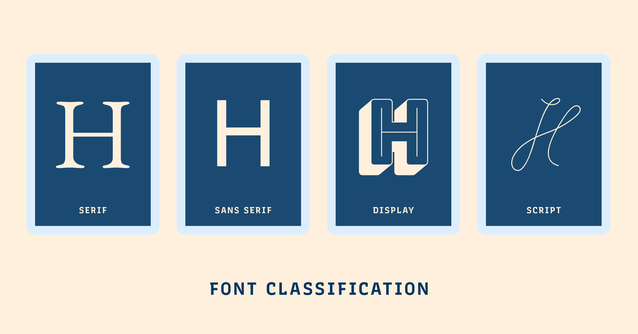
1. Serif Typefaces
The defining characteristic of a serif typeface is the small decorative stroke—or "foot"—at the ends of the main strokes of a letter.
- Characteristics: Traditional, classic, and often seen as formal or elegant.
- Psychology & Use: Serif fonts convey a sense of stability, tradition, and respectability. They are commonly used by institutions that want to appear trustworthy and established, such as banks, universities, and law firms. They are also very common in long-form printed text like books and newspapers because the serifs can help guide the eye along the lines of text.
To get a deeper understanding of serif fonts, including their history, watch this next segment.
The ULTIMATE Guide To Typography For Beginners
The video 'The ULTIMATE Guide To Typography For Beginners' by DesignSpo gives a great overview of serif typefaces and their historical context.
Watch from 00:18 to 02:13. This section explains what serifs are, where they came from, and what feelings they are associated with today.
2. Sans-Serif Typefaces
As the name suggests ("sans" is French for "without"), sans-serif typefaces do not have the small decorative strokes at the end of their letters.
- Characteristics: Modern, clean, and straightforward. The letterforms are often more uniform and geometric.
- Psychology & Use: Sans-serif fonts feel contemporary, informal, and accessible. They are the standard for most digital text (like the text you are reading right now) because their clean lines render clearly on screens of all sizes. Tech companies, startups, and modern brands often use sans-serifs to appear progressive and user-friendly.
Let's continue with the same video to learn about the role of sans-serifs.
The ULTIMATE Guide To Typography For Beginners
This next clip from 'The ULTIMATE Guide To Typography For Beginners' explains the advantages of sans-serif fonts, including their versatility and legibility.
Watch from 02:13 to 03:49. Notice the discussion on why these fonts are so versatile and widely used in modern branding.
Test your understanding!
Look at the logos for Google (a tech company) and Vogue (a legacy fashion magazine).
- Which one uses a serif typeface, and which uses a sans-serif?
- Based on what you've just learned, why do you think each brand made that choice?
Show answer
- Google uses a custom sans-serif typeface. Vogue uses a high-contrast serif typeface (a Didone style).
- Google's sans-serif choice reflects its identity as a modern, accessible, and clean technology brand. The simplicity of the font makes it feel user-friendly. Vogue's serif choice conveys elegance, authority, and a sense of timeless luxury, fitting its status as a high-fashion institution with a long history.
3. Script Typefaces
Script typefaces are designed to look like handwriting or calligraphy, with flowing, connected letters.
- Characteristics: Elegant, personal, and often decorative. They can range from very formal and intricate to casual and playful.
- Psychology & Use: Scripts evoke feelings of artistry, grace, and human touch. Formal scripts are perfect for wedding invitations and luxury branding. Informal, handwritten scripts can feel friendly and are great for quotes, signatures, or brands that want to appear personal and approachable. Because they can be hard to read in small sizes, you should avoid using script fonts for long paragraphs of text.
4. Display Typefaces
This is a broad category for fonts that are designed to be eye-catching and are best used at large sizes.
- Characteristics: Highly stylized, decorative, and full of personality. This category can include fonts of any style (serif, sans-serif, etc.) that are made for headlines rather than body text.
- Psychology & Use: Display fonts are all about making a statement. They are perfect for logos, posters, book covers, and any other application where you need to grab the viewer's attention. Their unique and often complex designs mean they are not suitable for small sizes or long-form reading.
This final clip from the video will clarify the roles of both script and display fonts.
The ULTIMATE Guide To Typography For Beginners
This last segment from 'The ULTIMATE Guide To Typography For Beginners' quickly covers display and script typefaces, highlighting their specific use cases.
Watch from 03:49 to 04:32. Focus on the distinction that display fonts are for titles, while script fonts are for creating an elegant or calligraphic feel.
Deeper Classifications and Reference
Now that you understand the four main categories, it's helpful to have a more structured reference. The world of typography includes many sub-classifications that add more nuance. For example, Slab Serifs are a type of serif font with thick, block-like serifs, often used to create a bold, confident look.
For a concise, well-organized overview of these classifications, the Material Design guidelines from Google are an excellent resource.
The 'Understanding typography' guide from Google's Material Design provides clear, technical definitions of the main type classifications and their sub-categories.
Read the section titled 'Type classification.' It covers Serif (including Slab Serifs), Sans Serif, Handwriting (which includes Script), and Display. You don't need to memorize the sub-types like 'Old-Style' or 'Grotesque' right now, but it's good to be aware that they exist.
Here's a visual summary that brings all these ideas together:

As a final tip, remember that all of the fonts available in Google Fonts are automatically available to you in Figma. As shown in the resource "Web Typography Basics in Figma - Font Classifications" (LINK), you can use the category filters on the Google Fonts website to explore different types of fonts, which is a great way to start training your eye.
Conclusion
Congratulations! You've just taken your first major step into the world of typography. By learning to distinguish between these fundamental typeface classifications, you're building the vocabulary needed to make deliberate and effective design choices.
Here are your key takeaways:
- Serif: Has "feet," feels traditional, stable, and is highly readable in print.
- Sans-Serif: Lacks "feet," feels modern, clean, and is the standard for digital text.
- Script: Mimics handwriting, feels personal and elegant, and is best for short, expressive text.
- Display: Highly decorative and stylized, designed for grabbing attention in headlines and logos.
In our next lesson, we'll build on this foundation. Now that you can identify different types of fonts, you'll learn how to adjust typographic spacing (kerning, leading, and tracking) to make your text perfectly readable and visually balanced.