Hello! Welcome to the first lesson of our third module, "Mastering Color and Typography."
In the last module, you learned the core principles of design and how to critique work using a professional vocabulary. You can now analyze a design's structure, hierarchy, and balance. Today, we begin to explore one of the most powerful and emotive tools in a designer's toolkit: color. Understanding color isn't just about picking shades you like; it's about using a scientific and artistic system to create mood, draw attention, and communicate clearly.
This lesson directly addresses your goal of building a professional skillset by providing the foundational knowledge of color that every designer needs. We will focus on today's learning outcome: to explain the color wheel and create color harmonies (e.g., complementary, analogous).
What is Color Theory?
Before we dive in, let's establish what "color theory" is. It's a set of practical guidelines on how colors mix, match, and contrast with each other. For a graphic designer, it's the framework you'll use to build effective and appealing color palettes for logos, websites, posters, and more.
To get a quick overview of why this is so important in design, let's start with a short article from Figma's resource library.
This article, 'What is color theory?', introduces the topic from a designer's perspective, explaining how color is used strategically to communicate messages and influence emotions.
Please read the first two sections, 'What is color theory?' and 'How color theory works'. This will set the stage for the concepts we're about to cover.
The Color Wheel: Your Map for Navigating Color
The centerpiece of color theory is the color wheel, a tool that organizes colors in a circular way to show the relationships between them. It was first developed by Sir Isaac Newton in the 17th century.
To understand the color wheel, we need to start with its basic building blocks. Let's watch a video that breaks this down clearly.
COLOR THEORY BASICS: Use the Color Wheel & Color Harmonies to Choose Colors that Work Well Together
This video from Sarah Renae Clark provides a great introduction to the color wheel. It explains how all the colors on the wheel are created from just three primary colors.
Watch from the beginning until 01:55. Focus on understanding the difference between Primary, Secondary, and Tertiary colors.
As you just saw, the color wheel is built in three layers:
- Primary Colors: Red, Yellow, and Blue. These are the foundational colors that cannot be created by mixing other colors.
- Secondary Colors: Orange, Green, and Purple. These are created by mixing two primary colors (e.g., Red + Yellow = Orange).
- Tertiary Colors: These are created by mixing a primary color with an adjacent secondary color (e.g., Yellow + Green = Yellow-Green).
Beyond the Basic Hues
The 12 colors on the wheel are just the starting point. Every color also has properties that allow for infinite variations. Understanding these properties is key to creating sophisticated palettes.
The video you just started also explains these properties perfectly.
COLOR THEORY BASICS: Use the Color Wheel & Color Harmonies to Choose Colors that Work Well Together
Let's continue with the same video to learn about the four main qualities of color. This will help you describe and modify colors with more precision.
Watch from 01:42 to 03:05. Pay attention to the definitions of Hue, Saturation, Value, and Temperature.
Let's summarize those four key terms:
- Hue: This is the purest form of a color—essentially, the name of the color itself (e.g., red, blue, green).
- Saturation: This refers to the intensity or vibrancy of a color. A highly saturated color is bright and strong, while a desaturated color is muted and closer to gray.
- Value: This is the lightness or darkness of a color. Adding white creates a lighter value (a tint), and adding black creates a darker value (a shade).
- Temperature: Colors can be perceived as "warm" (reds, oranges, yellows) or "cool" (blues, greens, purples). This has a significant psychological impact, which we will explore more in our next lesson.
Color Harmonies: Formulas for Great Color Schemes
Now that we understand the color wheel, we can use it to create color harmonies—time-tested color combinations that are known to be pleasing to the eye. These "formulas" are your secret weapon for picking colors that work together.
Let's see the most common harmonies in action.
COLOR THEORY BASICS: Use the Color Wheel & Color Harmonies to Choose Colors that Work Well Together
This final segment of the video explains the most common color harmonies. Notice how each one uses a different geometric relationship on the color wheel to select colors.
Watch from 03:05 to 05:04. Focus on understanding how each harmony is constructed: Monochromatic, Complementary, Split-Complementary, Triadic, Tetradic, and Analogous.
To reinforce what you've learned and have a handy text-based reference, the Figma article provides clear descriptions of these harmonies.
This article from Figma clearly defines seven key color schemes. Having this as a reference will be very useful as you start building your own palettes.
Read the section titled '7 harmonious color schemes'. Pay attention to the short descriptions of each scheme: Analogous, Monochromatic, Complementary, Split-complementary, Triadic, Tetradic, and Square.
Here is a visual summary of the most common harmonies you just learned about.
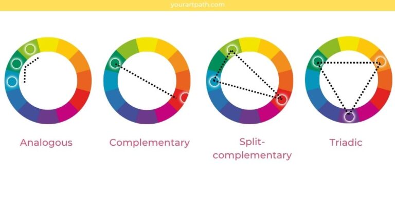
Let’s quickly review the most important ones:
- Analogous: Colors that sit next to each other on the color wheel. They create serene and comfortable designs.
- Complementary: Colors that are directly opposite each other on the color wheel. They create high contrast and are very vibrant.
- Triadic: Three colors that are evenly spaced around the color wheel, forming a triangle. They create vibrant, balanced palettes.
Test your understanding!
Look at the color wheel in the image above. Let's use Blue as our starting color.
- What is its complementary color?
- Name an analogous color scheme starting with Blue.
- What colors would form a triadic harmony with Blue?
Show answer
- Complementary: Orange (it's directly opposite Blue).
- Analogous: Blue, Blue-Green, and Green (or Blue, Blue-Violet, and Violet).
- Triadic: Blue, Red, and Yellow (the three primary colors form a triadic harmony).
Conclusion
Great work today! You've taken your first step into the world of color theory, a topic that blends art and science to create powerful visual experiences. This knowledge is essential for your journey toward becoming a professional designer, as color choices can make or break a design.
Here are the key takeaways from this lesson:
- The color wheel organizes colors and shows their relationships, built from primary, secondary, and tertiary colors.
- Every color has four main properties: Hue (the color itself), Saturation (intensity), Value (lightness/darkness), and Temperature (warm/cool).
- Color harmonies are formulas for creating balanced and visually appealing color palettes. Key harmonies include complementary (opposites), analogous (neighbors), and triadic (evenly spaced).
In our next lesson, we will build on this foundation. We will delve into the psychological impact of color and discuss the technical differences between RGB and CMYK color modes, which is crucial for designing for screens versus print.