Hello! Welcome back to our series on designing for social media.
In our last lesson, we adapted your design skills to the vertical format of Instagram Stories, focusing on creating templates that leave room for interactive elements like polls and quizzes. This was a great step towards thinking strategically as a designer.
Today, we're tackling one of the most common and important challenges in graphic design: applying text overlay techniques to ensure readability over images. You'll often need to place text on top of a photograph for social media posts, ads, or website headers. Your message must be crystal clear, no matter how "busy" the background image is. Mastering this skill is essential for creating professional and effective visual communication.
By the end of this lesson, you will be able to identify and apply several techniques in Figma to make sure your text is always legible and impactful.
1. The Foundation: Contrast and Accessibility
Before we dive into specific techniques, we must start with the single most important principle for text readability: contrast. Contrast is the difference between the text color and the background color. High contrast (like black on white, or white on black) is easy to read. Low contrast (like light grey on white) is difficult to read.
When your "background" is a complex photograph with many different colors and tones, achieving good contrast becomes a design challenge.
Tips to make Text Stand out on Images (Social Media Design & Graphic Design Tips)
To understand this core concept visually, let's watch the first part of the video 'Tips to make Text Stand out on Images' from the Creator Impact channel. The presenter does a great job of explaining why contrast is key and why simple solutions like adding an outline often fail.
Please watch from the beginning until 01:47. Pay close attention to the explanation of why high contrast works and the critique of using outlines on text.
Professional Standards: Accessible Contrast
For professional work, relying on "what looks good" isn't enough. We need to meet accessibility standards to ensure people with visual impairments can read our designs. The Web Content Accessibility Guidelines (WCAG) provide specific contrast ratios to aim for.
The Ultimate Guide to Overlaying Text on Images
The article 'The Ultimate Guide to Overlaying Text on Images' from Okzest provides a concise summary of these professional standards.
Please read the subsection titled 'Contrast and Readability'. You don't need to memorize the numbers, but focus on the key idea: there are established minimum ratios for normal and large text. This is a crucial part of designing responsibly.
The key takeaways are:
- Normal text: Aim for a contrast ratio of at least 4.5:1.
- Large text: Aim for a contrast ratio of at least 3:1.
You can use a free online tool like the WebAIM Contrast Checker to check the ratio between your text color and a background color. When working with images, you can sample the color directly behind your text to get an approximate check.
2. Five Techniques for Readable Text on Images
Now that we understand the goal is to create contrast, let's explore five effective techniques to achieve it. You can see many of these techniques in action in the examples below.
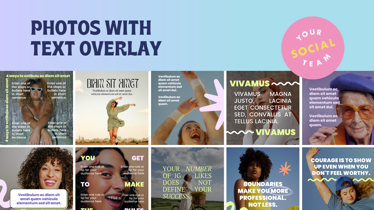
Let's break these techniques down one by one. The article "Designing Accessible Text Over Images" from Smashing Magazine is an excellent resource that we will refer to throughout this section.
Designing Accessible Text Over Images: Best Practices ...
We'll use this article as our guide. For now, just have it open and ready. We'll read specific sections as we discuss each technique.
You don't need to read anything just yet. We will refer to specific parts of this article as we go.
Technique 1: Find the "Copy Space"
This is the simplest approach. Instead of fighting a busy background, find a "quiet" one. Copy space is an area of an image that is naturally uncluttered and has a relatively uniform tone, making it a perfect spot for text. This could be a clear sky, a plain wall, or a patch of calm water.
- How it works: You place your text directly onto the image in this clear area.
- When to use it: When your chosen image has a natural area of low detail. This requires careful image selection.
Now, read the section on this technique in the Smashing Magazine article.
Designing Accessible Text Over Images: Best Practices ...
Let's read about Copy Space.
In the article, find and read the section titled 'Find And Use That Space (Copy Space)'. Look at the examples to see how designers position text in these 'empty' areas.
Technique 2: The Color Overlay
What if your image has no copy space? The next technique is to create your own by applying a semi-transparent color layer over the entire image. A dark overlay with white text is most common, but you can also use a light overlay with dark text, or even a brand color.
- How it works: You place a colored shape (usually a rectangle) over the entire image and reduce its opacity. This mutes the details of the photo and creates a more uniform background for your text.
- When to use it: This is a very versatile technique that works on almost any image, especially busy ones.
Read the corresponding section in the article.
Designing Accessible Text Over Images: Best Practices ...
This is one of the most common and effective techniques.
Find and read the section 'Using An Overlay Technique Over The Entire Image'.
Technique 3: The Scrim (Gradient Overlay)
A scrim is a more subtle and often more elegant version of the full overlay. Instead of a flat color, you use a gradient that fades from semi-transparent to fully transparent. This allows you to create a high-contrast background for your text while leaving other parts of the image untouched.
- How it works: You place a gradient over part of the image, usually starting from an edge or corner. The text goes on the most opaque part of the gradient.
- When to use it: When you want to preserve the beauty of the image but need a clean area for text, often for headlines or captions at the top or bottom of a design.
Let's see this technique in the article.
Designing Accessible Text Over Images: Best Practices ...
The scrim is a favorite of many designers for its professional look.
Find and read the section 'Text With Scrim Overlay'.
Technique 4: The Solid Block or Strip
This is a very direct and bold way to ensure readability. You simply place a solid shape (like a rectangle) behind your text. This shape can be opaque or semi-transparent. It functions like a label or a banner for your text.
- How it works: You layer a shape between your text and the background image. This completely separates the text from the complexity of the photo.
- When to use it: When the text is the most important element and you want it to have maximum impact and clarity. It creates a strong, graphic look.
Designing Accessible Text Over Images: Best Practices ...
This technique is straightforward and highly effective.
Find and read the section 'Strips/Highlight Technique'.
Technique 5: Blur the Background
Another way to reduce the "busyness" of a photo is to apply a blur effect. By blurring the background image, you soften the hard edges and complex details, making the sharp text in the foreground stand out clearly.
- How it works: You apply a layer blur effect to the image itself. The text remains sharp on top.
- When to use it: This works well for hero images or backgrounds where the image serves more as a textural or atmospheric element rather than a specific subject.
Designing Accessible Text Over Images: Best Practices ...
Blurring is a simple but powerful effect for creating depth and focus.
Find and read the section 'Text Over Blurred Background Effect Of The Entire Image'.
Test your understanding!
You are designing a social media post using a very busy photo of a crowded market. You want the headline "Fresh Finds Weekly" to be the main focus. Which two techniques would be most effective and why?
Show answer
The Color Overlay or the Solid Block would be most effective. A busy market photo likely has no natural "Copy Space." A full overlay or a solid block behind the text would effectively block out the visual noise of the market, guaranteeing high contrast and making the headline the undeniable focus of the design. A scrim or blur could also work, but the overlay/block provides the most certainty on a very complex image.
3. Practical Application in Figma
Knowing the theory is great, but let's see how to actually do this in Figma. The process for most of these techniques is quite simple.

Here's how you can create three of these effects in Figma:
1. To Create a Color Overlay:
- Place your image on the canvas.
- Draw a Rectangle (
R) that covers the entire image. - In the Fill panel on the right, choose a color (e.g., black).
- In the Layer panel, change the opacity from 100% to something lower, like 40% or 60%, until you achieve the desired effect.
- Place your text layer on top of this overlay layer.
2. To Create a Scrim (Gradient):
- Draw a Rectangle (
R) over the area where you want the text. - In the Fill panel, click the color swatch. In the top-left of the pop-up, change
SolidtoLinear. - You'll see two color stops on the gradient bar.
- Click the first stop (left) and set its color to black. Make sure its opacity slider (the bottom bar) is at 100%.
- Click the second stop (right) and set its color to black as well, but drag its opacity slider down to 0%.
- You can rotate the gradient line directly on your shape to change its direction (e.g., from bottom to top).
- Place your text over the more opaque part of the gradient.
3. To Blur the Background:
- Select your image layer.
- In the right-hand sidebar, go to the Effects panel and click the
+icon. - It defaults to
Drop shadow. Click this and change it toLayer blur. - Click the sun icon to adjust the blur settings. Increase the
Blurvalue until the image is softened enough for your text to be readable. A value between 8 and 20 is often a good starting point. - Place your sharp text layer on top.
4. Your Turn: Experiment with Overlays
Now it's time to apply these techniques.
Your Task:
- Go to a free stock photo website like Unsplash, Pexels, or Pixabay and find a visually busy photograph. A picture of a cityscape, a forest, or a market would be perfect.
- Choose a short quote. For example: "Creativity is intelligence having fun."
- In Figma, create two frames, both with your chosen image.
- On the first frame, place the quote on the image using the Color Overlay technique.
- On the second frame, place the same quote on the image using the Scrim technique.
- Adjust the opacity and gradient settings to make the text as readable and aesthetically pleasing as possible in both versions.
This exercise will help you get a feel for how different techniques change the mood of a design and which ones work best for different situations.
Conclusion
Great job today! You've learned not just how to put text on an image, but how to do it effectively, professionally, and accessibly. This is a fundamental skill that you will use in almost every project you tackle as a graphic designer.
Key Takeaways:
- Contrast is non-negotiable for text readability.
- You can use online tools to check for accessible contrast ratios (WCAG).
- You now have a toolkit of five reliable techniques: Copy Space, Color Overlay, Scrim, Solid Block, and Background Blur.
- Each technique can be easily implemented in Figma to solve the problem of busy backgrounds.
In our next lesson, we will design a professional LinkedIn post graphic. You'll get to apply the layout, composition, and text overlay skills you've just learned to create a design tailored for a more corporate and professional audience.