Hello! Welcome back.
In our last lesson, we focused on the crucial skill of applying text overlays to ensure readability on busy images. That's a technique you'll use constantly, and today, you'll get a perfect chance to put it into practice.
We're now shifting our focus to a specific platform: LinkedIn. Your goal for this lesson is to design a professional LinkedIn post graphic. While platforms like Instagram can be very visual and trend-driven, LinkedIn is a professional network. This means your designs need to be clean, credible, and communicate value clearly. Mastering this style is a key step toward your goal of becoming a working graphic designer.
We'll cover the correct technical specifications for LinkedIn, look at what makes a design effective for a professional audience, and then you'll create your own post graphic in Figma.
1. The Rules of the Road: LinkedIn Post Specifications
Before you start designing, you must know the technical constraints of the platform. Designing to the wrong size can result in your work being awkwardly cropped, looking unprofessional, and undermining your message.
For LinkedIn, there are a few key dimensions to know, but we'll focus on the most versatile and effective one for single-image posts.
LinkedIn Posts Specs: A Complete Guide to Dimensions ...
To get the official specifications, let's consult the article 'LinkedIn Posts Specs: A Complete Guide to Dimensions ...' from Postiv.ai. This is a great reference for the technical side of design.
Please read two short sections from this article: Start at the heading 'Getting Your LinkedIn Image Dimensions Just Right' and read through the subsection 'Mastering Single Image Posts'. Pay close attention to the recommended pixel dimensions for the square format. Then, jump to the FAQ section at the end and read the answer to the question 'What Is the Best Image Size to Avoid Cropping?'. This will give you a clear and reliable starting point.
As you've just read, the key takeaways for a single-image post are:
- Square (1:1 Aspect Ratio): The recommended size is 1200 x 1200 pixels. This is the most reliable format, as it displays well on both desktop and mobile without unexpected cropping. We will use this for our project.
- Vertical (4:5 Aspect Ratio): A size like 1080 x 1350 pixels is also a great option. It takes up more vertical space on mobile feeds, which can help grab attention. However, you must keep key information centered, as the top and bottom might be slightly cropped on the desktop view.
Here's a helpful visual summary of common LinkedIn post sizes. You can see our target format, the Square Post, on the top left.

2. Anatomy of a Professional LinkedIn Graphic
A LinkedIn graphic isn't just about looking good; it's about communicating information efficiently. Most effective posts share a similar structure designed for clarity and quick comprehension. They typically include:
- A strong headline: The main takeaway or topic.
- Supporting points: Bullet points, short sentences, or key data.
- Clear visual hierarchy: Using size, weight, and color to guide the reader's eye.
- Branding: Your logo or name, and consistent brand colors/fonts.
- Whitespace: Ample space around elements to avoid a cluttered look and improve readability.
Take a look at the following image, which shows a variety of templates for square LinkedIn posts. Notice how they all use these core components to create clean, organized, and professional layouts.
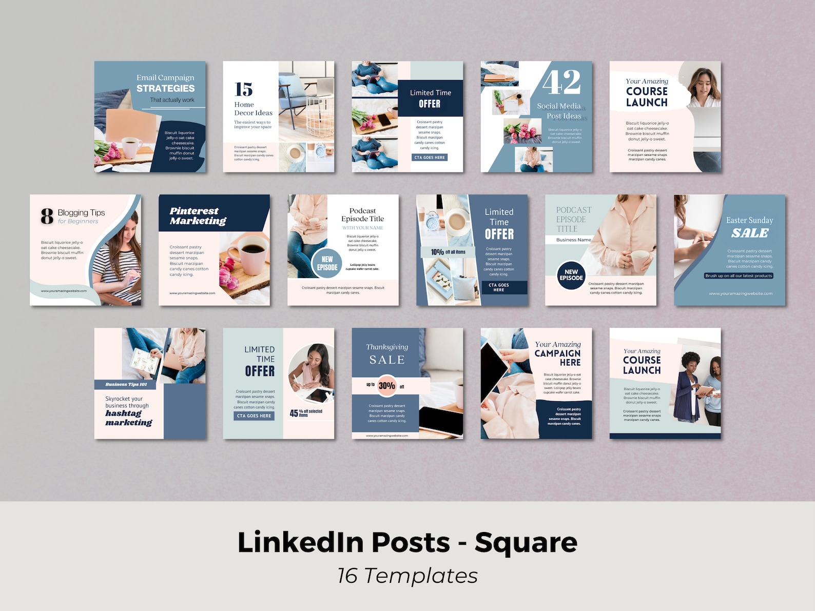
Test your understanding!
Look at the image above with the 16 templates. Pick the template in the second row, third from the left (the dark blue one that starts with "Grow Your Business"). Can you identify the headline and the supporting points? How does the design use hierarchy?
Show answer
- Headline: "Grow Your Business" is the main headline. It's the largest and boldest text, immediately grabbing your attention.
- Supporting Points: The three points below ("Target the right audience," "Engage with your audience," "Create a sales funnel") are the supporting details. They are smaller and have less weight than the headline.
- Hierarchy: The design guides your eye from the main benefit ("Grow Your Business") to the specific ways to achieve it. The numbering (01, 02, 03) also helps structure the information clearly.
3. Finding Inspiration for Professional Design
Seeing how other professionals design for LinkedIn is one of the best ways to learn. Figma itself provides excellent resources and examples.
Social Media Guide: Design Tips for Posts & Ads
Figma has a resource library that includes an article with great LinkedIn post examples. Looking at these will give you a strong sense of the current design standards on the platform.
In this resource, find the link titled '11 LinkedIn post examples + templates to inspire standout content' and click 'Read article'. As you scroll through the examples, notice: How they use grids to align text. The use of simple color palettes. How they apply the text-on-image techniques we covered in the last lesson (like overlays and solid blocks).
4. Your Turn: Design a LinkedIn Post Graphic
Now it's time to combine everything you've learned—hierarchy, alignment, contrast, and text overlays—into a single, professional graphic.
Your Design Brief:
You need to create a graphic for a fictional productivity coach. The purpose of the post is to share a simple, valuable tip.
- Headline:
The 2-Minute Rule - Supporting Text:
If a task takes less than two minutes to complete, do it immediately. - Branding: Use a simple, clean aesthetic. You can invent a name for the coach (e.g., "Jane Doe | Productivity Coach").
- Format: 1200 x 1200 pixels.
Step-by-Step Guide in Figma:
-
Set Up Your Canvas:
- Open Figma and create a new design file.
- Press
Fto select the Frame tool. In the right sidebar, enter1200for both width (W) and height (H).
-
Establish Hierarchy with Text:
- Press
Tfor the Text tool. Type out the headline: "The 2-Minute Rule". - Choose a clean, professional sans-serif font (like Inter, Montserrat, or Lato).
- Make the headline large and bold to establish it as the primary focus. For a 1200px frame, a font size between 80-120px is a good starting point.
- Add the supporting text in a separate text box. Use the same font but at a much smaller size (e.g., 24-32px) and a lighter weight (e.g., Regular or Medium).
- Press
-
Create a Professional Layout:
- Align your text. A center alignment can work well for a simple post like this. Use the alignment tools at the top of the right sidebar to ensure everything is perfectly centered.
- Ensure there is plenty of whitespace. Don't push your text to the very edges of the frame. Imagine an invisible margin around your content.
- Add the coach's name at the bottom, smaller than the rest of the text, to act as a signature.
-
Add Visual Interest & Color:
- This is a great place to apply a technique from our last lesson. You could find a subtle, professional background image (e.g., a clean desk, a notebook) on Unsplash or Pexels and apply a Color Overlay or a Scrim to ensure your text is readable.
- Alternatively, you can keep it simple with a solid or gradient background. Choose a professional color palette—a dominant color (like a corporate blue or a calm green) and a neutral (like light grey or off-white) works well.
-
Review and Refine:
- Zoom out and look at your design. Is the hierarchy clear? Is it easy to read in under 3 seconds?
- Check for consistent spacing and alignment. Use Figma's red guide lines to help you.
- Ask yourself: "Does this look like it belongs on a professional network?"
This project is a direct application of the core design principles we've covered and is a tangible piece you can build upon for your portfolio.
Conclusion
Excellent work! You've successfully navigated the specific requirements of designing for a professional platform. You've learned that effective design for LinkedIn is less about flashy graphics and more about clarity, professionalism, and the efficient communication of value.
Key Takeaways:
- Always start with the correct technical specifications. For LinkedIn, a 1200x1200 pixel square is a robust and versatile format.
- Professional graphics prioritize clarity, readability, and a strong visual hierarchy.
- The principles of alignment, contrast, and whitespace are essential for creating a clean and credible design.
- You can apply text overlay techniques to create sophisticated and readable posts that combine text and imagery.
In our next lesson, we will build directly on this exercise. You'll learn how to design a 3-slide social media carousel post. The graphic you just designed could easily serve as the first slide in a series, allowing you to tell a more detailed visual story.