Hello! Welcome back to the course.
In our last lesson, you designed a professional graphic for LinkedIn, where the main goal was clarity and credibility. Today, we're tackling a different beast: YouTube. Your objective for this lesson is to design an engaging YouTube thumbnail that captures attention.
While principles like hierarchy and alignment are still important, the primary job of a YouTube thumbnail is to stop someone from scrolling. It competes in a visually noisy environment, so it needs to be powerful, intriguing, and instantly understandable. This lesson will focus on the psychology and design techniques that make a thumbnail "clickable," a crucial skill for any designer working with digital content.
Let's get started.
1. The Foundation: Specs and Psychology
Before we dive into creative strategies, let's get the technical details right. Just like with LinkedIn, starting with the correct canvas size is non-negotiable.
The official Figma resource library has a handy guide on YouTube assets. We'll use it to confirm the correct dimensions.
Please read the first two sections of this guide: 'YouTube thumbnail size' and 'YouTube thumbnail maker'. Focus on the recommended dimensions and the mention of Figma's free thumbnail presets, which are a great starting point.
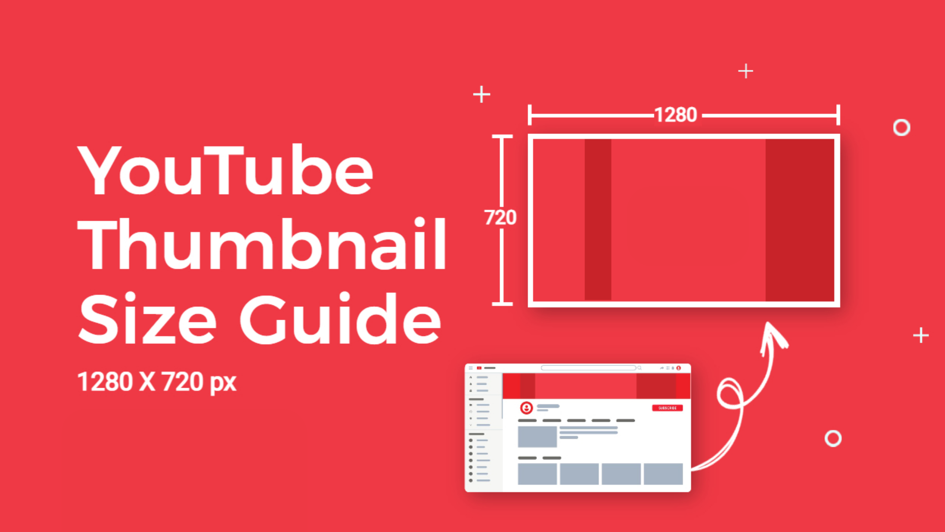
As the guide states, the standard for a YouTube thumbnail is:
- Dimensions: 1280 x 720 pixels
- Aspect Ratio: 16:9
Now for the most important part. Top YouTubers and designers agree: a great thumbnail is about 80% psychology and 20% design. People don't click on a pretty picture; they click on a video they want to watch. The design's job is to trigger that desire.
The two core psychological drivers are curiosity and attention. Let's see how they work.
how to make a killer thumbnail (for the 2025 algorithm)
To understand the psychology of a click, we'll watch a segment from the video 'how to make a killer thumbnail' by Aprilynne Alter. She breaks down the concept of a 'curiosity gap' masterfully.
Watch the section from 01:58 to 06:13. Pay close attention to the definition of a 'curiosity gap' and the five types of thumbnails that create it: moment, story, result, transformation, and novelty.
By creating a gap between what the viewer knows and what they want to know, you create an "itch" that can only be "scratched" by clicking. Before you even think about colors or fonts, your first question should always be: What curiosity gap am I creating?
2. The Anatomy of an Attention-Grabbing Thumbnail
Once you have a strong curiosity gap, your next job is to make sure people actually see your thumbnail. This is where the design comes in. Your design must act as a "visual stun gun," stopping the viewer mid-scroll.
Let's explore the key design components that achieve this.
how to make a killer thumbnail (for the 2025 algorithm)
We'll return to Aprilynne Alter's video to learn about the 'three C's' of thumbnail design. This is a simple but powerful framework for structuring your thumbnail.
Please watch from 07:00 to 21:53. This is a longer but very valuable segment. Focus on understanding: Scroll Stoppers: The elements that our brains are primed to notice (faces, emotion, bright colors, etc.). Contents: The concept of a 'main character' and 'supporting characters'. Composition: How layout, hierarchy, and text guide the viewer's eye. Contrast: The critical role of luminosity, saturation, and hue in making a thumbnail 'pop'.
That was a lot of information, so let's distill it into a practical checklist. The following resource is a fantastic summary of best practices compiled from numerous experts.
I Obsessively Studied the Best YouTube Thumbnails and ...
This Reddit post, 'I Obsessively Studied the Best YouTube Thumbnails...', is an excellent, concise checklist. You don't need to read the whole thing now, but we'll reference its key rules.
Quickly scan these three short sections: 'Elements': Note the '3 Element Rule'. 'Text': Pay attention to the '4 Words Maximum' rule and font recommendations. 'No Man’s Land': Look at the advice to avoid the lower right corner.
Summary of Key Design Rules:
- Simplicity is King: Stick to the 3-Element Rule. A typical combination is a face/subject, a key graphic, and a short text phrase.
- High Contrast: Use bright, saturated colors that stand out. Contrast light elements against dark backgrounds (and vice-versa).
- Clear Hierarchy: Have one dominant "main character" (the focal point). Everything else should support it.
- Bold, Readable Text: Use a maximum of 4 words. The font should be a thick, bold, sans-serif. Add a stroke (outline) or a shadow to make it pop.
- Strategic Composition: Use the Rule of Thirds. And crucially, avoid putting important elements in the bottom-right corner, as the video timestamp will cover them.
Test your understanding!
Imagine you're making a thumbnail for a video titled "I Baked a GIANT Cookie." Based on the principles you just learned, which of these thumbnail concepts is likely to be most effective and why?
A. A photo of you smiling next to a mixing bowl, with the text "Baking a Giant Cookie!"
B. A close-up shot of the giant, freshly-baked cookie taking up most of the frame, with you in the background looking shocked. The text simply says "IT'S HUGE!"
C. A collage of 10 different types of cookies, with the text "My Ultimate Cookie Recipe."
Show answer
Concept B is the most effective.
- Curiosity Gap: It's a "Result" thumbnail. The viewer sees the amazing result and wants to know how you did it.
- Scroll Stopper: A giant cookie is novel, and a shocked face expresses strong emotion.
- Hierarchy: The cookie is the clear "main character." Your shocked face is a "supporting character" that adds emotion.
- Text: The text "IT'S HUGE!" is short, punchy, adds to the emotion, and doesn't just repeat the title.
Concept A is okay, but less powerful. Concept C is too busy (violates the 3-element rule) and the message is less focused.
3. Your Turn: Design a YouTube Thumbnail in Figma
It's time to put theory into practice. You'll design a thumbnail for a fictional tech tutorial aimed at designers.

Your Design Brief:
- Video Concept: A tutorial revealing a little-known Figma trick.
- Video Title: The Figma Trick Nobody is Talking About
- Thumbnail Goal: Create a "Novelty" or "Result" curiosity gap. Make the viewer think, "What is that trick? I need to know!"
Step-by-Step Guide:
-
Set Up Your Canvas:
- In Figma, press
Fto select the Frame tool. In the right sidebar, choose the "Social Media" category and select YouTube Thumbnail (1280x720).
- In Figma, press
-
Brainstorm Your Concept:
- How can you visually represent a "secret trick"?
- Idea 1 (Result): Show a "before" (a messy, complicated process) and an "after" (a clean, simple result). You could use simple shapes and arrows to represent this.
- Idea 2 (Novelty): Create a compelling and strange visual. For example, combine the Figma logo with a question mark or a keyhole graphic.
- Let's go with Idea 2 for this exercise.
-
Assemble Your Elements (3-Element Rule):
- Element 1 (Main Character - Text): Press
Tand type1 SECRET. Choose a very bold, thick sans-serif font (like 'Inter' Black or 'Montserrat' ExtraBold). Make it huge. - Element 2 (Supporting Graphic): Find a high-quality Figma logo (you can use a plugin like "Logos" or find an SVG online and drag it in).
- Element 3 (Supporting Graphic/Emotion): Let's add an element to create intrigue. You could add a large, stylized question mark
?behind the Figma logo.
- Element 1 (Main Character - Text): Press
-
Compose and Add Contrast:
- Arrange your elements using an asymmetrical layout. Place the "1 SECRET" text on the left two-thirds of the frame. Place the Figma logo and question mark on the right.
- Create a dark background. A dark gray or a dark gradient works well.
- Make your text and graphics POP. Select the Figma logo and give it a bright Outer Glow effect (
+next to Effects, choose Drop Shadow, then change the settings to a bright color with 0 X/Y offset and high blur). - Select your text. Give it a bright color. In the "Stroke" panel, add a black outline of about 4-8px to make it stand out against any background.
-
Final Polish and Shrink Test:
- Make sure nothing important is in the bottom-right corner.
- Shrink Test: Zoom out until the thumbnail is about the size it would be on a phone screen. Is it still instantly clear? Can you read the text? If not, make your elements bigger and increase the contrast.
Conclusion
Fantastic work! You've just designed a thumbnail based on the same psychological and design principles used by the most successful creators on YouTube. You've moved beyond just making something look nice and have started to think like a communication strategist.
Key Takeaways:
- A great thumbnail starts with a strong curiosity gap.
- The design's job is to be a "visual stun gun" using scroll-stopping elements like emotion, contrast, and novelty.
- Follow the 3 C's of Design: prioritize your Contents, perfect your Composition, and maximize your Contrast.
- Keep it simple and readable by adhering to the 3-Element Rule and using minimal, bold text.
- Always perform a Shrink Test to ensure your design works at a small size.
In our next lesson, we will combine the skills from the last two lessons. You'll learn how to design a 3-slide social media carousel post, which requires you to tell a simple visual story across multiple connected graphics.