Hello! Welcome back to the next step in your graphic design journey.
In our last lesson, you did a fantastic job creating a reusable Instagram post template for "Aura Coffee" by mastering Figma's Styles and Components. You learned how to build a system for consistency, which is a core professional skill.
Today, we will adapt those skills to a different, highly popular format. Our goal is to design an Instagram Story template with interactive elements in mind. We'll move from the square post to the vertical Story, and more importantly, we'll learn how to design layouts that invite audience participation. This is key to creating engaging content that gets results for clients.
1. The Anatomy of an Effective Instagram Story
Designing for Instagram Stories isn't just about changing the canvas size. It's a unique format with its own rules and opportunities. Let's break down the three most important considerations.
a) Dimensions and Safe Zones
First, the basics. An Instagram Story uses a vertical aspect ratio. The standard size is 1080 pixels wide by 1920 pixels tall.
More importantly, not all of that space is visible. Instagram overlays its own user interface (UI) on top of your design. This includes your profile picture and name at the top, and the "Send message" bar at the bottom. Any content you place in these areas might be cut off or difficult to see.
The area free from these elements is called the "Safe Zone."
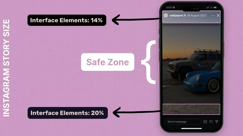
As a rule of thumb, avoid placing logos, key text, or interactive buttons in the top ~15% and bottom ~20% of your design.
Test your understanding!
You've designed a beautiful Story with a 'Tap here!' call-to-action placed at the very bottom edge of your 1080x1920 frame. What is the likely problem with this placement when it's uploaded to Instagram?
Show answer
The call-to-action will likely be obscured or completely covered by Instagram's 'Send message' or 'Reply' bar, making it invisible or unusable for viewers.
b) Designing for Interaction
Instagram Stories are powerful because they are interactive. As a designer, you don't add the interactive elements (like polls or quizzes) in Figma. You design a visual background and layout that accommodates them. You create the stage; the client or social media manager adds the actors in the Instagram app.
This means leaving intentional blank space for these elements and using your design to draw attention to them.

To understand what you need to design for, it's helpful to know what interactive "stickers" are available in Instagram.
A complete guide to creating an Instagram Story
The article 'A complete guide to creating an Instagram Story' from Canva provides an excellent overview of the various interactive stickers you can design for. We'll focus on the most common ones.
Please read the following sections to understand the types of interactive elements you can build templates for: Start at the heading 'How to boost engagement on Instagram Stories' to get a general introduction. Read the sections 'How to make Instagram Story questions' and 'How to do a poll on your Instagram Story'. Finally, read 'How to add links on your Instagram Story'. Focus on what the sticker does and what it looks like, as this will inform how you design around it.
2. Practical Walkthrough: Building a Story Template
Now let's see how these principles are applied in Figma. We're going to watch a professional designer create a complete, multi-slide Instagram Story template. This will tie together the concepts of safe zones, brand consistency, and layout in a vertical format.
The video uses a real estate brand, but the techniques—using brand assets, masking images, and structuring layouts—are universal and directly applicable to your "Aura Coffee" brand.
How to Design Social Media Templates in Figma
This section of the 'How to Design Social Media Templates in Figma' video by Envato Tuts+ is a perfect step-by-step guide for our learning outcome today. You'll see how to build a four-slide story from scratch.
Please watch from 33:25 to 55:13. As you watch, pay close attention to: Frame Setup: How he sets up the 1080x1920px frames. Consistency: How he reuses colors, fonts, and shape styles from the brand kit to make the four slides feel like part of a single, cohesive story. Layout & Hierarchy: How he arranges images and text to guide the viewer's eye through the vertical space. Visual Cues: Notice the arrow he adds at the bottom. This is a simple design element that encourages the user to interact by tapping to the next slide.
3. Your Turn: Design an Interactive Story Template
It's time to put your skills to the test. Your task is to design a single-slide Instagram Story template for "Aura Coffee" that is specifically made for a "This or That" poll.
The Goal: Create a template where "Aura Coffee" could ask their audience to vote on their favorite drink, for example, "Espresso vs. Filter Coffee".
Instructions:
- Open your "Aura Coffee" brand file in Figma.
- Create a new Frame (
F) and select the "Instagram Story" preset (1080x1920). - Using your "Aura Coffee" Color Styles, Text Styles, and logo Component, design a background for the poll.
- Add a headline, such as "Which do you prefer?" or "Help us decide!".
- Divide the screen visually into two halves (e.g., left and right, or top and bottom).
- On one side, add the text "Espresso" and maybe a small icon or image of an espresso.
- On the other side, add the text "Filter Coffee" and a corresponding visual.
- Crucially, leave a clear, balanced space in the middle or below the headline where the Instagram Poll Sticker would be placed. You can draw a simple grey rectangle as a placeholder for the poll itself.
- Make sure all your important text and visuals are within the Safe Zone.
This exercise will test your ability to not only apply brand assets but also to think like a strategist by designing with the final, interactive use-case in mind.
Conclusion
Excellent work today! You've taken your template-building skills to a new format and added a critical layer of strategic thinking. Understanding how to design for interaction is what separates a good designer from a great one in the world of social media.
Key Takeaways:
- Instagram Stories use a 1080x1920px vertical format.
- The Safe Zone is the central area where critical content must be placed to avoid being covered by Instagram's UI.
- Designing for interaction involves creating a visual context and leaving dedicated space for elements like polls, quizzes, and link stickers that are added later.
- Brand consistency is just as important across multi-slide Stories as it is for individual posts.
In our next lesson, we will tackle a common challenge in social media design: applying text overlay techniques to ensure readability over images. This skill is essential for creating striking designs where your message is always clear, no matter how busy the background photo is.