Hello! Welcome to your next lesson in building your professional identity.
In our last session, we focused on how to tell a compelling story about your design work by writing a great project description. This is crucial for showing potential clients how you think. Today, we're going to create the visual cornerstone of your professional brand: your personal logo.
This lesson directly addresses your goal of becoming a professional graphic designer by having you design a personal logo or monogram for your freelance identity. A personal logo acts as your unique signature. It builds credibility, makes your portfolio and communications look more professional, and is the first piece of design that is truly yours.
Let's get started on creating a mark that represents you as a designer.
1. Defining Your Personal Brand
Before you draw a single line, you need a strategy. A logo is a visual solution to a communication problem. For a personal logo, the problem is: "How do I visually communicate my professional identity to potential clients?"
To answer this, you first need to define that identity. This process is like writing a brief for yourself as the client.
How To Design a Logo in 5 Simple Steps
The first step in any logo design process is understanding the brand's identity. This article from Figma, 'How To Design a Logo in 5 Simple Steps,' provides an excellent set of questions to guide this discovery phase.
Please read the section 'Step 1: Brainstorm and find inspiration,' focusing on the subsection 'Understand your brand identity.' As you read, think about how you would answer those questions for your own freelance identity.
Take a moment to answer these questions for yourself:
- Who is my target audience? (e.g., small startups, local restaurants, tech companies, artists?)
- What is my core message? (e.g., I create clean and modern designs; I offer creative and bold solutions.)
- What adjectives describe my style? (e.g., minimalist, playful, corporate, elegant, technical.)
- What are my values as a designer? (e.g., reliability, creativity, speed, collaboration.)
Answering these will form the foundation for all your design decisions.
2. Choosing Your Logo Type: Wordmark, Monogram, or Something Else?
Once you have a sense of the identity you want to project, you can decide on the type of logo that will best represent it. For a personal brand, designers often use their name or initials.
- Wordmark (or Logotype): A logo that is just your name, styled in a specific typeface. (e.g., Google, Coca-Cola). This is a great option if you have a unique name.
- Lettermark (or Monogram): A logo created by combining two or more of your initials into a single symbol. (e.g., HBO, Louis Vuitton). This is perfect for simplifying a longer name and creating a compact, memorable mark.
A guide to the monogram design process
To understand these types better, let's look at a guide focused specifically on monograms. This will help you see how initials can be transformed into a unique design.
Read the first two sections, 'What is a monogram?' and 'When do monograms work best?'. Notice the distinction between a simple row of initials and a true monogram, where the letters are integrated into a single motif.
For your freelance identity, a monogram is an excellent choice. It’s personal, works well in small spaces like social media avatars or as a portfolio watermark, and can look very sophisticated.
3. The Design Process: From Sketch to Vector
Now for the creative part. The best logos are born from exploration, and that exploration should always start on paper.
Step 1: Sketch, Sketch, Sketch!
Resist the urge to jump straight into Figma. Working with a pencil and paper is faster, freer, and allows you to generate many ideas without getting bogged down by digital tools. The goal here is quantity over quality.
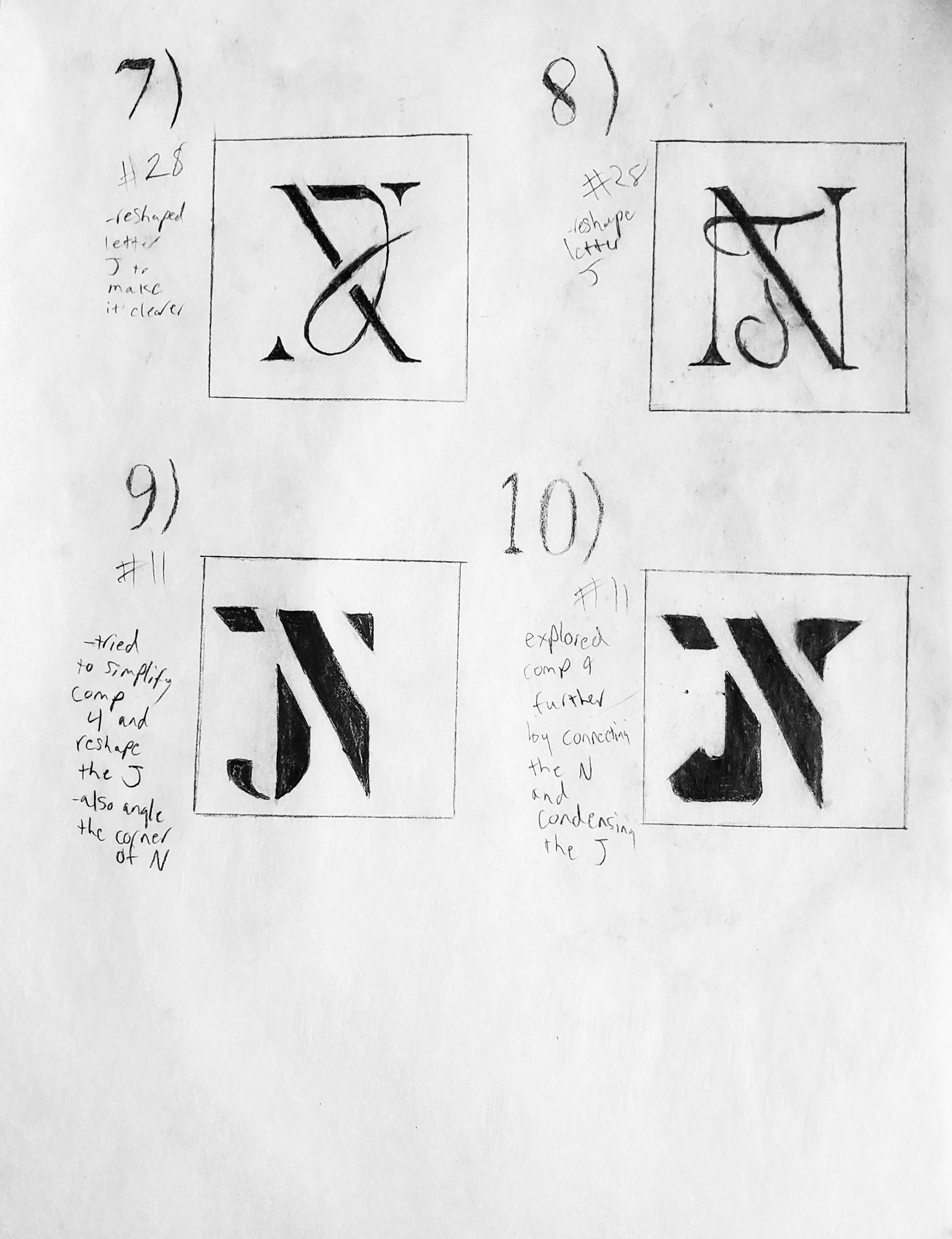
Your Task (10 minutes):
Grab a pen and paper. Based on the initials of your name, sketch at least 10 different ideas for a personal monogram. Try different approaches:
- Have the letters overlap.
- Let one letter form part of another.
- Place them inside a shape (circle, square).
- Use negative space to define a letter.
- Experiment with different styles (blocky, cursive, abstract).
Step 2: Evaluating Your Ideas
Once you have a page full of sketches, you need a way to decide which ones are the most promising. A strong logo abides by a few key principles.
The ONLY Logo Design Guide You’ll EVER Need (2025 Edition)
The video 'The ONLY Logo Design Guide You’ll EVER Need' by Satori Graphics provides a fantastic summary of the four 'golden rules' of logo design. These will help you evaluate your sketches.
Watch from 00:05 to 02:50 to learn about Simplicity, Versatility, Memorability, and Scalability. Then, watch the section on shape psychology from 04:38 to 05:47 to consider how the shapes in your sketches might be perceived.
As you look at your sketches, ask yourself:
- Is it simple? Can it be recognized at a glance?
- Is it memorable? Does it have a unique quality?
- Is it versatile and scalable? Will it work in black and white? Will it be clear when it's tiny (like a favicon on a browser tab)?
Choose your top 1-3 sketches that best meet this criteria and align with the personal brand identity you defined earlier.
Step 3: Digitizing in Figma
Now it's time to bring your best concept to life in Figma. You'll use the vector tools you learned about in Module 5.
- Take a photo of your chosen sketch and import it into Figma.
- Lock the image layer and lower its opacity.
- Using the Pen Tool (
P) and Shape Tools (R,O,L), trace over your sketch to create clean vector paths. - Use Boolean Operations (Union, Subtract, Intersect, Exclude) to combine and cut shapes to form your monogram.
- Refine the anchor points and bezier curves until the form is smooth and balanced.
Test your understanding!
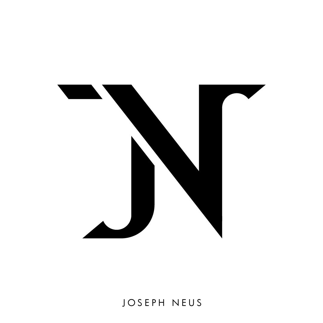
Look at the final 'JN' monogram above. Which of the four golden rules (Simplicity, Versatility, Memorability, Scalability) does it demonstrate well, and why?
Show answer
The logo demonstrates all four rules well:
- Simplicity: It uses clean lines and a clear form without any unnecessary details.
- Versatility: It's a single-color design that would work equally well in black on white or white on black.
- Memorability: The clever integration of the 'J' into the 'N' creates a unique and memorable "aha" moment.
- Scalability: Because of its simple, bold shapes, it would remain clear and recognizable even at very small sizes.
4. Refining and Testing Your Design
A vector draft isn't the end. The final stage is about refinement and testing to ensure your logo is robust.
- Design in Black and White First: As recommended in the 99designs article, always finalize your logo's form in black and white before adding color. A strong logo doesn't depend on color to work.
- Choose Colors and Typography: If your logo will include your full name, select a typeface that complements the mark and aligns with your brand personality. Choose a simple color palette (1-2 colors is often best) that reflects the adjectives you chose in step 1.
- Test Your Logo: You don't need a focus group to test your logo. You can do it yourself right in Figma.
The ONLY Logo Design Guide You’ll EVER Need (2025 Edition)
Let's return to the Satori Graphics video to learn three simple but powerful tests you can run on your design.
Watch from 07:17 to 08:53 to learn about the 'blur test,' the '5-second recall test,' and the 'scalability test.'
- The Scalability Test: Duplicate your logo and shrink it down to about 16x16 pixels. Is it still recognizable? If not, it may be too detailed.
- The Blur Test: Apply a layer blur effect to your logo. Can you still make out its basic shape?
- The Invert Test: Place your logo on both a pure white and a pure black background. Does it work well on both?
Use the results of these tests to make final adjustments to the spacing, weight, and form of your logo.
Conclusion
Congratulations! You've just walked through the entire professional process for designing a logo, from strategy and sketching to vector execution and testing. You now have a foundational asset for your freelance identity.
Key Takeaways:
- Strategy First: Define your personal brand (audience, style, values) before you design.
- Sketch Broadly: Explore many ideas on paper to find the strongest concept.
- Evaluate with Principles: Use simplicity, memorability, versatility, and scalability as your guide.
- Refine Digitally: Use Figma's vector tools to create a clean, professional mark.
- Test Your Work: Ensure your logo is robust enough to work in any situation.
Up Next:
Now that you have your own personal logo, what do you do with it? In the next lesson, you will learn how to structure a portfolio page layout using a grid in Figma. Your new logo will be the perfect element to place at the top of your page, officially branding your portfolio as your own.