Hello! Welcome back to your course on becoming a graphic designer.
In our last lesson, you created a personal logo—a crucial first step in building your freelance identity. That logo is your signature, but it needs a place to live. Today, we'll build the house for it.
This lesson focuses on how to structure a portfolio page layout using a grid in Figma. Grids are the invisible skeleton that holds a design together, ensuring everything is organized, aligned, and professional. For a portfolio, which is your primary tool for attracting work, a strong grid-based layout signals to clients that your work is intentional and well-crafted. This skill is fundamental to almost all forms of digital design.
Let's learn how to bring order and clarity to your designs.
1. What is a Layout Grid and Why Use One?
Before we jump into Figma, let's understand the concept. A layout grid is a system of intersecting horizontal and vertical lines that helps you structure content. Think of it as the foundation and frame of a building—it's not visible in the final product, but it dictates where everything goes and ensures the structure is solid.
Key benefits of using a grid:
- Order and Consistency: Grids create a sense of order, making your layout easier for viewers to scan and understand.
- Alignment and Professionalism: Aligning elements to a grid makes your design look deliberate and polished, rather than random and amateurish.
- Efficiency: Once a grid is set up, it becomes much faster to place and organize elements on the page.
- Responsiveness: Grids are essential for creating layouts that can adapt to different screen sizes, like desktop, tablet, and mobile.

2. Setting Up Layout Grids in Figma
Figma has a powerful, built-in layout grid feature. Let's start with the basics of how to add and configure a grid on a frame.
This official video from Figma provides a quick and clear introduction to the Layout Grids feature. It will show you how to add a grid and explain the basic settings.
Watch from the beginning to 01:58. Pay close attention to: How to add a layout grid to a frame. The difference between a uniform grid, columns, and rows. The key properties you can adjust: count, gutter, and margin.
As you saw in the video, Figma offers three main grid formats:
- Grid: A uniform pixel grid (like graph paper). This is great for enforcing consistent spacing, often used for an "8-point grid system" where all spacing and sizes are multiples of 8px.
- Columns: Vertical guides. This is the most important type for structuring page layouts.
- Rows: Horizontal guides. Useful for establishing vertical rhythm, especially with text.
For most web and portfolio design, you'll primarily use a column grid for the main structure, often combined with a uniform grid for vertical spacing.
3. The 12-Column Standard for Web Layouts
While you can create any number of columns, the 12-column grid is a widely accepted standard for web design. Why 12? Because it's a highly divisible number (by 2, 3, 4, and 6), which gives you incredible flexibility. You can easily create layouts with:
- Two columns (each spanning 6 grid columns)
- Three columns (each spanning 4 grid columns)
- Four columns (each spanning 3 grid columns)
- And various other combinations.
Let's dive deeper into how to set up a professional-grade grid.
Master Responsive Grids (Rows & Columns) in Figma
The video 'Master Responsive Grids' by designer Tim Gabe explains the 12-column layout in more detail and covers important settings for creating responsive designs.
Watch the section from 03:22 to 07:03. This part focuses specifically on setting up a 12-column grid. Pay attention to the explanation of the 'Type' setting (Center vs. Stretch) and how 'Margin' and 'Gutter' are configured.
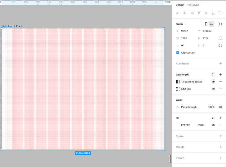
Setting up your 12-Column Grid
Let's create a grid for a typical desktop portfolio page.
- Create a new Frame (
F) in Figma. A good starting width for a desktop design is 1440px. - With the frame selected, go to the Layout grid section in the right-hand properties panel and click the
+icon. - Click the grid icon to open the settings and make the following changes:
- Change the type from Grid to Columns.
- Count:
12 - Type:
Stretch(This makes the columns fluid, which is very useful for responsive design). - Margin:
80(This is the white space on the left and right edges of your content area). - Gutter:
24(This is the space between your columns).
You now have a professional grid structure ready for your content!
4. Structuring Your Portfolio Page on the Grid
Now, let's use this grid to build a simple portfolio page structure. The columns act as guides. Your content—text, images, buttons—should align with these columns. Elements don't have to be exactly one column wide; they can span multiple columns.
Here's a simple structure you can create:
-
Header:
- Place the personal logo you designed in the last lesson on the left, aligned with the start of the first column.
- Add navigation links (e.g., "Work," "About," "Contact") on the right, aligned with the end of the 12th column.
-
Hero Section:
- This is your big introduction.
- Add a large headline (e.g., "Jane Doe, Graphic Designer & Illustrator") that spans about 8 columns.
- Add a short introductory paragraph below it, also spanning the same 8 columns.
-
Project Grid:
- This is where you'll showcase your work.
- To create a three-column project layout, place three placeholder rectangles on the page. Each rectangle should span 4 columns of your grid. Remember to leave the gutters empty!
- To create a two-column project layout, each placeholder would span 6 columns.
Important: Content lives within the columns, and the gutters are the empty space that separates them. Don't place content inside the gutters.
Test your understanding!
You are using a 12-column grid. You want to place a large banner image and, directly below it, two smaller text boxes side-by-side. How might you use the columns to achieve this layout?
Show answer
- Banner Image: You could make the banner image span all 12 columns for a full-width, impactful look.
- Text Boxes: For the two text boxes below, you could have each one span 6 columns. This would divide the space evenly and leave a gutter in between for separation.
5. A Glimpse into Responsive Design
Your portfolio will be viewed on different devices. A grid is the key to making your design look good everywhere. While a full dive into responsive design is a bigger topic, the grid you've set up makes it straightforward.
The standard practice is:
- Desktop (e.g., 1440px wide): 12 columns
- Tablet (e.g., 768px wide): 8 columns
- Mobile (e.g., 375px wide): 4 columns
When you switch to a smaller screen, the content reflows. For example, the three projects that were side-by-side on desktop (each 4 columns wide) might become stacked vertically on mobile, with each project taking up all 4 available columns.
If you'd like to explore this further, this article provides a step-by-step guide for setting up grids for different device sizes.
How to Create a Responsive Layout Grid in Figma
For a more in-depth look at creating grids for different screen sizes, this article 'How to Create a Responsive Layout Grid in Figma' is an excellent resource.
Feel free to read the section 'Creating a responsive grid system in Figma'. Focus on how the column count, margins, and gutters change for different breakpoints (mobile, tablet, desktop). This is a great reference to save for later.
Conclusion
You now have one of the most powerful and essential tools in a designer's toolkit: the layout grid. Using grids will immediately elevate the quality and professionalism of your work.
Key Takeaways:
- Grids bring order, consistency, and professionalism to your layouts.
- In Figma, you can add column, row, or uniform grids to any frame.
- The 12-column grid is the industry standard for web design due to its flexibility.
- Key grid settings are Count (number of columns), Gutter (space between columns), and Margin (space at the edges).
- Content should align with columns and span across them, while gutters should remain as empty space.
Up Next:
You've created a logo and now you've built the structural blueprint for your portfolio page. In the next lesson, we will put it all together. You'll assemble a 3-page portfolio in Figma, showcasing 4-6 of your curated projects. We will take the grid you learned to build today and start populating it with the designs you'll be creating throughout this course.