Recommended resources
The freely available resources this lesson will direct you to.
Hello! Welcome to your first lesson.
Given your extensive background in design and storytelling, you already have a strong intuitive grasp of what makes motion feel right. This course is designed to bridge that intuition with the technical language of code, empowering you to direct AI tools like Claude to bring your creative visions to life.
In this introductory lesson, we'll focus on the foundational concepts of motion design in code. Our goal is to map the familiar principles of timing and easing to their corresponding CSS animation properties. By the end, you'll understand how to translate your ideas about an animation's speed and feel into the specific instructions a browser—or an AI code assistant—needs to understand.
This is the first step towards writing effective prompts and refining the code you generate. Let's begin.
From Animation Principles to CSS Properties
You're already familiar with the classic principles of animation, such as those popularized by Disney. Two of the most critical principles for creating believable motion are Timing and Slow In & Slow Out.
- Timing refers to the speed of an action, defining how long it takes to occur.
- Slow In & Slow Out (or easing) refers to the acceleration and deceleration of an object, making its movement appear more natural and less mechanical.
These abstract concepts have direct, concrete counterparts in CSS.
To see how these principles are discussed in the context of web animation, let's start with a short reading.
The 12 Principles of Animation and CSS
This article, 'The 12 Principles of Animation and CSS' by Bruno Mazza, provides an excellent bridge between traditional animation theory and modern web development. It will help anchor our discussion in concepts you already know.
Please read the descriptions for principles #6 ('Slow in & slow out') and #9 ('Timing'). Notice how the text explicitly connects these ideas to animation duration and easing functions in code.
As the article highlights, achieving the right "Timing" and "Slow in & slow out" in CSS comes down to controlling two key aspects: the duration of the animation and its timing function (or speed curve). Let's break down each of these.
1. Controlling Timing: animation-duration
In traditional animation, timing is about the number of frames an action takes. In CSS, it's simpler: we define time directly. The animation-duration property specifies how long an animation cycle should last.
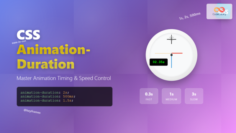
You can set this in seconds (2s) or milliseconds (500ms). Choosing the right duration is crucial for user experience, a concept you are very familiar with from your product design work. An animation that is too slow can feel sluggish, while one that is too fast can be jarring.
The following reading provides some excellent, practical guidelines for choosing durations based on the context of the animation.
Enhancing User Experience With CSS Animations
In 'Enhancing User Experience With CSS Animations', Stéphanie Walter offers best practices that connect animation timing directly to UX principles.
Read the section titled 'Finding the Perfect Animation Duration and Timing'. Focus on the best practices for choosing durations for different types of effects (e.g., fades vs. larger movements).
The key takeaway is that there's no single "correct" duration. It depends on the animation's purpose, complexity, and even the screen size it's viewed on. Your design intuition will be your best guide here.
2. Controlling Easing: animation-timing-function
If animation-duration sets how long an animation takes, the animation-timing-function defines how it gets there. This property controls the speed curve, implementing the "Slow in & Slow out" principle.
Let's watch a short video that introduces the core CSS animation properties, paying close attention to the timing function.
Master CSS Animation Property in 11 Minutes [Full Tutorial] 🚀
This video, 'Master CSS Animation Property in 11 Minutes', gives a concise overview of the essential properties. We'll focus on the part that explains the different types of easing.
Watch the segment from 05:50 to 06:25. It describes the animation-timing-function and its common values: linear, ease, ease-in, ease-out, and ease-in-out.
Here’s a visual breakdown of what those keywords mean:
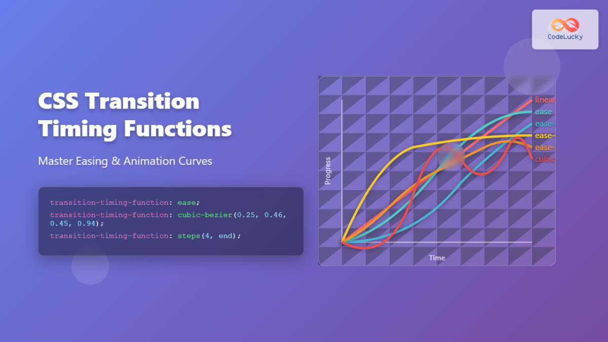
linear: Constant speed from start to finish. Feels mechanical and is often used for continuous effects like rotation or for changes in properties like color and opacity.ease-in: Starts slow, then accelerates. Good for objects animating off the screen.ease-out: Starts fast, then decelerates. Ideal for objects animating onto the screen.ease-in-out: Starts slow, speeds up in the middle, and ends slow. A good default for objects moving from one point to another within the viewport.
Full Creative Control with cubic-bezier()
The keywords above are presets. For full creative control, CSS provides the cubic-bezier() function. This allows you to define your own custom easing curve, which is essential for creating unique and expressive motion.
You don't need to understand the complex math behind it. Instead, you can rely on visual tools to create these curves. This next video is excellent for understanding this concept visually.
Create Smooth CSS Animations with Cubic Bezier
The video 'Create Smooth CSS Animations with Cubic Bezier' by Coding2GO does a fantastic job of explaining how timing functions work and demonstrates a visual tool for creating custom curves.
Please watch from 00:44 to 02:18. The key things to focus on are: How the cubic-bezier curve is visualized. How you can use browser developer tools to interactively create a custom curve and see the result in real-time.
The crucial insight here is that you can translate a feeling—like a "snappy" or "bouncy" movement—into a visual curve, and the tool generates the code for you. Knowing that cubic-bezier() is the property to ask for is the key to prompting an AI effectively for custom easing.
A Quick Note: Transitions vs. Animations
You will see these properties—transition-duration, transition-timing-function, animation-duration, animation-timing-function—used in two contexts: CSS Transitions and CSS Animations.
For now, here’s the simple distinction:
- Transitions are for simple, two-state changes, typically triggered by an interaction like a mouse hover. Think of a button changing color.
- Animations are for more complex, multi-step sequences that can run automatically, loop, and be orchestrated in detail. Think of a character walking or a title sequence.
We will explore this difference more deeply in a future lesson. The important part for today is that the core concepts of duration and easing apply to both.
Key Takeaways
You've now taken the first and most important step in learning to code for motion graphics: connecting your existing design knowledge to the fundamental properties of CSS.
- The animation principle of Timing is controlled by the
animation-durationproperty in CSS, set in seconds (s) or milliseconds (ms). - The principle of Slow In & Slow Out (easing) is controlled by the
animation-timing-functionproperty. - You can use simple keywords like
ease-in(starts slow) andease-out(ends slow) for common effects. - For complete creative control, you can define a custom speed curve using
cubic-bezier(), often with the help of visual tools.
This vocabulary is the foundation you'll use to instruct Claude to generate the exact motion you envision.
Next Up
In our next lesson, we'll shift our focus from motion to matter. We will explore the structure of SVG (Scalable Vector Graphics) files. Understanding how an SVG is built with paths, shapes, and groups is essential for targeting specific parts of your illustrations for animation. This will prepare you for exporting your designs from Figma and bringing them to life with code.