Recommended resources
The freely available resources this lesson will direct you to.
- Everything about Swing points; How to Identify Swing Highs and Swing Lowswww.youtube.com
- How To Trade TRENDLINES In UNDER 17 Minuteswww.youtube.com
- John Murphy's "Charting Made Easy" eBook | ChartSchool | StockCharts.comchartschool.stockcharts.com
- How to Draw Trendlines: Trading Drawing Guide for Better Analysistrendspider.com
Hello! In the previous lesson, you kept support and resistance zones fixed while judging a break and any later return. A trendline asks a different question: can a straight, sloping line describe a sequence of genuine turning points? Today you’ll identify confirmed price pivots, connect the appropriate ones, and decide when a line is valid—or when it is being forced onto the chart. Allow about 35–40 minutes, including time on your TradingView chart.
Start with turns that have actually formed
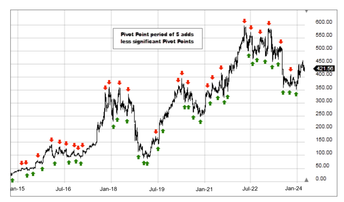
A pivot low is a trough: price declines into a low and then rises away from it. A pivot high is a peak: price rises into a high and then falls away. You can recognize a possible pivot as it develops, but you need price action after the turning candle to confirm that it was a turn.
The video Everything about Swing Points; How to Identify Swing Highs and Swing Lows, from Be Your Own Chief Investment Officer, gives one precise way to mark them.
Everything about Swing points; How to Identify Swing Highs and Swing Lows
Watch the five-candle example to see why a pivot cannot be confirmed on the turning candle itself. Then watch the brief connection between pivots and trendlines.
In five-candle pivots, focus on the candles on both sides of a high or low. Continue through trendline anchors, where the presenter distinguishes swing points from arbitrary places on a chart.
Under that video’s five-candle convention, a pivot low is identified only after two subsequent candles have higher lows; a pivot high needs two subsequent candles with lower highs. Those are operational rules, not the only possible definition of a swing. Their useful discipline is that you must wait for evidence to the right of a proposed turning point. On a weekly chart, two subsequent candles means two more weeks, not two days.
Also choose pivots that belong to the trend you are studying. A daily chart may contain many small turns inside one weekly advance. Connecting whichever tiny turns happen to suit a desired angle does not give you a line for the larger trend.
Two anchors draw a line; a third tests it
John Murphy’s rule gives trendline drawing a clear starting point. In an uptrend, draw beneath successive rising reaction lows. In a downtrend, draw above successive declining reaction highs. Do not connect a low to a high: those are different kinds of turning points.
John Murphy's "Charting Made Easy" eBook | ChartSchool | StockCharts.com
Read Murphy’s account for the distinction between drawing a line through two turns and validating it with a third.
In “Support and Resistance Trendlines and Channels,” skip past the support-and-resistance figures to the paragraph beginning “The trendline is perhaps the simplest and most valuable tool available to the chartist.” Read the trendline rules through the example of a third dip and bounce. Focus on which pivots anchor each type of line and what the third response adds.
Suppose an adjusted weekly chart shows a confirmed low at ₹100 in week 1 and a confirmed higher low at ₹112 in week 5. Those two pivots establish a candidate rising trendline. Extend that straight line to the right without changing its original anchors. In week 9, it would pass near ₹124. If price dips to roughly that area, rises away, and the week 9 trough subsequently becomes a confirmed pivot, you have evidence of a third test.
That third response makes the line more credible; it does not make it an exact floor. Equally, if the next confirmed higher low forms well above the line, the uptrend may still be healthy, but that low has not tested this particular line. Do not rotate the line upward just to claim another touch.
The same method works in reverse for a downtrend: anchor a candidate line at two confirmed, descending pivot highs; look for a later rally toward the extended line that turns down. For a long-only chart review, such a line can help describe overhead resistance without implying that you must trade the decline.
Let price determine the line, not the other way around
The hard part is rarely finding TradingView’s drawing tool. It is resisting the temptation to make every turn fit. TrendSpider’s How to Draw Trendlines offers a useful practical check alongside Murphy’s rule.
How to Draw Trendlines: Trading Drawing Guide for Better Analysis
Read TrendSpider’s drawing procedure for its emphasis on obvious swing points, natural alignment, and spaced tests.
Under “How to Draw Trendlines,” begin at the sentence “Trendlines work best when they reflect natural market structure.” Read the drawing steps from “1. Identify the Trend” through the checklist in “4. Validate the Trendline.” Notice the advice on selecting clear turns and considering wicks, as well as the warning against forcing a fit.
Use these checks as you draw:
- Choose the timeframe first. Keep a weekly line based on weekly pivots and a daily line based on daily pivots. A lower-timeframe turn should not quietly become an anchor for a higher-timeframe line.
- Pick obvious, separated reactions. Two adjacent candles with nearly the same low may belong to one trough, not two independent tests. You want distinct swings with price movement between them.
- Use a consistent anchor convention. Candle highs and lows include wicks and are a sensible starting choice for pivot lines. If an exceptional wick makes the line unrepresentative, note that problem rather than switching selectively between wicks and candle bodies until the chart looks tidy.
- Inspect the price between anchors. An intended uptrend support line should generally run beneath the price movement it describes; a downtrend resistance line generally runs above it. Obvious crossings between the chosen pivots are a reason to question the line or choose a different genuine pair of pivots.
- Keep the chart scale and price setting consistent. A line’s visual angle can change when you switch between arithmetic and logarithmic scales. Likewise, do not change the adjusted-price setting merely to improve a fit.
A small overshoot does not automatically erase a useful line: markets do not turn at geometrically perfect coordinates. But neither should “price is noisy” become permission to drag an anchor after every new candle. If later price action no longer respects the original line, record that observation. You may draw a new line from later confirmed pivots to study the newer swing, while leaving the old one as evidence of what changed.
This is the distinction between revising an analysis and rewriting its history. The first responds to new information; the second makes an old prediction appear more accurate than it was.
Draw one on your position-analysis layout
Open an NSE-listed stock on the weekly chart, with the adjusted-price setting and scale you selected earlier in the module. Look across a span broad enough to show several substantial swings. If the weekly movement is sideways or has no two clear rising lows or declining highs, do not invent a line; choose another span or stock.
For an uptrend, mark two distinct confirmed rising pivot lows. In TradingView, select Trend Line from the drawing tools and place its two endpoints on those lows. Extend the line rightward if needed, but leave the anchor dates and prices unchanged while you inspect later candles. Ask whether a third, later confirmed pivot low approaches the line and turns up. For a downtrend, repeat the procedure with declining pivot highs.
Write a brief annotation next to your drawing:
Timeframe and anchors: weekly; pivot lows at [date, price] and [date, price].
Status: candidate line from two pivots / supported by a third test / not supported by later price.
Reason: what the later candles actually did near the extended line.
Spend about 12–15 minutes on this chart review. If you move to the daily chart afterward, treat any daily line as a separate observation rather than refining the weekly line with daily candles. Your existing horizontal zones can remain visible: they describe previously observed price areas, while the trendline describes how a series of turning prices changes over time.
Where this leaves you
A defensible trendline begins with confirmed, same-type pivots: rising lows for an uptrend or declining highs for a downtrend. Two pivots let you draw a candidate straight line; a distinct third response gives it stronger validation. Keep the original anchors, note imperfect tests honestly, and leave the chart without a trendline when no natural one exists.
Next, you will use a valid basic trendline to construct a parallel trend channel and assess where price sits within it.