Recommended resources
The freely available resources this lesson will direct you to.
- A Critical Skill People Learn Too LATE: Learning Curves In Machine Learning.www.youtube.com
- Lecture 8 - Data Splits, Models & Cross-Validation | Stanford CS229: Machine Learning (Autumn 2018)www.youtube.com
- [PDF] Underfitting and Overfitting in Machine Learningpeople.ece.uw.edu
- Why Your Machine Learning Model Fails: The Definitive Guide to Bias-Variance Tradeoffmedium.com
Hello! Welcome to our next lesson on model evaluation.
In our previous session, we established the critical importance of the train/validation/test split. We learned that to get an unbiased estimate of a model's ability to generalize, we must evaluate it on data it has never seen. The validation set, in particular, is our workbench for tuning hyperparameters and selecting the best model without tainting the final test set.
Today, we'll see how the training and validation sets can be used as more than just a simple performance scorecard; they are powerful diagnostic tools. We will explore how to create and interpret learning curves, which are plots of a model's performance over the course of training. By analyzing the shape and behavior of these curves, you can diagnose two of the most common failure modes in machine learning: underfitting and overfitting.
Visualizing the Training Process: Learning Curves
A learning curve plots a model's performance on the training set and the validation set as a function of training progression. Typically, the x-axis represents the number of training iterations, or epochs, and the y-axis represents a performance metric, usually some form of error or loss.
The following video provides an excellent, high-level introduction to learning curves using a student-teacher analogy. It will help us build a strong intuition for the three main scenarios you'll encounter.
A Critical Skill People Learn Too LATE: Learning Curves In Machine Learning.
This video from the channel Underfitted introduces the core concepts of learning curves.
Watch the video from the beginning up to the summary of a well-fit model. As you watch, focus on: The distinction between training loss (measuring performance on familiar data) and testing/validation loss (measuring generalization). Why a high training loss is a clear sign of underfitting. Why a large gap between a low training loss and a high validation loss indicates overfitting. The characteristics of an ideal, "well-fit" set of curves.
As the video explained, observing the training and validation loss curves gives us a window into the model's "mind." Are the two curves converging nicely to a low value? Is there a large gap between them? Is the validation loss starting to increase? The answers to these questions are your primary diagnostic signals.
Let's summarize these three key patterns visually.
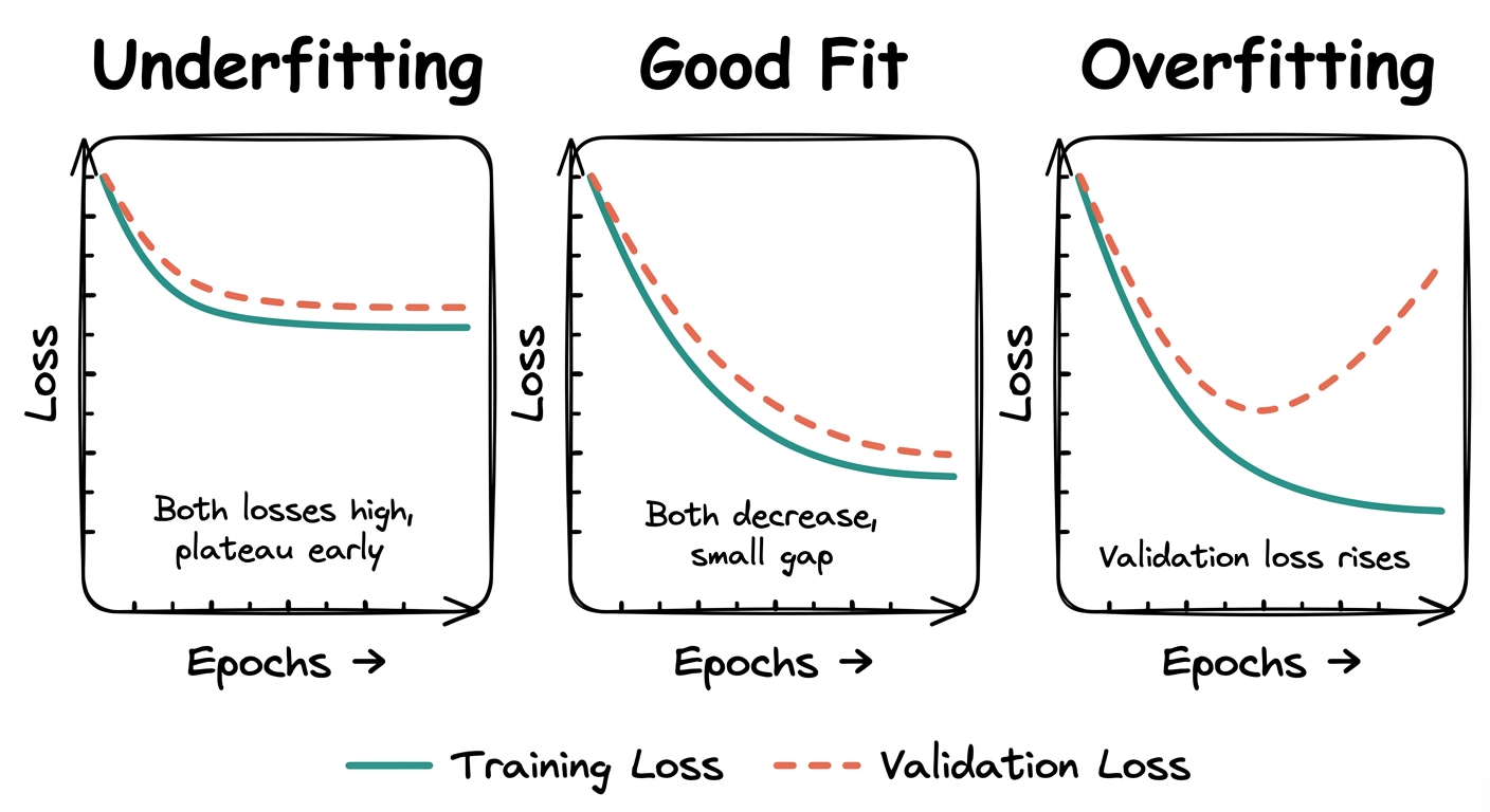
Let's break down each case:
-
Underfitting (High Bias):
- Signature: Both the training and validation loss are high and plateau quickly. There is a very small gap between the two curves.
- Diagnosis: The model is too simple to capture the underlying structure of the data. It fails to learn the training data well, and this poor performance naturally extends to the validation data.
-
Overfitting (High Variance):
- Signature: The training loss becomes very low, but the validation loss starts to increase after a certain point. A significant and often growing gap appears between the two curves.
- Diagnosis: The model has become too complex for the amount of data it has. It has started to "memorize" the noise and specific examples in the training set instead of learning the generalizable patterns. This memorization leads to excellent performance on the training set but poor performance on new, unseen data.
-
Good Fit:
- Signature: Both the training and validation loss decrease and converge to a low value. The gap between the two is minimal and stable.
- Diagnosis: The model has learned the general patterns in the training data, and this learning successfully generalizes to the validation set. This is the ideal scenario we strive for.
Formalizing the Concepts
Now that we have the visual intuition, we can ground it in a more formal theoretical framework. The core issue in overfitting is the divergence between a model's performance on the training data and its performance on the true, underlying data distribution, which we approximate with our validation set.
The following resource provides a precise, mathematical definition of overfitting.
[PDF] Underfitting and Overfitting in Machine Learning
This document provides precise, theoretical definitions of overfitting and underfitting. Let's examine the formal definition.
In Section 2, please read the two definitions of overfitting. Note how they formalize the intuition we've discussed: a model ĥ overfits if there's another model h' that is worse on the training data but better on the validation data. This is the essence of memorization versus generalization.
This formal definition perfectly describes the "Overfitting" plot. The model at the final epoch has a lower training loss than the model at the epoch where validation loss was minimal. However, its validation loss is higher. We sacrificed generalization for better performance on the training set—a classic sign of overfitting.
Connecting Learning Curves to the Bias-Variance Tradeoff
The phenomena of underfitting and overfitting are direct consequences of the bias-variance tradeoff, a central concept in machine learning.

Let's connect this theoretical graph to the learning curves we've been analyzing:
- Region A (Underfitting): This corresponds to the underfitting learning curve. The model is too simple (low complexity), resulting in high bias. Both training and validation errors are high because the model cannot represent the true underlying function.
- Region C (Overfitting): This corresponds to the overfitting learning curve. The model is too complex for the data. Its high variance means it fits the noise in the training set, leading to low training error but high validation error.
- Point B (Good Fit): This is the "sweet spot" we aim for, where the model is complex enough to capture the true signal but not so complex that it overfits the noise. This corresponds to the point in our "Good Fit" learning curve where the validation loss is at its minimum.
Professor Andrew Ng provides a clear lecture segment that graphically illustrates this exact relationship between model complexity, training error, and generalization error.
Lecture 8 - Data Splits, Models & Cross-Validation | Stanford CS229: Machine Learning (Autumn 2018)
In this segment from his Stanford CS229 lecture, Andrew Ng provides a clear walkthrough of how training and generalization error change with model complexity.
Please watch from this discussion on regularization. Pay close attention to the plot he draws, showing how training error decreases with complexity while generalization error forms a U-shape. This is the theoretical basis for the learning curves we observe.
A Deeper Diagnostic: Error vs. Training Set Size
So far, our learning curves have plotted error against training epochs or model complexity. A second, equally powerful type of learning curve plots error against the size of the training set. This curve helps answer a critical question: "Will collecting more data actually help my model?"
- If your model is suffering from high bias (underfitting), adding more data will not help. The model is fundamentally too simple to capture the pattern, and more examples of that pattern won't change this. The training and validation error curves will converge to a high value.
- If your model is suffering from high variance (overfitting), adding more data is one of the most effective solutions. More data helps the model learn the true underlying pattern instead of being distracted by noise in the smaller dataset. You will see a large gap between the training and validation error, which will shrink as the training set size increases.
The following article explains this concept clearly.
Why Your Machine Learning Model Fails: The Definitive Guide to Bias-Variance Tradeoff
This article describes how plotting error versus dataset size can serve as a powerful diagnostic tool.
Please read Section 5, "Learning Curves: Data-Driven Diagnosis". Focus on the two key patterns described and their implications: High Bias Pattern: Both curves converge to a high error. This tells you that the bottleneck is model complexity, not data quantity. High Variance Pattern: A large, persistent gap exists between the curves. This indicates that the model has capacity to improve, and more data could help it generalize better.
Conclusion
In this lesson, we've transformed the validation set from a mere grading tool into a sophisticated diagnostic instrument. By plotting training and validation loss, we can look directly at a model's learning process and identify critical issues.
Here are the key takeaways:
- Learning curves (plotting error vs. training epochs) are your first line of defense for diagnosing model health.
- Underfitting (High Bias) is identified by high training and validation loss that quickly plateaus. The cure is typically to increase model complexity.
- Overfitting (High Variance) is identified by a large and growing gap between a low training loss and a high (or increasing) validation loss. Potential cures include getting more data, using regularization, or reducing model complexity.
- A "Good Fit" is achieved when both loss curves converge to a low value with a minimal gap, indicating the model has learned generalizable patterns.
- Plotting error against training set size provides a different diagnostic angle, helping you determine if investing in more data is a worthwhile strategy to improve your model.
In our previous lesson, we saw the importance of splitting data. Today, we saw how to use those splits. However, this entire methodology rests on having enough data to create meaningful train, validation, and test sets. What if your dataset is small? Sacrificing data for validation and testing can leave too little for training, potentially harming model performance.
In our next lesson, we will address this exact problem by introducing k-fold cross-validation, a more data-efficient and robust technique for model evaluation and selection, especially in low-data regimes.