Recommended resources
The freely available resources this lesson will direct you to.
- 15 Psychological Marketing Triggers to MAKE PEOPLE BUY From YOU!www.youtube.com
- How THE FRAMING EFFECT influences YOUR DECISION MAKING - (Psychology mental model)www.youtube.com
- How to Write Clear Calls-to-Action That Drive Clicks - Mediummedium.com
- The Definitive Guide to Optimizing Your SaaS Pricing Page: A ...www.forgeiq.ca
Hello! Welcome to the final lesson of this module.
In our previous lessons, we've explored several powerful principles of choice architecture, including how information framing (gain vs. loss), default options, and the decoy effect can subtly guide user decisions. We've focused on the theory and seen real-world examples.
Today, we transition from theory to practice. Your learning outcome is to redesign a call-to-action (CTA) or pricing display using gain/loss framing and anchoring principles. This lesson is designed to be a hands-on workshop, equipping you with a practical toolkit to apply these psychological concepts directly to your work as a product designer.
We will review the core principles of framing and anchoring, explore specific design tactics for implementing them, and then you'll tackle a redesign challenge.
1. A Refresher on Key Principles
Before we start redesigning, let's quickly refresh our memory on the two key psychological principles for today's lesson: gain/loss framing and anchoring.
Gain vs. Loss Framing (Loss Aversion)
As we've discussed, people are not purely rational. The way information is presented, or framed, can dramatically alter our perception and subsequent choice. A key aspect of this is loss aversion: the pain of losing something is psychologically about twice as powerful as the pleasure of gaining something of equal value.
This means a frame that emphasizes avoiding a loss can be more motivating than one that highlights a gain.
How THE FRAMING EFFECT influences YOUR DECISION MAKING - (Psychology mental model)
This video from AI Alfie provides a great refresher on loss aversion, using the classic thought experiment from Daniel Kahneman about a viral outbreak. It clearly demonstrates how framing the exact same outcome as a gain (lives saved) versus a loss (people dying) leads to different choices.
Watch the segment from 04:45 to 06:40. Pay attention to how people's choices flip when the options are reframed from saving people (a gain) to people dying (a loss).
In product design, this can be applied by framing an upgrade not just as "gaining new features" but as "stopping the loss" of time, money, or efficiency.
The Anchoring Effect
The anchoring effect describes our tendency to rely heavily on the first piece of information offered (the "anchor") when making decisions. Once an anchor is set, other judgments are made by adjusting away from that anchor, and there is a bias toward interpreting other information around it.
15 Psychological Marketing Triggers to MAKE PEOPLE BUY From YOU!
To see how this applies directly to marketing and pricing, this clip from Adam Erhart gives a concise explanation of anchoring.
Please watch from 08:29 to 09:39. Notice how the first price a user sees becomes the reference point for what feels 'expensive' or 'a good deal'.
For a product designer, this is a fundamental principle for constructing pricing pages, setting default values, or presenting any numerical information.
2. A Toolkit for Redesigning a Pricing Display
Now, let's translate these principles into concrete tactics you can use. Designing a pricing page is a classic challenge where psychology and UX design intersect.
The following reading offers a masterclass in applying these ideas.
The Definitive Guide to Optimizing Your SaaS Pricing Page
Let's dive into 'The Definitive Guide to Optimizing Your SaaS Pricing Page'. This is a highly practical resource for product professionals.
Please read two sections from this guide: Start at 'Price Anchoring: Setting the Frame of Reference' and read through its three tactics. Then, skip down to 'Loss Aversion: The Fear of Missing Out (FOMO)' and read through its three tactics. Focus on how these abstract principles are turned into specific design decisions.
Let's consolidate those tactics and add a few more to our toolkit:
- Anchor with Tier Order: Present plans from most expensive to least expensive. This anchors the user to the highest price, making the mid-tier option seem more reasonable and affordable in comparison.
- Anchor with Strikethrough Pricing: Display a higher "original" price next to the current, lower price (e.g.,
Was $99, Now $79). This anchors the product's value at the higher number, framing the current price as a direct saving (a gain). - Frame with Annual Discounts: Offer a discount for paying annually but display the price as a lower monthly cost (e.g., "$15/month, billed annually"). This frames the choice around the lower monthly payment (a gain) and anchors the user to that smaller number, even though the upfront commitment is larger.
- Frame with Feature Strikethroughs: In the feature lists for your lower-tiered plans, visually strike through the features that are only available in higher tiers. This leverages loss aversion by making it painfully clear what the user is "losing" by not choosing the better plan.
Let's look at a real-world example that combines some of these ideas.
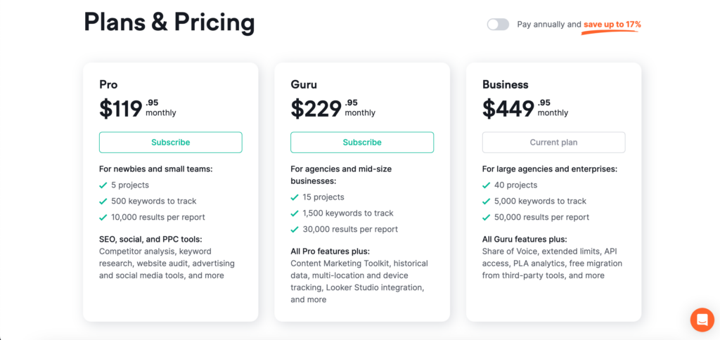
3. A Toolkit for Redesigning a Call-to-Action (CTA)
The principles of framing and anchoring also apply at the micro-level of button copy and the surrounding text. The CTA is the gateway to conversion, and its design deserves just as much psychological consideration.
How to Write Clear Calls-to-Action That Drive Clicks
The article 'How to Write Clear Calls-to-Action That Drive Clicks' provides an excellent breakdown of the psychology and mechanics of effective CTAs.
Please read the sections 'The Psychology of Action and Inaction' and 'The Core Elements of Clear CTAs'. Pay close attention to the discussion of loss aversion and the use of friction-reducing language.
Here are some key tactics for your CTA toolkit:
- Use a First-Person Perspective: Frame the CTA from the user's point of view. "Start My Free Trial" has been shown to outperform "Start Your Free Trial" because it fosters a sense of ownership before the click even happens.
- Focus on Value, Not Friction: The CTA should state what the user gets, not what they give. "Get Your Free Guide" is better than "Submit Email". The former focuses on the gain, the latter on the action of submitting.
- Frame the Benefit:
- Gain Frame: "Start Saving Time Today"
- Loss Aversion Frame: "Stop Wasting Hours on Manual Entry"
- Reduce Perceived Risk with Microcopy: Use small text near the CTA to dismantle objections. Phrases like "No credit card required," "Cancel anytime," or "Join 50,000+ other designers" reduce friction and provide social proof, making the decision to click feel safer.
4. Your Redesign Challenge
Now it's your turn to be the designer. Imagine you are tasked with improving the conversion rate of the following pricing page.
The "Before" State:
Here is a simple, un-optimized pricing display for a fictional project management tool called "FlowState".
| Basic | Pro | Enterprise |
|---|---|---|
| For freelancers and solo users | For small teams | For large organizations |
| $10 / month | $25 / month | $75 / month |
| - Task tracking | - Task tracking | - Task tracking |
| - 5 Projects | - Unlimited Projects | - Unlimited Projects |
| - Basic reporting | - Advanced reporting | - Advanced reporting |
| - Team collaboration | - Team collaboration | |
| - Dedicated support | ||
| Sign Up | Sign Up | Sign Up |
Your Task:
In the space below, sketch out or describe a redesigned version of this pricing page. Your redesign should incorporate at least two of the principles we've discussed today:
- One technique related to anchoring (e.g., tier order, strikethrough pricing).
- One technique related to gain/loss framing (e.g., annual discount presentation, feature strikethroughs, CTA copy).
Please also include a brief justification for your design choices, explaining which psychological principles you are using and why you believe your redesign will be more effective.
(Take about 15-20 minutes for this exercise. There is no single "right" answer; the goal is to thoughtfully apply the concepts.)
(Example of a possible answer)
My Redesigned Pricing Page:
| Enterprise | Pro | Basic |
|---|---|---|
| For scaling organizations | For growing teams | For freelancers & starters |
| $62 / month (Billed annually, was $75/mo) |
$20 / month (Billed annually) [ Most Popular ] |
$8 / month (Billed annually) |
| - All Pro features, plus: | - All Basic features, plus: | - Task tracking |
| - Dedicated support & onboarding | - Unlimited Projects | - 5 Projects |
| - Advanced security & compliance | - Advanced reporting | - Basic reporting |
| - API Access | - Team collaboration | - |
| Start My Enterprise Trial | Start My Pro Trial | Get Started for Free |
| No credit card required |
Justification:
- Anchoring: I reversed the tier order to present 'Enterprise' first. This anchors the user to the highest price point ($62/mo), making the 'Pro' plan at $20/mo seem significantly more affordable and a better value in comparison.
- Gain/Loss Framing:
- I used gain framing by defaulting to the annual pricing, which is presented as a lower monthly rate. For the Enterprise plan, I included a "was $75/mo" strikethrough to explicitly frame the annual price as a saving.
- I used loss aversion framing in the 'Basic' column by striking through "Advanced reporting." This visually communicates what the user is losing by choosing the cheapest plan, nudging them to consider 'Pro'.
- CTA Redesign: I changed the generic "Sign Up" to the first-person "Start My... Trial" to increase psychological ownership. I also added friction-reducing microcopy ("No credit card required") under the most popular plan.
Conclusion
Excellent work! Today you've moved from understanding psychological principles to applying them as a designer. You now have a practical toolkit for creating more persuasive and user-friendly pricing displays and calls-to-action.
Key Takeaways:
- Anchoring can be implemented by strategically ordering pricing tiers (highest first) or using strikethrough prices to set a high value reference point.
- Gain/Loss Framing is a powerful tool. You can highlight gains (e.g., "Save 17%") or leverage loss aversion by showing what users miss out on (e.g., feature strikethroughs).
- CTAs should be redesigned to be value-focused, use a first-person perspective ("My Trial"), and be supported by microcopy that reduces friction and anxiety.
Next Up
This lesson concludes our module on Framing, Priming, and Presentation. You've learned how the context and presentation of choices—through framing, defaults, decoys, and anchoring—can have a profound impact on behavior.
In our next lesson, we will step back and look at the bigger picture. We will evaluate the ethical implications of using default options and the decoy effect in product design, helping you build a framework for using these powerful techniques responsibly.