Recommended resources
The freely available resources this lesson will direct you to.
- HOW TO CHOOSE THE RIGHT FABRIC FOR THE RIGHT SEWING PATTERN! ✂Know what you're ACTUALLY looking for!www.youtube.com
- How to Choose the Best Fabrics for Sewing: A Beginner’s Guidewww.youtube.com
- Fabric Fundamentals: A Designer’s Guide to Textiles & Properties - FDIwww.thefashiondesigninstitute.com
- 10 Types of Fabric and Textiles - The Miami School of Fashion & Designwww.istitutomarangonimiami.edu
Hello! You have now examined fabric structure, grain, drape, opacity, recovery, and care behaviour, and you have seen how common fabrics are used in different garments. This final lesson in Fabric Knowledge and Selection brings those observations together. Instead of asking, “What is this fabric usually used for?”, you will ask, “Will this particular fabric deliver the shape, comfort, coverage, and care that this design requires?”
Allow about 40 minutes, including the short video and reading. If you have swatches nearby, you can apply the selection method as you go.
Start with the design, not the fabric name
Consider this design brief: a sleeveless woven top for frequent wear, with a clean neckline, defined armhole edges, a gently shaped body, and enough coverage to wear as a single layer. It should feel comfortable in warm conditions and tolerate the intended washing routine.
That description gives you criteria before you visit a fabric shop. The cloth should be stable enough for defined edges, light enough for a top, sufficiently opaque in one layer, and suitable for regular care. A beautiful fabric that fails one of those essential requirements is not the best choice for this design.
The image below groups familiar fabrics by drape. Use it to picture the difference between cloth that holds itself away from the body and cloth that falls in soft folds—not as a fixed rating for every version of each fabric.
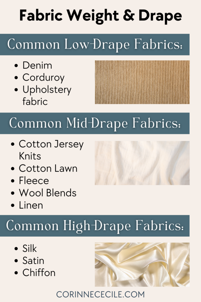
Notice that weight and drape are separate observations. A light fabric can be crisp; a more substantial one can still fall softly. Nor does a label settle the matter: “silk” identifies a fibre, while “satin” describes a fabric construction. Examine the swatch rather than treating either word as a guarantee of fluidity.
Watch the woven and knit comparisons in Evelyn Wood’s How to Choose the Right Fabric for the Right Sewing Pattern. You already know how to distinguish these structures; here, focus on how their properties affect a design decision.
HOW TO CHOOSE THE RIGHT FABRIC FOR THE RIGHT SEWING PATTERN! ✂Know what you're ACTUALLY looking for!
In Evelyn Wood’s How to Choose the Right Fabric for the Right Sewing Pattern, physical fabric examples make the link between a design’s shape and a fabric’s behaviour easier to see.
Watch woven weight for the distinction between a fabric’s mass and its suitability for a garment. Continue with drape and shape, noticing the difference between a firm outline and soft folds. Then watch knit selection for why drape alone is insufficient when a design depends on stretch and recovery. Treat the presenter’s fit suggestions as useful starting points, not rules that override an actual swatch or pattern requirement.
Turn the brief into fabric requirements
A useful selection has two sides: the appearance you want and the performance you need. For the sleeveless top, drape affects its outline, but opacity determines whether the planned single layer works. Stability affects the defined edges; care behaviour matters because the top will be washed often.
The Miami School of Fashion & Design’s 10 Types of Fabric and Textiles offers a concise set of questions for making those priorities explicit.
10 Types of Fabric and Textiles - The Miami School of Fashion & Design
Read the Miami School of Fashion & Design’s selection framework to see how silhouette, movement, wearing context, care, and wider material choices belong in the same decision.
In the subsection “How to Select the Right Fabric for Your Design,” begin with “Understanding the properties of different types of textiles is only the first step.” Read the five questions through the paragraph immediately after the list. Focus on which questions reveal a requirement of a particular design, rather than a general preference for a fabric.
For the example top, you could rank the requirements this way:
- Essential: woven cloth with adequate coverage and enough stability for the intended outline.
- Important: comfortable hand and manageable weight for frequent wear.
- Conditional: acceptable shrinkage and colour transfer under the planned care routine.
- Flexible: exact surface texture or sheen, provided the essentials still hold.
This ranking prevents a common mistake: selecting on colour or softness first, then discovering that the cloth is sheer or changes size in the wash. It also leaves room for more than one good answer. Fabric selection is usually a reasoned choice among trade-offs, not the discovery of one universally correct cloth.
Compare candidates against the same design
Suppose you have three swatches labelled light- to medium-weight cotton poplin, lightweight viscose challis, and firm denim. The following is a possible comparison, not a claim about every swatch with these names.
A poplin swatch that feels reasonably light, holds a clear edge, and passes your single-layer opacity check is a strong candidate for the sleeveless top. Its firmness supports the planned outline without the bulk of trouser-weight cloth. You would still check its shrinkage and colourfastness results; “cotton poplin” does not promise that it is pre-shrunk or colourfast.
A viscose challis swatch might feel pleasant and fall into attractive soft folds. Those properties would be assets for a looser, gathered top. For this brief, however, that same fluidity may soften the defined outline. If the swatch is also too sheer or distorts during the intended care, it is a weaker choice unless you change the design or add a suitable layer. It is not a bad fabric; it answers a different brief more readily.
A firm denim swatch may provide coverage and hold its shape, yet feel too heavy or stiff for the desired lightweight top. A much lighter denim could behave differently, which is why comparing actual swatches matters more than rejecting every cloth called denim.
The provisional choice is the poplin swatch, subject to its care-test results. The justification connects observed properties to specific design needs: its weight suits a top, its tested opacity supports single-layer wear, and its stable hand helps preserve the neckline and armhole outline. The other two candidates reveal the trade-off: greater fluidity in the challis, or greater firmness and bulk in the denim.
Now change just one feature of the brief: imagine a loose kameez with gathers intended to fall in soft folds. The earlier challis might become the better candidate if it provides the required coverage and passes the care checks. The selection changed because the design requirement changed, not because the fabric acquired new properties. Similarly, a structured trouser and a flowing wide-leg trouser can call for different fabrics even though both are “trousers.”
Verify the choice and state the reasoning
Before committing to fabric, bring together the simple checks from earlier lessons. Hold a single layer over a contrasting surface and in the lighting in which the garment is likely to be worn. Let a generous part of the swatch hang over your hand to judge its fall; a tiny corner can hide how cloth behaves at garment scale. Compare its stretch in the lengthwise and crosswise directions, and whether it returns to shape. A knit design that relies on stretch needs a fabric that meets the pattern’s stretch requirement; a stable woven is not an automatic substitute. Finally, use your shrinkage and colourfastness records to judge the intended care.
If swatches are available, a brief decision note is more useful than a list of fabric adjectives. Record each candidate’s observed weight or hand, drape, opacity, stretch or stability, and care results. Then write the choice in this form:
For [specified design], I would choose [identified swatch] because [observed property] supports [design requirement]. I checked [another essential property]. The main trade-off is [limitation], which is acceptable because [reason or design adjustment].
For the example, that could read:
For the frequently worn sleeveless woven top, I would choose the tested light- to medium-weight cotton poplin. Its stable hand supports the defined neckline and armhole edges, and the swatch provides adequate coverage in one layer. I would proceed only if its shrinkage and colour-transfer results suit the planned wash routine; its tendency to crease is an acceptable trade-off for this design.
The words “tested” and “if” matter. They distinguish evidence from an expectation based on a label. You can make a provisional recommendation from a description, but a final recommendation should reflect the cloth you will actually use.
Key takeaways
Choose fabric by translating a specified garment design into requirements for silhouette, weight, drape, coverage, stability or stretch, comfort, and care. Compare candidates against those requirements, use swatch observations to resolve uncertainty, and explain both the advantage of your choice and its trade-off. A fabric can be excellent for one design and unsuitable for another.
You have completed the fabric-selection module. Next, the course turns to colour and visual design, beginning with the colour wheel; later, you will combine colour decisions with the material choices you can now justify.