Recommended resources
The freely available resources this lesson will direct you to.
Hello again. Last time, you distinguished a comic script from prose and a screenplay: the script gives collaborators a plan for what readers will encounter in images and placed words. But a plan is not a finished page. How much can change between the two without changing the story?
Today you will compare a script page from Brain Boy with the published comic page made from it. The comparison is useful for your short-comic goal: it shows which details a writer needs to protect and where collaborators can find stronger visual solutions.
Put the script and page side by side
Blambot’s Comic Script Basics presents a page written by Fred Van Lente, explains its annotations, and shows the resulting comic page. Allow about 8 minutes to read the example and look over both images. You do not need to memorize the article’s formatting advice yet; the next lesson will put formatting into practice.
Read Blambot’s annotated Brain Boy script alongside the finished page to see what the team retained, changed, or added.
In “Comic Script Basics,” begin with the introductory paragraph above the annotated script image. Read the annotated example, including the script image and numbered explanations 1–13. Then find the sentence “Now, let’s take a look at how that scripted page turned out in the finished comic...” and examine the comic image immediately beneath it, before the copyright line and “Automatic Downloads.” Notice that the red numbered circles on the script image are annotations explaining the document, not marks intended for the comic.
Keep these two images available as you read the analysis. The script calls for four panels, and the finished page retains four; that makes changes within the panels easier to see.
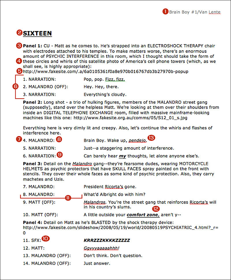
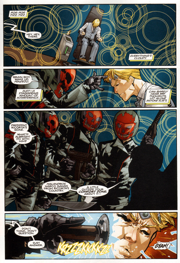
A useful comparison has three parts: what the script specifies, what the page actually shows, and what difference that makes to the reader. Keep those separate. A change is not automatically an improvement or a mistake, and the two documents alone cannot tell you who proposed it or why.
The first two panels: from specified views to a visual experience
In panel 1, the script requests a close-up of Matt coming to in an electroshock-therapy chair. It describes electrodes, psychic interference, and circular swirls inspired by a reference image. The finished panel instead shows much more of Matt and the chair against a field of overlapping circles. The shot is no longer the requested close-up, but the reader can grasp his confinement and the disorienting interference at once.
Notice what carries the feeling of confusion. The script’s instruction about psychic interference is not itself visible as a sentence. The circles supply a visual disturbance, while the printed caption, “Everything’s cloudy,” gives the reader Matt’s experience in words. Neither element has to do the whole job alone.
Panel 2 makes a larger shift. The script asks for a long shot of three hulking figures, viewed over their shoulders inside a dim digital telephone exchange. The finished panel concentrates on one masked figure reaching toward Matt, with Matt’s face close by. The other figures and the room do not receive the same attention here. Instead of first establishing the whole space, the panel brings the threat uncomfortably near.
That decision has a benefit and a cost. The reaching hand and proximity make the confrontation immediate. But a reader looking only at this page may not identify the room as a telephone exchange, although the script names it. That is a concrete distinction between information given to the artist and information successfully conveyed to the reader on this page. It might be established elsewhere; this comparison does not show us.
Across these panels, the circular interference continues behind the characters. A written instruction has become a recurring visual feature that holds the page together. The scripted dialogue and captions still orient us: someone is trying to wake Matt, and he can barely hear his own thoughts. The page changes the views while preserving the essential situation.
The last two panels: threat, text, and what remains invisible
Panel 3 turns the gang into the page’s largest image. The script calls for skull-faced motorcycle helmets, weapons, and men who seem fearsome. The published panel gives the figures substantial space and makes their painted masks and weapons prominent. You can read the intimidation without a caption stating that they are frightening.
Not everything in the description transfers so directly. The script says the helmets cover the gang members’ whole faces as a form of psychic protection. The page shows the helmets, but their protective purpose is not self-evident from their appearance. This is not necessarily a problem: the story may explain it elsewhere, or readers may not need to know it yet. It is, however, the kind of gap you should notice when comparing a script’s intended information with a page’s readable information.
The lettering also changes. Matt’s scripted explanation of who the gang are is longer; the finished balloon compresses it to “Malandros. Narco gangs from Ricorta’s country.” The basic identification survives, while the wording occupies less of the large image. That is more than a copyediting curiosity. Words take up visible space in a comic, so a shorter balloon can leave more room for the figures to exert their threat.
Panel 4 supplies a final contrast. The script describes Matt being blasted by the device and lists a sound effect, his cry, and the interrogators’ commands as separate lettering items. On the finished page, the commands sit at the left, while the jagged electrical sound effect and Matt’s cry occupy the violent image. The effect’s shape and placement help make the shock feel abrupt; the words “Don’t think. Don’t question. Just answer” make clear what the captors want from it. Comparing the script’s numbered items with their placement on the page shows why lettering order on paper and reading rhythm in the comic deserve separate attention.
This page does not simply “illustrate” each description. It retains the four-panel interrogation and its key exchanges, while redistributing emphasis: the opening makes confusion visible, the second panel favors proximity over a room-wide view, the third gives the gang a commanding presence, and the last makes text and electrical impact compete for attention. Some scripted information becomes clearer in the art; some becomes less explicit. That is the heart of a script-to-page analysis.
A second look at how changes happen
For a complementary example, watch selected portions of Walter Ostlie’s Comic script to page: How to draw comics. Here, the artist discusses decisions he made while developing a different comic page. Unlike the Brain Boy comparison, the video gives you some firsthand reasons for the changes. Allow about 7 minutes for the selected portions.
Comic script to page: How to draw comics
Watch Walter Ostlie’s “Comic script to page: How to draw comics” for an artist’s account of choices made between script, thumbnails, and finished page.
Watch script and thumbnails to see why he reads ahead and reserves space for words. In expanded action, notice why one scripted beat becomes several images. Skip ahead to changed details for his explanation of altered weapons and continuity; then watch collaborator checks for how he handles more substantial changes. Finish with background and color and lettering choices, attending to what these add beyond the written plan.
Ostlie’s page changes panel count, while the Brain Boy page keeps its four-panel structure. Both illustrate the same principle: collaborators may alter presentation to clarify an action, direct attention, or make room for text. The writer’s useful question is not “Did they follow every instruction?” but “Does the finished page communicate the story information that matters?” If a proposed change affects a necessary reveal or changes what a character knows, it merits discussion; a different framing that preserves the beat may not.
Key takeaways
To analyze a finished page against its script, identify what survived, what the page added or emphasized, and what became less visible or changed. Then explain the effect on a reader rather than stopping at a list of differences. In Brain Boy, the published page preserves the interrogation while using scale, proximity, recurring visual interference, and lettering placement to shape how it feels.
Next, you will format a sample script page of your own. This comparison gives those formatting choices a purpose: clear panel and lettering instructions help collaborators protect the story’s essentials while leaving room for the finished comic to become more than the script.