Recommended resources
The freely available resources this lesson will direct you to.
Hello! In our last lesson, you learned how to prompt Claude to create the individual animations for your title sequence. As we saw, the result was a bit chaotic, with every element animating at the same time.
Today, we'll bring order to that chaos. We will focus on choreographing those movements into a polished sequence, just like you planned in your storyboard. The key to this is a single, powerful CSS property: animation-delay. You'll learn not only how to use it but also how to manage timing in a clean, scalable way—a practice that should resonate with your experience in building design systems.
By the end of this 60-minute lesson, you will be able to use the 'animation-delay' CSS property to orchestrate the timing of a complex animation sequence.
1. The Basics of Orchestration: animation-delay
The simplest way to create a sequence is to tell each animation when to start. The animation-delay property does exactly that. It accepts a time value (e.g., 1s for 1 second, or 500ms for 500 milliseconds) and waits that long before starting the animation.
Based on your storyboard, let's say the line animation (drawLine) takes 1 second to complete. You might want the title's fadeIn animation to begin slightly before the line finishes, perhaps at 0.8s. You'd add this to your CSS:
#title {
  animation: fadeIn 1.5s;
  animation-delay: 0.8s; /* Starts after an 0.8s delay */
}
However, this introduces a common problem. What does the title look like during that 0.8-second delay? By default, it's fully visible, and then it suddenly disappears to start its fadeIn animation. This is jarring and not what we want.
The solution is another property: animation-fill-mode.
An Interactive Guide to Keyframe Animations
An excellent article by Josh Comeau, 'An Interactive Guide to Keyframe Animations', explains this exact problem and its solution. It will show you how to use animation-fill-mode to ensure your elements have the correct appearance both before and after the animation runs.
Please read the section titled 'Filling backwards'. Pay close attention to the visual examples that show what happens during the delay period. The key takeaway is the value backwards, which applies the styles from your animation's starting keyframe (from or 0%) during the delay period. The value both does this and also holds the final state after the animation ends, which is almost always what you want.
By setting animation-fill-mode: both;, you tell the browser: "During the delay, apply the styles from the start of the animation. After the animation finishes, apply the styles from the end of it."
For your fadeIn animation, this means the element will be invisible (opacity: 0) during the delay, which is exactly the effect we need for a smooth entrance.
2. A Scalable Approach: CSS Custom Properties
Manually setting a delay for every single element works, but it can become tedious and difficult to manage. If you decide to change the timing of one element, you might have to recalculate and update the delays for all subsequent elements. This is not a scalable system.
A much cleaner method involves using CSS Custom Properties (often called CSS variables). This technique separates the logic of the timing from the implementation.
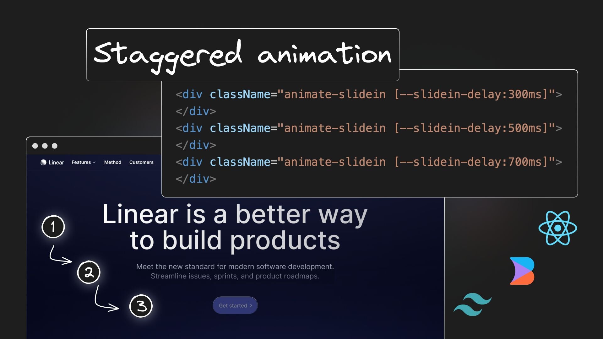
You can define a custom property—let's call it --order—for each element in your HTML, and then use a single CSS rule to calculate the delay.
This video from Fireship provides a fast-paced, practical demonstration of this exact technique for a staggered SVG animation.
Make Awesome SVG Animations with CSS // 7 Useful Techniques
Watch how the presenter uses inline CSS variables and the calc() function to create a sophisticated, staggered animation with minimal, reusable code.
Watch the segment from 00:10:08 to 00:12:05. Notice how an inline style style="--order: 1;" is added to each SVG element in the HTML. Then, in the CSS, animation-delay is set using calc(var(--order) * 200ms). This is the powerful pattern we will use.
This method is elegant because it's declarative. You're not hardcoding delays; you're just defining the order of the elements. The CSS then calculates the actual delay for you. If you want to change the sequence, you only need to change the --order values in your HTML.
This article from CSS-Tricks provides more detail on why this is the preferred modern approach.
Different Approaches for Creating a Staggered Animation
The article 'Different Approaches for Creating a Staggered Animation' explores several ways to create sequences and ultimately concludes that custom properties are the most flexible and powerful solution.
First, skim the section under the main heading that discusses the :nth-child route. This shows the 'old' way and its limitations. Then, read the section 'How about custom properties?'. It reinforces the technique from the video and shows its flexibility.
3. Your Turn: Orchestrate the Title Sequence
Now, let's apply this powerful pattern to your project. We'll use Claude to refactor the code from the last lesson. Your goal is to sequence the animations according to your storyboard:
- The line draws itself.
- The title fades in.
- The subtitle fades in.
Your Task:
Open your project in VS Code and provide Claude with a prompt to implement this staggered timing.
Here is an example of a clear, structured prompt you could use:
"I need to orchestrate the animations in my
index.htmlandstyle.cssfiles. Please modify the code to achieve the following:
- Use CSS custom properties for timing. Add an inline style attribute to each animated element (
#line,#title,#subtitle) to define a custom property named--order. Set--order: 1for the line,--order: 2for the title, and--order: 3for the subtitle.- In the
style.cssfile, create a single class named.animatedthat will apply to all three elements.- This
.animatedclass should use the--ordervariable to calculate theanimation-delay. The formula should becalc((var(--order) - 1) * 400ms). This means the first item has no delay, the second is delayed by 400ms, and the third by 800ms.- Ensure that
animation-fill-mode: both;is applied to prevent elements from appearing before their animation starts.- Finally, update the HTML to apply the
.animatedclass to the#line,#title, and#subtitleelements, in addition to their IDs."
After you run the prompt, examine the code Claude generates. Open your index.html in the browser with Live Server. You should now see your title sequence play out exactly as planned, with each element appearing in a perfectly timed succession. Experiment by changing the --order values in the HTML to see how easily you can now re-choreograph the sequence!
Conclusion
You have now mastered the art of animation orchestration in CSS. You've gone from creating isolated movements to choreographing a complete, multi-part sequence with precise timing.
Key Takeaways:
- The
animation-delayproperty is the fundamental tool for staggering animations. animation-fill-mode: both;is crucial for ensuring elements are in their correct starting state during the delay period.- Using CSS Custom Properties (e.g.,
--order) combined withcalc()is a modern, scalable, and maintainable method for managing complex animation sequences. This separates your timing logic from your CSS rules.
In our next lesson, we will move on to the final stage of our project: exporting your creation. You'll learn how to record your browser-based animation as a high-quality MP4 video and explore the powerful workflow for creating Lottie animations directly from Figma.