Recommended resources
The freely available resources this lesson will direct you to.
Hello! Welcome to the final lesson in our module on finishing your film.
In our last session, we focused on directing the soundscape, transforming your film from a purely visual piece into a complete audiovisual experience. We discussed how to articulate your vision to a sound team and how the most impactful sound is designed from the very beginning of the creative process.
Now, we turn our attention to the final, crucial brushstroke: color. Your learning outcome for this lesson is to supervise the final color grading to achieve the intended visual tone and apply color symbolically.
As a director with a rich background in visual communication, textile design, and fashion, you already possess a sophisticated understanding of color's power. This lesson is not about teaching you color theory, but about translating your existing expertise into the language and process of cinematic color grading. We'll explore how color shapes emotion and meaning on screen and how you, as the director, can effectively lead this process to realize your artistic vision.
1. The Language of Cinematic Color
Color grading is far more than just making the image "look good"; it's a fundamental part of storytelling. It guides the audience's emotions, defines the atmosphere of your film's world, and can imbue objects and characters with symbolic weight.
To begin, let's refresh these concepts within a specifically cinematic framework. The three primary levers a colorist uses are Hue (the color itself), Saturation (the intensity), and Brightness (also known as luminance or value).
Color Theory in Film — Color Psychology for Directors: Ep5
This video from StudioBinder, 'Color Theory in Film,' provides a concise overview of how hue, saturation, and brightness are manipulated to create mood and meaning. It's a great primer on the vocabulary of color in post-production.
Watch from 00:28 to 04:02. As you watch, pay close attention to: The HSB Model (00:28 - 00:55): How Hue, Saturation, and Brightness are defined as the core components of color. Monochromatic Schemes (00:55 - 01:32): The example of The Matrix shows how a dominant hue can establish a world's core concept. Saturation & Brightness (01:32 - 02:59): Note how desaturation can evoke a historical or gritty feel, while brightness affects the overall energy of a scene. Breaking the Rules (02:59 - 04:02): This is the most important part for you. Notice the discussion of how a director can assign their own meaning to colors, subverting traditional associations, as Spike Jonze does with red in Her.
The video rightly points out that you, the director, get to decide what colors mean in your film. This is where your artistic vision, inspired by surrealism and metaphor, comes into play.
2. The Psychology of Color and Emotional Impact
To apply color symbolically, we need to go beyond basic associations and consider the deep psychological impact of your color choices. Each element—temperature, saturation, contrast—is a tool for tuning the audience's emotional response.
The Psychology Of Color Grading & Its Emotional Impact
The article 'The Psychology Of Color Grading & Its Emotional Impact' by Noam Kroll is an excellent resource that articulates how different aspects of a color grade affect an audience on an emotional level. It will provide a strong conceptual foundation for your discussions with a colorist.
Please read the following sections, focusing on the core emotional principles: 'Warm Vs. Cool': Understand how color temperature fundamentally shifts the mood from inviting to clinical. Think about how you might use this (or subvert it) to tell a story about human emotion. 'Saturated Vs Desaturated': This section is key. Note the idea that desaturation removes the 'distraction' of color, forcing the viewer to focus on composition and character, while high saturation emphasizes the world and can evoke a sense of excess. 'High Contrast Vs Low Contrast': Focus on the direct correlation made between contrast and tension. A high-contrast image feels intense and sharp, while a low-contrast image feels softer and more dream-like.
By combining these principles, you can create complex and specific moods. A warm, low-contrast, desaturated image feels nostalgic and gentle. A cool, high-contrast, highly saturated image feels aggressive, sleek, and futuristic. These are the conversations you will have in the color suite.
3. The Director's Real Work: Planning for Color
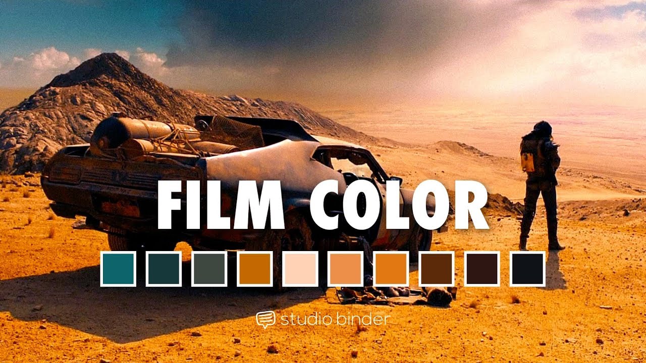
One of the most common misconceptions is that a film's look is created entirely in the color grading suite. As with sound design, the most impactful work begins long before post-production. Your background in design makes you uniquely equipped to excel here. The costumes you design, the locations you choose, and the props you place in a scene are the "raw ingredients" for the final color grade.
The Most Cinematic Color Grading Trick that No One Knows!
This video, 'The Most Cinematic Color Grading Trick that No One Knows!', makes a powerful and essential point: cinematic color starts before you even press record. It's about consciously designing your frame.
Watch the first four minutes of the video (00:00 - 04:02). The key takeaway is in how filmmakers create a strong foundation for the grade through thoughtful choices in production design and wardrobe, such as deliberately placing complementary colors within the frame.
When you ask a colorist for an "orange and teal" look, their success depends on whether you gave them orange and teal elements to work with on set. A colorist can push and pull colors, but they cannot invent what isn't there. Your role as director is to ensure that the visual elements captured by the camera are already in harmony with your intended palette.
4. Supervising the Grade: Collaborating with Your Colorist
Supervising the color grade is a process of communication and collaboration, very much like the spotting session for sound. Your job is not to know how to operate the software, but to articulate your artistic intent clearly and effectively.
IFH 058: Tips on How Directors Should Work with a Colorist
The article 'Tips on How Directors Should Work with a Colorist' from Indie Film Hustle offers direct, practical advice from a professional colorist's perspective. It outlines the do's and don'ts of the director-colorist relationship.
Read the key sections of this article to prepare for this critical collaboration: 'Have a vision': Start reading from 'So first and foremost you've got to have a vision...'. Note the importance of providing multiple visual references (stills, paintings, other films) to communicate your desired look. 'Understand limitations': Continue to the section that discusses The Matrix. This reinforces the point from the video: a look is built in production, not just post-production. This is where you explain that your costume and set design choices were deliberate. 'Creative partnership': Read the final section starting with '...understand that the colorist a new as a filmmaker, this is a creative partnership...'. This emphasizes that the relationship should be a collaborative dialogue, not a dictation.
To effectively supervise the grade, you must:
- Prepare a Vision: Assemble a mood board with stills from other films, paintings, or photographs that capture the tone you're after.
- Use Descriptive Language: Instead of saying "make it more cinematic," use the psychological language we've discussed: "I want this scene to feel more tense and claustrophobic," or "This moment should feel dream-like and nostalgic."
- Trust Your Collaborator: A good colorist brings their own artistry to the table. Be open to their suggestions while holding firm to your core vision.
5. Practical Exercise: The Color Brief
Let's apply these ideas. You will create a creative brief for your colorist for the same scene from our last lesson. This ensures continuity and shows how sound and color direction are two sides of the same coin.
The Scenario:
A silent, 60-second scene. A performance artist, wearing one of your own sculptural costume designs, moves slowly through a vast, desolate, and beautiful natural landscape (e.g., a black sand beach, a cracked desert floor, a misty forest).
Your Task:
Write a "Color Brief" for this scene. Your document should communicate your vision to your colorist clearly and evocatively. Address the following points:
- Core Mood & Visual Tone: In one or two sentences, what is the emotional atmosphere of this scene? (e.g., "The tone is one of sublime melancholy, balancing the beauty of the landscape with a profound sense of isolation.")
- Color Palette & Symbolism: Describe your intended palette. What are the key colors and what do they represent? Given your background, be specific. (e.g., "The palette is overwhelmingly monochromatic, using the desaturated grays and blues of the landscape. The only point of color is a single, muted ochre panel on the costume, symbolizing a fragile, earthy connection.")
- Contrast & Saturation: Specify your desired levels and their purpose. (e.g., "The image should be low-contrast, with milky blacks and soft highlights, creating a dream-like, ethereal quality. Saturation should be minimal, except for the ochre, which should retain just enough color to draw the eye.")
- Visual References: List 2-3 specific reference points. These can be films, directors, photographers, or even painters. (e.g., "References: The desolate landscapes in Andrei Tarkovsky's Stalker; the painterly quality of Bill Henson's photography; the color palette of the 'Winter' chapter in Kim Ki-duk's Spring, Summer, Fall, Winter... and Spring.")
This exercise simulates the crucial pre-session homework that enables a productive and successful color grading session.
Conclusion
Supervising the color grade is the final step in visually authoring your film. It's where you ensure that every frame is emotionally resonant and aligned with your deepest thematic intentions.
Key Takeaways:
- Color is Story: Hue, saturation, and contrast are not just technical settings; they are narrative tools for shaping the audience's psychological and emotional journey.
- Plan Ahead: The most effective color grading is built on a foundation of thoughtful color choices made during pre-production and production, especially in costume and set design.
- Collaborate with Vision: Your role in the grading suite is that of the lead creative. You achieve your goals by articulating a clear, well-referenced vision and engaging your colorist as a true artistic partner.
What's Next?
With this lesson, we have put the final creative touches on your film. You have now journeyed from foundational concepts all the way through the finishing processes of sound and color.
In our next module, we will shift our focus from creating the work to presenting it to the world. The first lesson will be "Create a compelling synopsis and a director's statement for film promotion," where you will learn to distill the essence of your complex artistic vision into powerful, concise language for festivals, galleries, and collaborators.