Recommended resources
The freely available resources this lesson will direct you to.
- Marketing Color Psychology: What Do Colors Mean and How Do They Affect Consumers?www.youtube.com
- Graphic Design Principles Master Class! (Advanced Colour Theory)www.youtube.com
- Color Psychology In Marketing And Branding Videoswww.pixelabstudios.com
- Color Theory in AI: Master Color Palettes with Promptsartsmart.ai
Welcome to the final lesson in our "Foundations of Visual Design" module. In our last session, we learned to sculpt mood and dimension using lighting, distinguishing between the dramatic effects of hard light and the flattering look of soft light. You now have a foundational understanding of composition, camera work, and lighting—the core building blocks of any compelling visual.
Now, we add the final and most emotionally resonant layer: color. If lighting is how you shape a scene, color is how you paint its soul. For your goal of creating high-end advertising, color is not merely a decorative choice; it's a primary tool for communicating brand values, influencing consumer perception, and driving action.
By the end of this 60-minute lesson, you will be able to apply color theory principles—specifically complementary and analogous schemes—to create harmonious palettes that strategically influence perception in advertising.
1. The Unspoken Language: Color Psychology in Advertising
Before we discuss how to combine colors, we must first understand what individual colors mean. Different colors evoke distinct psychological and emotional responses in viewers, and in advertising, these associations are used deliberately to shape a brand's identity.
Take a look at the "Color Emotion Guide" below. It provides a fantastic overview of the feelings and concepts brands often associate with different colors, using famous logos as examples.
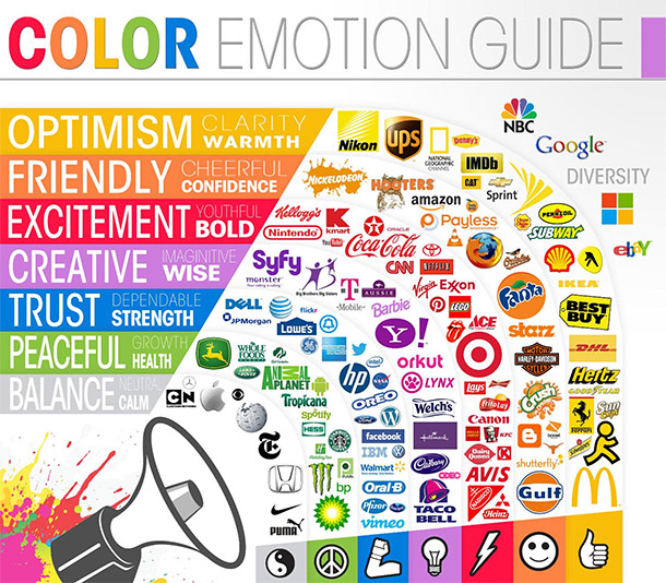
To get a more detailed breakdown, the following video from Visme provides a great tour of the psychology behind the most common colors used in marketing.
Marketing Color Psychology: What Do Colors Mean and How Do They Affect Consumers?
This video, "Marketing Color Psychology," will walk you through the positive and negative connotations of individual colors.
Watch the section that breaks down the meanings of different colors, starting from yellow through the metallic colors. As you watch, think about which brands you know that use these colors and whether their message aligns with the psychological effects described.
This connection between color and emotion is the bedrock of visual branding. A bank uses blue to communicate trust and stability; a fast-food chain uses red and yellow to signal energy and grab attention. Your ability to select the right color is your first step in aligning a visual with a brand's core message.
To reinforce this, let's turn to a concise written guide.
Color Psychology In Marketing And Branding Videos
This article from Pixelab Studios provides a table that clearly summarizes the psychological effects and common associations for key colors.
In the section "Why Use Color Psychology In Video Marketing?", find the subheading Psychological Effects of Color. Study the table that follows, which maps colors like Red, Blue, and Green to their emotional impact.
With this foundation, you can now start thinking like a creative director: what feeling does this ad need to evoke, and which color will help achieve that?
2. Creating Harmony: Complementary and Analogous Schemes
While individual colors have meaning, their true power is unlocked when they are combined into a color scheme, or palette. A well-chosen scheme creates a sense of harmony and intention, making a design feel professional and cohesive. We will focus on two of the most fundamental and useful schemes: complementary and analogous.
The "Color Wheel Cheat Sheet" below is your map for understanding these relationships.

Let's break down the two schemes central to today's lesson:
-
Complementary Colors: These are colors that sit directly opposite each other on the color wheel (e.g., blue and orange, red and green).
- Effect: They create the strongest possible contrast. This high contrast is vibrant, energetic, and excellent for drawing the viewer's eye to a specific point.
- Use in Ads: Perfect for a call-to-action button, highlighting a product against a muted background, or creating a dynamic, exciting mood.
-
Analogous Colors: These are colors that sit next to each other on the color wheel (e.g., blue, blue-green, and green).
- Effect: They have low contrast, creating a serene, comfortable, and unified feeling. The result is often seen as natural and harmonious.
- Use in Ads: Ideal for brands that want to evoke calmness, nature, or sophistication. Think wellness apps, organic food products, or high-end lifestyle brands.
To see how major brands apply these schemes, let's return to the Pixelab Studios article.
Color Psychology In Marketing And Branding Videos
This article effectively demonstrates the use of complementary and analogous colors with well-known brand examples.
Read the section titled Basics of Color Theory. Pay close attention to the examples of Pepsi (complementary) and Starbucks (analogous) to see how these schemes support their respective brand identities.
By choosing between a high-contrast complementary scheme or a low-contrast analogous one, you are making a strategic decision about the energy and personality of your advertisement.
3. Directing the AI: Prompting for Color
Now for the most important step: translating this theory into instructions for an AI image generator. AI models don't "feel" emotion, but they have been trained on millions of images and their text descriptions. By using the language of color theory in your prompts, you can guide the AI to create visuals with a specific, intended mood.
The following article from ArtSmart AI is an excellent guide for this process. It explains how to use color theory terms to achieve precise control over your AI-generated images.
Color Theory in AI: Master Color Palettes with Prompts
This article is your playbook for turning color theory into effective prompts. We will focus on how to prompt for harmony, mood, and precision.
Please read the following three parts of the article: Start with the section on Color Harmony, which explains how to use terms like "complementary" and "analogous" in your prompts. Next, read the section on Color Psychology to understand how to prompt for mood using warm, cool, and muted tones. Finally, review the Prompt Examples to see how positive and negative prompts are combined to achieve a professional look.
As the article demonstrates, you can move from simple prompts to sophisticated art direction.
- Simple prompt:
A bottle of wine(The AI will guess the color and mood). - Better prompt:
A bottle of red wine on a wooden table(More specific, but the mood is still random). - Professional prompt:
Cinematic photo of a luxury red wine bottle. A **dramatic complementary color scheme** of deep burgundy red and dark forest green. Muted tones, soft, low-key lighting creating a sophisticated and exclusive mood.
In the professional prompt, you are not just describing a scene; you are directing the mood, color harmony, and lighting—just as a creative director would on a real set.
4. Practical Exercise: Setting the Tone for a Brand
It's time to put your new knowledge into practice. Your task is to create two distinct advertisements for a single fictional product: "Aura," a new line of organic herbal tea. This exercise will challenge you to use color to tell two different stories about the same product.
Product: "Aura" Organic Herbal Tea. The box is simple and elegant.
-
Ad Concept 1: "Calm & Serenity" (10 minutes)
- Advertising Goal: Communicate that Aura tea helps you unwind and find peace. The target audience values mindfulness and relaxation.
- Color Strategy: Use an analogous color scheme to create a harmonious, soothing visual.
- Prompt Idea:
commercial product photography of 'Aura' herbal tea. A serene and **harmonious analogous color palette** of soft sage green, muted teal, and creamy off-white. Natural, diffused light from a window. The scene evokes a feeling of calm and tranquility. Minimalist styling. - Generate the image and observe how the colors blend to create a peaceful atmosphere.
-
Ad Concept 2: "Vibrancy & Energy" (10 minutes)
- Advertising Goal: Communicate that Aura tea is refreshing and revitalizing. The target audience is health-conscious but also busy and needs an energy boost.
- Color Strategy: Use a complementary color scheme to create a vibrant, eye-catching visual.
- Prompt Idea:
commercial product photography of 'Aura' herbal tea. A vibrant and energetic **complementary color scheme**. The background is a rich, deep blue, making the packaging pop. Accents of bright, zesty orange or lemon yellow slices are placed nearby, creating a striking visual contrast. Clean, bright lighting. - Generate this image and compare it to the first one. Notice how the high-contrast colors create a completely different feeling of energy and zest.
Save both images. These are your first portfolio pieces demonstrating strategic use of color theory in advertising.
Conclusion
In this lesson, you've moved from simply seeing color to understanding its power as a strategic tool. You've completed the foundational module of your training, equipping you with the essential principles of visual design.
Here are your key takeaways:
- Color Psychology: Colors carry inherent emotional and psychological weight, which is used in advertising to build brand identity and influence perception.
- Color Harmonies: A color scheme brings intention and professionalism to a design.
- Analogous schemes use adjacent colors for a harmonious, calming effect.
- Complementary schemes use opposite colors for a high-contrast, energetic effect.
- Prompting with Color: You can direct an AI model's output by using the language of color theory—specifying schemes, tones (warm/cool), and descriptive color phrases in your prompts.
You have now mastered the fundamentals of composition, lighting, and color. In our next module, "Visual Storytelling & Narrative Structure," we will begin combining these skills to tell compelling stories. You'll learn how to structure a narrative, use visual metaphors, and build a sequence of images that guide a viewer on a journey—transforming single, beautiful images into powerful advertisements.