Recommended resources
The freely available resources this lesson will direct you to.
Hello! Welcome back to our course on the psychology of decision-making.
In our last lesson, we examined the representativeness heuristic, our tendency to make judgments based on how well something matches a mental prototype. We saw how this shortcut is fundamental to visual design, influencing how users perceive an interface's trustworthiness and function.
Today, we'll explore another powerful mental shortcut from our "Heuristics" module. This lesson addresses the learning outcome: Explain the anchoring effect and identify its use in pricing pages or setting default values in forms.
We will dissect how an initial piece of information can latch onto our thinking and disproportionately influence subsequent decisions. For you as a Product Design Lead, understanding anchoring is critical, as it's one of the most widely used psychological principles in digital product strategy, especially in pricing and user onboarding.
1. What is the Anchoring Effect?
The anchoring effect, or anchoring bias, is our cognitive tendency to rely heavily on the first piece of information offered (the "anchor") when making decisions. Once an anchor is set, we tend to adjust our estimates and judgments from that starting point, but we often fail to adjust sufficiently.
To see just how powerful and sometimes illogical this effect can be, let's start with a video that demonstrates one of the classic experiments on anchoring.
CRITICAL THINKING - Cognitive Biases: Anchoring [HD]
This video from the Wireless Philosophy channel, 'CRITICAL THINKING - Cognitive Biases: Anchoring', provides an excellent introduction to the concept. It begins with a simple math problem that reveals the surprising power of the initial number presented.
Please watch from the beginning until 03:17. Pay close attention to how the order of numbers in the multiplication problem creates two different anchors, leading to vastly different estimates for the same answer.
As the video shows, even when the anchor is subtle—like the first number in a sequence—it has a magnetic pull on our final judgment. The group that started with 8 x 7... was anchored to a higher number (56) and produced a much higher median estimate (2,250) than the group that started with 1 x 2..., which was anchored to a lower number (2) and gave a median estimate of only 512. The correct answer, 40,320, was far from both, which highlights our second tendency: insufficient adjustment.
2. Arbitrary Anchors and Willingness to Pay
Perhaps the most fascinating aspect of anchoring is that the anchor doesn't even need to be relevant to the decision at hand. To explore this, let's turn to a foundational article from the Nielsen Norman Group, a leader in UX research.
This article, 'The Anchoring Principle,' details the classic studies that established the anchoring effect, including the one from the video and another famous study involving social security numbers.
Please read the section titled 'Past Studies about Anchoring'. This section reinforces the math problem experiment and introduces Dan Ariely's study, which shows how a completely arbitrary number can anchor our perception of value.
The study by Dan Ariely is particularly revealing. Participants' willingness to pay for items was significantly influenced by the last two digits of their social security number—a number with absolutely no connection to the value of a bottle of wine or a keyboard. Those with higher SSN digits were willing to pay significantly more.
This demonstrates a crucial point for product design: the first price or number a user sees sets the context for value, even if it's presented arbitrarily.
3. Anchoring in Product Design
Now, let's connect this principle directly to your work. Designers and product managers intentionally use anchoring to frame choices, guide users, and influence the perception of value. The learning outcome for this lesson specifically asks us to look at pricing pages and default values.
Let's continue with the Nielsen Norman Group article, which provides excellent examples of these applications.
We'll now read the section of the same article that applies these principles directly to UX design.
Please read the section 'How Anchoring Can Improve the User Experience'. Focus on the two main applications discussed: 'Good Defaults and Suggested Values' and 'Show Original Prices Along with the Discounted Price'.
Let's break down these two key applications.
Application 1: Pricing Pages
Pricing pages are a classic playground for the anchoring effect. The goal is to make a certain price point feel reasonable or like a great deal.
-
Showing a Higher "Original" Price: When a discounted price is shown next to a higher, struck-through original price (e.g.,
$100$75), the $100 price acts as an anchor. The user's brain anchors to the higher value, making the $75 price seem like a significant saving. The perceived value of the item is anchored to the higher price. -
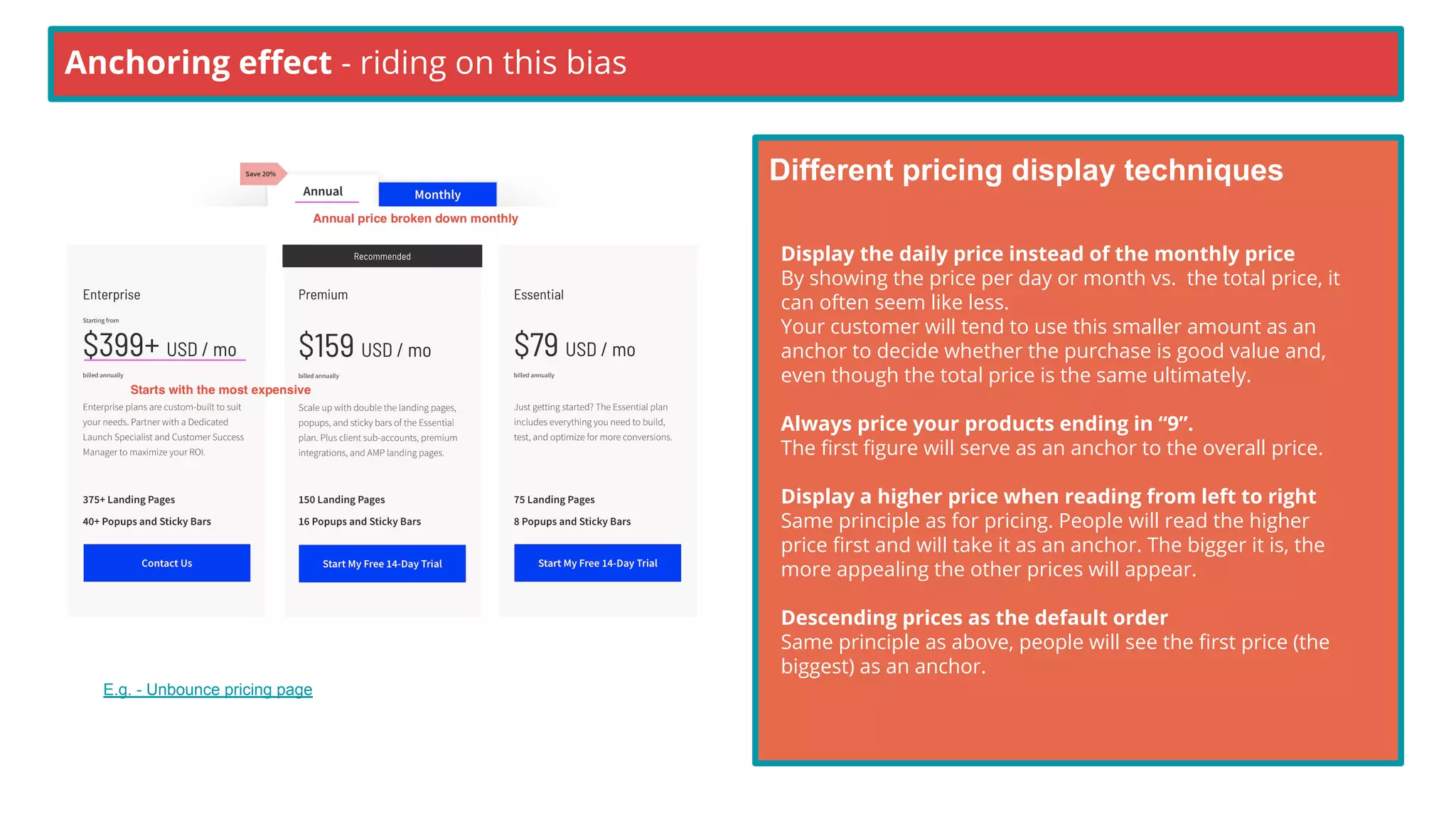
Tiered Pricing Order: Many SaaS companies list their most expensive plan first or give it the most visual prominence. This high price anchors the user's perception of cost, making the mid-tier or lower-tier plans seem much more affordable in comparison.
The image below illustrates several of these techniques on a single pricing page.
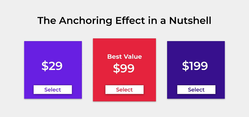
Here is another common pattern, often called the "center-stage" effect, combined with anchoring.
Application 2: Setting Default Values in Forms
Defaults are powerful anchors because they implicitly suggest a "normal" or recommended choice. They don't just reduce the effort of typing; they frame the user's decision.
- Donation Forms: As the NN/g article mentions, providing suggested donation amounts (e.g., $25, $50, $100) with one pre-selected anchors the user. Instead of asking "How much should I give?", the user now asks, "Is $50 the right amount for me?". This shifts the decision from an open question to an adjustment from a suggested starting point.
- Configuration Settings: When a user sets up a new software, the default values for settings (e.g., notification frequency, quality settings) anchor their understanding of what is typical. Most users will not change these defaults unless they have a strong reason to, as the default is perceived as the "standard" choice.
- Mortgage Calculators: The default values for home price, down payment, and interest rate in a mortgage calculator anchor a first-time homebuyer's expectations about the market.
By setting a thoughtful default, you can guide users toward a choice that is likely best for them (or for the business) while also reducing their cognitive load.
A Note on Ethical Design
Anchoring is a powerful tool for persuasion, which means it can be used to guide or to manipulate. The line between the two can be thin. For example, is a "suggested" donation amount a helpful starting point, or is it designed to guilt users into giving more than they're comfortable with? Is a struck-through "original" price genuine, or was it artificially inflated to create a false sense of a bargain?
This resource offers a good perspective on using anchoring responsibly.
The Interaction Design Foundation provides guidance on how to use anchoring ethically, ensuring you are guiding users rather than misleading them.
Please read the short answer to the question 'How do I avoid misleading users with anchoring?'.
The key is transparency and user control. An ethical design uses anchors to simplify decisions and set reasonable expectations, not to deceive or pressure users into choices that aren't in their best interest. This is a theme we will return to when we discuss dark patterns and ethical frameworks later in the course.
Conclusion
Today, we've focused on the anchoring effect, a heuristic where our judgments are tethered to an initial piece of information.
Here are the key takeaways:
- Definition: The anchoring effect is our tendency to rely too heavily on the first piece of information we receive (the anchor) when making decisions.
- Insufficient Adjustment: We tend to make adjustments from our anchor, but these adjustments are often too small.
- Application in Pricing: Pricing pages use anchors like high-tier plans and struck-through original prices to make other options seem more valuable or affordable.
- Application in Forms: Default values in forms act as anchors, suggesting a "normal" or recommended choice, which simplifies decision-making and nudges user behavior.
- Ethical Consideration: While powerful for guiding users, anchoring can be manipulative if used to create false perceptions of value or to pressure users.
In our next lesson, we will transition from heuristics to a closely related topic: cognitive biases. We'll begin Module 3 by exploring confirmation bias, the tendency to search for and favor information that confirms our existing beliefs, and see how it can impact both user research and the effectiveness of your product's onboarding.