Recommended resources
The freely available resources this lesson will direct you to.
Hello! Welcome back to our course on the psychology of decision-making.
In our last lesson, we explored the availability heuristic, where we judge the likelihood of an event based on how easily an example comes to mind. We saw how this affects both users and the product teams designing for them.
Today, we'll continue our journey into the mind's shortcuts by focusing on another powerful heuristic. This lesson addresses the learning outcome: Explain the representativeness heuristic and identify how it influences user perceptions of interface elements based on visual stereotypes.
We'll investigate our tendency to make judgments based on similarity and stereotypes, and you'll see how this fundamental aspect of human cognition is a cornerstone of effective visual communication in product design.
1. What is the Representativeness Heuristic?
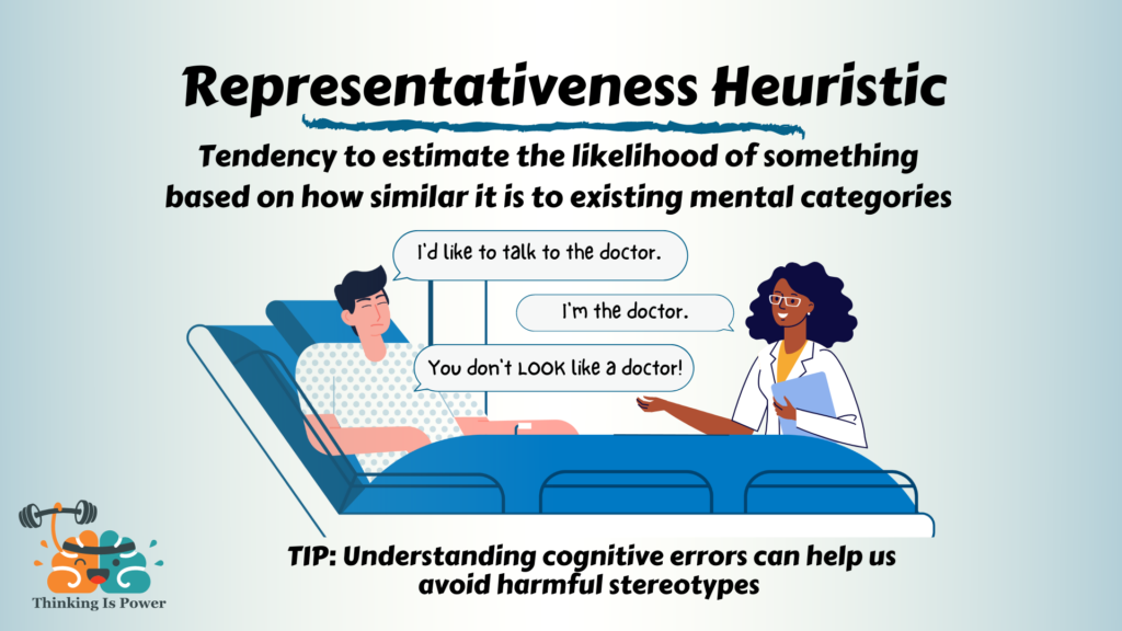
The representativeness heuristic is a mental shortcut where we estimate the likelihood of an event or categorize something by comparing it to a prototype or stereotype that already exists in our minds. In short, if something looks like our mental image of 'X', we tend to believe it is 'X', often ignoring other important information.
To get a clear understanding of this concept and its classic demonstrations, let's start with a video.
The Representativeness Heuristic (Learn Social Psychology Fundamentals)
This video from Andy Luttrell's social psychology series provides a fantastic introduction to the representativeness heuristic. It uses the famous 'Tom W.' and 'Linda' problems to illustrate two key errors that result from this heuristic: ignoring base rates and the conjunction fallacy.
Please watch from the beginning to 04:35. Pay close attention to how the descriptions of Tom and Linda lead people to make judgments that defy statistical probability.
As the video explains, this heuristic can lead to two significant errors in judgment:
- Base-Rate Neglect: This is what we see in the "Tom W." example. Even when told that engineering majors are rare at the university (a low base rate), people still bet on Tom being an engineer because his description perfectly matches the stereotype of one. The compelling description overrides the statistical fact.
- Conjunction Fallacy: The "Linda" problem illustrates this. It is statistically impossible for a subset (feminist bank teller) to be more probable than the larger category (bank teller). Yet, because the description of Linda is so representative of a feminist, people judge the combination as more likely. The specific, vivid story feels more plausible than the general, abstract category.
This tendency to judge based on stereotypes is deeply ingrained and often happens automatically, as the following image amusingly illustrates.
2. Why Does This Heuristic Occur?
Relying on prototypes is not inherently a "bad" thing. It's a highly efficient way for our brains to process a complex world. Instead of analyzing every new object or situation from scratch, we categorize them based on past experience. This saves enormous time and cognitive energy.
The following article from Dovetail provides more detail on the mechanics behind this heuristic.
Understanding the representativeness heuristic: A deep dive
This article, 'Understanding the representativeness heuristic,' explores the cognitive reasons we rely on this shortcut. It explains how our brains use categories and mental prototypes to make sense of the world efficiently.
Please read the sections 'What is the representativeness heuristic?' and 'Why does the representativeness heuristic occur?'. These sections will reinforce the definition and explain the underlying cognitive mechanisms.
As the article notes, categorization is essential. The problem arises when our prototypes are inaccurate, incomplete, or when we rely on them so heavily that we ignore other critical data, like base rates.
3. Representativeness in Product and UX Design
This brings us to the core of today's lesson: how this heuristic shapes user experience. In design, you can't afford to ignore users' mental prototypes. In fact, successful design often leans into them to create intuitive and trustworthy experiences.
When a user interacts with your product, they are constantly, and unconsciously, asking: "Does this look like what I expect it to look like?"
- Does this button look like a button?
- Does this checkout page look like a secure checkout page?
- Does this app look like a professional financial tool?
The answers are based on visual stereotypes built from all the other digital products they've ever used. The following resource explains how to use this principle in design.
Behavioral Design: Representativeness Heuristic
This article from Patent355, 'Behavioral Design: Representativeness Heuristic,' directly addresses how to apply this heuristic in web design and user experience to build trust and drive engagement.
Please read the sections 'Using Visual Representativeness Heuristic in Web Design' and 'Using Representativeness Heuristic in User Experience'. Notice how it connects visual design elements to user perceptions of quality and reliability.
As the article highlights, by designing an interface that is representative of a high-quality, trustworthy, or innovative product, you tap into the user's mental shortcuts. They will infer the qualities of your product from its visual resemblance to their prototype of a "good" product in that category.
Here are some concrete examples of this in action:
- Financial Apps: Many banking and investment apps use dark blue or green color palettes, clean sans-serif fonts, and spacious, symmetrical layouts. This visual language is representative of stability, security, and professionalism. A fintech app that used a chaotic, scrapbook-like design would likely fail because it violates the user's prototype for a "safe place for my money."
- Creative Portfolios: A designer's portfolio website might use an unconventional layout, bold typography, and unique micro-interactions. This is representative of creativity and mastery of the craft. It signals to potential clients that the designer is innovative.
- E-commerce "Bargains": Websites that want to be perceived as offering low prices often use bright, high-contrast colors (like red and yellow), display prominent "SALE" banners, and have a denser layout of products. This matches the visual stereotype of a discount retailer, signaling to users that they can expect to find deals.
- Icons: The universal icons for "save" (a floppy disk, an object most new users have never seen), "search" (a magnifying glass), and "settings" (a gear) work because they are representative of those functions based on decades of established convention. Deviating from these can cause confusion, as the new icon won't match the user's prototype.
In your work as a Product Design Lead, understanding these prototypes is crucial for stakeholder alignment and design strategy. When you propose a design, you are also implicitly making a statement about how you want the product to be perceived. Aligning the visual design with the desired user perception is a direct application of the representativeness heuristic.
Conclusion
Today we've unpacked the representativeness heuristic and connected it directly to the visual language of design.
Here are the key takeaways:
- Definition: The representativeness heuristic is our tendency to judge things based on how closely they match our mental prototype or stereotype.
- Cognitive Errors: It can cause us to ignore statistical base rates and fall for the conjunction fallacy, making us prefer a good story over a probable reality.
- Influence in UX: Users judge an interface's quality, trustworthiness, and function based on its visual similarity to their established mental models. A design that looks professional and secure is perceived as professional and secure.
- Strategic Design: By intentionally using visual cues that are representative of desired qualities (like security, creativity, or affordability), designers can guide user perception and build trust more effectively.
In our next lesson, we will examine the anchoring effect. We'll explore how the first piece of information we receive acts as a powerful "anchor" that influences all subsequent judgments, a principle you'll immediately recognize in pricing pages and negotiations.