Recommended resources
The freely available resources this lesson will direct you to.
Hello! Last lesson, you turned a small CSV into a cleaned table and checked that its values satisfied your assumptions. A plot is the next check: it can reveal the shape of a measurement distribution, while also making a cleaning mistake conspicuous. Later in a machine-learning project, plots will help you communicate how performance changes as more training data becomes available.
In about 40 minutes, you’ll make a histogram from the cleaned CSV, learn what its bars mean, and create a clearly labeled learning curve with Matplotlib. You won’t need to train a model yet; that comes later in the course.
Build a plot with a Figure and Axes
Matplotlib separates the Figure, the whole image you can save, from an Axes, the plotting area on which you draw data and set labels. For project code, it helps to create these explicitly: fig, ax = plt.subplots(). A second chart can then have its own Axes without relying on whichever plot happens to be “current.”
Quick start guide — Matplotlib 3.10.8 documentation
Read the Matplotlib documentation’s Quick start guide to establish the Figure–Axes vocabulary and see the plotting style used below.
In “A simple example,” read the setup and run your eye over its three-line plotting example. In “Parts of a Figure,” read Figure and Axes. Finally, under “Coding styles” → “The explicit and the implicit interfaces,” read the style recommendation. Focus on why ax.plot(...) and ax.set_xlabel(...) belong to the same plotting area.
The important pattern is short: create fig and ax, draw on ax, label it, then save or display fig. We’ll use the same pattern for two different kinds of evidence.
Show where measurements fall
A histogram divides a numerical range into bins and counts how many observations fall in each one. Unlike a bar chart of named categories, its adjacent bars represent intervals along a numerical scale.
Matplotlib Tutorial (Part 6): Histograms
Watch Matplotlib Tutorial (Part 6): Histograms by Corey Schafer for a concrete demonstration of bins and their boundaries. The presenter uses plt.hist(); our code will use the equivalent ax.hist() on an explicit Axes.
Watch first histogram for counts and visible bin edges, then custom bins for the difference between specifying a number of bins and supplying their exact boundaries. Notice near the end that bins which do not cover the data can leave observations out of the plot.
Use observations_clean.csv from the previous lesson. Run this in the directory containing that file; if Matplotlib is not installed in your course environment, install it there with python -m pip install matplotlib.
import matplotlib.pyplot as plt
import numpy as np
import pandas as pd

clean = pd.read_csv("observations_clean.csv")
values = clean["signal_a"].dropna().to_numpy(dtype=float)

# Five bins covering readings from 0 through 1.
edges = np.arange(0, 1.01, 0.2)
assert ((values >= edges[0]) & (values <= edges[-1])).all()

fig, ax = plt.subplots(figsize=(6, 4), layout="constrained")
ax.hist(values, bins=edges, edgecolor="black", color="C0")
ax.axvline(
    np.median(values),
    color="C1",
    linestyle="--",
    label="Median",
)

ax.set_xlabel("signal_a reading")
ax.set_ylabel("Number of records")
ax.set_title(f"Cleaned signal_a (n={len(values)})")
ax.legend()

fig.savefig("signal_a_distribution.png", dpi=150)
plt.show()
The x-axis states what was measured; the y-axis states that bar heights are counts, not probabilities. The dashed line marks the median and is identified by the legend. savefig() creates an image you could include in an experiment report, while show() displays it during exploration.
This plot contains only five records. It verifies that the plotted readings occupy the expected range, but five points are too few to support a confident claim about the shape of a larger population. The range assertion also matters: if you had used these fixed bin edges on the uncleaned signal_b column, its 999 sentinel would sit outside the plotted range. A plausible-looking chart must not silently omit an inconvenient value.
Know what the histogram’s height means
Changing bin boundaries can change a histogram’s appearance even when the observations stay fixed. For small datasets especially, treat the chosen bins as part of the chart’s specification, not as a discovered property of the data.
Histogram bins, density, and weight — Matplotlib 3.11.2 documentation
Read this Matplotlib example to distinguish counts, density, and fraction per bin. These choices become important when comparing datasets with different numbers of observations.
At the start of the page, read bin counting. Under “Modifying bins,” read bin size. Under “Normalizing histograms: density and weight,” read density. Then find the paragraph beginning “The value of normalizing histograms” and read the comparison setup; inspect the three-panel chart immediately below its code, just before “Tags.”
With observations in bin , plotted observations overall, and bin width , three common bar heights are:
- Count: , the default from
ax.hist(values, bins=edges). - Fraction per bin: , obtainable by assigning every observation a weight of . The bar heights sum to one if the bins include every observation.
- Density: , obtainable with
density=True. The bar areas, rather than their heights, sum to one if the bins include every observation.
For equal-width bins, fractions and densities have the same shape but different vertical scales. Neither density nor a fraction-per-bin chart should have a y-axis labeled “Number of records.”
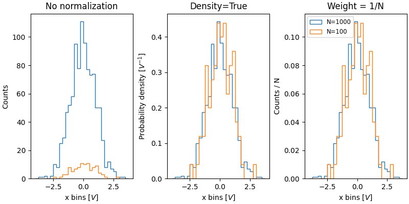
For the five cleaned records, counts are the most direct choice. If you later compare distributions from groups of substantially different sizes, use the same bin edges for both groups and consider density=True. Label the resulting y-axis “Density per signal_a unit,” not “Count.”
Plot performance against training-set size
A learning curve in the following sense places the number of training examples on the x-axis and a model score on the y-axis. Plotting both training and held-out performance lets you see not only whether a score changes with data size, but also whether the two scores move together. An accuracy of means 85% of the evaluated examples were classified correctly.
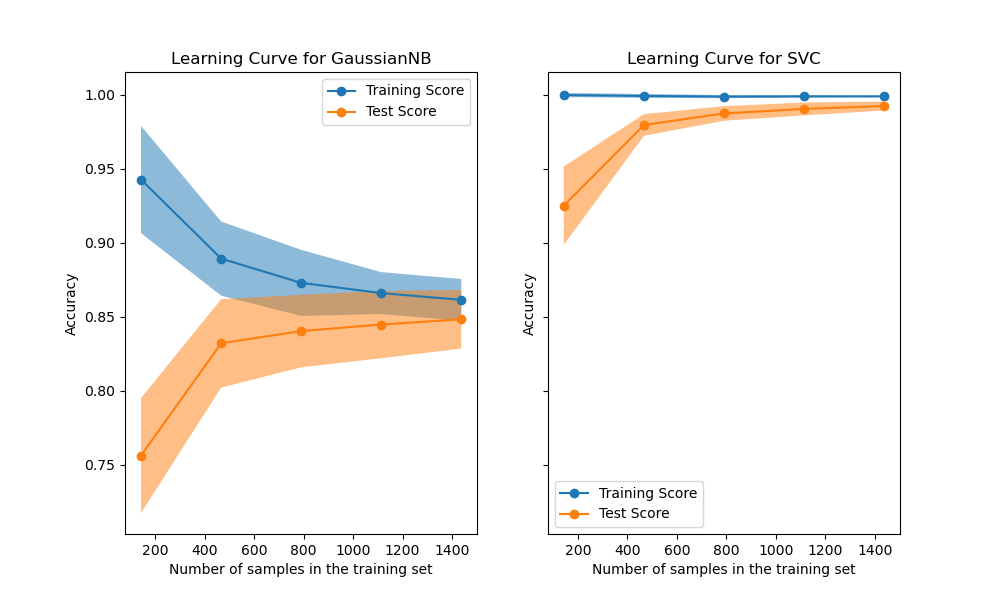
Read the axes before interpreting a curve. In the left panel, the orange score rises as training-set size increases, while the blue score falls from its high value on the smallest training set. In the right panel, both scores are high by the largest sizes shown. The chart alone does not tell you which model is appropriate for a different dataset, or precisely what the shaded bands quantify; those claims require the experimental setup.
You can learn the plotting mechanics without pretending that last lesson’s five-row CSV supports a model experiment. The values below are illustrative records, not measured model results. Writing and reading them as a CSV mimics a useful workflow: keep recorded results separate from the code that visualizes them.
from pathlib import Path

curve_path = Path("illustrative_curve.csv")

illustrative_results = pd.DataFrame({
    "train_size": [100, 250, 500, 800, 1400],
    "train_accuracy": [0.94, 0.90, 0.88, 0.87, 0.86],
    "validation_accuracy": [0.75, 0.81, 0.83, 0.845, 0.848],
})
illustrative_results.to_csv(curve_path, index=False)

curve = pd.read_csv(curve_path).sort_values("train_size")
assert curve["train_size"].is_monotonic_increasing
assert curve[["train_accuracy", "validation_accuracy"]].notna().all().all()

fig, ax = plt.subplots(figsize=(7, 4), layout="constrained")
ax.plot(
    curve["train_size"],
    curve["train_accuracy"],
    marker="o",
    label="Training accuracy",
)
ax.plot(
    curve["train_size"],
    curve["validation_accuracy"],
    marker="o",
    label="Validation accuracy",
)

ax.set_xlabel("Number of training examples")
ax.set_ylabel("Accuracy (fraction correct)")
ax.set_title("Illustrative learning curve — not measured")
ax.set_ylim(0.70, 1.00)
ax.legend()
ax.grid(alpha=0.3)

fig.savefig("illustrative_learning_curve.png", dpi=150)
plt.show()
Here ax.plot() joins observations made at different training-set sizes, and marker="o" shows where values were actually supplied. The y-axis starts at to make differences easier to see; its label and tick marks must remain visible so the zoom is not mistaken for a full zero-to-one scale.
The distinction between training and validation belongs in the chart and in the experiment. A validation score should come from examples not used to fit the model at that training-set size. The supplied image labels its held-out series “Test Score”; the code labels ours “Validation accuracy.” Do not relabel one as the other without knowing how the scores were obtained. Later lessons will cover splitting data, recording real scores, and diagnosing curve shapes. When you reach that point, replace the illustrative CSV with actual recorded results—and add uncertainty bands only if you have computed quantities for them to represent.
A plot against training-set size is also different from a plot against training epochs. Both can contain training and validation lines, but their x-axes answer different questions: how performance changes with more examples versus how it changes with more optimization steps. The plotting commands are similar; the experimental meaning is not.
What to take forward
Use a histogram to show where numerical observations fall, with bin coverage and y-axis normalization stated honestly. Use a learning curve to show scores against a clearly named x-axis, distinguishing training from held-out results. In both cases, explicit fig, ax code, informative labels, and saved image files make plots easier to inspect and reuse.
Next, you’ll track a small experimental project with Git commits and branches. The CSV and PNG files you created here provide concrete artifacts to organize—but the illustrative learning curve must remain labeled as illustrative, not presented as an experiment.