Recommended resources
The freely available resources this lesson will direct you to.
Hello! This first module begins with the tools you’ll use for head studies in ibis Paint, then moves into constructing and correcting the head. Before drawing a portrait, it’s worth making your marks predictable. In this lesson, you’ll set up pressure response and choose a small brush set that can sketch, lay down substantial paint, and soften a transition without blurring everything together. Allow about 40 minutes, including time to try the settings on a canvas.
Make pressure response predictable
Pressure sensitivity lets a compatible stylus change a stroke as you press harder. Depending on the brush, that change may affect thickness, opacity, or both. Your first aim is not to find a perfect curve; it is to make a light stroke reliably different from a firm one.
【ibisPaint】How to Pressure Sensitivity and Stabilizer mode
Watch ibisPaint’s “How to Pressure Sensitivity and Stabilizer mode” for a quick look at where the pressure control lives and how its graph can be adjusted.
Watch pressure setup. Notice the route through the tool picker and settings, and how the presenter adds a point to the curve. You can leave the other stabilizer options for now.
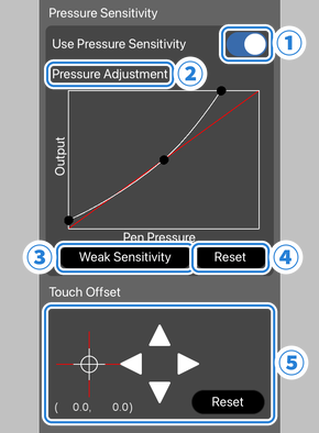
180. Settings window details - How to use ibisPaint
Read ibisPaint’s explanation of its pressure graph so that adjustments have a clear purpose rather than becoming guesswork.
In “Pressure Sensitivity / Touch Offset,” read the numbered controls, from “Use Pressure Sensitivity” through “Reset.” Below the Touch Offset explanation and accompanying image, read the knob instructions. Focus on what raising or lowering the curve changes.
Start with Use Pressure Sensitivity enabled and the graph at its reset position. On a spare canvas, draw three strokes with the same brush and roughly the same speed: one light, one medium, and one firm. Keeping speed similar helps you see whether pressure, rather than a faster hand movement, caused the difference.
If light marks are nearly invisible and you must press uncomfortably hard, raise the curve a little in the light-pressure portion. If every mark starts heavy, lower that portion instead. Change one thing, test again, and keep the change modest. Because brushes respond differently, a curve that helps one brush may be excessive for another. If the control is gray, ibisPaint reports that pressure sensitivity is unavailable with the current device or stylus connection. You can still work effectively with the brush’s thickness and opacity controls; pressing a finger harder is not a substitute for a supported pressure-sensitive stylus.
Choose brushes by job, not by quantity
A large brush library can make each new mark a search for a different tool. For the coming portrait studies, begin with two brushes in three working configurations:
| Job | Starting choice | What to look for |
|---|---|---|
| Sketching | Dip Pen (Soft) at a fairly small size | Lines that stay readable but can vary as you draw lightly or firmly |
| Blocking paint | Flat Watercolor Opaque at a larger size and high opacity | Broad, connected patches that establish a clear shape |
| Softening paint | The same Flat Watercolor Opaque, with lower opacity | Controlled strokes that ease a boundary while leaving some surface character |
These are starting roles, not permanent rules. A brush is useful if it makes the intended mark repeatably on your device.
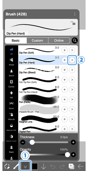
The sliders visible at the bottom of the brush window set your immediate Thickness and Opacity. Those differ from pressure settings: choosing a larger thickness changes the brush’s working size, while pressure determines how a responsive brush varies within a stroke. If all your sketch lines are too broad, reduce Thickness before reshaping the global pressure curve.
182. Details of Brush Parameters - How to use ibisPaint
Read ibisPaint’s brush-parameter guide to distinguish the brush window’s basic controls from a brush’s own pressure response. You do not need to customize every parameter.
At the beginning of “Details of Brush Parameters,” read the settings overview; locate “Basic” and “Dynamic” in its list of tabs. Then, in the Dynamic parameter list, start at “Pressure - Thickness” and read the pressure entries through “Pressure - Blurring.” Concentrate on thickness and opacity; leave blur and speed parameters unchanged for this lesson.
This gives you two levels of control: the pressure graph affects how your pen input is interpreted, while a brush’s Dynamic settings determine which qualities of that particular brush respond. Keep the presets close to their defaults initially. If one brush behaves unexpectedly after your general pressure test, inspect that brush rather than repeatedly changing the global curve.
For a painterly option, watch one artist use Flat Watercolor Opaque across several jobs. Treat the demonstration as an example of behavior, not a preset you need to reproduce.
BEST IBISPAINT BRUSH EVER (and how to use it)
Fungzau’s “BEST IBISPAINT BRUSH EVER (and how to use it)” shows why one brush can handle substantial painting and gentler transitions. The recommendation is the creator’s preference, so judge the brush by your own test marks.
Watch finding the brush, including the distinction between Flat Watercolor Opaque and its “2” variant. At stroke variation, notice width changing with stylus force. Finally, watch painting transitions for the contrast between stronger paint marks and lower-opacity strokes that soften a transition without relying entirely on smudge.
For blocking, choose a size broad enough to cover a noticeable part of a cheek or forehead in a few strokes, with opacity high enough to read as a definite shape. For softening, keep that brush but lower its opacity and work with a few intentional strokes near the boundary. Softening does not mean erasing the boundary: a portrait needs both clear edges and gentle ones to describe form.
Check the set on one small canvas
Spend roughly ten minutes making a simple swatch rather than starting a finished face. Sketch an oval and a centerline with Dip Pen (Soft). Then use Flat Watercolor Opaque to place one light patch beside one dark patch. Try its lower-opacity configuration along part of their meeting edge, leaving the rest crisp for comparison.
As you work, look for three practical results. Your sketch should remain legible without requiring heavy pressure. Your blocking brush should make a solid patch without dozens of tiny strokes. Your softening strokes should make the chosen boundary gentler while preserving the distinction between the two patches. If a result fails, adjust the relevant brush’s size or opacity first; revisit the pressure curve only when the pressure response itself feels wrong across brushes.
Save the settings that pass this check. There is no need to assemble more presets yet: a compact set makes it easier to learn what each stroke is doing.
Takeaway
You now have a baseline pressure curve, a way to test it, and two brushes covering three essential painting jobs. The central distinction is between global pressure response, per-brush behavior, and the current thickness and opacity sliders. Knowing which one you are changing makes corrections much faster.
Next, you’ll arrange a reference, canvas, and temporary layers for an efficient portrait study. Your brush set can then serve the drawing rather than interrupt it.