Hello! Welcome back to our work on your brand's logo.
In our last lesson, we took a big step by defining a complete logo system—your primary, secondary, and submark/icon variations. We also detailed the technical specifications for each, covering clear space, minimum size, color codes, and file formats. You can think of that as creating the high-quality, standardized components for your brand.
Today, we'll build the instruction manual for those components. The goal is to create clear usage guidelines for logo placement, sizing, and clear space. These rules are not about limiting creativity; they are about protecting your brand's integrity and ensuring it always looks professional, intentional, and recognizable. This is a critical section of the brand guidelines you'll eventually hand off to a designer, removing ambiguity and ensuring consistency across every application.
The Importance of "Personal Space" for Your Logo
A logo's impact can be easily diminished if it's crowded by other elements. That's why the first and most important rule to establish is clear space—an invisible "force field" or exclusion zone that surrounds the logo.
In the last lesson, we introduced this concept. Now, let's dive into the practical method for defining and visualizing it. The most robust way to do this is to derive the clear space measurement from the logo itself, ensuring it scales proportionally.
The video 'What Is Clearspace For Logos?' from the Will Paterson channel provides an excellent, hands-on demonstration of how to define this space.
Please watch the following sections: 00:17 - 00:59: The presenter defines clear space and its purpose. 00:59 - 02:31: Pay close attention to how he uses a letter from the logo itself (the 'T') to define a proportional, scalable buffer zone. This is the key technique. 03:17 - 05:20: Notice how this same principle is adapted for different logo styles (script and icon-based). This shows the versatility of the method.
As you saw, the measurement is often called the "x-unit." By using a part of your logo (like the height of a letter or a part of your symbol), the clear space rule remains consistent no matter how large or small the logo is displayed.
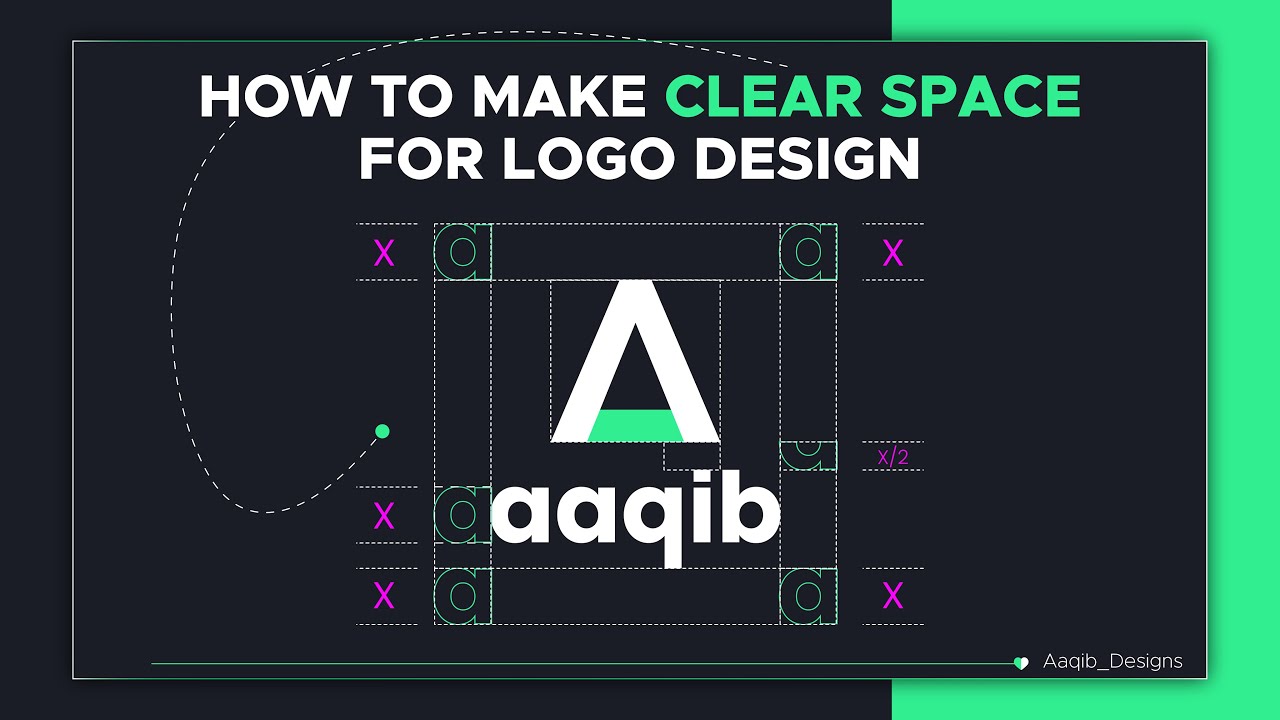
To go deeper, this article details various ways to define your "x-unit" depending on your logo's design.
How to Make Clear Space for a Logo
The article 'How to Make Clear Space for a Logo' by Ofspace provides a comprehensive look at different methods for defining your clear space.
Please read the section titled 'How to Make Clear Space and Proportional Ratio Logo Like a Pro (Logo Spacing Guidelines)'. Focus on the six different methods presented. You don't need to memorize them all, but understand the logic behind choosing an element—like a letter, the x-height, or part of a logomark—to define your spacing.
For your woodworking brand, you might use the height of the first letter of your brand name, or a distinct element from your brand symbol, as your scalable 'x' unit.
Test your understanding!
Imagine your logo for the woodworking studio uses a stylized symbol of a wood plane tool next to the brand name. Which element would be a good candidate for defining your 'x' unit for clear space?
Show answer
There are several good options! You could use:
- The height of a specific part of the wood plane symbol, like the handle.
- The x-height of the lowercase letters in your brand name.
- The cap-height (height of a capital letter) if your brand name starts with one.
The key is to choose a distinct, easily measurable element that is integral to the logo's design.
Defining Rules for Sizing and Placement
Once you've protected your logo with clear space, you need to set rules for its size and position.
Minimum Size
As we touched on previously, every logo has a size below which it becomes illegible. This is especially important for a premium brand where clarity is paramount. Your guidelines must specify this limit.
- For Digital: Define a minimum width or height in pixels (px). For example, "The primary logo must not be used at a width smaller than 300px."
- For Print: Define this in physical units (mm or inches). For example, "The minimum print width for the primary logo is 40mm." This is crucial for business cards, labels, or even the small metal plaque you might affix to your furniture.
Proportional Scaling
A cardinal rule of logo usage is to never distort the logo. It must always be scaled proportionally. Your guidelines should explicitly state this. This means no stretching, squashing, or shearing. Given your mechanical design background, think of this as maintaining the original aspect ratio of a part drawing.
Consistent Placement
While placement can be flexible, establishing standard positions helps build brand recognition. For example, you might decide:
- On your website: The logo always appears in the top-left corner of the header.
- On social media posts: The logo is placed in the bottom-right corner.
- On letterheads: The logo is centered at the top.
You don't need to dictate every possibility, but defining a default placement for your most common applications creates a strong sense of consistency.
Showing What Not to Do: The "Don'ts"
One of the most effective ways to create clear guidelines is to visually demonstrate common mistakes. A "Logo Misuse" or "Don'ts" section is standard in professional brand guides.
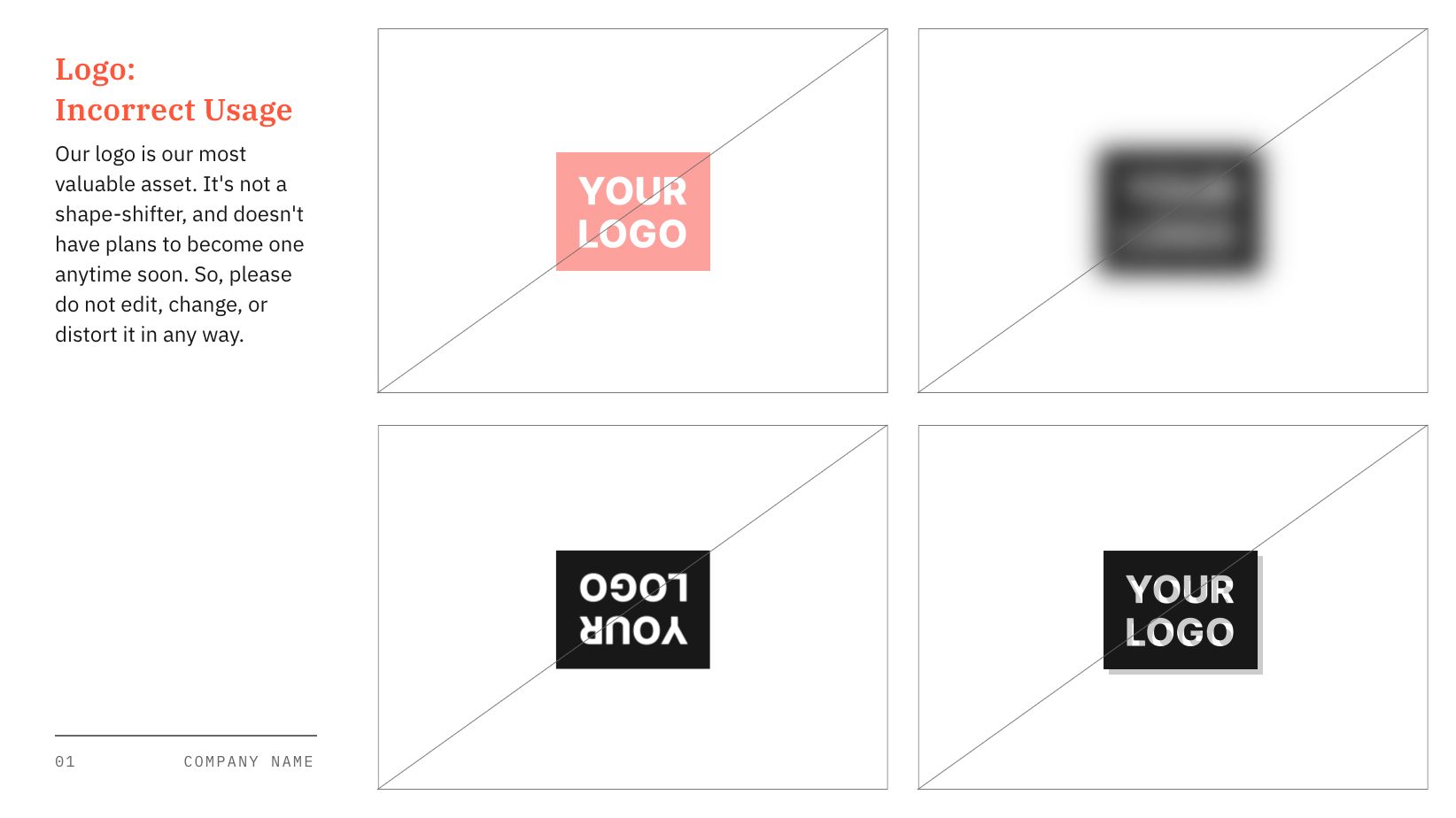
Your guidelines should include a similar section with clear visual examples.
Logo usage guidelines: What they are and how to set them
Let's review a checklist of what to include in your guidelines, which also contains a great list of common misuses to forbid.
Please read the section 'Examples of bad logo usage'. This list provides the exact types of misuse you should illustrate in your own guidelines.
The most common mistakes to forbid are:
- Do not stretch or distort the logo.
- Do not change the logo's colors (except for the approved variations like all-black or all-white).
- Do not rotate or tilt the logo.
- Do not place the logo on a busy or low-contrast background that makes it hard to read.
- Do not add effects like drop shadows, glows, or bevels.
- Do not rearrange or remove elements from the logo (unless it's an approved variation).
- Do not violate the clear space.
Bringing It All Together
Ultimately, these rules for placement, sizing, and clear space will become a key chapter in your final brand guidelines document. They provide a clear, easy-to-follow reference for any designer, marketer, or partner who works with your brand.
This one-page "brand poster" concept is a great example of how these elements can be presented in a concise, visual format.
HOW TO: Design a Brand Identity System
The video 'HOW TO: Design a Brand Identity System' by Butler Branding Agency shows how they consolidate key brand rules into a 'brand poster'. This is a great example of a practical deliverable.
Please watch from 12:52 to 14:41. See how they present the logo variations, colors, typography, and logo usage examples all on a single, digestible page. This is a great format to aim for when summarizing your logo rules.
Conclusion
You have now established the essential rules that will protect your logo and ensure it is used with consistency and professionalism. By creating these guidelines, you are building a strong foundation for your brand identity that safeguards your investment in its design.
Key Takeaways:
- Clear Space: A non-negotiable "exclusion zone" around your logo, defined by a scalable unit ('x') derived from the logo itself.
- Sizing Rules: Your guidelines must specify a minimum size for both print and digital use and strictly forbid any disproportional scaling (stretching or squashing).
- Placement: Establishing standard placements for common applications builds consistency.
- Logo Misuse: A "Don'ts" section with visual examples is a powerful and clear way to prevent common mistakes like altering colors, adding effects, or placing the logo on busy backgrounds.
Next Up:
We have now completed the core work on your logo system. In the next module, we will zoom out and begin Developing the Full Visual Identity System. Our first lesson will focus on defining the components of this system that exist beyond the logo and colors, such as brand photography style, iconography, and supporting graphic elements like patterns or textures. This is where we'll start building the complete visual world your brand will live in.