Hello! Welcome back.
In our last few lessons, we've done a deep dive into the core assets of your brand's visual toolkit: the logo system, color palette, and typography. You've now established the foundational rules for how your logo should be used to ensure it always looks its best.
Now, it's time to zoom out. A powerful brand identity is more than just a great logo and a few colors; it's a complete, immersive visual world. This lesson will focus on defining the components of that world. Our learning outcome is to define the components of a complete visual identity system beyond the logo and colors.
Think of it this way: if your logo is the protagonist of your brand's story, these other elements are the setting, the atmosphere, and the supporting characters. They all work together to create a consistent and emotionally resonant experience for your audience.
The Anatomy of a Visual Identity System
A visual identity is the sum of all the visual elements that represent and differentiate your brand. You can think of this as a system of interconnected components, much like a mechanical assembly. Each part has a specific function, but they are all designed to work together harmoniously.
Creating a graphic charter for a luxury brand
The article 'Creating a graphic charter for a luxury brand' provides an excellent, structured overview of the essential elements that make up a complete visual identity. Its focus on the luxury sector is particularly relevant to your goal of building a premium brand.
Please read the section titled 'Essential elements in a graphic charter'. As you read the list, notice how it goes beyond just the logo and colors to include visuals, layout, and overall tone.
Based on that reading and standard brand design practice, a complete visual identity system includes:
- Logo System: The various logo lockups and marks. (You've already defined this).
- Color Palette: Your primary, secondary, and accent colors. (You've already defined this).
- Typography System: Your primary and secondary typefaces and usage rules. (You've already defined this).
- Photography & Videography Style: The consistent mood, subject matter, and composition of your images and videos.
- Iconography & Illustration Style: A unique family of icons or illustrative graphics.
- Supporting Graphic Elements: Background patterns, textures, or other brand-specific visual devices.
- Composition & Layout: Guiding principles for how these elements are arranged, often using grids and rules for white space.
Now, let's explore these new components in more detail.
Exploring the Visual World with Stylescapes
Before committing to a specific photography style or pattern, designers often create stylescapes. These are highly curated, wide-format mood boards that explore how all the different visual elements might look and feel together. They are a powerful tool for translating the abstract ideas from your brand strategy (like "premium," "natural," "crafted") into a tangible visual direction.
Building a Brand – Redesigning a Business Start to Finish
In this clip from 'Building a Brand' by Matthew Encina, you'll see exactly how stylescapes are used to explore and refine the visual direction for a brand before any final assets are created.
Please watch from 11:54 to 13:47. Pay attention to how different themes ('Serious Fun', 'Crafted Narrative') are visualized and how the final direction is a combination of the best elements.
As you begin to think about your brand's photography and other elements, creating a simple stylescape for yourself can be an invaluable exercise to ensure all the pieces feel like they belong to the same family.
The Key Components in Detail
1. Brand Photography & Videography Style
For a premium woodworking brand, photography is arguably one of the most critical components. It’s how you’ll communicate the quality of your materials, the skill of your craftsmanship, and the beauty of the final product. A defined photography style ensures that every image, whether on your website or Instagram, feels like it came from you.
Building a Brand – Redesigning a Business Start to Finish
Let's return to the Matthew Encina video. After finalizing his stylescape, he defines clear principles for his brand's photography. This is a perfect example of what goes into a photography style guide.
Watch from 15:52 to 16:43. Note the specific principles he establishes for lighting, color tones, scene composition, and the presence of people. These are the exact kinds of rules you will develop for your brand.
Your style guide for photography would answer questions like:
- Lighting: Do we use bright, natural light or dramatic, moody shadows?
- Color & Tone: Are the images warm and inviting, or cool and crisp?
- Subject Matter: Do we focus on wide shots of furniture in beautiful rooms, or tight macro shots of wood grain and joinery? Do we show the CNC machine in action to highlight precision?
- Composition: Are our photos clean and minimalist, or rich and layered with props?
We will dedicate our entire next lesson to developing a detailed photography style guide.
2. Iconography and Illustration
Iconography is a set of custom-designed icons that serve functional purposes (e.g., website navigation) or communicate concepts visually. A unique icon set can make a digital experience feel much more bespoke and branded than using generic stock icons.
Illustrations can add personality and explain complex ideas in a way that photography can't. For your brand, this could range from technical drawings of your furniture designs to hand-drawn illustrations that tell the story of the wood's origin.
Building a Brand – Redesigning a Business Start to Finish
In the final summary of his brand redesign, Matthew Encina highlights how they developed custom iconography as part of their new visual language.
Watch from 19:25 to 19:45. Notice how the style of the custom iconography is driven by the brand's 'alter ego' concept, ensuring it's not just functional but also reinforces the brand personality.
3. Supporting Graphic Elements (Patterns & Textures)
These are unique, repeatable visual assets that add depth, texture, and brand recognition to your designs. They can be used as backgrounds on your website, on packaging, or as subtle details on social media graphics.
A great source for these elements can be the logo itself.
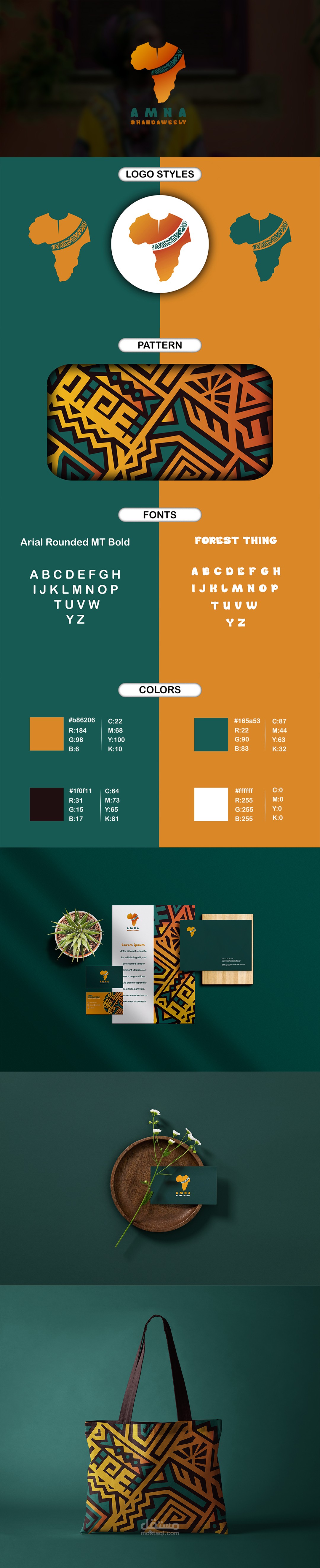
In the example above, the geometric pattern becomes just as recognizable as the logo. For your brand, you might consider:
- A pattern derived from a simplified element of your logo.
- A subtle texture that evokes the grain of a specific wood you use.
- A pattern inspired by traditional East African textiles, reinterpreted in a modern, premium style.
Test your understanding!
Looking at the 'AMNA' brand identity image above, besides the logo and colors, what other distinct components of a visual identity system can you identify?
Show answer
You can clearly see several components working together:
- Supporting Graphic Element: The prominent orange and teal geometric pattern.
- Typography: A specific pairing of a bold, rounded font for headings ('Arial Rounded MT Bold') and a more decorative font ('Forest Thing').
- Logo System: At least three variations of the logo are shown.
- Application Examples: It shows how the system is applied to business cards, letterheads, and merchandise (tote bag), which is part of defining layout rules.
The System in Action: Brand Boards
A "brand board" or "brand poster" is a fantastic way to see all these components on a single page, demonstrating how they work as a cohesive system.
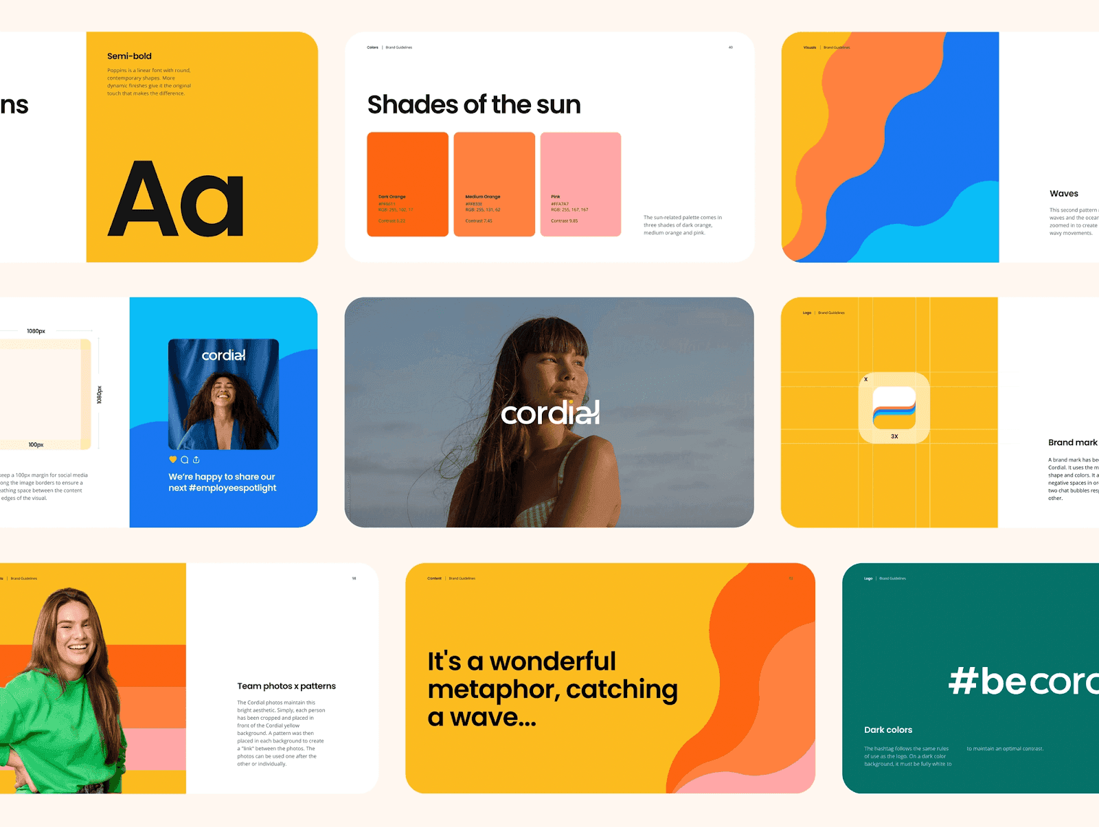
This example explicitly shows all the components we've discussed:
- Typography:
Poppins Semi-Bold. - Color Palette:
Shades of the sun. - Supporting Graphic Elements: The
Wavespatterns. - Photography Style: Guidance on using team photos with brand patterns.
- Layout: Examples of how to combine these elements in social media posts.
This is the goal: to create a set of distinct but related assets that can be combined in flexible yet consistent ways.
Conclusion
Today, we've expanded our view from individual assets to a complete visual identity system. You now understand that a powerful brand communicates through a family of interconnected visual elements.
Key Takeaways:
- A visual identity system includes the logo, colors, and typography, but also extends to photography style, iconography, supporting patterns/textures, and layout principles.
- These elements work together to create a consistent, recognizable, and emotionally engaging brand world.
- Tools like stylescapes can help you explore and define the overall aesthetic before creating final assets.
- The ultimate goal is a cohesive system where every visual element feels like it belongs to the same brand family.
Next Up:
We will take the first, most important step in building out your system: developing a brand photography style. Given that you are selling premium, physical products, your photography will do the heaviest lifting in communicating quality and creating desire. We will define the specific rules for lighting, composition, and subject matter that will bring your woodworking brand to life.