Hello again! Welcome back to our work on building your brand's visual identity.
In the last lesson, we created a framework for your brand's photography style. We established that every photo, whether it's of a finished product or the crafting process, must work together to tell a consistent story of quality, craftsmanship, and a premium, natural aesthetic.
Today, we will extend this principle of a cohesive visual system to two other important elements: iconography and illustrations. Our goal is to establish a style for your brand's iconography and illustrations to ensure consistency. These small but mighty visuals play a huge role in shaping user experience and communicating your brand's personality, from your website to your social media graphics.
Iconography vs. Illustration: What's the Difference?
First, let's clarify the terms. While related, they serve different purposes:
- Iconography is a set of functional, symbolic graphics. Think of the magnifying glass for "search" or the shopping cart icon. They are visual shorthand that helps users navigate and understand information quickly. For your brand, you might have icons for "Wood Types," "Sustainability," or "Custom Orders."
- Illustrations are more decorative and narrative. They tell a story, evoke an emotion, or explain a complex idea visually. An illustration might show the journey of wood from forest to furniture or depict a stylized scene of a room furnished with your pieces.
While their functions differ, their visual styles must be harmonious and feel like they belong to the same brand family.
Part 1: Defining a System for Your Brand Icons
Because you have a background in engineering, you'll appreciate that great iconography is built on a clear, logical system. A consistent set of icons makes a brand feel professional, trustworthy, and easy to use.
The importance of consistent brand iconography style
To understand the fundamentals, let's start with the article 'The importance of consistent brand iconography style' from Brand Guidelines Lab. It clearly explains why consistency is so important and what specific attributes you need to define.
Please read the sections 'What Is Brand Iconography?', 'Why Consistency in Iconography Matters', and 'What Should Be Included in Iconography Guidelines?'. Pay close attention to the checklist in the last section, as this will form the basis of your own guidelines.
As the article details, defining an icon style isn't about vague feelings; it's about making concrete decisions on specific visual parameters. A strong set of guidelines ensures that any icon created for your brand—whether by you or a future designer—will look and feel consistent.
Here are the key parameters you'll need to define:
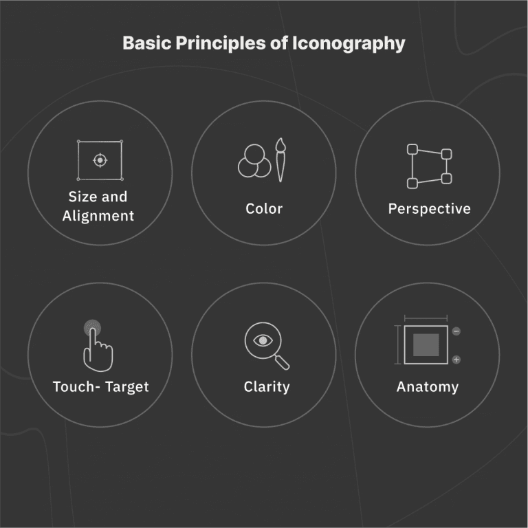
Based on the article and this visual summary, the core elements to specify for your icon set are:
- Visual Style: Will they be line-based (outline), filled, or a mix?
- Stroke Weight: If line-based, what is the line thickness (e.g., 2px)? Consistency here is crucial.
- Corner Style: Are corners sharp and geometric (suggesting precision) or rounded (suggesting softness and friendliness)?
- Level of Detail: Will they be simple and abstract or more detailed and illustrative?
- Color Usage: Will they be monochrome, use the primary brand colors, or have multiple colors?
Part 2: Sourcing Inspiration from East African Art
Now for the creative part. Instead of using generic, off-the-shelf icons, you have a unique opportunity to create a style that is deeply connected to your brand's location and the concept of premium craftsmanship. Traditional East African art and design offer a rich vocabulary of shapes and symbols.
Characteristics of East African Paintings: A Comprehensive ...
To explore this visual language, let's look at the article 'Characteristics of East African Paintings'. It provides a fantastic analysis of the symbolic meanings behind common visual elements in the region's art.
Please read the subsections on 'Geometric Patterns and Symbolic Motifs' and 'Wildlife and Natural Environment'. Focus on how shapes like circles and triangles, and animals like elephants and lions, are used to convey deeper meanings.
This article gives us powerful building blocks for a unique iconography style:
-
Geometric Motifs:
- Circles: Symbolize unity, completeness, and the sun.
- Triangles: Can represent mountains, or the connection between earth and sky.
- Zigzags: Often symbolize water, lightning, or pathways.
-
Symbolic Wildlife:
- Elephants: Represent wisdom, leadership, and ancestral connection.
- Lions: Represent courage, strength, and authority.
- Birds: Can be messengers or spiritual guardians.
Look at how these principles manifest in traditional craft:

Test your understanding!
Imagine you need to create three icons for your website: one for "Materials," one for "Durability," and one for "Community." How might you use the symbolic language from the East African art article to represent these concepts?
Show answer
There are many possibilities, but here are a few ideas:
- Materials: A simple, stylized leaf icon to represent wood, perhaps enclosed in a circle to symbolize unity with nature.
- Durability: A stylized elephant icon, focusing on its strong form, to symbolize wisdom and longevity. Alternatively, a triangular mountain shape could represent permanence and strength.
- Community: A set of three interlocking circles to represent unity and social connection, or stylized figures reminiscent of those seen in communal paintings.
Part 3: Developing a Style for Brand Illustrations
While your icons will be functional and simple, your illustrations can be more expressive and tell a bigger story. The process for defining an illustration style starts with the same foundation: your brand's personality.
Illustration Styles for Brands with Mika Bacani
This video, 'Illustration Styles for Brands with Mika Bacani', offers an excellent walkthrough of how a designer translates a brand's essence into a distinct illustration style.
Please watch from 01:21 to 04:40. Pay close attention to how she discusses brand personality (bright/dark, traditional/modern) and how that informs choices about line quality, color, and medium (e.g., hand-drawn vs. vector).
The video gives you a framework for making key decisions. Ask yourself: is your brand...
- ...more traditional or modern?
- ...more casual or refined?
- ...more hand-crafted or machine-precise?
Your answers will guide your illustration style. For your woodworking studio, which combines CNC precision with hand-finishing, you could explore a fascinating hybrid style:
- Structure: Clean, geometric forms and lines (representing the CNC).
- Texture: Subtle, hand-drawn textures or imperfect line weights (representing the human touch and natural wood grain).
- Color: A palette drawn from the natural earth tones discussed in the East African art article (ochre, deep reds, charcoal black) to ground the modern forms in an authentic context.
This combination would tell the unique story of your brand—a blend of modern technology and timeless craftsmanship, rooted in its East African identity.
Part 4: Your Turn to Define the Guidelines
Now it's time to consolidate these ideas into a clear set of rules for your brand guidelines document.
Iconography Guidelines Template:
- Style:
e.g., Line-based, geometric forms - Inspiration:
e.g., Inspired by patterns in Swahili coast architecture and Maasai beadwork - Stroke Weight:
e.g., Consistent 2px stroke - Corner Style:
e.g., Sharp, 90-degree corners to reflect precision - Color Usage:
e.g., Monochrome in primary brand black. Can use one accent color for hover states. - Level of Detail:
e.g., Minimalist and abstract. Focus on the core symbolic shape.
Illustration Guidelines Template:
- Overall Vibe:
e.g., Educational, sophisticated, and warm. Tells a story about process and materials. - Line Style:
e.g., Clean vector lines with a slight, subtle texture to give a human feel. - Color Palette:
e.g., Use the secondary brand palette (earth tones). Avoid overly bright, synthetic colors. - Subject Matter:
e.g., Stylized depictions of the workshop, cross-sections of wood grain, maps of where materials are sourced, symbolic local wildlife. - Composition:
e.g., Use ample white space. Compositions should feel balanced and calm.
Conclusion
You've now established a system for creating two more crucial parts of your visual identity. By defining a clear style for your icons and illustrations, you ensure they work in harmony with your logo, colors, and photography to build a strong, recognizable, and authentic brand. Most importantly, by drawing inspiration from the rich visual heritage of East Africa, you are building a brand that is not just premium, but also meaningful and deeply rooted in its culture.
Key Takeaways:
- Iconography is a functional system: Consistency in style, stroke, and color is essential for user experience and professionalism.
- Illustrations tell a story: Their style should reflect the brand's personality and values.
- Authentic inspiration is powerful: Using elements from East African art and craft will give your brand a unique and resonant visual language.
- Guidelines are essential: Documenting your style rules ensures consistency as your brand grows.
Next Up:
We will continue building out your visual toolkit by exploring another supporting element: patterns and textures. The geometric ideas we've explored today will be a perfect foundation for developing unique brand patterns that can be used on packaging, your website background, or other marketing materials.