Welcome back!
In our last lesson, we focused on establishing a consistent style for your brand's iconography and illustrations, drawing inspiration from East African art to create a unique visual language. We set up guidelines for everything from line weight to subject matter, ensuring these elements would feel cohesive and authentic.
Today, we'll add another essential layer to your brand's visual system: supporting graphic elements like patterns and textures. This lesson is designed to help you define how to use these elements to add depth, personality, and a premium feel to your brand. By the end, you'll understand their strategic role and be able to create clear guidelines for their use.
The Difference Between Texture and Pattern
While often used together, texture and pattern play distinct roles in design. A texture relates to the tactile or perceived surface quality of an object, while a pattern is a repeating decorative design.
To get a clear understanding of this distinction, let's watch a short video.
‘Texture’ Visual element of Graphic Design Ep5/45 [Beginners guide to Graphic Design]
The video ‘Texture’ Visual element of Graphic Design from Gareth David Studio provides an excellent breakdown of these concepts. It clearly differentiates between 'image texture' (which evokes sensation) and 'pattern texture' (which is more about visual recognition).
Please watch from 01:09 to 04:27. As you watch, notice how the video explains that texture can trigger emotional and sensory responses, while patterns work well as decorative, brand-building elements.
As the video explains:
- Texture is the perceived feel of a surface. It can be physical (the roughness of sandpaper) or purely visual (a digital image of wood grain). Its power lies in its ability to tap into our sensory memory and evoke emotions. A wood texture feels natural and warm; a metallic texture can feel sleek and modern.
- Pattern is a repetition of graphic motifs. Its power lies in creating a distinct, recognizable visual rhythm. Think of Burberry's iconic check or Louis Vuitton's monogram. A well-designed pattern becomes a signature for your brand.
The Strategic Role of Supporting Graphics
So, why dedicate a lesson to these "background" elements? Because they are crucial for building a complete and immersive brand identity. They provide a consistent visual backdrop that ties everything together.
All The Assets Your Brand Identity Package Needs
This short clip from the Superside video 'All The Assets Your Brand Identity Package Needs' explains where these supporting elements fit into a professional brand identity package.
Please watch from 04:37 to 05:05. The video refers to them as the 'background of a brand's visual identity,' which perfectly captures their role.
These supporting elements are not just decoration; they are a strategic tool. They help you:
- Build Consistency: They create a recognizable look across all touchpoints, from your website to your packaging, without having to place your logo on every square inch.
- Add Depth and Personality: They add richness and a tactile quality to your designs, making your brand feel more premium and considered.
- Communicate Values Subconsciously: A natural wood texture quietly reinforces your commitment to craftsmanship and nature. A pattern inspired by local art communicates cultural authenticity.
Brand Texture Guidelines: Crafting a Cohesive Visual Identity
To go deeper into the psychology and strategy, the article 'Brand Texture Guidelines' from Octopus Marketing is an excellent resource. It explains how textures can trigger sensory memory and build emotional connections.
Please read the first two main sections: 'What Are Brand Textures and Why Do They Matter?' and 'The Psychology Behind Texture in Branding'. Focus on how visual textures can activate the brain's sense of touch and communicate brand values without words.
Developing Textures and Patterns for Your Brand
Now, let's apply these ideas directly to your premium woodworking studio.
Choosing Your Textures
For a brand centered on woodworking, the choice of textures is intuitive and powerful. Your primary textures should be derived from your materials and environment.
- Wood Grain: This is your most authentic texture. I recommend building a library of high-resolution photographs of the specific woods you use in your workshop. A close-up of reclaimed dhow wood or Mninga has a story that a generic stock photo doesn't.
- Complementary Natural Textures: Think about other materials that align with a premium, natural aesthetic. This could include:
- Stone or Concrete: Polished concrete can convey a modern, clean look, contrasting beautifully with warm wood.
- Linen or Canvas: These fabrics suggest natural comfort and quality.
- Handmade Paper: A fibrous paper texture can reinforce the idea of craft and attention to detail.
Designing Your Patterns
Your patterns are an opportunity to express your brand's unique identity, blending your modern precision with your East African roots. This is where the geometric motifs we discussed in the last lesson become incredibly valuable.
10 Cool Patterns That Will Transform Your Brand Identity
The article '10 Cool Patterns That Will Transform Your Brand Identity' by NoBoringDesign provides a great overview of different pattern styles. Let's focus on the two most relevant to your brand.
Please read the descriptions for '1. Geometric Minimalism' and '3. Heritage-Inspired Patterns'. These two styles can be blended to create something unique for your brand: clean, modern patterns that are rooted in tradition.
You can create a powerful brand pattern by taking inspiration from:
- Maasai beadwork: The triangular and diamond shapes can be simplified into a clean, repeatable geometric pattern.
- Swahili architectural carvings: The intricate geometric latticework found on doors and balconies in Zanzibar can be distilled into a modern, minimalist line-based pattern.
- Tinga Tinga art: While the subject matter is often figurative, the use of bold outlines and dense, dot-based backgrounds can inspire a textural pattern.
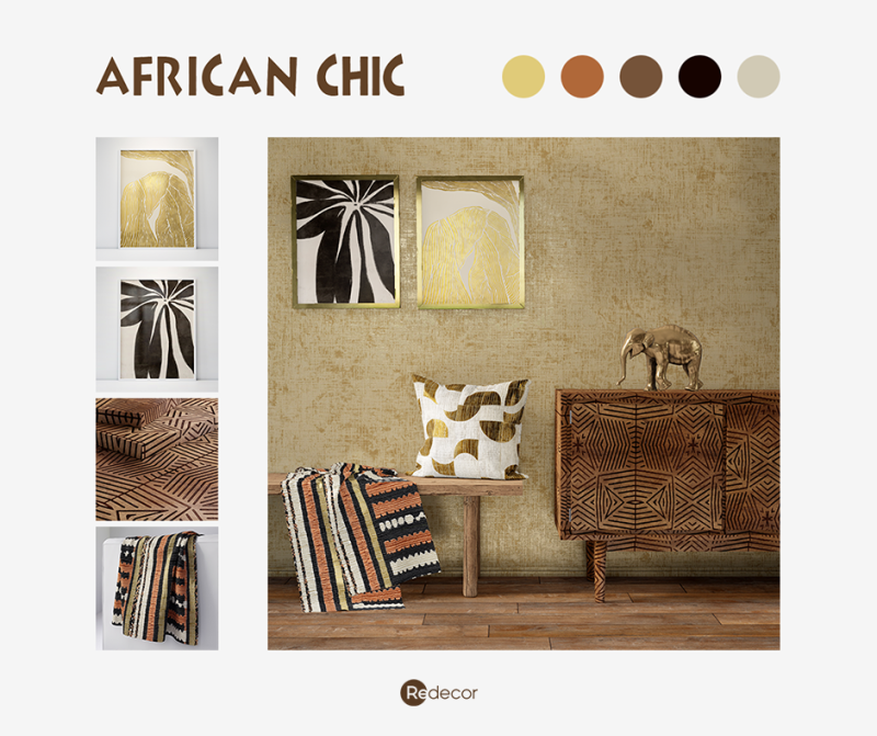
The image below shows how various patterns and textures can be combined to create a cohesive, culturally-inspired aesthetic.
Defining Usage Guidelines
Having great textures and patterns is one thing; using them consistently is another. Your brand guidelines must define how, where, and when these elements should be used.
Brand Texture Guidelines: Crafting a Cohesive Visual Identity
Let's return to the 'Brand Texture Guidelines' article. The section on creating your own guidelines provides a fantastic, actionable framework.
Please read the section 'How to Create Your Own Brand Texture Guidelines'. Pay close attention to the five steps, especially 'Step 4: Set Do’s and Don’ts', which is crucial for preventing misuse.
Based on that article, here is a template you can use to build out this section of your brand guidelines.
Brand Guidelines: Patterns & Textures
1. Texture Library
- Primary Texture: High-resolution photo of [Your Primary Wood] grain.
- Usage: As a background for "About Us" webpage sections, subtle overlay on lifestyle photos.
- Rules: Use at 10-15% opacity for backgrounds. Use with a "Multiply" blend mode for photo overlays.
- Secondary Texture: Polished concrete texture.
- Usage: Background for product spec sheets, footer of the website.
- Rules: Use at 5-10% opacity. Can be colorized with our secondary grey.
2. Pattern Library
- Primary Pattern (The "Signature" Pattern):
- Description: A minimalist geometric pattern inspired by [e.g., Swahili door carvings].
- Usage: Endpapers of catalogues, branded tissue paper for packaging, subtle background on the website homepage banner.
- Rules: Use only in our primary black, white, or deep blue. Must be scaled consistently. Do not stretch or distort.
- Secondary Pattern (Accent Pattern):
- Description: A simple, repeating line pattern representing CNC toolpaths.
- Usage: As a graphic frame on social media posts, section dividers on the website.
- Rules: Line weight must be 2px. Can be used in any brand color.
This image shows a great example of how a simple line pattern can be used as a framing device in social media content to create a consistent, branded look.

Test your understanding!
Imagine you are designing a business card. Using the guidelines you've started to define, where might you apply a texture versus a pattern?
Show answer
There are many good solutions, but here's one possibility:
- Texture: You could apply a subtle, low-opacity wood grain texture to the entire background of the card to give it a tactile feel and connect it to your core material.
- Pattern: You could use your primary "Signature Pattern" on the back of the card as a full-bleed decorative element, making it instantly recognizable even before someone reads the name. This makes the card a beautiful object in itself.
Conclusion
You have now defined another critical component of your visual identity system. By thoughtfully selecting textures that reinforce your brand's connection to natural materials and designing patterns that celebrate your cultural context, you move beyond just having a logo to creating a truly immersive and premium brand experience.
Key Takeaways:
- Textures create emotion and sensory feel; patterns create recognition and rhythm.
- Your brand's primary textures should be authentic to your craft (e.g., specific wood grains).
- Your patterns can be a powerful blend of modern minimalism and heritage-inspired motifs from East Africa.
- Defining clear usage rules (Do's and Don'ts) in your brand guidelines is essential for maintaining consistency.
Next Up:
In our next lesson, we will bring everything together. You will create a sample design, like a social media post template, by applying the full visual system we have developed: your logo, color palette, typography, photography style, icons, and the patterns and textures you defined today. This will be the first test of how all the individual elements work in harmony.