Welcome back! In our previous lesson, you learned the critical skill of evaluating your color palette for digital accessibility, ensuring your brand is not only beautiful but also inclusive and professional. We tested color combinations against WCAG standards to guarantee readability.
Now, we'll take the final step in solidifying your brand's color identity. This lesson will teach you how to document your color specifications using the standard codes (HEX, RGB, and CMYK) needed for consistent brand application. This is the crucial bridge between your creative vision and its real-world execution, whether on a website, a social media post, or a printed business card. This knowledge is fundamental for creating the visual identity section of your brand guidelines.
The Two Worlds of Color: Digital vs. Print
Before we get into the specific codes, it's essential to understand why different codes exist. Your mechanical engineering background will appreciate the physics here: colors are created in fundamentally different ways on screens versus on paper.
-
Digital Screens (Light): A screen creates color by mixing light. It uses an additive color model, starting with black and adding Red, Green, and Blue light to produce the spectrum of colors we see. This is the RGB model.
-
Printed Materials (Ink): A printer creates color by putting ink on paper. It uses a subtractive color model, starting with a white surface and subtracting brightness with ink. The standard inks are Cyan, Magenta, Yellow, and Key (Black). This is the CMYK model.
Because these processes are different, the range of colors they can produce (their "gamut") is also different. The RGB gamut is much larger than the CMYK gamut, meaning some bright, vibrant colors you see on screen simply cannot be reproduced with standard printing inks. This is why having the correct codes for each medium is non-negotiable for brand consistency.
Meet the Color Codes
Let's define the specific codes you'll need to document for your brand. The following video provides a concise overview of the most common color models.
Colours in Branding and Illustration - Creating Palettes
To start, watch these short clips from Kayla's video 'Colours in Branding and Illustration' for a clear introduction to each color model.
Watch the segments explaining RGB (02:01-02:23), CMYK (02:23-03:09), and Hex codes (04:15-04:54). Focus on what each acronym stands for and its primary use—digital or print.
Here is a breakdown of the essential codes you will use:
-
HEX (Hexadecimal):
- Use: The standard for web design (HTML, CSS).
- Format: A six-character code of numbers and letters, preceded by a
#. For example,#FFFFFFis pure white and#000000is pure black. It's essentially a shorthand representation of an RGB value.
-
RGB (Red, Green, Blue):
- Use: All things digital—websites, social media graphics, videos, on-screen presentations.
- Format: Three values, each ranging from 0 to 255, representing the intensity of red, green, and blue light. For example,
rgb(92, 61, 46)would be the RGB equivalent for a rich brown color.
-
CMYK (Cyan, Magenta, Yellow, Key/Black):
- Use: All four-color process printing—brochures, business cards, flyers, packaging.
- Format: Four percentage values representing the amount of each ink used. For example,
cmyk(0%, 34%, 50%, 64%)would be the CMYK breakdown for that same rich brown.
-
PMS (Pantone Matching System):
- Use: Professional printing where exact color accuracy is paramount.
- What it is: Instead of mixing four inks on the press (CMYK), Pantone is a spot color. It's a specific, pre-mixed ink that guarantees the exact same shade every time, anywhere in the world. This is how brands like Coca-Cola ensure their red is always perfect. For a premium brand, specifying a Pantone color for your logo is a mark of quality.
This next clip explains the unique value of the Pantone system.
CMYK vs Pantone vs RGB - What's the difference? Why does it matter? When to use each?
The distinction between CMYK and Pantone is crucial for a premium brand. This clip from Print Peppermint explains why you'd choose Pantone for perfect color matching.
Watch from 00:36 to 01:00 to understand what the Pantone Matching System (PMS) is, and then from 03:47 to 04:22 to learn why it's used for achieving perfectly accurate brand colors.
For your specific business: Since you are creating physical furniture, you might also encounter NCS (Natural Colour System) or RAL, which are standards used for paints and powder coatings. It's useful to be aware of these, as you may need to match your brand colors to physical finishes one day.
From Screen to Print: The Conversion Process
Now for the most important practical step: how do you find all these codes for your chosen colors?
The best professional practice is to start with the most restrictive color system—print. Ideally, you would select your brand colors from a physical Pantone or CMYK swatch book. This guarantees your chosen color can be printed accurately. You would then find its digital (RGB/HEX) equivalent.
However, it's more common to start by picking colors on a screen. In that case, you need to convert your digital color to its closest print equivalent. The following reading explains both approaches and shows how to perform the conversion using free online tools.
Establishing Consistent Brand Colors Across Media
This article, 'Establishing Consistent Brand Colors Across Media,' provides a superb, professional-level guide to selecting and translating colors.
First, read the section 'Picking Your Brand Colors' to understand the 'start with the smallest gamut' principle. Then, read 'Translating Colors,' focusing on how to use free online tools like the PANTONE Color Finder and Adobe Color to get the RGB, CMYK, and Hex values for your colors. This is a very practical guide.
Documenting Your Palette for the Brand Guidelines
Once you have all the codes, you need to present them clearly in your brand guidelines document. This ensures that any designer, printer, or developer who works with your brand can apply your colors consistently.
Your documentation should include:
- A visual swatch of the color.
- The color's role (e.g., Primary, Secondary, Accent).
- The HEX, RGB, and CMYK values.
- The closest Pantone (PMS) equivalent, if applicable.
Here are two excellent examples of how this looks in a professional brand guide:
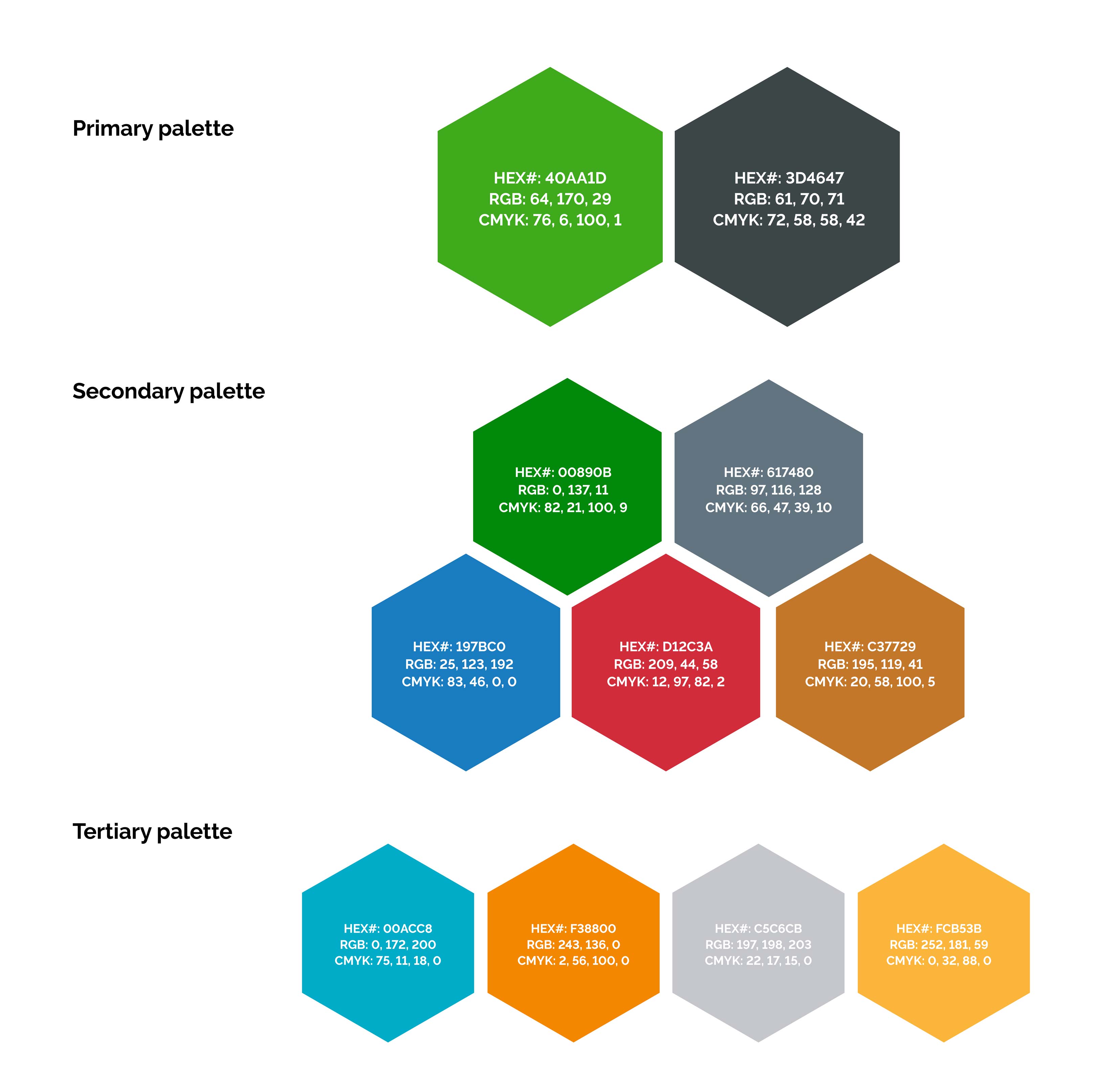

You can create a simple table in your guidelines document to capture this information for your brand.
Test your understanding!
Let's use the Burnt Orange (#D95B1E) from our "Serengeti Earth" palette in the previous lesson.
Go to the Adobe Color wheel. In the color sliders on the right, paste #D95B1E into the HEX field and press Enter. The tool will automatically show you the corresponding RGB and CMYK values.
What are they?
Show answer
- HEX:
#D95B1E - RGB:
R=217, G=91, B=30 - CMYK:
C=13, M=75, Y=99, K=1
You have now successfully translated a digital color into its print and screen specifications!
Conclusion
You now understand the critical difference between color for screen and print, and you can confidently find and document the correct codes for your brand palette. This seemingly technical step is what breathes life into your brand consistently across every touchpoint.
Key Takeaways:
- Screens use the RGB (additive, light) model, while print uses the CMYK (subtractive, ink) model.
- HEX is the web standard and is a shorthand for RGB.
- Pantone (PMS) is the gold standard for print, using pre-mixed "spot colors" for perfect consistency.
- To ensure consistency, you must document the HEX, RGB, CMYK, and ideally Pantone codes for each of your brand colors.
Next Up:
This lesson concludes our module on "The Language of Color." We are now ready to move to the next foundational element of your visual identity. In our next lesson, we will begin the "Voice of Typography" module, where you will learn the role of typography in brand perception and readability. Just like colors, the fonts you choose have a distinct personality and are a powerful tool for communicating your brand's premium, handcrafted nature.